Tech Ideas & Best Practices
Quick Answer
To brand your SharePoint intranet, apply your company's primary colors to the site theme using SharePoint's Change the Look settings, upload your logo to the header, and select a consistent font pairing across all pages. The goal is to make the intranet feel like an extension of your corporate website not a generic Microsoft template. Done right, branded intranets see up to 40% higher daily adoption rates than unbranded ones.
Your employees open the intranet and the first thing they see is a grey Microsoft template with the default blue header and a placeholder logo. Within three seconds, they've already decided this isn't worth their time.
This is the branding problem that affects most SharePoint intranets and it's entirely fixable.
Branding your SharePoint intranet isn't about aesthetics for aesthetics' sake. It's about trust, recognition, and adoption. When your intranet looks and feels like your company, your colors, your logo, your voice employees stop seeing it as an IT tool and start seeing it as a company resource worth using every day.
At SharePoint Designs, we've branded over 800+ SharePoint intranets for organizations including Harvard University, Vanderbilt University, and multiple Fortune 500 companies. This guide distils everything we've learned into a step-by-step framework you can apply to your own intranet today.
Why does SharePoint Intranet Branding Matter?
An unbranded intranet sends an unintentional message to employees: this wasn't built for you. It looks like an afterthought. Employees who land on a generic SharePoint site with the default Microsoft theme are significantly less likely to return, less likely to search for content, and less likely to trust the information they find there.
The data backs this up. In our work across 800+ intranet deployments, we consistently find that branded intranets those using company colors, fonts, and logo prominently achieve measurably higher adoption within the first 90 days of launch compared to unbranded equivalents with the same content.
What does good Intranet Branding actually achieve?
- It builds immediate recognition. Employees shouldn't need to read the URL to know they're on the company intranet. The visual identity should communicate that within one second of the page loading.
- It signals that this is a permanent, invested resource. A polished, branded intranet tells employees that leadership cares about this tool. That perception alone increases usage.
- It reduces cognitive friction. When the intranet matches the visual language employees already associate with your brand, they navigate it more instinctively. Familiar colors and typography reduce the mental effort required to use the tool.
- It supports employer branding. For new hires especially, the intranet is often the first internal digital touchpoint after onboarding. A well-branded intranet reinforces the professionalism and culture they were sold during recruitment.
What are the Core Elements of SharePoint Intranet Branding?
There are four core branding elements to get right on a SharePoint intranet:
- Color palette - Your primary, secondary, and accent colors applied to headers, buttons, section backgrounds, and navigation
- Typography - Font choices for headings, body text, and UI elements
- Logo placement - Where your logo sits, at what size, and on which pages
- Visual language - Photography style, illustration style, icon sets, and graphic elements that feel consistent with your corporate identity
Each of these works together. Getting the colors right but leaving the default SharePoint font makes the intranet feel 70% branded. Getting all four right makes it feel completely native to your company.
You may also like: Typography Trends
Part 1: How to Choose the Right Colors for your SharePoint Intranet
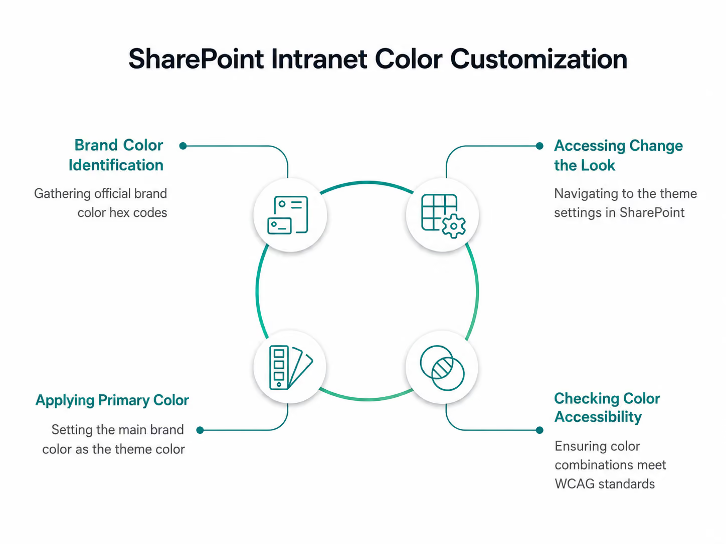
SharePoint Online uses a theming system called Change the Look that lets you apply custom colors to your intranet without any coding. Here's how it works in practice.
Step 1 - Identify your brand color values
Before touching SharePoint, collect your official brand color hex codes from your brand guidelines or marketing team. You'll need:
- Primary color - your main brand color (e.g. #0052CC for a corporate blue)
- Secondary color - a supporting color used for accents or secondary elements
- Neutral colors - your greys, whites, and off-whites for backgrounds and text
If your brand guidelines only specify Pantone or CMYK values, convert them to hex using a color converter tool before proceeding.
Step 2 - Access Change the Look
From your SharePoint home site, click the gear icon (Settings) in the top right → Change the look → Theme. You'll see a palette of Microsoft's pre-built themes. Ignore these you're going to create a custom one.
Step 3 - Apply your primary color
Click Custom at the bottom of the theme panel. You'll see a color picker where you can enter your hex code directly. Enter your primary brand color as the "Theme color."
SharePoint automatically generates a color ramp from your primary color lighter and darker variations used across different UI elements. Review this ramp carefully. Sometimes the auto-generated variations clash or become inaccessible if so, adjust manually.
Step 4 - Check color accessibility
This is a step most organizations skip and later regret. Every color combination on your intranet needs to meet WCAG 2.1 AA accessibility standards specifically a minimum contrast ratio of 4.5:1 for body text and 3:1 for large text and UI components.
Use the WebAIM Contrast Checker to test your primary color against white and against your neutral backgrounds. If you're a public sector organization or in a regulated industry, you may need to meet the stricter AAA standard.
What colors work best for SharePoint intranets?
The best performing intranet color palettes we've seen across our 300+ projects share a few characteristics:
- Use your primary brand color for the header and navigation only. Applying it everywhere dilutes its impact and makes the intranet feel visually noisy. The header and navigation are high-visibility areas strong brand colour here is immediately z without being overwhelming.
- Use neutral backgrounds (white or light grey) for content areas. Dark or heavily coloured page backgrounds make long-form content harder to read and reduce dwell time. White and off-white backgrounds consistently outperform colored ones for readability metrics.
- Reserve your accent color for calls to action. Buttons, links, and key navigation elements should use your accent color consistently. This creates a clear visual hierarchy that guides employees to take actions submit a form, find a document, read an announcement.
- Avoid pure black (#000000) for body text. Use a very dark grey instead (e.g. #1a1a1a or #111827). Pure black on white creates a harsh contrast that causes eye strain during long reading sessions. Most corporate brand guidelines already specify this.
Part 2: How to Choose and Apply Fonts to your SharePoint Intranet
SharePoint Online supports web-safe fonts natively and also support web fonts through custom CSS injection for organizations with developer access. However, for most intranet projects, working with SharePoint's available font options is both faster and more maintainable.
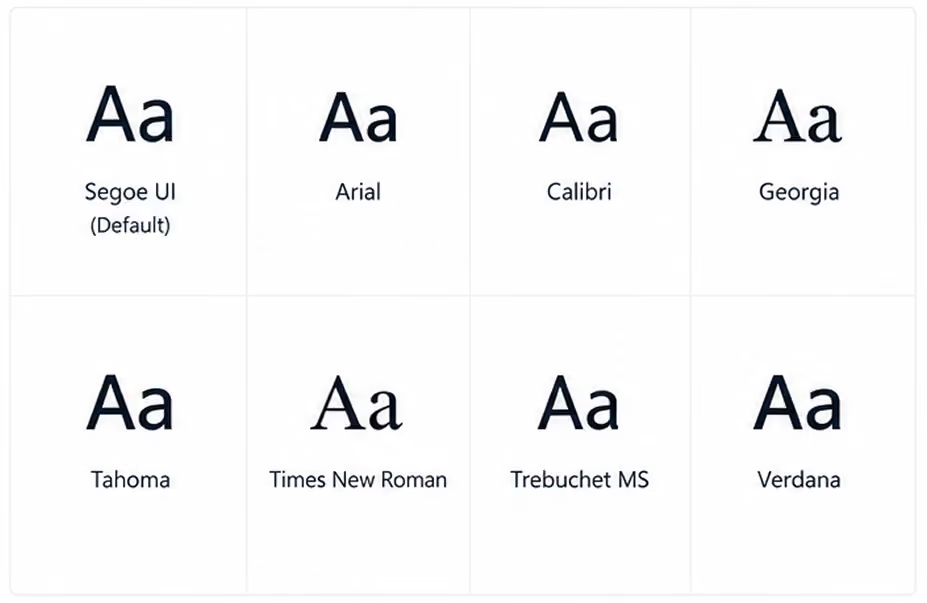
The available fonts in SharePoint's native theme settings include Segoe UI (Microsoft's default), Arial, Calibri, Georgia, Tahoma, Times New Roman, Trebuchet MS, and Verdana.
If your brand specifies a custom font that isn't in this list (for example, Gilroy, Proxima Nova, or a bespoke typeface), you have two options:
- Inject a Google Fonts or Adobe Fonts web font via a custom SPFx web part requires developer involvement but gives full control
- Choose the closest available system font that matches your brand's personality faster and simpler, suitable for most intranet projects
What font pairing works best for SharePoint intranets?
The most reliable and accessible font approach for SharePoint intranets is a two-font system:
- Heading font - bolder, slightly larger, used for H1, H2, H3 page titles and section headings
- Body font - clean, neutral, used for paragraph text, labels, and navigation items
The classic combination that works well across virtually every corporate intranet is Segoe UI for headings (it's Microsoft's own typeface optimized for screen readability) and Segoe UI for body text at a lighter weight. Simple, cohesive, and consistently legible across devices.
If your brand requires more personality, a safe alternative is Georgia for headings (adds warmth and editorial quality) with Arial for body text (neutral and universally accessible).
What font sizes should you use?
Consistent typographic hierarchy makes a SharePoint intranet dramatically easier to scan. Use these as a baseline:
Avoid going below 14px for any text employees need to read regularly. Small text on SharePoint's responsive grid can render even smaller on certain screen resolutions, making it inaccessible on some devices.
Part 3: How to Add and Position your Logo on SharePoint
The logo should appear in two locations at minimum on a well-branded SharePoint intranet:
1. The global navigation header - 0 top left of every page, visible on all sites and sub-sites within your intranet. This is the primary logo placement and the most important.
2. The home page hero section - either within the hero web part or as a standalone image element on the homepage. This reinforces the brand identity on the page employees see most frequently.
How do you add your logo to the SharePoint header?

Step 1 - Prepare your logo file
Your logo needs to be in PNG format with a transparent background. SVG is not supported in all SharePoint contexts. Recommended dimensions: 200px wide × 50px tall at 2x resolution (so upload at 400px × 100px for retina screens). Ensure the logo is legible against your header background color, test both light and dark backgrounds.
Step 2 - Go to Change the Look → Header
Settings gear → Change the Look → Header.
Here you can upload a custom logo image directly.
Step 3 - Upload and position
Click the logo upload area and select your PNG file. SharePoint will position it in the top left of the global header automatically. You can adjust the header layout between Compact, Standard, and Minimal. Standard is the most widely used for branded intranets as it gives the logo adequate breathing space.
Step 4 - Set the site name
Decide whether to show the site name text alongside the logo or suppress it. If your logo is a full wordmark (logo + company name), suppress the text to avoid duplication. If your logo is an icon or symbol only, keep the site name text visible.
What are common logo mistakes on SharePoint intranets?
- Using a logo with a white background instead of transparent. This creates a white box around your logo sitting on a colored header one of the most common and most visible branding errors we see. Always use a PNG with transparent background.
- Uploading a logo that's too small. SharePoint compresses uploaded images. If you upload a small logo, the compression makes it blurry. Always upload at 2x the intended display size.
- Using a dark logo on a dark header. Check contrast carefully. A dark navy logo on a dark teal header background disappears. Either lighten the logo version or choose a header background that provides sufficient contrast.
Part 4: How do you make the whole intranet feel visually consistent?
Applying colors, fonts, and a logo is the foundation but visual consistency across a multi-site intranet requires additional discipline. Here's what the best-branded intranets we've built share:
- Standardized page templates. Create saved page templates in SharePoint for the most common page types news article, department hub, policy document, event listing. Each template has pre-set section layouts, background colors, and web part placements that reflect your brand guidelines. This means whoever creates a new page, the output is always on-brand.
- A defined image style. Decide whether your intranet uses photography (real people, real offices), illustration, or icons and stick to it. Mixed visual styles are one of the most common causes of an intranet looking "off" even when the colors and fonts are correct. A branded photo library shared internally gives content authors the right assets to pull from.
- Consistent icon sets. SharePoint's default icons are functional but generic. Replacing them with a consistent icon set that matches your brand's visual style whether that's outlined, filled, or illustrated significantly elevates the overall feel. Microsoft's Fluent UI icon library is free, comprehensive, and designed to work within the Microsoft 365 environment.
- Section backgrounds used intentionally. SharePoint lets you set background colors on individual page sections. Used well, this creates visual rhythm and hierarchy alternating a white section with a light brand-color section breaks up long pages and draws attention to key content areas. Used poorly (random colours with no logic), it makes pages look chaotic.

You may also like: 10 UX Pitfalls that make your employees hate your Intranet
Part 5: What are the most common branding mistakes on SharePoint intranets?
Across 800+ intranet projects, these are the mistakes we see most frequently:
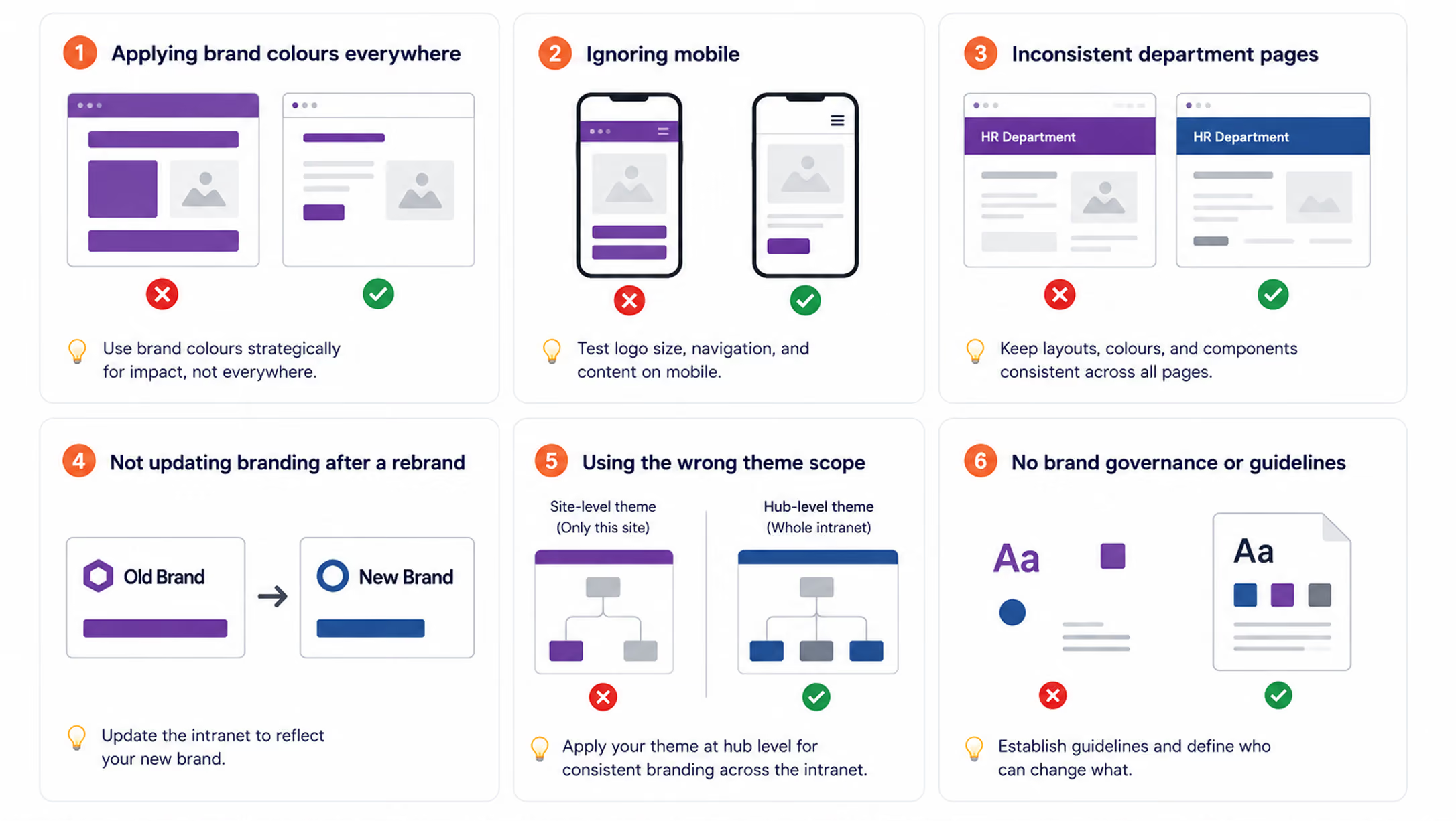
Applying brand colors everywhere. Covering every section, button, and background in your primary brand color doesn't make the intranet look more branded it makes it look exhausting. Brand colour should be used at strategic points to create impact. White space is your ally.
- Ignoring mobile. Over 30% of intranet visits now happen on mobile devices. SharePoint's responsive design means your intranet will reflow for mobile automatically, but your branding elements won't always translate perfectly. Test your logo size, navigation, and hero sections on a phone before launch.
- Inconsistent department pages. A beautifully branded homepage loses credibility the moment an employee clicks through to a department page that looks completely different. Brand governance who can change what and how needs to be established before launch and enforced afterwards.
- Not updating branding after a rebrand. When a company rebrands, the intranet is frequently the last digital property to be updated. This means employees are working in an intranet that contradicts the new brand identity they're seeing everywhere else. Build a branding update checklist into your intranet governance plan from day one.
- Using the wrong SharePoint theme scope. SharePoint has site-level themes and hub-level themes. If you apply branding only at site level, sub-sites and associated sites won't inherit it. Apply your theme at hub site level so it cascades consistently across the entire intranet.
Your SharePoint Intranet Branding Checklist
Before launching a branded SharePoint intranet, run through this checklist:
- Brand color hex codes collected from official brand guidelines
- Color accessibility tested (minimum 4.5:1 contrast ratio)
- Custom theme applied at hub site level
- Logo uploaded in PNG format with transparent background at 2x resolution
- Logo tested against header color for contrast
- Site name text shown or suppressed (consistent decision)
- Font hierarchy defined for H1, H2, H3, body, and navigation
- Page templates created for each major content type
- Image style guide defined and photo library shared
- Icon set selected and consistently applied
- Section background colors used with a clear logic
- Mobile view tested on iOS and Android
- Department pages and sub-sites checked for brand consistency
- Branding governance policy documented
%201.avif)
How to Brand your SharePoint Intranet: Colours, Fonts & Logo Guide (2026)
To brand your SharePoint intranet, apply your company's primary colors to the site theme using SharePoint's Change the Look settings,

What is the Best Intranet for Healthcare in 2026?
The best intranet for healthcare in 2026 is Microsoft SharePoint, properly implemented by a specialist partner. Key differentiators include HIPAA security, granular role-based access, seamless EHR integration, and a customized, branded employee experience, all provided without extra vendor licenses for organizations already on Microsoft 365.
Platforms like Simpplr, Staffbase, and Unily target healthcare but can't replace your Microsoft 365 subscription. SharePoint delivers those features with stronger compliance, direct integration with Teams, Outlook, and Power Platform, and workflows customized to your environment.
Healthcare IT leaders: If you use Microsoft 365, you already have the top healthcare intranet platform. You need expert implementation, not another vendor.
Quick Comparison: Intranet Platforms for Healthcare
Why Healthcare Intranets Are Different From Every Other Industry
Healthcare organizations face intranet challenges that no other vertical deals with at the same scale.
The U.S. expects a shortage of over 500,000 registered nurses by 2033. Most clinical staff are rarely at desks and must be reached quickly. Intranets that require desktop logins during long shifts are ignored. Only mobile-first platforms succeed in healthcare.
HIPAA and ePHI compliance is non-negotiable. A data breach in a corporate intranet is a PR problem. A healthcare intranet breach involving protected health information (PHI) triggers mandatory federal breach notification and fines up to $1.9 million per violation category. Your intranet must be architected for compliance from day one, not retrofitted after launch.
Shift-based communication creates dangerous information gaps. A policy update published at 9am reaches the day shift. Night shift nurses starting at 7pm may not see it for 16 hours unless the intranet actively surfaces it on login. Healthcare intranets must handle time-sensitive, shift-aware communication. According to the American Hospital Association, hospitals with more engaged staff deliver measurably safer care and better patient outcomes, linking intranet effectiveness directly to clinical quality.
Multiple departments with radically different needs. Doctors need fast access to clinical protocols and prescription portals. Nurses need shift reports and care plans. HR needs policy management and onboarding workflows. Administrators need real-time operational dashboards. A single homepage layout fails all of them.
Regulatory documentation requires a lifecycle, not just storage. Clinical SOPs, formularies, infection control guidelines, and accreditation documents must be versioned, approved, and retired on a documented schedule. SharePoint handles this natively. A communication-first platform does not.
The Core Problem: Most Healthcare Intranets Are Built Wrong
Across 100+ intranet deployments in hospital networks, multi-site health systems, clinics, and aged care providers, the same failure pattern appears consistently:
The intranet launches as a communication portal. It has a news section, a document library, and quick links. After 6 months, usage drops. Staff returns to email, WhatsApp, and printed handouts. Leadership asks why adoption failed.
The reason is structural, not technical. An intranet not built around the actual daily workflow of each clinical role will fail. The right approach starts with one question: what does each role need to complete their job in the first 10 minutes of their shift?
- A floor nurse clocking in needs today’s patient census, active alerts, shift handover notes, and emergency protocols
- A ward administrator needs to review pending approvals, staff scheduling updates, and HR announcements.
- A department head needs the status of compliance documentation, team performance data, and departmental news.
- A new staff member needs onboarding tasks, a training calendar, and their manager’s contact information.
When those answers drive design, adoption follows because the intranet is useful, not just available.
What a Healthcare SharePoint Intranet Looks Like in Practice
SharePoint Designs has built healthcare intranets across seven distinct design approaches, each tailored to different clinical environments, organizational cultures, and branding requirements. All seven run on the same SharePoint foundation.
Design 1 - Clinic Hub: Acute Care & Multi-Department Hospitals
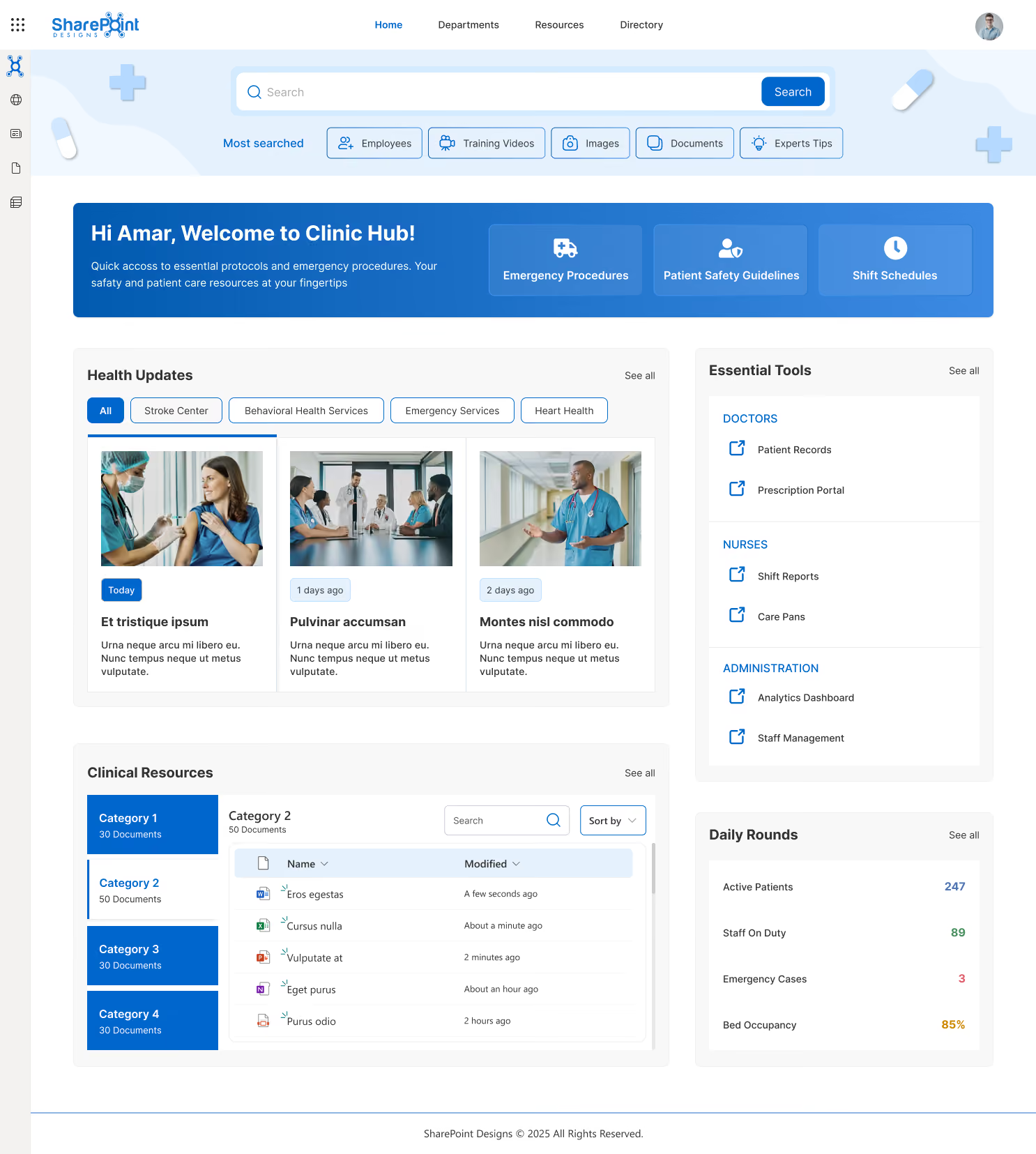
Built for acute care hospitals and multi-department clinical environments. The homepage centers on role-specific quick access: Emergency Procedures, Patient Safety Guidelines, and Shift Schedules are pinned in the hero section.
Health Updates are filterable by service line: Stroke Center, Behavioral Health, Emergency Services, and Heart Health. A right-side panel separates doctor tools (Patient Records, Prescription Portal) from nurse tools (Shift Reports, Care Plans) and administrative tools (Analytics Dashboard, Staff Management).
A Daily Rounds widget surfaces live operational metrics: Active Patients, Staff on Duty, Emergency Cases, and Bed Occupancy. This is the most operations-dense design, suited to high-acuity hospital environments.
Design 2 - Vision: Large Health Networks (500+ Staff)
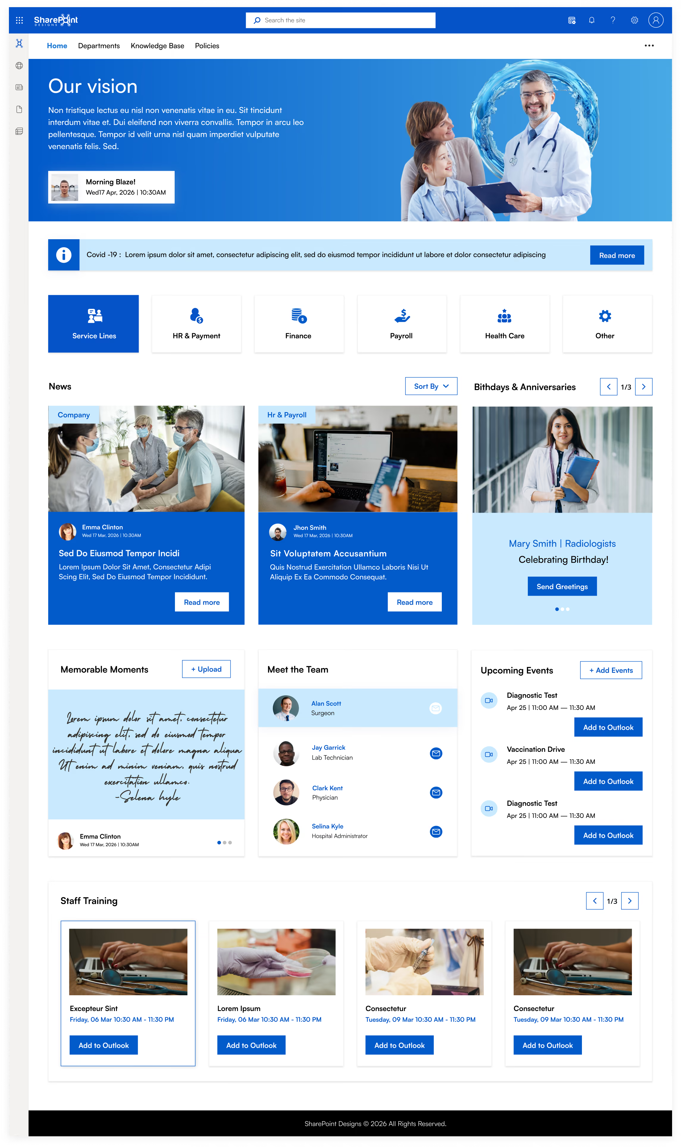
Built for multi-location health systems where leadership communication and cultural alignment are priorities. The full-width hero banner carries personalized daily briefing and leadership vision messaging. A service line navigation row lets each department (HR & Payment, Finance, Payroll, Health Care) operate as its own subsite while remaining connected to the central hub.
The Meet the Team and Memorable Moments sections drive connection across distributed sites. Birthdays & Anniversaries and Staff Training, with direct Outlook calendar integration, are consistently among the highest-used features after launch because they make the platform feel human, not institutional.
Design 3 - Women’s Health & Specialty Clinics
Built for specialty healthcare providers: OB/GYN practices, fertility clinics, maternity hospitals, and women’s health centers. The design language (purple palette, specialty-specific department filters: Obstetrics, Gynecology, Fertility IVF, Maternity Care) signals immediately that this was designed for this organization.
The People Directory includes an org chart filterable by specialty. The calendar surfaces relevant appointments (Prenatal Checkup, Ultrasound Scan) with direct Outlook integration. Service Awards recognize long-tenure staff as a meaningful driver of retention in specialist clinical environments.

Design 4 - Compassionate Care: Community & Family Health
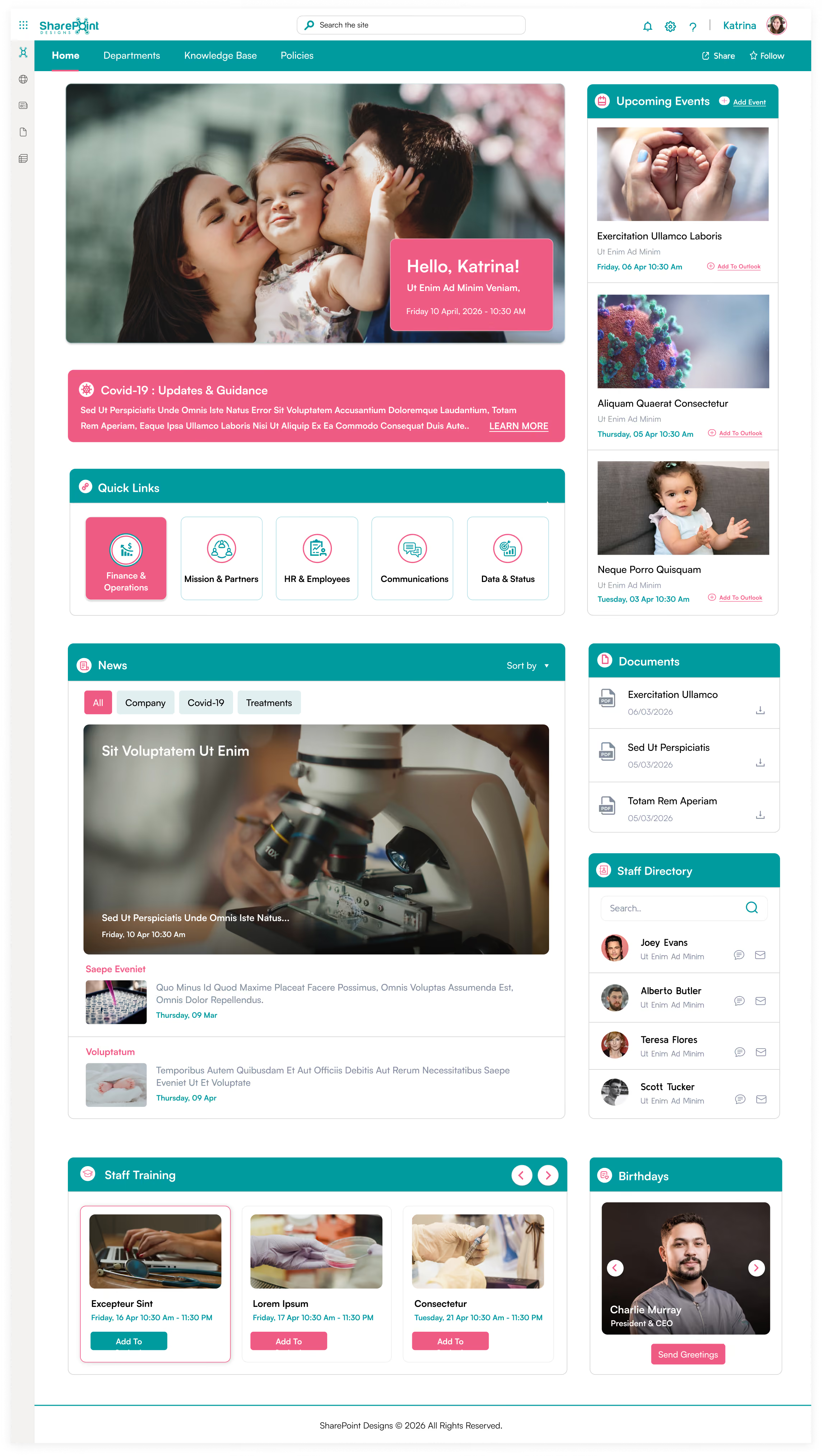
Built for community health centers, family medicine practices, and organizations where patient-centered culture is central to the brand. Quick Links segment by role: Finance & Operations, Mission & Partners, HR & Employees, Communications, Data & Status.
The News section supports filtered views for Company, Covid-19, and Treatments content. Documents are surfaced on the homepage with direct download links; clinical staff never navigate a document library.
The warm hero imagery and Birthdays section reinforce a community feel, which better drives adoption in smaller clinical environments than any feature set.
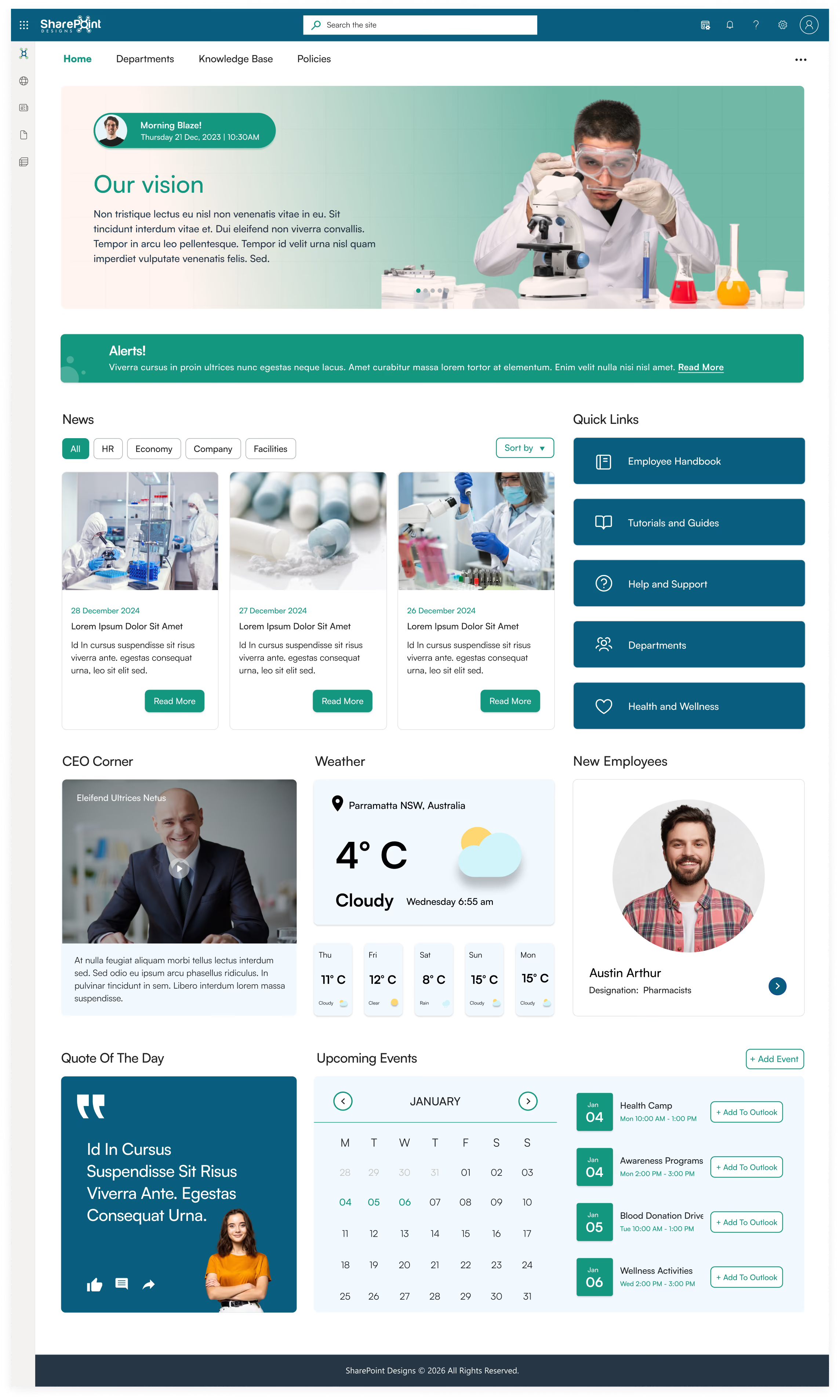
Design 5 - Research & Pharma: Science-Led Healthcare
Built for pharmaceutical companies, research hospitals, and clinical research organizations. The homepage leads with a CEO Corner video section and lab-focused hero imagery.
Quick Links structure research workflows: Employee Handbook, Tutorials and Guides, Help and Support, Departments, Health and Wellness. A live weather widget supports staff traveling between campuses.
New Employees are highlighted to improve onboarding visibility in organizations with higher researcher turnover. The Quote of the Day section reinforces culture in a format that resonates with research-oriented teams.
Design 6 - Enterprise Hospital Network
The most feature-complete design for large enterprise hospital systems. The personalized hero greeting with vision statement carousel creates immediate personal relevance.
Below it: an Announcements scroller for urgent all-staff communications, Quick Links divided across clinical and operational categories, a My Apps section surfacing role-specific tools (Call Center Web, Front Desk, Payroll, XM Fax, Duo Central), New Joiners, Birthdays & Anniversaries, Testimonials, Company Directory, Calendar, and Events all on a single scrollable homepage.
The Testimonials carousel lets staff share organizational moments, a proven driver of cultural engagement in large, distributed hospital networks.

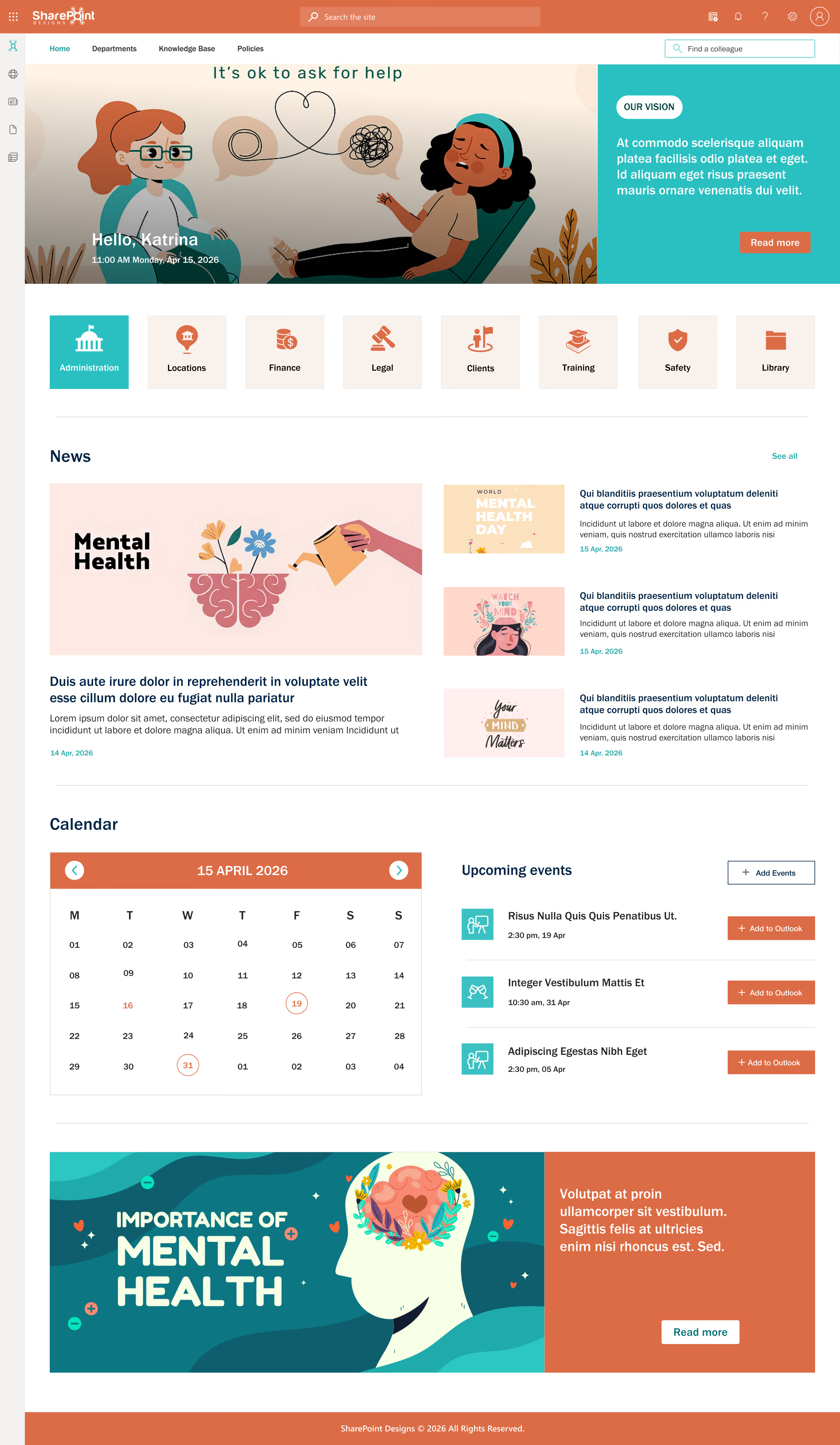
Design 7 - Mental Health & Behavioral Services
Built for mental health organizations, behavioral health services, and wellbeing-focused healthcare providers. The calm color palette (coral, teal, white) is deliberate, as clinical staff in this sector respond differently to high-intensity blue corporate designs.
Navigation reflects the specific needs of behavioral health: Administration, Locations, Finance, Legal, Clients, Training, Safety, and Library. A full-width mental health awareness banner at the bottom normalizes the organization’s focus on staff and patient wellbeing.
The Calendar and Upcoming Events sections are prominent because scheduling is operationally central to behavioral health service delivery.
SharePoint Intranet for Healthcare (2026): Complete Guide for Hospitals, Clinics & Health Systems
The best intranet for healthcare in 2026 is Microsoft SharePoint, properly implemented by a specialist partner. Key differentiators include HIPAA security

In today’s fast-paced workplace, a well-designed intranet isn’t just a “nice to have”; it’s a productivity booster, a culture-shaper, and a vital communication tool. As more organizations adopt Microsoft SharePoint for internal communication, collaboration, and knowledge sharing, the way you design your SharePoint intranet can make or break its effectiveness.
See these principles applied in real intranets Browse the LookBook
Below are transformative SharePoint intranet design tips that can elevate your intranet from “just another portal” to a powerful, intuitive, and user-friendly hub.
1. Use Hero Web Parts to Surface High-Priority News
Explore more Modern Webparts
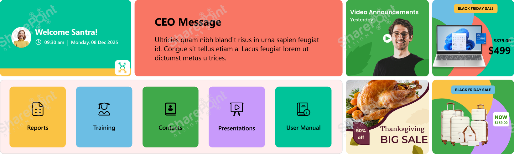
The first thing users see when they open the intranet matters; that’s why Hero Web Parts deserve more respect than mere “decorative” images. Instead of treating them as flashy banners, think of them as your intranet’s front page: a place for real, high-impact communication.
- Announcements: company-wide updates, deadlines, new initiatives
- CEO or leadership messages: set tone and direction
- Alerts or urgent notices: e.g., department-specific emergency info
- Company vision/mission/values: especially useful for new hires
- Polls, feedback requests, idea submission links: when you need quick employee input
- Useful content during seasonal changes, e.g., weather advisories, especially in the rainy season or extreme heat
- Reminders: celebrations, compliance deadlines, events
- Background videos: brief clips about company culture, onboarding, brand story
By leveraging Hero Web Parts for purposeful and timely content, you make the home page of your intranet an important communication hub, not just a placeholder image.
2. Keep Navigation Simple and Clear
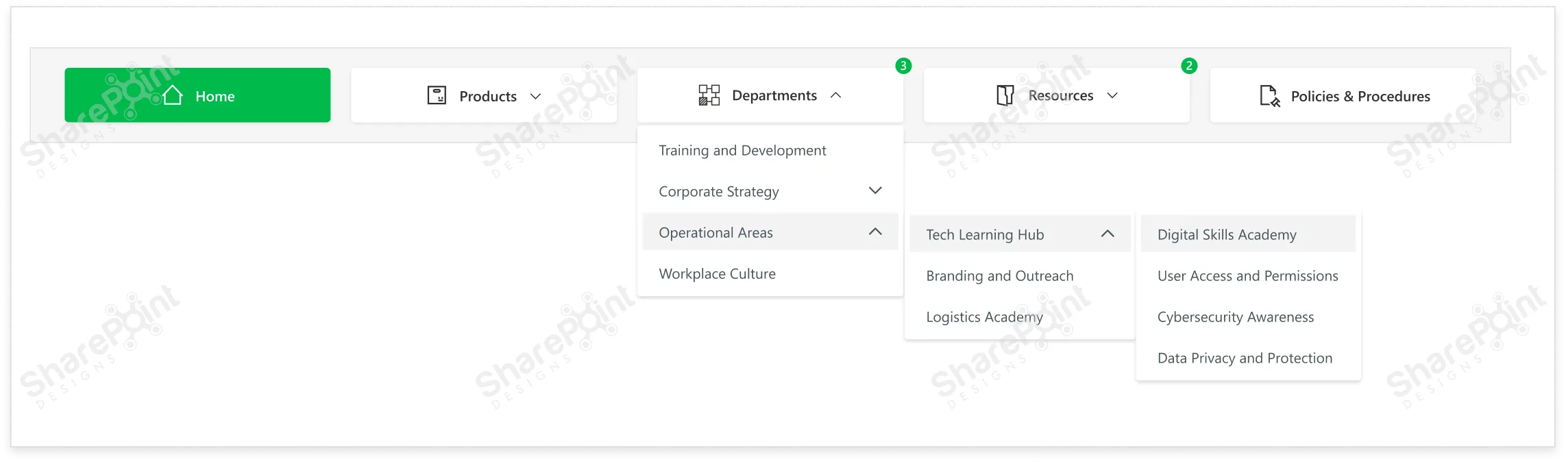
Your intranet may house tons of information documents, policies, apps, team pages, updates, and training materials, but users shouldn’t need a map to find anything.
- Use a mega-menu when you have many categories or sub links. It keeps navigation neat and avoids long dropdowns that break UX.
- Use user-friendly, consistent naming conventions for links. Avoid jargon or overly generic names like “Documents123” or “Misc.”
- Position navigation in a standard location, typically at the top. This aligns with common web and app UI/UX patterns, so users don’t have to hunt for the menu.
- Provide visual cues for states: default, hover, active/pressed. This helps users understand where they are in the site and what’s clickable.
- Double-check that each menu link points to the correct and relevant content. Dead or misdirected links are a sure way to frustrate users and lose trust.
Clear navigation in SharePoint is like giving every user a roadmap, helping them reach the information they need without confusion or wasted time.
3. Use White Space to Improve Readability.
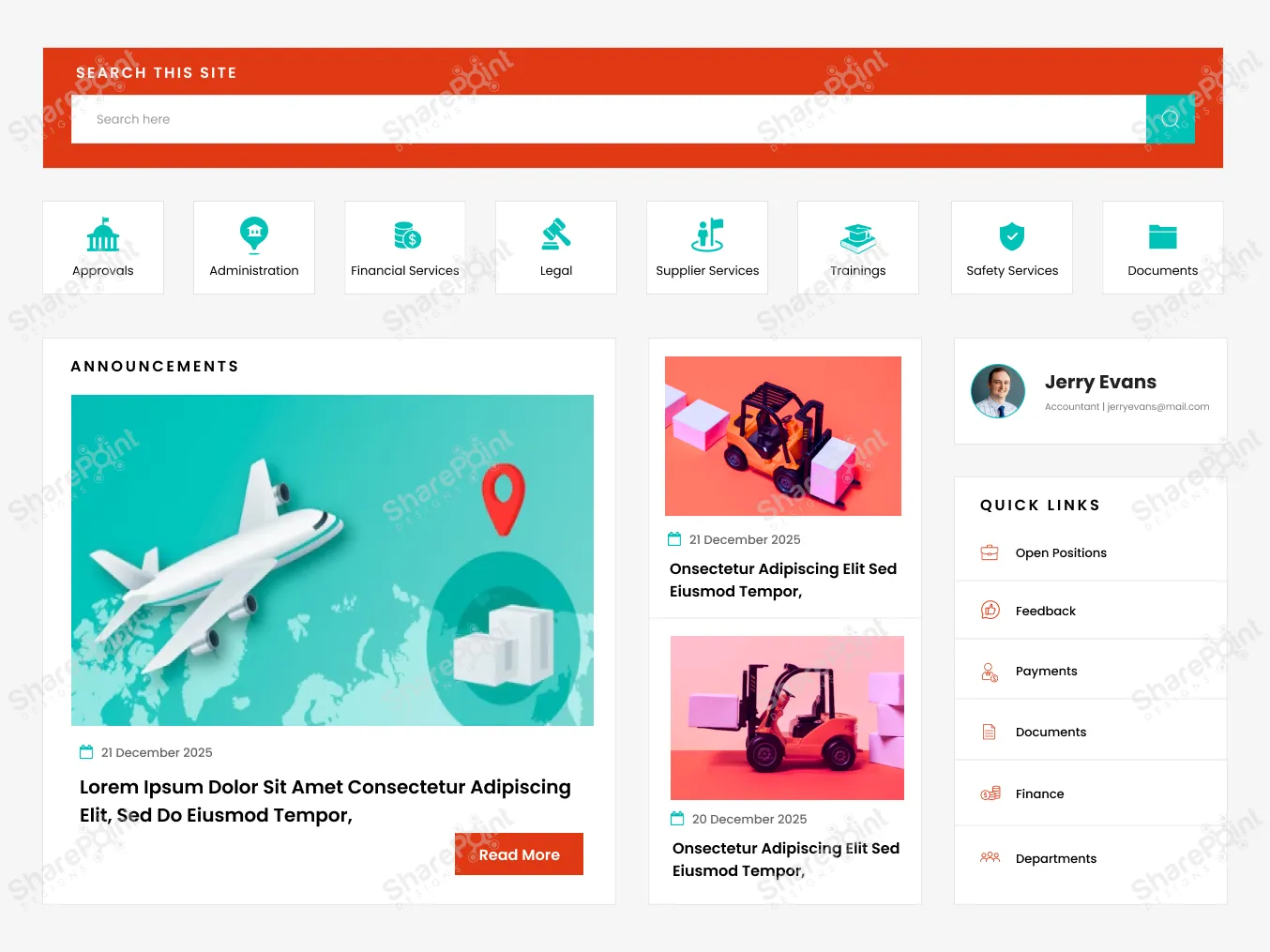
An intranet often contains dense information articles, policies, tables, and links, which can easily overwhelm the user if not laid out thoughtfully. That’s where white space (or blank space) becomes one of your most powerful design tools.
- It prevents visual clutter, making content easier on the eyes and easier to digest.
- It helps structure content logically: grouping related items, separating distinct sections, and defining hierarchy.
- It improves readability and comprehension, reducing cognitive load on users.
- It gives breathing room, preventing users from feeling overwhelmed by too much information at once.
Rule of thumb: Don’t pack too many web parts onto one screen without spacing. Let content breathe. Use margins, padding, and blank space between rows and columns. A clean layout isn’t empty, it’s intentionally
designed to guide the user’s focus.
Explore the best SharePoint design examples
4. Add Personalization Where It Counts
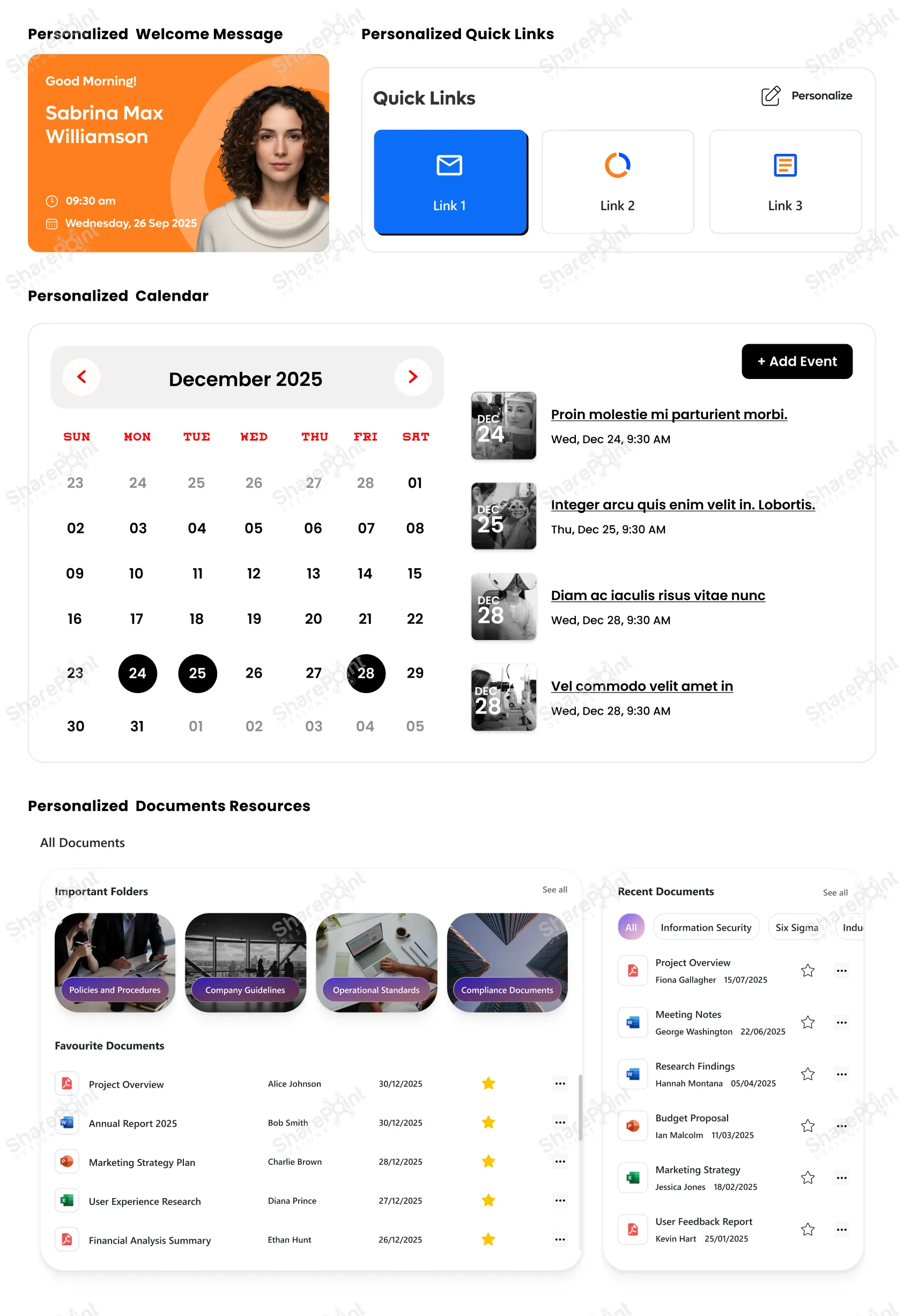
In an age where personalization is the norm, on social media, news feeds, even entertainment, your intranet should follow suit. A one-size-fits-all intranet rarely fits anyone particularly well.
- News and announcements: showing updates relevant to a user’s department, role, or location. · Quick links: Role-aware quick links that provide instant access to essential tools and apps. (e.g. HR forms for employees, project dashboards for team leads)
- Documents and resources: presenting what’s most relevant to the user rather than everything at once
- Welcome messages: personalized greeting or onboarding guidance for new joiners
- Events, training, calendar items: targeted to relevant teams or user groups
By giving users a customized view, you reduce noise, improve efficiency, and make it easier for them to focus on what matters, without sifting through unrelated content. The result? A leaner, clearer, and more impactful intranet experience.
5. Hide Complexity with Collapsible Sections
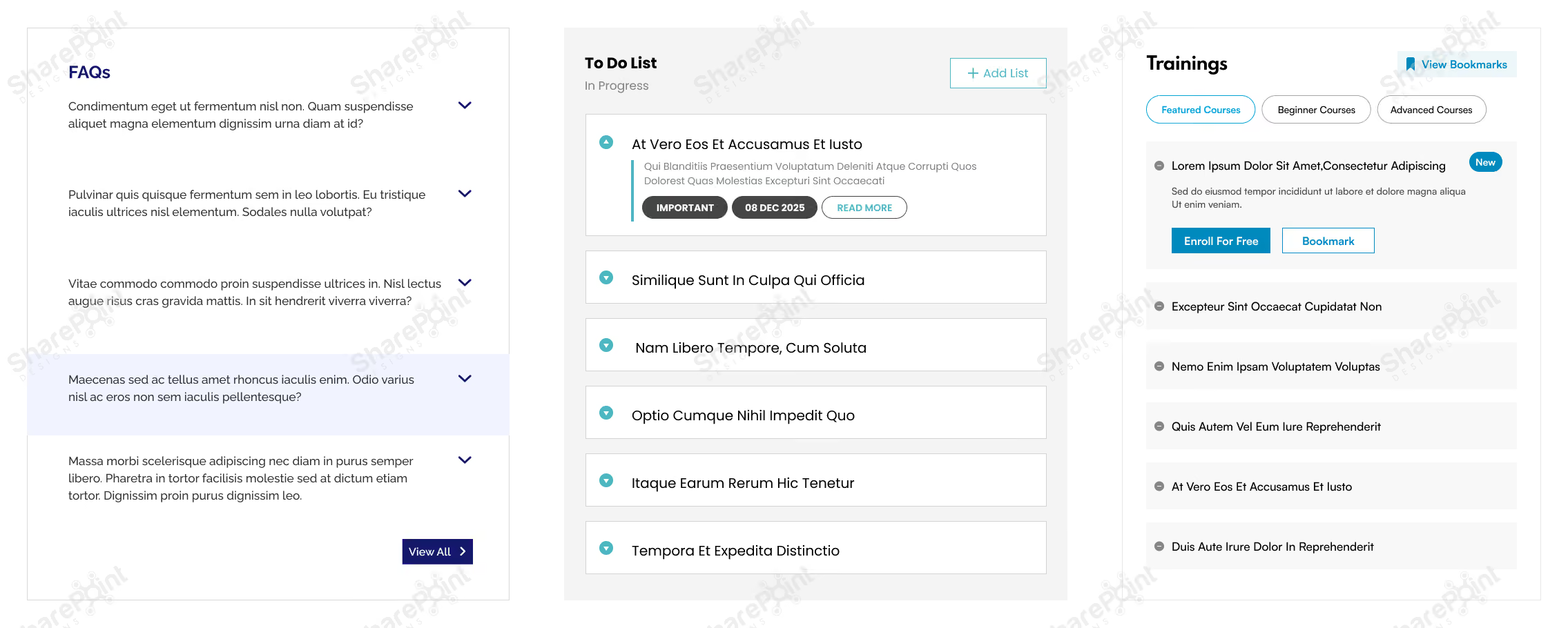
Sometimes you do need to present lots of information tables, detailed FAQs, long articles, or rich text, but that doesn’t mean it all should blast onto the user’s screen at once. Instead, use collapsible sections often implemented via accordions, to make complex information more digestible.
- Use accordions to organize FAQs, long policy documents, or help guides.
- Group dense content tables, multi-section reports, or long lists under collapsible headers.
- Let users expand only what they need, reducing overwhelm and keeping the UI clean.
- Especially useful for SharePoint pages with mixed content types, text, images, links, and embedded content where collapsing extra layers can greatly simplify navigation.
Collapsible sections let you balance having all information available when needed, without burdening the user with complexity by default. You can explore this in more detail in our guide on how to use flexible sections in SharePoint pages to simplify complex page designs and improve usability.
6. Prioritize Responsive Designs
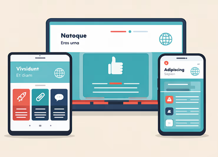
In 2026 the desk bound employee is the exception, not the rule. Whether it is frontline workers checking schedules or executives approving requests between meetings, your intranet must be responsive. Designing for responsive layouts is not just about shrinking the desktop view; it is about
prioritizing touch targets and vertical scrolling to ensure the site works flawlessly on tablets, laptops, and smartphones alike.
- Test page layouts on the SharePoint mobile app: Ensure columns stack correctly and do not break the reading flow.
- Prioritize vertical scrolling over horizontal: Horizontal scrolling is notoriously difficult on touch devices.
- Use larger touch targets: Buttons and links should be easily tapable without zooming in.
- Simplify the home page for smaller screens: Use the "Hide on mobile" feature for non-essential web parts that clutter the small screen.
7. Leverage "Section Backgrounds" for Visual Hierarchy
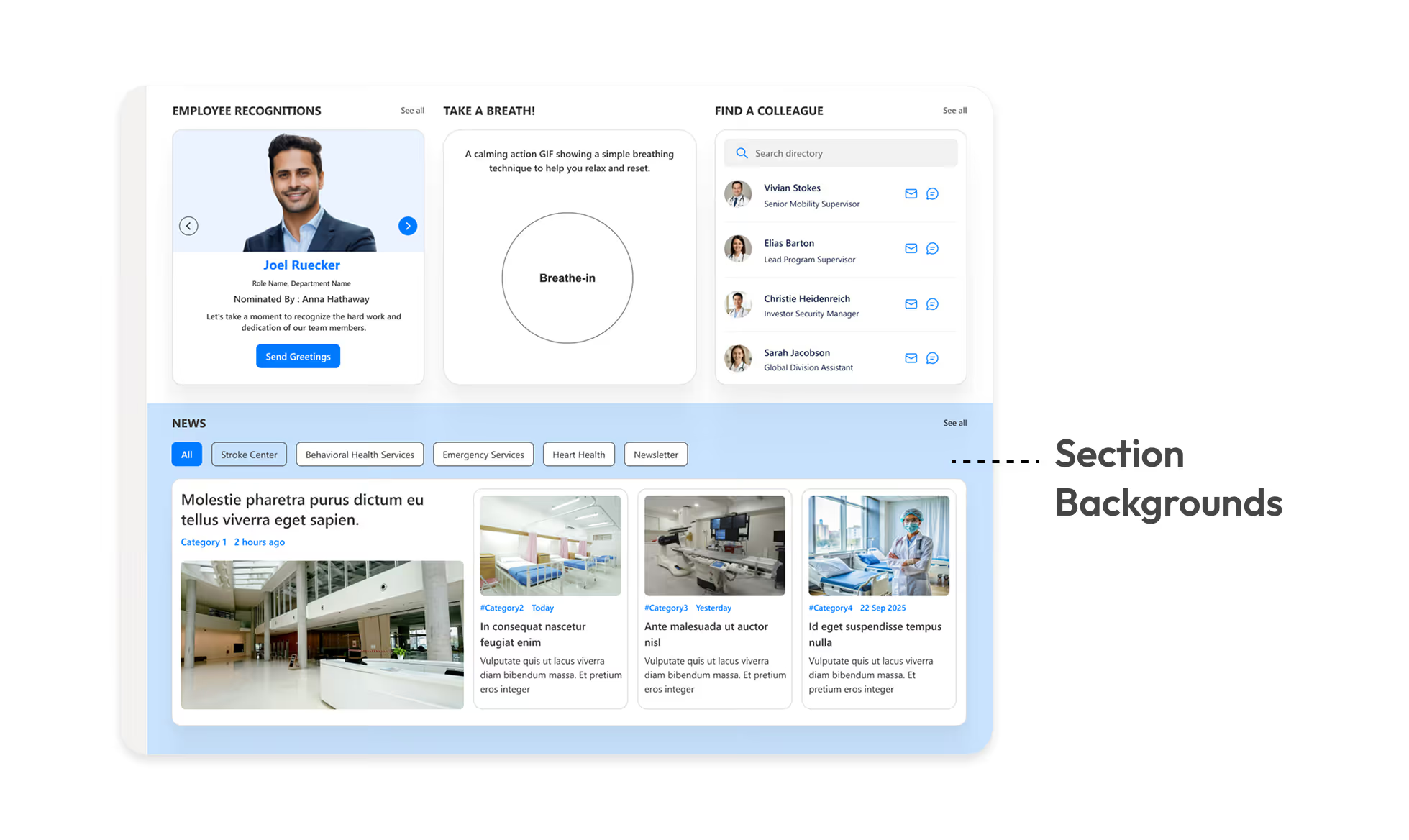
Monochromatic pages are functional but boring. SharePoint’s modern experience allows you to apply different background colors to specific page sections. This is a subtle but powerful way to break up long pages and signal a change in context to the user.
- Highlight key calls to action: Use a contrasting background color for sections containing critical buttons or forms.
- Separate content types: Use soft grey or brand tinted backgrounds to distinguish between "News" sections and "Resource" sections.
- Create visual rhythm: Alternating section colors prevents the "wall of text" fatigue and guides the eye down the page.
- Ensure contrast: Always verify that your text remains readable against the chosen background color (e.g. dark text on light backgrounds).
8. Standardize Your Page Templates
Ready-to-use Templates Explore Templates
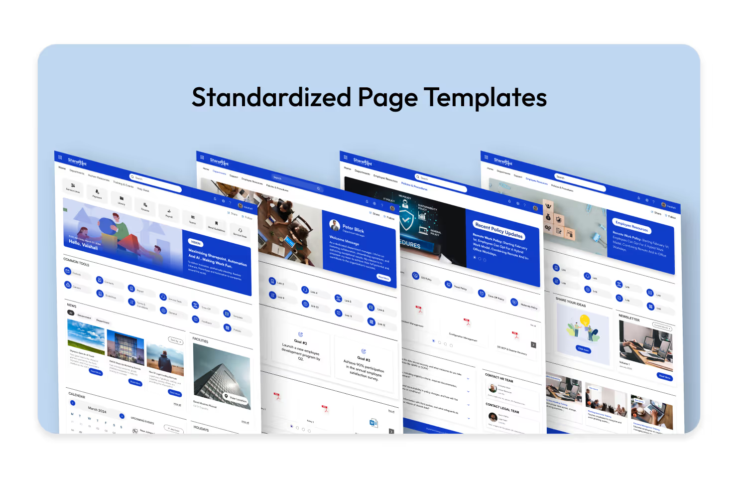
Inconsistency kills user confidence. If the HR page looks completely different from the IT page, users have to re-learn how to find information every time they switch departments. Creating and enforcing standard Page Templates ensures a cohesive experience across the entire intranet.
- Predefine web part placement: Decide where the "Contact Person," "Quick Links," and "News" web parts should always sit (typically the right-hand column).
- Save time for content creators: Authors can simply select a "New Policy Page" or "New Team Event" template rather than building from scratch.
- Maintain brand consistency: Ensure headers, banners, and footer information are uniform across all new pages.
- Reduce training requirements: When pages follow a pattern, users intuitively know where to look for specific data.
9. Utilizing "Button Web Parts" for Clear Calls to Action (CTA)
Explore more Modern Webparts
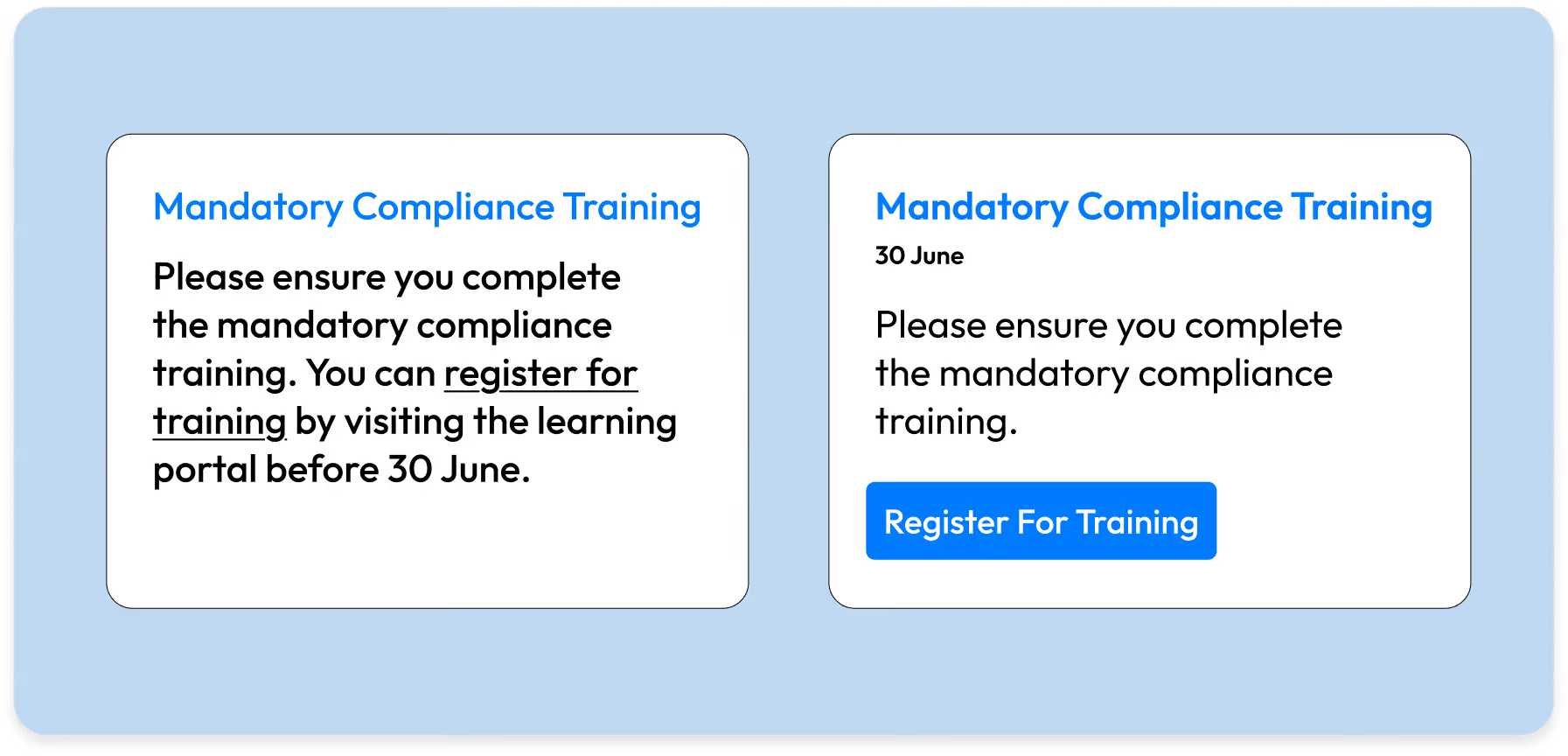
Hyperlinked text in the middle of a paragraph often gets missed. When you need a user to do something like "Submit Expense Report" or "Register for Training" use the Button Web Part. It acts as a visual signpost that stands out from the narrative text.
- Use descriptive labels: Instead of "Click Here," use specific action verbs like "Download 2026 Handbook" or "Access IT Helpdesk".
- Center align for impact: A centered button draws the eye immediately and implies a pause in the reading flow to take action.
- Consistent styling: Stick to one primary color for main actions and a secondary outline style for less critical links to avoid a "rainbow" effect.
- Place buttons strategically: distinct from the body text, usually after a brief explanation of why the user should click it.
20 Game-Changing SharePoint Design Tips You Need in 2026
In today’s fast-paced workplace, a well-designed intranet isn’t just a “nice to have”; it’s a productivity booster, a culture-shaper, and a vital communication tool.

SharePoint continues to evolve into one of the most powerful intranet platforms for modern organizations. As businesses focus on hybrid work, AI-driven productivity, and employee experience, SharePoint's design capabilities have expanded dramatically.
In 2026, companies expect intranets that are clean, intuitive, and personalized far beyond what traditional portals offered a few years ago. SharePoint delivers these capabilities through modern site designs, advanced layouts, and ready-to-use intranet examples that help teams launch faster and work smarter. This updated guide explores the best SharePoint intranet site designs and examples for 2026, how they support today’s digital workplace, and what features truly matter when building a high-performing SharePoint environment.
Want a SharePoint Intranet Like These Examples? Explore Intranet Templates
Instead of designing everything from scratch, explore professionally designed SharePoint intranet templates built for Microsoft 365.
Why SharePoint Site Designs Matter More in 2026
Modern workplaces demand intranet experiences that are:
- Simple to use
- Visually appealing
- AI-powered and personalized
- Mobile-friendly
- Fast to deploy
- Integrated with Microsoft 365
- Designed for collaboration and engagement
SharePoint meets all these needs through modern page layouts, flexible components, and professionally designed site examples that eliminate guesswork and reduce development time.
Top SharePoint Site Designs and Intranet Examples for 2026
Microsoft’s SharePoint design ecosystem has grown significantly. The latest examples show how organizations can create digital workplaces that feel modern, connected, and engaging.
Below are the best-performing design styles and examples dominating 2026 intranet builds:
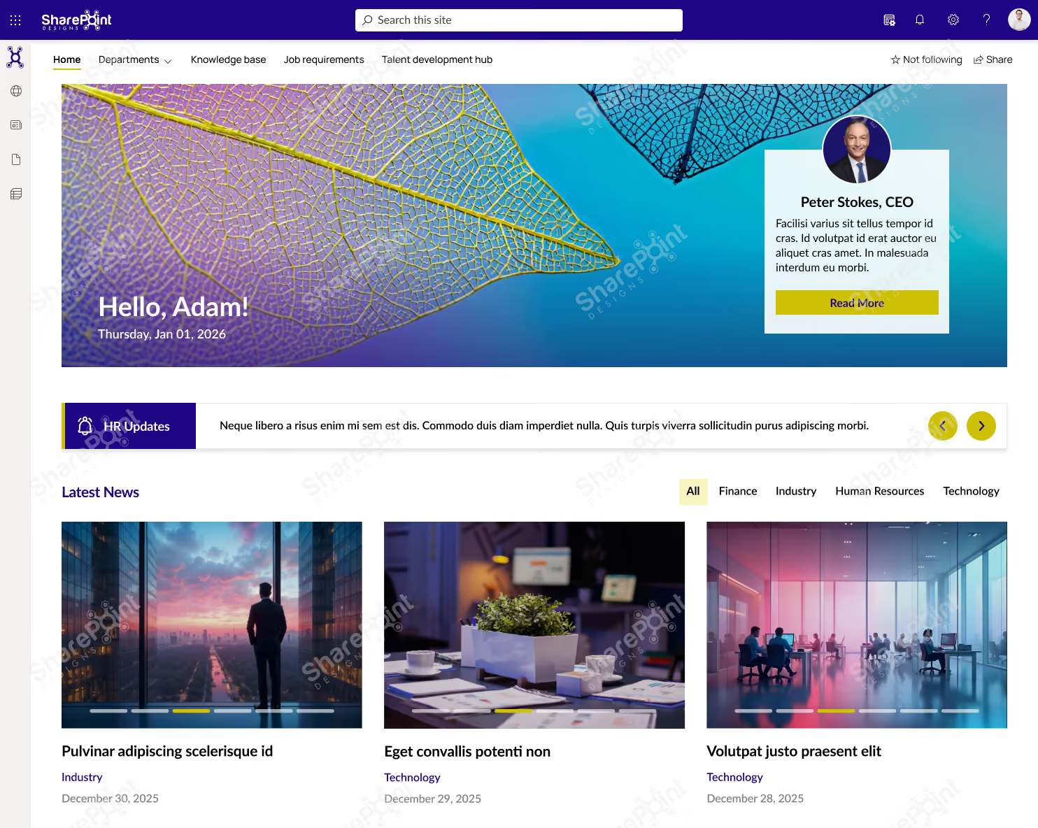
1. Modern Communication Sites (2026 Upgrade)
Communication Sites remain the backbone of enterprise intranets. The 2026 updates focus on:
- Streamlined layouts
- Improved readability
- Flexible navigation
- Strong visual hierarchy
- Personalized content sections
These sites help organizations share news, highlight updates, and maintain consistent branding across departments.
Looking for More Inspiration?
Explore 50+ professionally designed SharePoint intranet examples across HR, IT, Healthcare, Manufacturing, Finance, Education, and more.
Explore the SharePoint LookBook
Best for: Company-wide announcements, leadership communications, HR updates, and employee engagement.
Why This Template Works?
1. Built for daily employee use, not just announcements
2. Clean, scannable layout that improves content discovery
3. Combines news, resources, people, and links in one view
4. Easy to manage and scale without heavy customization
Who It’s For?
1. IT, HR, and Internal Communications teams
2. Mid to large organizations using SharePoint
3. Companies with hybrid or distributed workforces
Best Parts
1. Personalized hero with leadership visibility
2. Categorized news and updates
3. Quick access to policies, forms, and tools
4. Modern design that drives adoption
Book a live demo and see the platform tailored to your business needs. Schedule a Live Demo
2. Hub Sites for Structured, Scalable Navigation.
Hub Sites now offer deeper personalization and advanced navigation management. In 2026, businesses use them to unify:
- Department portals
- Regional intranets
- Project hubs
- Knowledge centers
Hub sites create a consistent experience across thousands of pages, no matter how large the organization grows.
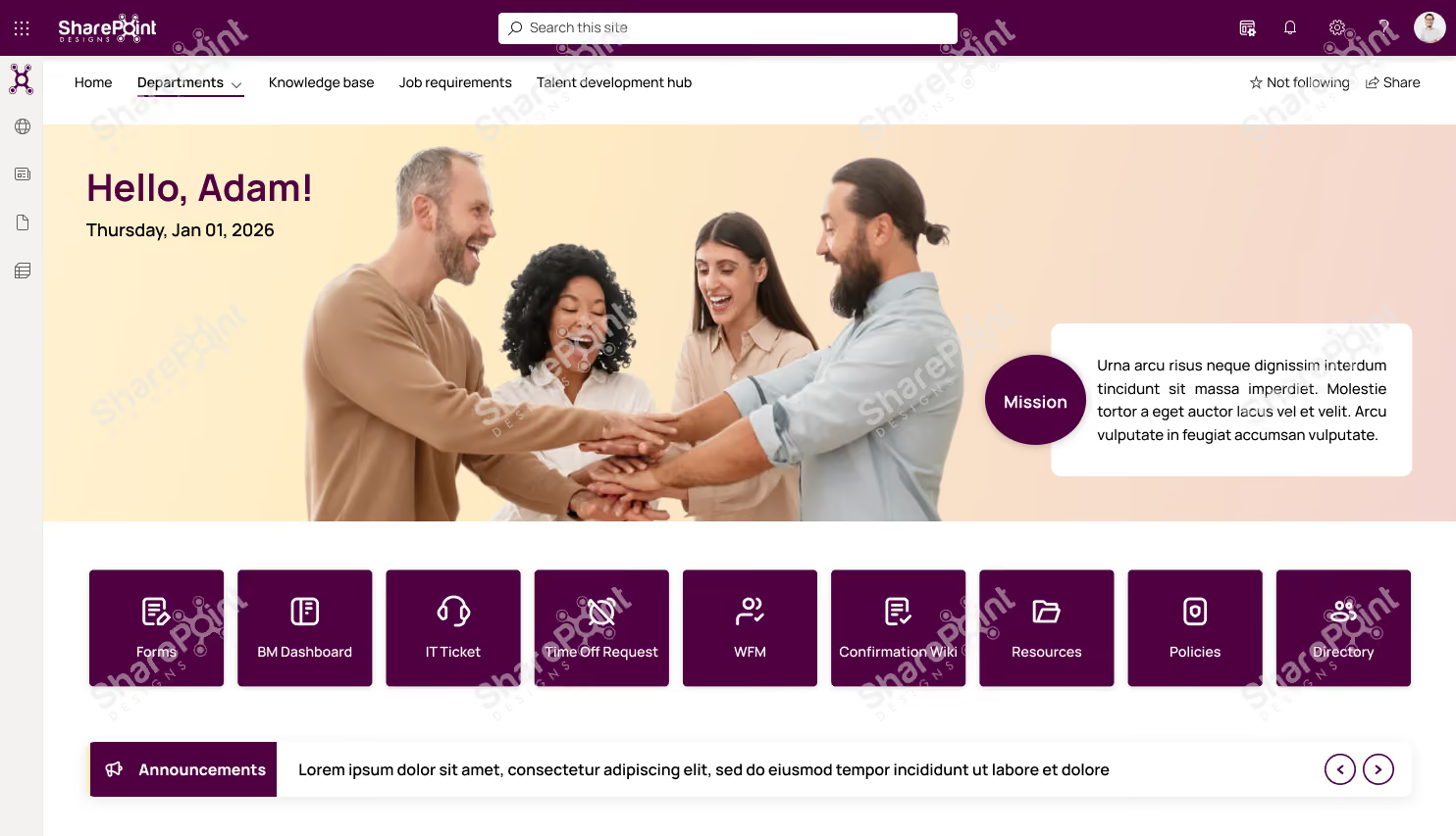
Why This Template Works?
1. Action-first layout with quick access to everyday tools and requests
2. People-centric design that highlights culture, goals, and leadership
3. Keeps employees informed with announcements, news, and events in one place
4. Clean structure that’s easy to update and scale
Who It’s For?
1. HR, IT, and People Ops teams
2. Organizations focused on employee engagement & internal communication
3. Mid to large enterprises using SharePoint
Best Parts
1. Centralized shortcuts for forms, tickets, and requests
2. Announcements and town hall countdown for timely communication
3. Goals and leadership sections to align teams
4. Modern, engaging UI that encourages daily use
Ready to launch a similar intranet?
Discover professionally designed SharePoint homepage templates, ready to deploy. Browse Templates
Book a live demo and see the platform tailored to your business needs. Schedule a Live Demo
3. AI-Powered SharePoint Home & Viva Connections
AI plays a major role in 2026 intranet experiences. Viva Connections integrates directly with SharePoint, offering:
- Personalized dashboards
- AI-curated news
- Task and workflow shortcuts
- Recommended content
- A unified mobile intranet inside Teams
Ready for an AI-Powered Intranet?
Create, customize, and launch a modern SharePoint intranet faster with Sangha's intelligent automation.
Explore Sangha
This transforms the intranet from a static portal into a smart, adaptive employee experience platform.
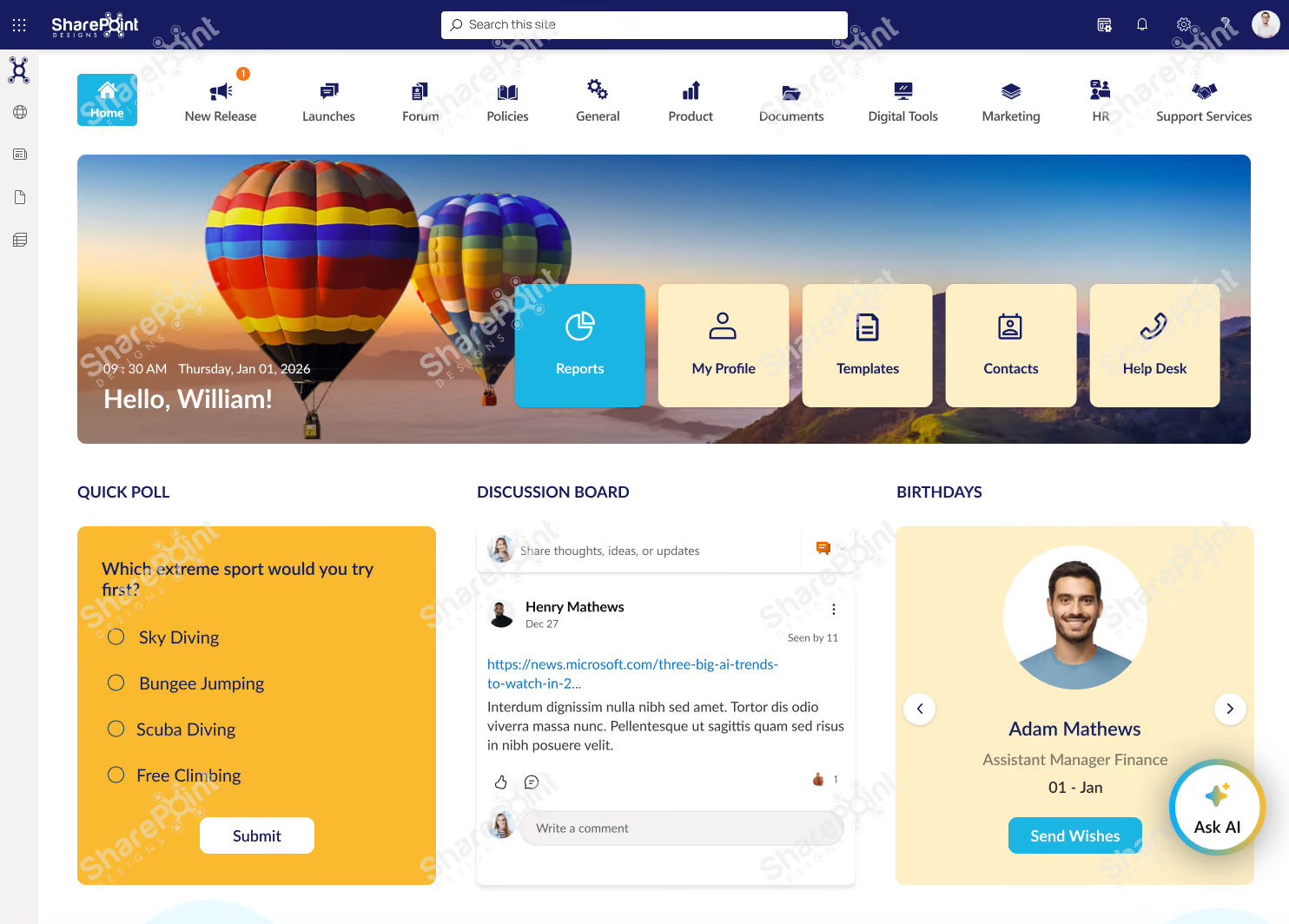
Why This Template Works?
1. Highly interactive layout that encourages participation, not just reading
2. Combines work updates and social engagement in one experience
3. Clear navigation to tools, documents, and services
4. Keeps content fresh with polls, discussions, and feeds
Who It’s For?
1. Internal Communications & HR teams
2. Organizations focused on culture, collaboration, and engagement
3. Mid to large enterprises using SharePoint
Best Parts
1. Quick access tiles for profiles, templates, contacts, and help desk
2. Polls, discussion boards, and birthdays to boost engagement
3. Categorized news and social media integration
4. Idea submission section to encourage innovation
Book a live demo and see the platform tailored to your business needs. Schedule a Live Demo
4. Modern SharePoint Intranet Examples That Stand Out in 2026
These trending designs shape intranets across industries:
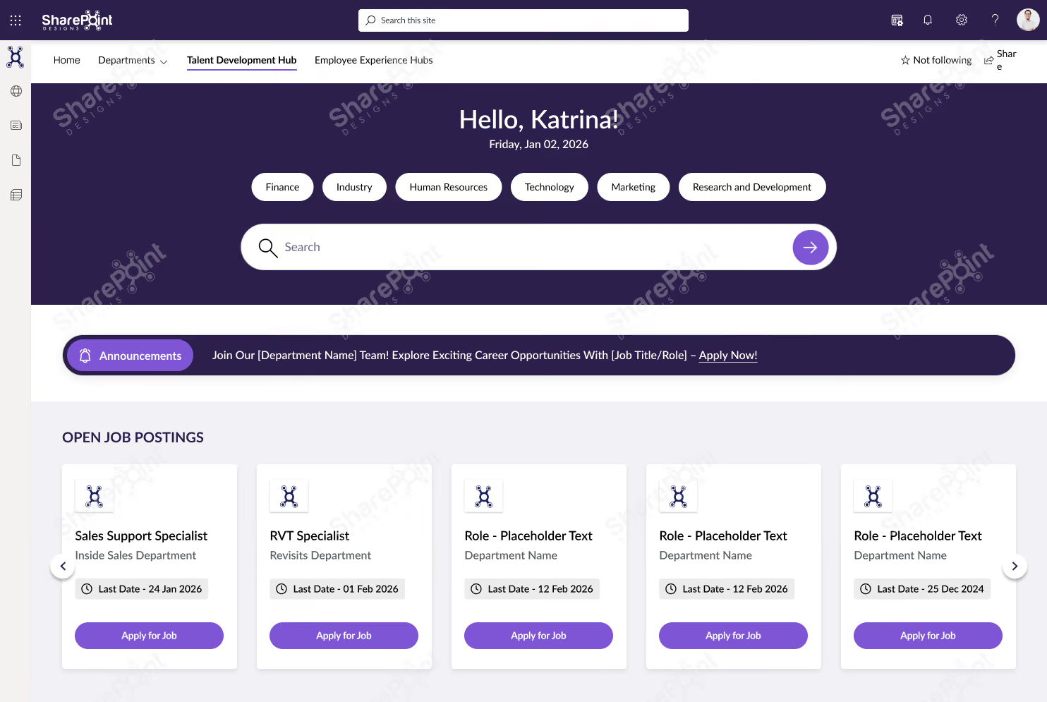
Employee Experience Hubs
Centralized hubs for announcements, events, resources, and employee services.
Beautiful intranets still need great document management.
Discover how DocVault adds intelligent search, approvals, version control, compliance, knowledge management.
Explore DocVault
Why This Template Works?
1. Purpose-built for learning & growth, not general intranet clutter
2. Smart filters and search make jobs, training, and resources easy to find
3. Clear progression from opportunities → learning → events
4. Structured layout that supports frequent updates
Who It’s For?
1. HR, L&D, and Talent Development teams
2. Organizations investing in internal mobility and upskilling
3. Mid to large enterprises using SharePoint
Best Parts
1. Open job postings with direct apply actions
2. Centralized SOPs and operational documents
3. Training hub with category-based filtering
4. Event calendar with Outlook integration
Book a live demo and see the platform tailored to your business needs. Schedule a Live Demo
HR Portals
Featuring onboarding guides, leave policies, self-service tools, and training content.

Why This Template Works?
1. HR-focused layout that simplifies policies, documents, and training access
2. Clear separation of information, actions, and learning
3. Intuitive navigation that reduces employee support queries
4. Easy to maintain with structured, repeatable sections
Who It’s For?
1. HR and People Operations teams
2. Organizations with growing or distributed workforces
3. Mid to large enterprises using SharePoint
Best Parts
1. Centralized guidelines, policies, and trending documents
2. Quick links for high-frequency HR tasks
3. Dedicated training and development section
4. Clean, professional design that builds trust and adoption
Book a live demo and see the platform tailored to your business needs. Schedule a Live Demo
Departmental Sites
Customized layouts for IT, HR, Finance, Sales, or Marketing teams.

Why This Template Works?
1. Department-focused structure that keeps people, documents, and support in one place
2. Clear navigation reduces time spent searching for files and contacts
3. Designed for day-to-day departmental workflows
4. Simple, clean layout that’s easy to manage
Who It’s For?
1. Department heads and team leads
2. Internal teams managing shared resources
3. Mid to large organizations using SharePoint
Best Parts
1. Centralized document library with category-based access
2. Quick links to people, perks, forms, and support
3. Built-in FAQs to reduce repeated queries
4. Feedback section to improve team communication
Want to see more? View complete intranet examples from Healthcare, Manufacturing, Construction, Finance, Education and Government
Open LookBook
Book a live demo and see the platform tailored to your business needs. Schedule a Live Demo
Knowledge Base Sites
Structured articles, FAQs, SOPs, and search-optimized content libraries.

Why This Template Works?
1. Search-first design that helps employees find answers fast
2. Clear categorization improves document discoverability
3. Reduces repeated queries with self-serve knowledge access
4. Clean, structured layout that’s easy to maintain
Who It’s For?
1. IT, HR, and Operations teams
2. Organizations managing large volumes of documents
3. Mid to large enterprises using SharePoint
Best Parts
1. Advanced search with category and sub-category filters
2. Centralized document library and featured content
3. Time-zone aware widgets for global teams
Built-in help and support links for quick guidance
Book a live demo and see the platform tailored to your business needs. Schedule a Live Demo
Project Workspace Designs
Modern dashboards for progress tracking, documents, workflows, and team collaboration.
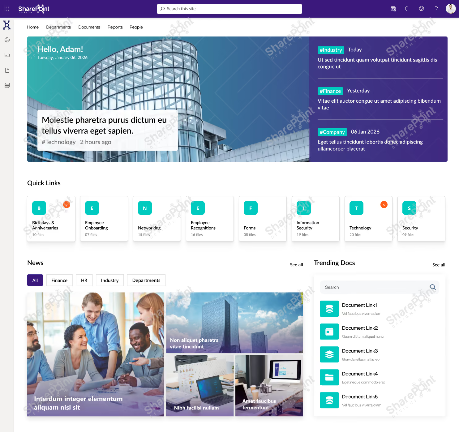
Why This Template Works?
1. All-in-one dashboard that combines communication, events, documents, and performance
2. Clear visual hierarchy makes updates and insights easy to scan
3. Designed to support daily decision-making, not just announcements
4. Scales well as teams, projects, and data grow
Who It’s For?
1. Leadership, PMOs, and Operations teams
2. Organizations that need visibility across projects and updates
3. Mid to large enterprises using SharePoint
Best Parts
1. Personalized hero with live updates and highlights
2. Quick links for fast access to key business areas
3. Integrated calendar, town hall events, and news
4. Project progress tracking with visual metrics.
Book a live demo and see the platform tailored to your business needs. Schedule a Live Demo
These examples showcase the full power of SharePoint’s modern design capabilities.
SharePoint Look Book: Still the Best Design Inspiration The SharePoint Look Book continues to offer some of the best curated examples of what modern SharePoint can achieve.
It provides:
- Ready-to-use design ideas
- Proven layout structures
- Industry-specific intranet examples
- Modern branding and UX options
For many organizations, the Look Book becomes the starting point for refining their own intranet vision.
Trusted by global enterprises. Proven through real customer success. Explore Case Studies
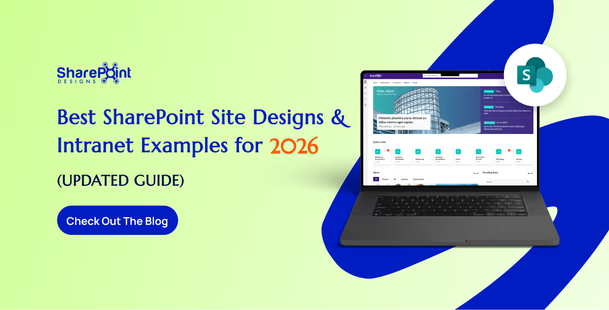
Best SharePoint Site Designs & Intranet Examples for 2026 (Updated Guide)
SharePoint continues to evolve into one of the most powerful intranet platforms for modern organizations.
A user is stuck on a long-loading screen, getting slightly frustrated. Suddenly, the UI shifts to a calming micro-animation, a soft breathing circle, and gently says, “Hang on, we’re almost there.”
Do you know what this moment represents?
It shows a human-like reaction: when we notice someone getting stressed, we naturally try to calm or comfort them.
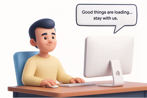
That’s exactly what Neuro-Adaptive Interfaces are trying to do in UI design by 2026. They use data from user behaviour, emotions, and context to automatically adjust the interface’s tone, layout, content, or visual intensity to match the user’s mental and emotional state.
Why It Matters
1. Burnout-Aware Design
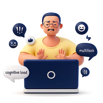
Modern users multitask more than ever, switching between apps, tabs, and devices. Neuro-adaptive design reduces cognitive strain by stepping in at the right moments, slowing things down, simplifying screens, or offering supportive cues before frustration builds.
2. AI Empathy Layer

Interfaces can now detect emotional arcs, not just actions. A stressed user gets softer tones and simpler paths. A confident user gets faster workflows. The system mirrors emotional intelligence by responding in a comforting, human-like way.
3. Neuro-Inclusion
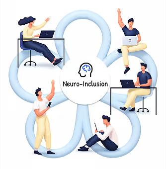
Different brains process information differently. By adapting layouts, reducing distractions, or altering reading density, neuro-adaptive UIs create safer digital spaces for users with ADHD, anxiety, dyslexia, or sensory sensitivities.
4. Productivity & Retention
Emotionally aligned experiences encourage trust and flow. When a system “feels” supportive, users learn faster, commit fewer errors, and stay engaged longer, directly impacting product adoption.
How It Works
1. Mouse Movement Speed or Pauses
Detects: Frustration, hesitation, or confusion
Response: Highlights tooltips, simplifies layout options, slows animations, or guides with micro-hints.
2. Eye Tracking or Camera Input
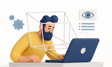
Detects: Distraction, fatigue, or wandering focus
Response: Reduces motion, adjusts brightness, increases contrast, or declutters the screen.
3. Voice Tone Analysis
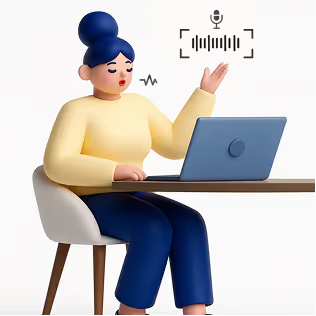
Detects: Stress, irritation, or urgency
Response: Shifts microcopy to a calmer tone or provides step-by-step instructions.
4. System Data (Time of Day, Workload)
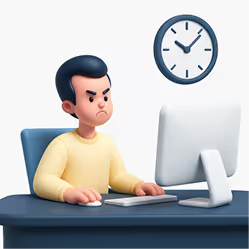
Detects: Late-night usage, heavy task load, or deadlines
Response: Suggests short breaks, activates “focus mode,” or reduces interface density.
5. Biometric Feedback (Opt-in)
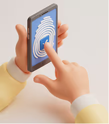
Detects: Elevated heart rate, stress responses
Response: Calming visuals, slow animations, ambient backgrounds, or mental reset prompts.
Expanded Real-World Use Cases
1. Microsoft Viva + Copilot
Recognizes emotional patterns across the workday and gently nudges users to manage workload, reflect, or reset, boosting well-being at work.
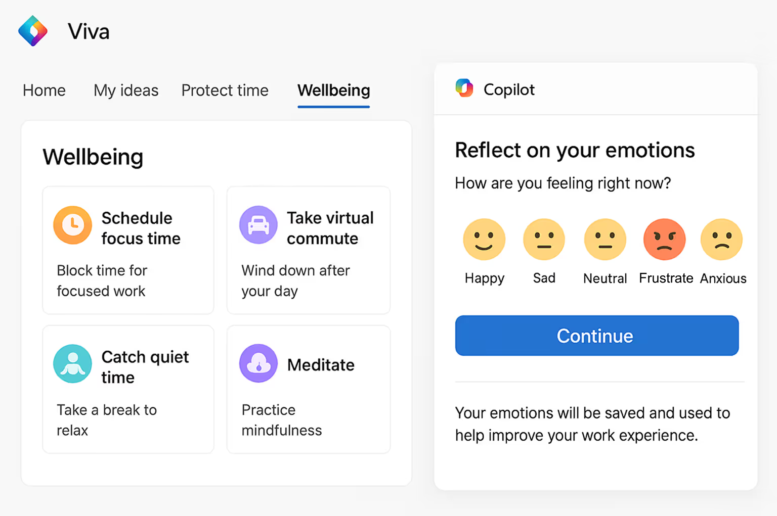
This image illustrates how Viva + Copilot visualizes emotional patterns and work rhythms, helping users stay balanced and productive throughout the day.
2. Healthcare Dashboards
During critical moments, interfaces shift to high-contrast, low-distraction modes to support better decision-making for doctors and nurses.
The dashboard image shows a high-contrast, distraction-free interface designed for doctors to make quicker, clearer decisions during critical moments.
3. E-Learning Platforms
Track attention levels and learning fatigue to dynamically adjust difficulty, add breaks, or change the lesson style.
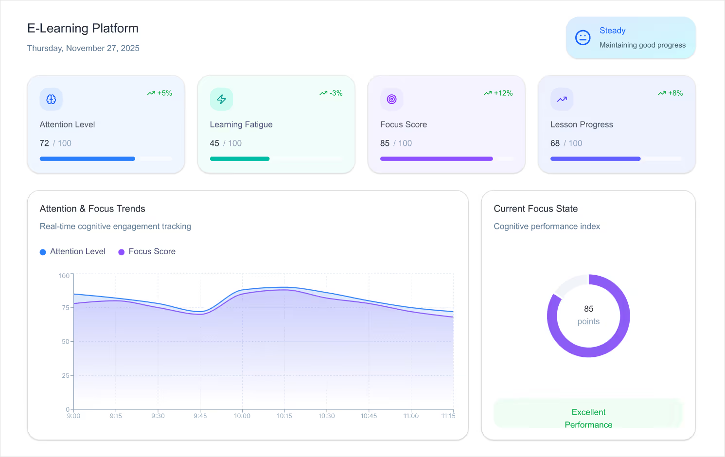
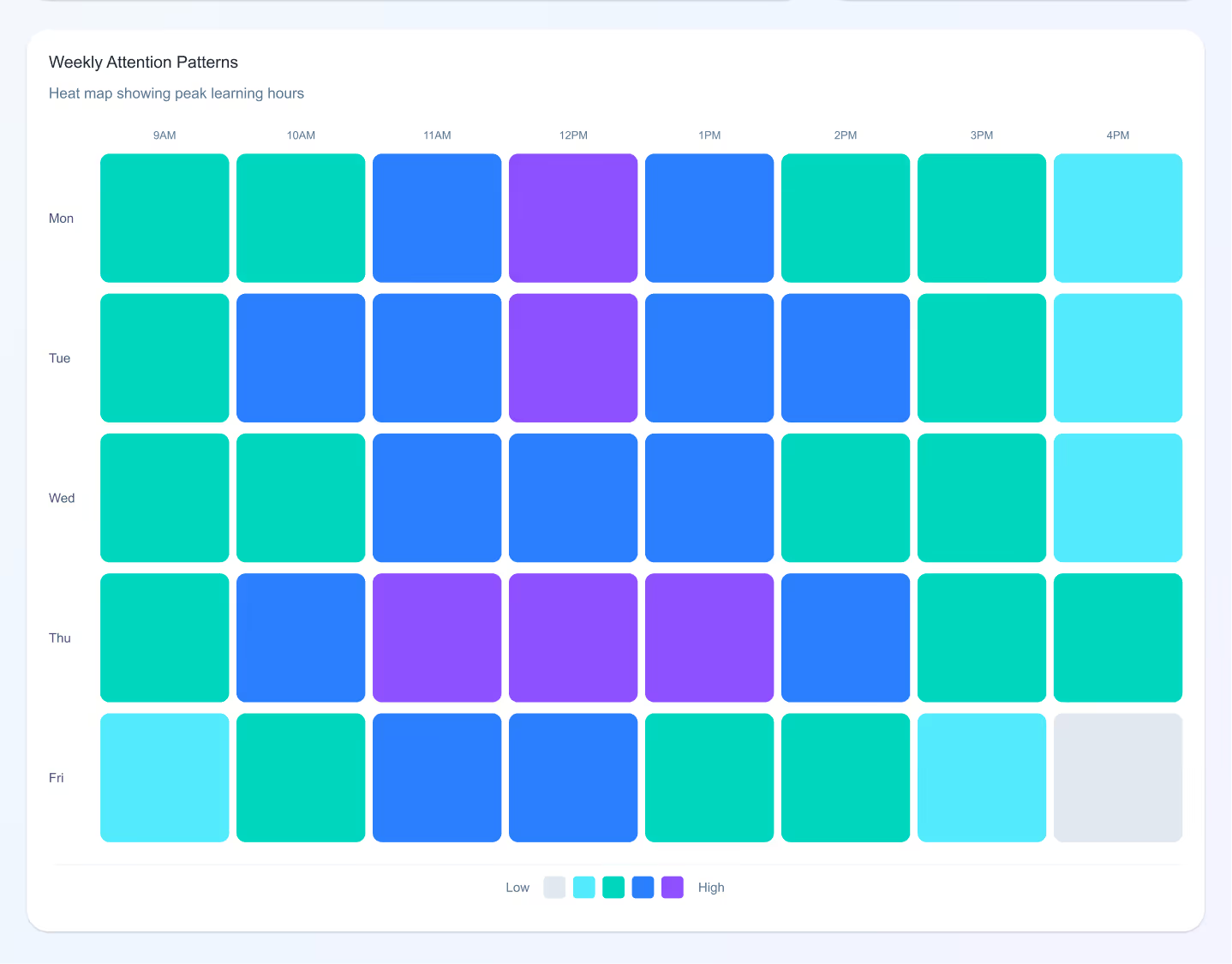
This example shows an adaptive learning screen that adjusts lesson difficulty and pacing based on a student’s attention level and engagement.
4. Banking Apps
Detect confusion during transactions and simplify steps automatically, reducing drop-offs and errors.
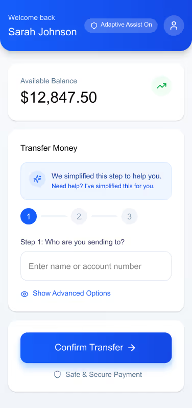
The banking UI demonstrates how steps can automatically simplify when confusion is detected, making complex transactions feel intuitive and safe.
5. Corporate Intranets
Enable “calm modes” during repetitive tasks soft colors, minimal UI, slower animations to reduce digital fatigue.
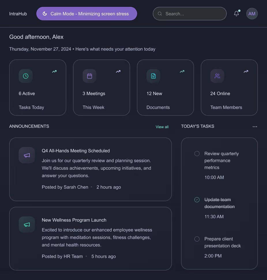
The intranet layout highlights a calm, minimal interface using soft colors and reduced visual noise to ease stress during repetitive workflows.
6. Productivity Tools
Apps like Notion, Asana, and Figma are beginning to experiment with emotion-sensitive features that adapt based on user pace and interaction mood.
Design Considerations for 2026 and Beyond
1. Privacy-First Emotion Tracking
Designers must ensure emotional data is opt-in, transparent, and stored responsibly. Users should always feel in control.
2. Avoid Over-Adaptation
Too much change can overwhelm users. Neuro-adaptive patterns must be subtle, predictable, and respectful.
3. Consistency with Human-Centered Language
Microcopy must balance empathy and clarity. Not every emotional signal needs a “comfort message”; sometimes simplifying the interface is enough.
4. Cross-Device Continuity
Emotion-aware experiences should sync across mobile, desktop, and wearable devices to maintain flow.
Conclusion
As we move into the next era of digital design, our role goes beyond usability. It’s about designing experiences that respect mental energy, emotional states, and human limitations.
Emotionally Intelligent and Neuro-Adaptive Interfaces remind us that great design doesn’t just speak, it listens, adapts, and supports.
This is the future of meaningful, human-centred digital experiences.
Emotionally Intelligent & Neuro-Adaptive Interfaces
Modern users multitask more than ever, switching between apps, tabs, and devices. Neuro-adaptive design reduces cognitive strain by stepping in at the right moments,

Celebrations are the heartbeat of workplace culture.
Whether it’s a birthday, a work anniversary, or simply welcoming a new colleague, these moments create opportunities to connect, appreciate, and build stronger bonds across teams. But in busy workplaces, it’s easy to let these special days slip by unnoticed.
That’s where Celebration Web Parts come in bringing birthdays, anniversaries, and milestones right onto your intranet. With simple, elegant, and engaging designs, they make it effortless to recognize your people and spread positivity with just one click.
All-in-One Celebrations Web Part
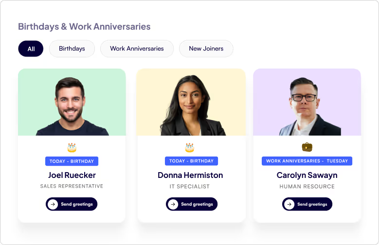
- Web Part Title at the Top Left - A clear, customizable title so employees instantly know what the section is about.
- Tabbed Navigation - Switch effortlessly between Birthdays, Work Anniversaries, and New Joiners with dedicated tabs.
- Employee Cards in a Clean Box Layout - Each person being celebrated gets their own spotlight in a beautifully organized card.
- Profile Image - Displays the employee’s photo to make celebrations more personal and recognizable.
- Celebration Type - Clearly shows whether it’s a Birthday, Work Anniversary, or a New Joiner being introduced.
- Employee Details - Includes the employee’s name and designation, giving context and recognition.
- Send Greeting Button - A one-click “Send Greeting” button that directly opens Outlook, allowing colleagues to instantly send warm wishes or a welcome note.
Celebrations in a Vertical View
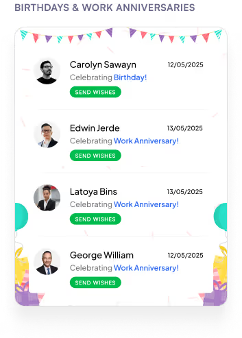
- Web Part Title on Top - A clear heading that immediately tells you what the section is about.
- Vertical List Layout - All employees celebrating a Birthday or Work Anniversary are neatly displayed in a vertical order.
- Profile Picture on the Left - Each employee’s photo is placed on the left for quick recognition.
- Employee Information in the Center
1. Displays the name and designation for context.
2. Includes a Send Greeting button that opens Outlook so you can instantly share wishes.
- Date on the Right - Clearly shows the date of the birthday or work anniversary, so you never miss a celebration.
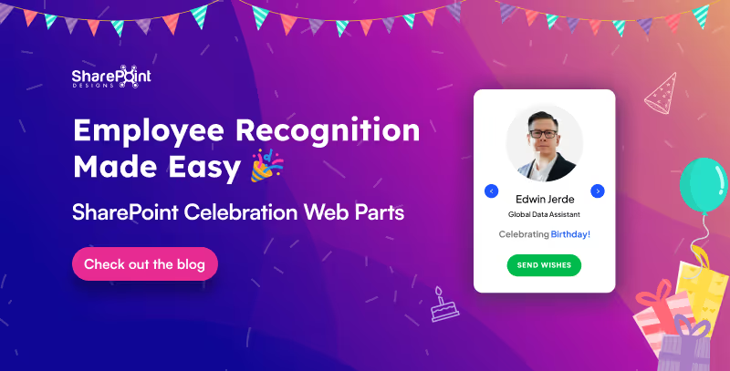
Employee Recognition Made Easy: SharePoint Celebration Web Parts
Celebrations are the heartbeat of workplace culture.

Calendars aren’t just about dates anymore. They’re about making sure you don’t double-book that meeting, forget your training, or miss the office party.
Custom Calendar Web Parts the unsung heroes of workplace organization. They don’t just sit quietly on your intranet, they remind, guide, and sync like a personal assistant who never takes a coffee break.
Whether it’s a new training, an all-hands event, or just keeping tabs on your week, these calendars are here to turn “Oops, I forgot” into “Don’t worry, I’m already on it.”
Plan Smarter with the Classic Calendar Web Part
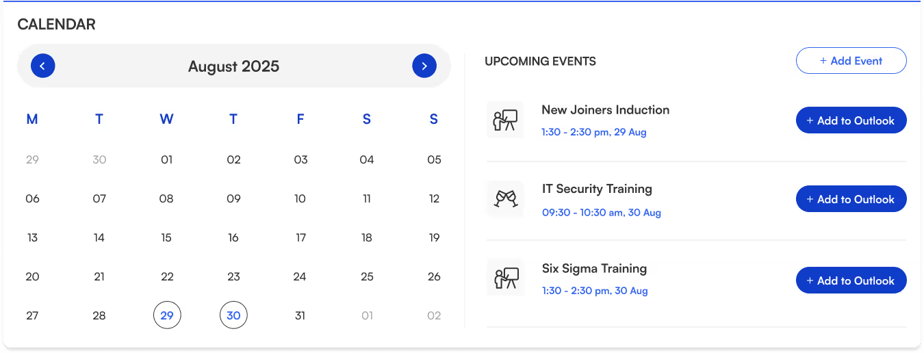
- Title sits neatly at the top-left for quick identification.
- Two-section layout:
Left → interactive calendar view.
Right → upcoming events list.
- Each event shows its name, icon, date, and time clear and scannable.
- “Add to Outlook” button beside every event for instant sync and reminders.
- “Add Event” button (top-right corner) makes creating events quick and easy.
- Perfect for day-to-day scheduling.
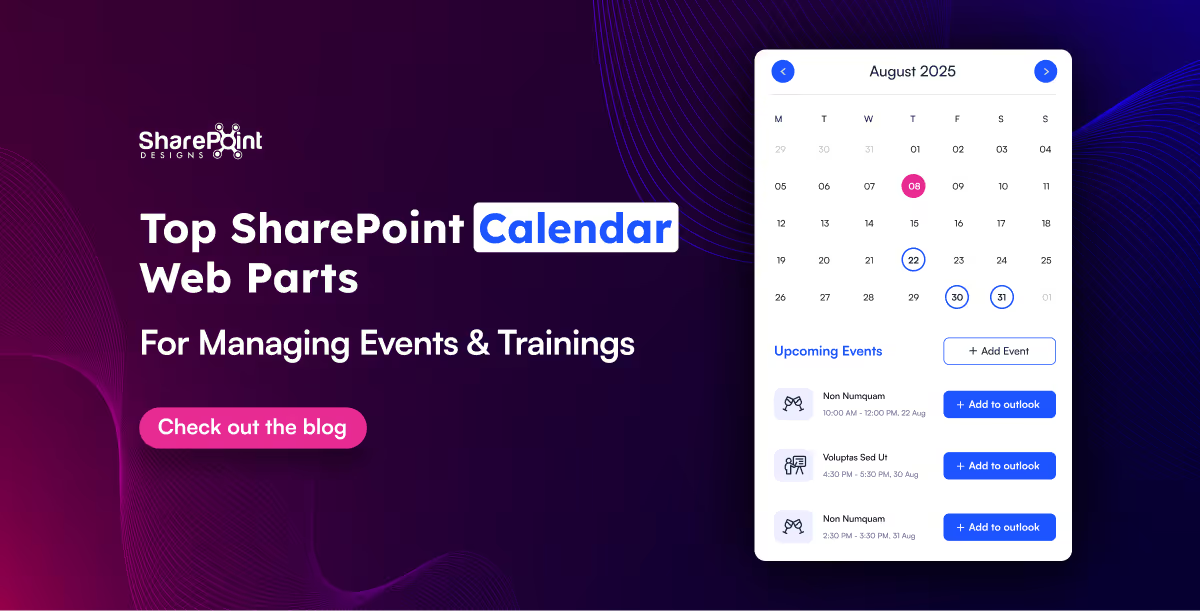
Top SharePoint Calendar Web Parts for Managing Events & Trainings
Calendars aren’t just about dates anymore. They’re about making sure you don’t double-book that meeting, forget your training,
Hunting down a document shouldn’t feel like solving a mystery novel.
That’s where Document Library Webparts swoop in like superheroes for your intranet. From sleek slides to smart filters, they don’t just store your files they showcase them in style, keep everything organized, and make searching as easy as scrolling your Insta feed. Whether it’s policies, SOPs, trainings, or your team’s most important docs, there’s a layout here designed to save your time.
1. Important Documents Library, Your One-Stop Space

- Organized as sleek slides with images, category, title, and short description.
- Shows who last viewed the document and how long ago (down to minutes or seconds).
- Department tabs below the title for instant filtering.
- See All link on the top-right to view the complete library.
- Smart, sleek, and makes key files easy to find.
2. Mandatory Trainings Library, Essential Learning Hub

- Every training document is displayed as slides with cover images.
- Category tag (top-left) and file type icon (bottom-left) on each slide.
- Short descriptions for quick context.
- Department tabs for category-based filtering.
- All links on the top-right for the full training collection.
- Keeps all your must-do training just a click away.

15 Modern SharePoint Document Library Web Part Layouts for Smarter File Management
Hunting down a document shouldn’t feel like solving a mystery novel.
In a big organization, remembering who’s who can feel like trying to recall names at a never-ending party.
The Organization Chart Web Part makes it easy to put faces, names, and roles together in seconds.
Whether you’re welcoming a new joiner, looking for the right colleague to collaborate with, or simply trying to understand the reporting flow, these web parts make navigating your org chart a breeze. They also integrate seamlessly into your SharePoint intranet design, helping employees connect faster and work smarter.
Smart Search & Quick Actions
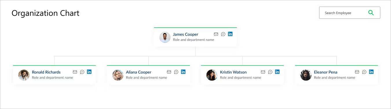
- Title & Search Bar: Title sits at the top left, while a smart search bar on the top right makes it effortless to find employees.
- Profile Cards: Each card brings the chart to life with a photo, name, and role.
- Quick Connect Icons: Handy action buttons on the right let you email, message, or even connect via LinkedIn in a single click.
- Why It’s Great: A simple yet powerful way to explore your company structure and stay connected.
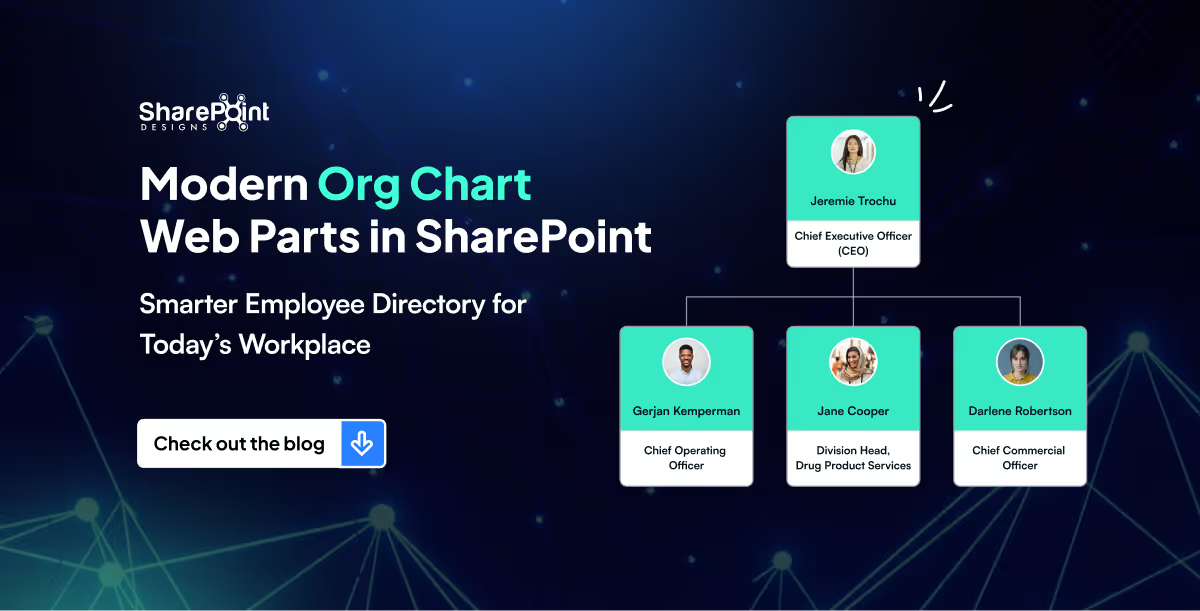
Modern Org Chart Web Parts in SharePoint: Smarter Employee Directory for Today’s Workplace
In a big organization, remembering who’s who can feel like trying to recall names at a never-ending party.
Quick Links aren’t just about getting from point A to point B, they are about making navigation effortless, engaging, and even a little exciting.
Imagine your intranet where every click feels smooth, every layout looks polished, and every user finds what they need without the clutter. From sleek boxed designs to dynamic interactive panels, these Quick Links layouts aren’t just functional, they’re stylish upgrades that bring personality and flow to your digital workspace.
Summary
This guide highlights five SharePoint Quick Links layouts includes Horizontal Boxed, Dropdown Menu, Two-Row Boxed, Department-Based, and Interactive Side Panel that make intranet navigation fast, clear, and visually polished. Each option blends clean design with usability to help users find what they need without clutter. You can mix and match these layouts and implement them quickly using the referenced SharePoint Intranet Templates.
1. Horizontal Boxed Layout

- Sleek and streamlined, this layout lines up your quick links like a well-dressed team of icons and titles.
- Clean, consistent, and perfect for top-of-page navigation, it delivers fast clicks with a fresh, flowing look.
2. Quick Links with Dropdown Menu
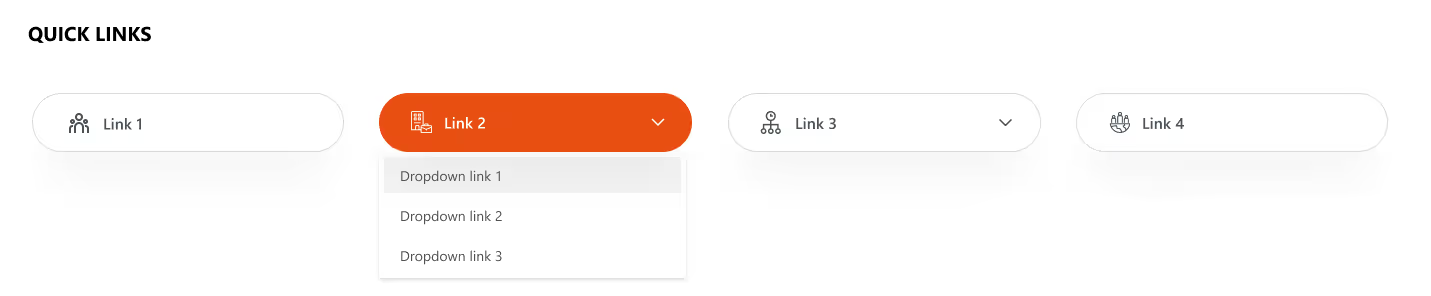
- Turn things up a notch with icons, titles, and a smart dropdown.
- Compact yet clever, this layout lets you pack in more links without clutter.
- Just click, expand, and boom; navigation made simple and stylish.
Explore our SharePoint Intranet Templates to implement these Quick Links layouts instantly.
3. Two-Row Boxed Quick Links
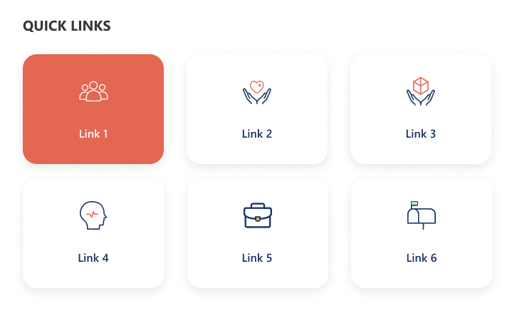
- Balanced and tidy, this design stacks your links in two neat horizontal rows.
- With crisp icons and clear titles, it’s perfect for organizing more content in a way that’s stylish, accessible, and easy on the eyes.
4. Department-Based Quick Links
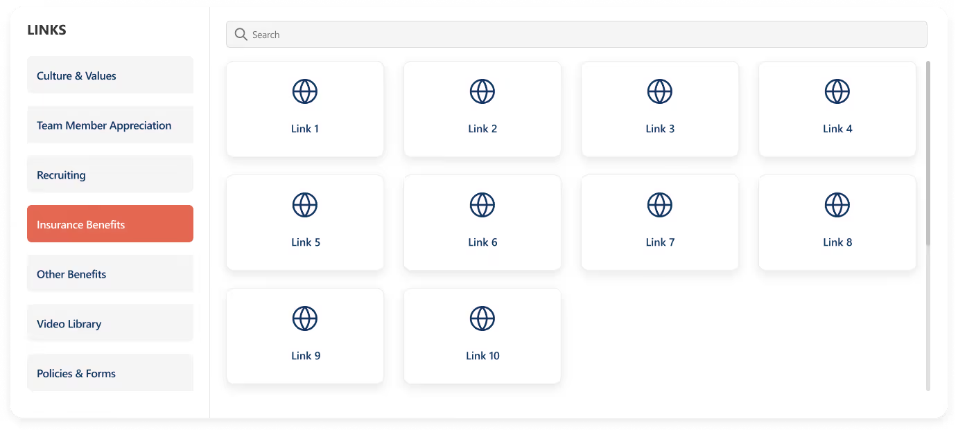
- Built for clarity and speed, this layout stacks departments vertically on the left for quick switching, while the right side features a handy search bar for precision.
- Below, a clean boxed display shows the selected department’s links.
- Add a custom web part title on top for your own flair.
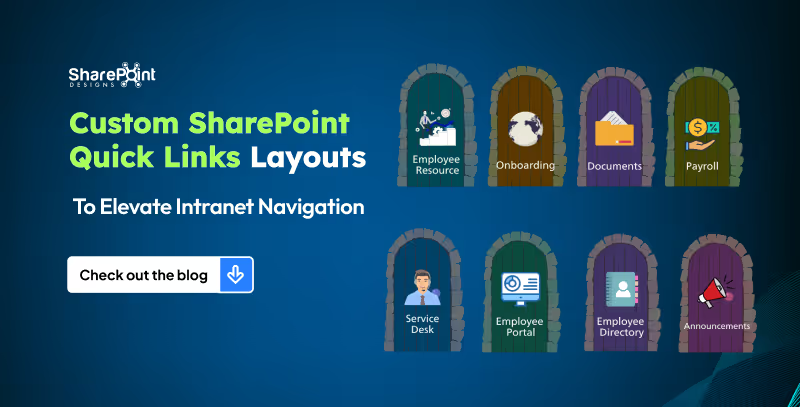
5 Custom SharePoint Quick Links Layouts to Elevate Intranet Navigation
Quick Links aren’t just about getting from point A to point B, they are about making navigation effortless, engaging, and even a little exciting.
News doesn’t have to be boring, especially on your intranet!
Imagine a space where every update feels alive: bold images, smooth layouts, and department filters that make sense. That’s exactly what our Custom News Web Part brings to the table. From dynamic tabs to sleek carousels, we’ve designed layouts that don’t just share information they show it off. Whether your team loves to scroll endlessly, skim quickly, or spotlight the big stories, we’ve got a style that fits.
1. Dynamic Department Tabs
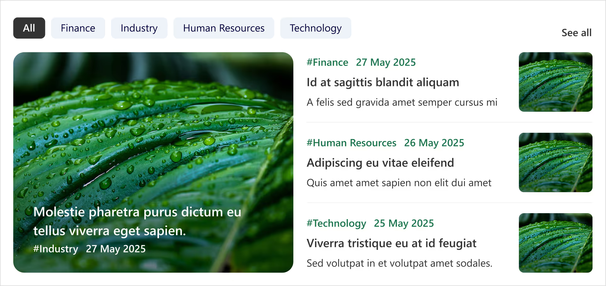
- Clickable tabs for each department (HR, Finance, Marketing, etc.).
- Instantly update the news feed when you tap a tab.
- Each Box includes department tag, crisp images, and publish date.
- Handy ‘See All’ link at the top-right corner for a dedicated news page.
- Smart, fresh, and perfectly tailored for departmental updates.
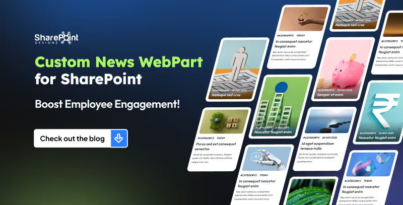
8 Custom SharePoint News Web Part Layouts to Boost Employee Engagement (That Employees Actually Love)
Imagine a space where every update feels alive: bold images, smooth layouts, and department filters that make sense.
Welcome Home Digitally...Meet the Custom Welcome Banner Web Part
Your SharePoint homepage doesn’t have to be just a portal, it can be a personal greeting, a global dashboard, and a daily dose of inspiration all in one. With the Custom Welcome Banner Web Part, every visit feels tailored, a warm welcome message, your name, the current time, and even live updates from around the world.
From rotating messages that showcase your company’s vision to interactive clocks and weather boxes for global teams, this web part turns a standard homepage into a dynamic, engaging experience. Stylish, personal, and smart, your SharePoint home just got a personality upgrade.
Explore Our Custom Welcome Banner Web Parts
Global Time Greeting Banner
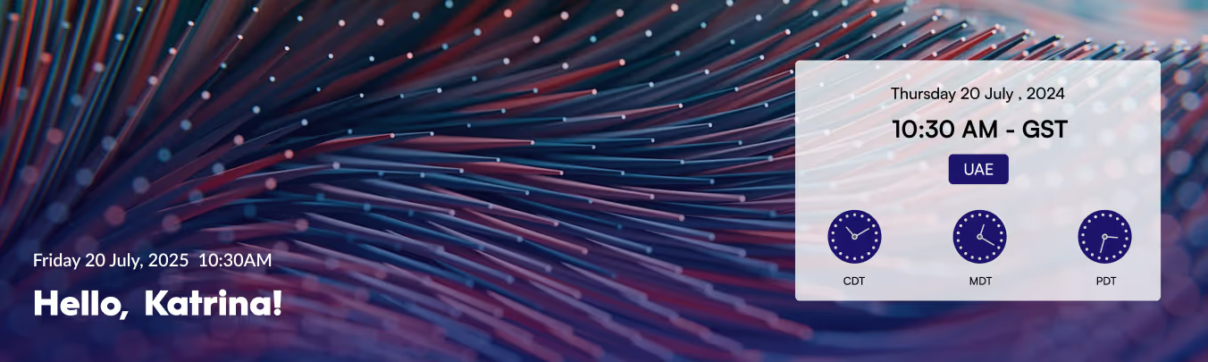
- Left side: Customizable welcome message, user’s name, local date/time.
- Right side: World clock zone
- Box displaying date/day of selected country.
- Three analog clocks showing different UTC time zones.
- Clean, informative, globally connected layout.
Vision & Values Spotlight Banner
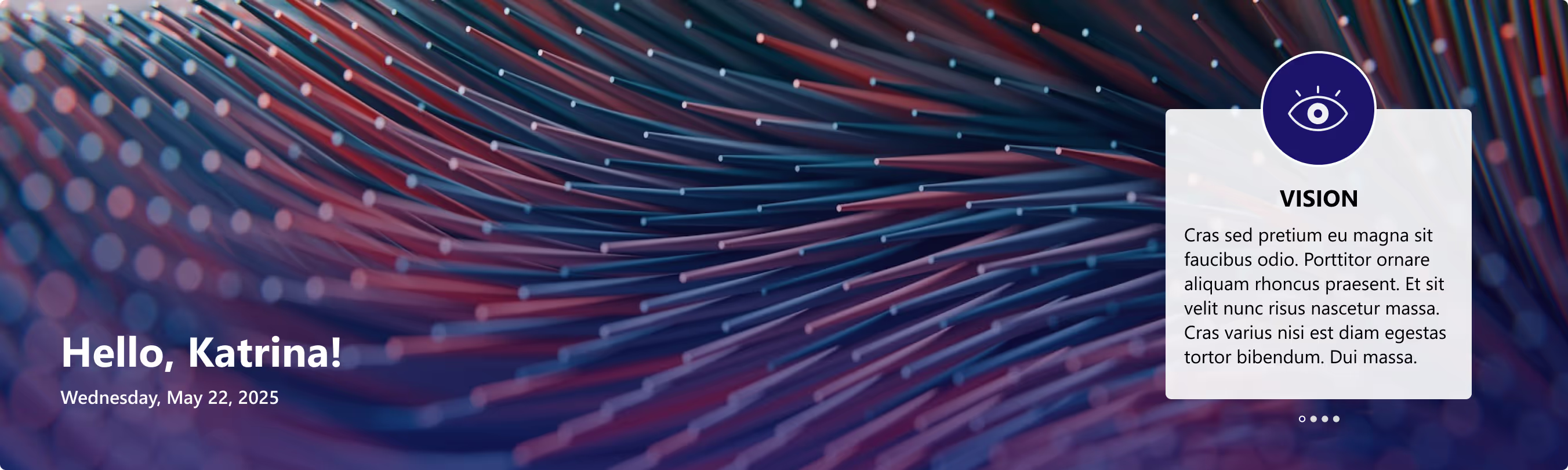
- Right side: Box for organization’s vision, mission, and values.
- Messages rotate dynamically at intervals.
- Highlights the company’s core values in a clear, engaging way.

Transform Your SharePoint Homepage with Custom Welcome Banner Web Parts
Your SharePoint homepage doesn’t have to be just a portal, it can be a personal greeting, a global dashboard, and a daily dose of inspiration all in one.


.svg)