Tech Ideas & Best Practices
For today’s employees, getting the right information quickly is critical to staying productive. Employees need to access the right information with minimal clicks, avoiding cluttered menus and outdated links. This is where a Custom Top Navigation Web Part comes into play. This web part is not just a design enhancement, it is a functional solution that makes SharePoint intranets smarter, cleaner, and more user-friendly.
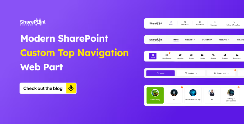
From simple menus to dynamic mega menus, we offer various custom top navigation web parts. Here’s what they look like.
1. The Informative Navigation Bar

- Organization’s Logo: neatly placed on the left, giving the navigation bar a professional, branded look.
- Quick Links: positioned right beside the logo, each with its own icon and label for tools, portals, or important pages just a click away.
- Standout Feature (Right Side):
1. Livestock market updates
2. Current date display
3. Real-time currency values for key countries - Overall Design: clean, functional, and designed to keep users informed and connected directly from the top of the page.
Modern SharePoint Custom Top Navigation Web Part: Boost UX and Productivity
For today’s employees, getting the right information quickly is critical to staying productive.

The workplace has evolved beyond physical boundaries. Today’s hybrid workforce isn’t tied to desks; they collaborate from coffee shops, client sites, or even while commuting. In this new era of work, an intranet that works beautifully on mobile isn’t optional; it’s essential.
A mobile-first intranet empowers employees to access vital information, engage with their teams, and complete tasks, regardless of their location or the device they’re using. This blog explores how to design an intranet that meets the demands of hybrid work and goes beyond just responsive design.
Why Mobile-First Intranet Design Matters?
Designing with mobile-first principles means prioritizing the mobile user experience, starting with small screens and scaling up. This approach ensures that all employees, whether working remotely, in the office, or in the field, receive a consistent and efficient intranet experience.
Key Benefits:
- Instant Access to tools and content, anytime, anywhere.
- Faster Load Times and improved performance on mobile networks.
- Higher Engagement from frontline and remote employees.
- Better Accessibility for diverse roles and work styles.
Must-Have Webparts for a Mobile-First Intranet
To go beyond simple responsiveness, focus on purpose-driven features built with mobile usability in mind. Below is essential intranet components designed for hybrid teams:
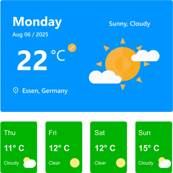
1. Weather Webpart
Whether you’re on a jobsite, traveling to meet a client, or planning an outdoor event, having quick weather info at your fingertips helps you prepare better. On a mobile intranet, it’s right where you need it, no extra apps required.
Features:
- Displays current day’s weather with location, date, temperature, and conditions (e.g., Sunny, Cloudy).
- Location detection to automatically fetch weather details for the user’s city.
- Toggle option for Celsius/Fahrenheit for personalized preference.
- 7-day or current-week forecast cards showing temperature, condition icons, and quick visual cues.
- Clear weather icons and colors for instant understanding at a glance.
Watch: Weather Webpart Demo
2. Birthday Reminder Webpart
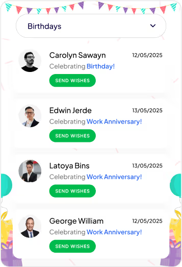
In a hybrid workplace, you don’t pass by a colleague’s desk to say happy birthday. This Birthday reminder webpart ensures no one’s special day is forgotten, wherever you’re working from.
Features:
- Category Filter: Dropdown menu lets you switch between multiple celebration types, including birthdays, work anniversaries, new joiners, and recognitions.
- Personalized Cards: Each entry shows the person’s photo, celebration type, and date, making it easy to identify and remember the occasion.
- Quick Action (Send Wishes): Dedicated “Send Wishes” button for each person allows you to instantly send greetings or messages.
- Event Feed Layout: Scrollable list of celebration cards helps you quickly see all upcoming and current occasions at a glance.
- Engaging Visuals: Festive header and clean card design create a cheerful, celebratory feel without overwhelming the UI.
Watch: Birthday Reminder Webpart Demo
3. Top Navigation
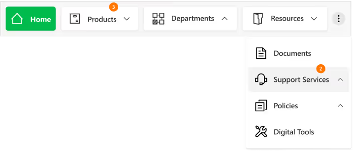
On mobile, clarity is everything. A well-structured top navigation makes it easy to get where you need to go without endless scrolling or tapping.
Features
- Sticky Positioning: Stays visible as you scroll for constant access.
- Custom-Styled Navbar: Fully themed navigation bar with clean typography, consistent iconography, and a modern, minimal look for better brand alignment.
- Intuitive Menu Structure: Clear text labels paired with relevant icons make it easy to identify sections at a glance.
- Expandable Options: The three-dot menu keeps extra navigation links organized without crowding the main bar.
- Real-Time Notifications: Numeric badges on menu items instantly indicate new updates or unread content, helping users prioritize.
- Dropdown Navigation: Smooth, organized dropdown menus allow quick access to subcategories like “Training & Development” or “Policies & Procedures.”
4. News Webpart
Company updates shouldn’t get buried in your email inbox. The mobile-friendly news webpart keeps important announcements front and center in a clean, scrollable feed you can check anywhere. With its slider design, category tags, and filtering options, it ensures you never miss a relevant update.
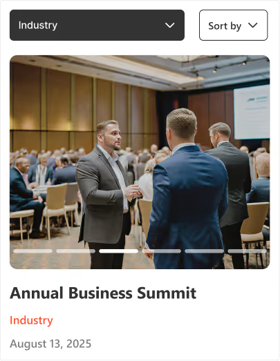
Features:
- Multi-Slide View: Browse several updates within a compact space using horizontal sliders.
- Category Tags: Each news item is labelled for quick context (e.g., Industry, Company).
- Active Slide Indicators: Clear visual markers show your current position in the feed.
- Smart Sorting & Filtering: Dropdown and "Sort by" options help you quickly find relevant news.
Watch: News Webpart Demo
5. Events Calendar
From virtual town halls to on-site training, the events calendar ensures everyone stays informed about upcoming activities, even on the go. It combines clear scheduling with easy interaction for a seamless event experience.

Features:
- Month Slider Navigation: Quickly preview previous or next month’s events without leaving the current view.
- Upcoming Events List: Displays event details like time, date, and category directly below the calendar.
- Category Filters: Group events by type (e.g., Meetings, Training, Conferences, Community & CSR) for faster access.
- Add to Outlook Integration: Instantly save events to your Outlook calendar with one tap.
- Add Events Button: Allows users to add their own events to the shared calendar for team-wide visibility.
6. Organization Chart
When teams are distributed across locations, knowing who’s who becomes essential, the organization chart provides a clear, structured view of roles, teams, and reporting lines, making it easier to identify colleagues, understand team connections, and reach the right person without delays.
Features:
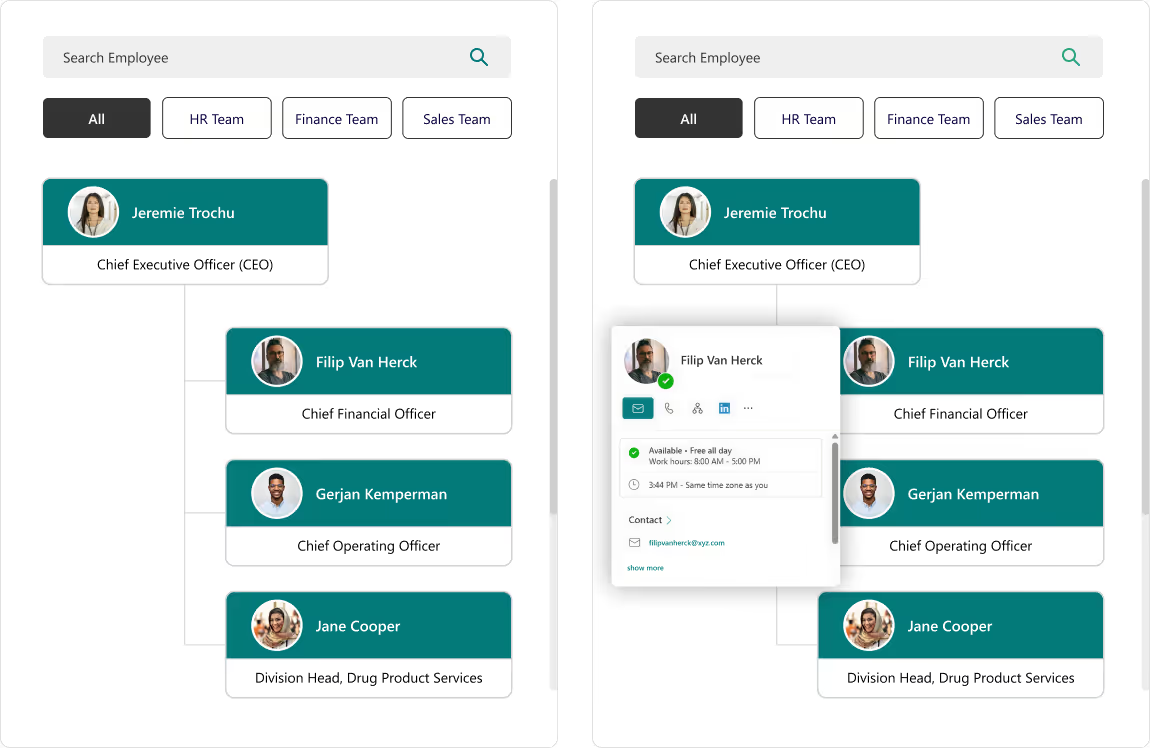
- Search Bar: Instantly find employees by name without scrolling through the entire directory.
- Department Filters: View team members grouped by specific categories like HR, Finance, or Sales.
- Interactive Hover Cards: Access quick actions like chat, email, call, or LinkedIn profile directly from a colleague’s profile card.
- Hierarchical View: Clearly see reporting structures and leadership levels for better team understanding.
7. Document Library
The Document Library keeps all files organized, searchable, and up to date, so you can quickly access the right document when it matters most. Whether filtering by category, searching by keyword, or sharing a file on the go, you’ll always have the latest version at your fingertips.
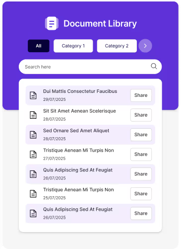
Features:
- Category Filters: Organize files into categories for easy navigation and reduced clutter.
- Search Functionality: Locate specific files instantly using the built-in search bar.
- Share Option: Share documents directly with colleagues in just one click.
- Clean, Mobile-Friendly Design: Ensures quick access and smooth browsing on any device.
8. Feedback and Improvement
An interactive platform to capture employee or user feedback instantly, helping organizations make data-driven improvements. The engaging design and one-tap access make it quick and easy to share thoughts.

Features:
- One-Tap Feedback Submission: Directly link to online feedback forms for instant input without delays.
- Engaging Visuals: Animated and expressive icons encourage higher participation rates.
- Actionable Insights: Feedback can be analyzed to identify trends and improve services.
Mobile-First Intranet Design for the Hybrid Workforce
The workplace has evolved beyond physical boundaries. Today’s hybrid workforce isn’t tied to desks.

Imagine driving on a road full of potholes, that’s how your employees feel when using your intranet which has too many UX issues. Here’s a list of common UX pitfalls that make employees frustrated or even hate using your company’s Intranet.
1. Slow Load Times
Waiting equals frustration. If pages take more than a few seconds, users give up or get distracted.
How to fix?
Focus on optimizing the network infrastructure, server performance, and content delivery. Consider content management practices like archiving old content, optimizing images and videos, and using caching mechanisms.
2. Confusing Navigation
If users can’t find what they need quickly, they’ll either click around endlessly or just ask someone else.
How to fix?
Use a clear menu, group related tasks, and include a sitemap.
3. Too Many Clicks
Making users go through 5+ clicks to find the relevant information or to complete a simple task is NOT acceptable.
How to fix?
Streamline user flows; use personalized quick links /shortcuts for frequent tasks.
4. No Mobile Optimization
If it doesn’t work well on phones or tablets, remote or field employees are stuck.
How to fix?
Make sure the design is responsive by testing on different sized devices

10 UX Pitfalls that make your employees hate your Intranet!
Imagine driving on a road full of potholes, that’s how your employees feel when using your intranet which has too many UX issues.

Remember the game “Passing the Message”? One person whispers a message to another, and by the time it reaches the last player, the sentence has completely changed. It’s fun, but it also teaches a valuable lesson about communication and it's eerily similar to what happens in many organizations today.
Without a centralized, user-friendly platform, internal communication often gets lost in translation. An intranet helps by bringing all company information together in one place. However, the success of an intranet depends not just on its features but also on the user experience (UX).
Like in the game, a poor UX can lead to confusion, disengagement, and misinformation. Conversely, A great UX ensures that the message is communicated clearly, consistently, and enthusiastically across the organization.
So, how does UX truly impact intranet adoption? Let’s explore.
How Can a Better User Experience Engage Users?
To create an intranet that employees enjoy using, we need to think beyond just logic. A good user experience should connect with users emotionally. Just as we connect with our favorite apps or websites, the intranet should feel familiar, easy to use, and enjoyable. It should align with the way people think, feel, and work every day. Let’s break it down using the human senses as a guide:
Eyes – Grabbing Attention
First impressions matter. Just as our eyes help us notice things quickly, the visual design of the intranet plays a major role in capturing attention. When the design provides a visually pleasant experience and incorporates your company’s colors, fonts, and images, it feels familiar. Employees feel a connection, thinking, 'This is ours’.
Examples:
- Shaping the intranet design to echo your company's brand values.
- A simple, clear design helps users focus on what’s important.
- Rotating banners or hero images that reflect current campaigns or internal events.

Mind – Aligning with Intuition
Once the eyes notice something, the mind starts to think and judge. It compares what it sees with existing knowledge. That’s why the intranet should be easy to understand and navigate. A straight forward layout, intuitive menus, and neatly organized content make users feel at ease. When people don’t have to guess where to find information, they’re more likely to return and use it again.
Examples:
- Grouping content logically: HR policies, quick links, department pages.
- Intelligent search that understands shortcuts and key terms.
- Easy-to-access menus that remember the user’s last location.


Curiosity – Inviting Exploration
Once the design grabs the eye and aligns with the mind, users become curious, encouraging them to explore more. If the intranet includes well-designed and interactive tools, it captures their interest. As a result, occasional visitors may start using it more actively.
Examples:
- Interactive web parts like calendars, polls, and task reminders.
- Custom dashboards with relevant information based on role or department.
- News feeds and boards that celebrate employee achievements, birthdays, and new joiners.


How Good UX Drives Intranet Adoption?
To create an intranet that employees enjoy using, we need to think beyond just logic. A good user experience should connect with users emotionally.
Typography is constantly evolving, with new trends emerging that shape how brands communicate visually. In 2025, several typography styles are defining modern UI/UX design:
1.Monospace Fonts
Monospace fonts continue to rise in popularity, especially in UI design for coding interfaces, tech branding, and minimalist aesthetics. They bring a structured and technical look to digital experiences.

2. Retro Revival Fonts
Vintage-inspired typefaces from the 1970s, 1980s, and 1990s are resurging in popularity, bringing a sense of nostalgia and personality to modern designs. These fonts feature bold, expressive styles and playful textures that bring a sense of familiarity and warmth, while enhancing authenticity and character in designs.

3. Minimalist Sans Serif Fonts
Characterized by clean, simple lines and lack of decorative elements, minimalist sans serifs convey modernity and sophistication. They remain a top choice for contemporary brands looking for a sleek and timeless feel.

4.Handwritten & Organic Fonts
Mimicking natural handwriting, these fonts add a personal touch to digital experiences, making brands feel more authentic, creative, and approachable. They are widely used in branding that aims to foster a closer connection with users.

5. Sci-Fi & Futuristic Fonts
Sci-fi and futuristic fonts are becoming increasingly popular with the rise of AI, Web3,and tech-driven branding. These typefaces typically showcase sharp angles, geometric shapes, and a digital look, making them perfect for brands aiming to express innovation and a futuristic edge. These fonts are used in AI-driven applications, fintech platforms, and gaming interfaces, creating a sleek and modern appeal.


Typography Trends for 2025
Typography is constantly evolving, with new trends emerging that shape how brands communicate visually.
Is it not amazing that 2025 has arrived? If you're still processing 2020, like me, it must be a major shock!
We are always excited and full of expectations regarding what the new year will bring while we prepare to greet it! At least for the initial days, until that rush wears off and vanishes forever. Alright, so what are the upcoming design trends for 2025? Here is what I anticipate and expect will be the trend, although I neither own the crystal ball nor am able to accurately forecast it.
1. Color of the year - 2025
The 2025 Pantone Color of the Year, PANTONE 17-1230 Mocha Mousse, has been revealed. This rich, chocolatey brown is a flexible option for a range of design applications since it radiates warmth and sophistication. According to Leatrice Eiseman, executive director of the Pantone Color Institute, Mocha Mousse is a multimodal experience that mimics common joys by appealing to taste, smell, and sight.

2. Sustainable Design
Sustainability would remain a key focus, influencing everything from physical products to UI/UX design. In digital spaces, designers are embracing eco-conscious practices by optimizing designs for energy efficiency, like using dark modes and lightweight assets to reduce power consumption. Similarly, brands are emphasizing their green credentials more than ever, showcasing eco-friendly practices in both their physical and digital experiences.
3. Inclusive Design
Inclusive design in UI/UX focuses on creating digital experiences that are accessible and usable by people of all abilities, ages, and backgrounds. It ensures designs cater to diverse needs, incorporating features like scalable text, high-contrast visuals, and keyboard navigation. Following WCAG (Web Content Accessibility Guidelines), inclusive design emphasizes principles such as perceivable content (e.g., alt text for images), operable interfaces (e.g., no time-sensitive tasks), understandable layouts (e.g., consistent navigation), and robust compatibility (e.g., assistive technologies). Inclusive design not only promotes accessibility but also enhances usability for everyone, creating equitable and enjoyable experiences.
4. Biophilic Design
Biophilic design in UI/UX brings elements of nature into digital experiences to promote a sense of calm and connection. This can include using nature-inspired color palettes like greens and earthy tones, organic shapes, and visual textures resembling wood or stone. Incorporating dynamic elements like flowing water animations or ambient sounds can further enhance this connection. By mimicking natural patterns and rhythms, biophilic design aims to reduce digital fatigue and create interfaces that feel more soothing and harmonious, fostering better user engagement and well-being.
5. Minimalism
Less is still more, with minimalism evolving into a blend of simplicity and functionality. Clean lines, white space, uncluttered elements, and intentional design choices will remain in focus. The new wave of minimalism incorporates warmth through earthy and neutral color palette, making it feel more inviting and less clinical.
6. AI as a Mainstream Design Tool
AI is transforming design by automating repetitive tasks and offering personalized solutions. From generating ready-to-go websites to customizing user experiences in real time, AI is now a staple tool for creatives. Expect smarter interfaces, adaptive branding, and hyper-personalized marketing to dominate the scene.
7. Organic Shapes
Goodbye rigid lines and hello flowing curves! Organic shapes inspired by nature—like waves, clouds, and pebbles might shape designs in 2025. These forms create a sense of movement and softness, giving a more human touch to digital and physical products alike. They’ll show up in everything from furniture to web designs.
8. Virtual Reality
VR is moving beyond gaming into mainstream applications like virtual showrooms, immersive training, and 3D design previews. Designers will focus on creating seamless, interactive, and hyper-realistic virtual environments. With accessibility improving, VR is set to transform how we engage with brands and products.
9. Voice and Conversational Interfaces
Voice-first interfaces are becoming more intuitive and widespread, thanks to advancements in AI. Think smart assistants that understand context and emotions better. These interfaces will be integrated across devices, focusing on creating smooth, natural conversations that feel less robotic and more human-like.
10. Ethical Design
Designing with ethics in mind means prioritizing transparency, inclusivity, and sustainability. It’s about creating solutions that are good for people and the planet, avoiding manipulative practices. In 2025, brands will embrace ethical storytelling, fair data usage, and socially responsible strategies to win consumer trust.
Conclusion
Design trends are undoubtedly moving in the direction of a future that prioritizes sustainability, diversity, and creativity as we are moving into 2025. Design is changing to meet the demands of a diverse and dynamic society, from biophilic components and eco-friendly materials to AI-driven personalization and immersive technologies like virtual reality. These themes represent a broader movement toward producing experiences that are ethical, meaningful, and user-focused rather than only being aesthetically pleasing. 2025 is looking to be a year where purpose and creativity come together in novel and fascinating ways, whether you're a designer or just an interested bystander.

Top Design Trends of 2025!
We are always excited and full of expectations regarding what the new year will bring while we prepare to greet it! At least for the initial days,
As digital products expand worldwide, we must create culturally sensitive UI/UX designs. They are vital for engaging and satisfying diverse users. Gone are the days when translation alone was sufficient for localization. To design products that resonate worldwide, we must understand cultures. We need to know their values, norms, and aesthetics.
In 2025, designers must be aware of users' diverse regional sensitivities. This guide covers essential aspects of culturally sensitive design in India, the U.S., the U.K., Germany, Australia, the Middle East, China, and Japan.
1. India: Celebrating Diversity and Localization
In a diverse country like India, it's crucial to recognize regional and cultural nuances for product adoption. Here’s how to design for Indian users:
- Language Diversity: India has over 20 official languages. Supporting regional languages such as Hindi, Tamil, and Bengali enhances inclusivity. Designers should account for text expansion and ensure UI flexibility.
- Color Sensitivity: Colors hold deep cultural significance. For example, red represents celebration, while white may signify mourning. Mindful color choices foster connection and avoid cultural missteps.
- Religious and Cultural Imagery: Religion is central to daily life. So, using respectful, relevant symbols helps maintain harmony. Avoid icons or colors tied to specific beliefs.
- Localized Payment Methods: Integrating popular methods, like UPI, boosts local usability.
2. United States: Inclusivity and Accessibility
In the U.S., inclusivity and accessibility are top priorities. They shape key UI/UX design principles.
- Color and Symbols: Use neutral colors to avoid unwanted associations. Avoid politically charged colors, like red and blue.
- Privacy and Transparency: We need explicit consent, with a focus on data privacy. Transparent data use policies are essential. Interfaces typically offer options for users to control their personal data, fostering trust.
- Accessibility Standards: Accessibility features are standard. They include screen readers, high-contrast themes, and keyboard navigation. Adhering to WCAG 2.1 requirements ensures inclusivity for users of all abilities.
3. United Kingdom: Tradition Meets Modernity
UK design combines tradition with contemporary aesthetics, favoring refined, polished interfaces.
- Subtle Design Language: British users often prefer muted color schemes with minimalistic layouts. Elegance and simplicity resonate well.
- Tone of Voice: A polite, formal tone aligns with British norms, contrasting with the more casual tone common in the U.S.
- Local Formats: Designs adopt the British date format (DD/MM/YYYY) and British English spellings, creating a sense of familiarity.
4. Germany: Structure, Directness, and Privacy
German design reflects values of clarity, structure, and privacy.
- Formal Layouts: Germans favor clear, direct interfaces with structured hierarchy. Functional designs with minimal embellishments suit German preferences.
- Privacy Consciousness: Germany’s strict data laws require detailed consent forms and privacy options. They ensure transparency.
- Direct Language: Germans appreciate straightforward, precise language, enhancing clarity and trust.
5. Australia: Relatable and Accessible Design
Australia’s laid-back culture favors approachable, nature-inspired designs.
- Friendly Tone: Australians prefer a friendly, conversational tone. It creates a relaxed, user-friendly experience.
- Nature-Inspired Imagery: Australians love the outdoors and value sustainability. So, eco-friendly themes and nature imagery align with their values.
- Accessibility Focus: High-contrast color schemes and clear fonts make apps inclusive. They help elderly users.
6. Middle Eastern Countries: Cultural Sensitivity and RTL Support
In Middle Eastern cultures, design must respect cultural values and language preferences.
- RTL Language Support: Arabic-speaking countries read right-to-left, requiring mirrored design layouts. Proper text alignment, icon placement, and navigation enhance usability.
- Symbolic Colors and Patterns: Green has religious significance, and ornamental patterns are popular. Gold, symbolizing luxury, is also prevalent in UI elements.
- Content Moderation: Imagery should respect cultural norms, especially regarding modesty and symbolism. Avoiding certain animals or icons prevents cultural missteps.
7. China: Dense Information and Super App Experience
China’s unique digital ecosystem favors multifunctional apps with information-rich layouts.
- Dense Information Display: Chinese users prefer data-dense layouts. They like compact, accessible icons, banners, and notifications.
- Red and Gold Colors: Red signifies prosperity, and gold is associated with wealth. These colors, especially popular around festivals, add a culturally resonant touch.
- Super Apps and Mini-Programs: Multi-functional apps like WeChat combine many services in one interface. This meets users' demands for convenience and a single, powerful app.
8. Japan: Simplicity, Balance, and “Kawaii” Aesthetics
Japan’s design philosophy emphasizes balance, simplicity, and a touch of playfulness.
- Minimalism and Harmony: Japanese design favors minimalism. It prefers clean layouts with ample whitespace. This reflects Zen-inspired aesthetics.
- Politeness in UX Writing: UX writing in Japan is often polite and formal, aligning with cultural norms around respect.
- “Kawaii” Elements: Cute, whimsical design elements are popular, adding charm to interfaces even in formal applications.
General Tips for Culturally Sensitive UI/UX Design in 2025
- Flexible Design Options: Let users customize themes or colors to match their cultural preferences. This creates a personalized experience.
- Date, Time, and Currency Localization: Adapting these to local formats boosts usability and familiarity.
- Inclusive Imagery: Use diverse representation in imagery to make users feel seen. Icons and avatars can reflect a range of skin tones, attire, and cultural elements.
- User Research and Feedback: Testing designs with local users uncovers their preferences. It ensures the design resonates with them.
- Respect for Privacy: Privacy standards vary by country. Transparent design with data control options builds trust, especially in privacy-conscious cultures.
Conclusion: Moving Beyond Translation to Cultural Resonance
Cultural sensitivity in UI/UX design is not a luxury but a necessity. Understanding and honoring each region's cultural nuances fosters trust and deepens engagement. By designing with respect for unique cultural values and aesthetics, we create digital spaces that welcome and serve users worldwide.
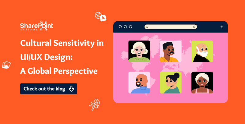
Cultural Sensitivity in UI/UX Design: A Global Perspective for 2025
As digital products expand worldwide, we must create culturally sensitive UI/UX designs. They are vital for engaging and satisfying diverse users.
What is biophilic design?
The biophilic design tries to align the built environment with natural processes in a way that encourages human creativity, productivity and wellness.
It holds that people have an intrinsic connection with nature and react positively when they are able to have some elements of the natural world provided they are inside the house.
Benefits of biophilic design in UI/UX
Enhancement of User’s Well-being: By blending nature into an interface, we can achieve a more relaxing and pleasing user experience.
Improvement in Focus and Productivity: Natural designs can help decrease cognitive load thereby making it easy for users to navigate the interface which leads to improved task completion.
Increased Emotional Engagement: Biophilic principles integrated into a program may lead users to feel greater emotional connection and involvement with it.
Biophilic design has been implemented in UI/UX design
This is an innovative approach that can enhance user experience by developing interfaces reflecting the calming and refreshing aspects of nature.
Here’s how you can incorporate biophilic principles into your digital design projects:

Nature-Inspired UI/UX: Harnessing Biophilic Design for Enhanced User Experience
The biophilic design tries to align the built environment with natural processes in a way that encourages human creativity, productivity and wellness.
Let's explore the science behind the Magic of Visuals!
Recently I was reading a book on Cognitive Psychology, which deals with how information is perceived, processed, and stored in the human brain. I was amazed to discover how several concepts of Psychology are utilized in Design, even without realizing it.
In cognitive science and psychology, the adage "A picture is worth a thousand words" reflects the idea that images can convey complex information more efficiently and effectively than text alone. This concept is supported by how our brains process visual information.
Understanding the Science
Visual Processing:
Our brains are highly tuned to process visual information quickly. When we see an image, our brain can immediately recognize patterns, colours, shapes, and scenes, which helps us understand the context and meaning without needing to read or hear a detailed explanation.
Memory
Visuals are often easier to remember than text. This is known as the "picture superiority effect." When you see an image, your brain stores it as both an image and a word, making it easier to recall later.
Comprehension
Images can simplify complex ideas. They can break down information into easily digestible visual chunks, making it simpler to understand and absorb, whereas words take more time and effort to read and comprehend.
Example 1: Traffic Signs
A stop sign immediately conveys the need to stop without any text. Drivers instantly recognize the sign and understand its meaning. Here are some of the road signs that drivers can easily understand without any need for additional text.

Example 2: Icons and Symbols
Icons and symbols can convey messages quickly and universally, transcending language barriers.

Example 3: Graphs and Charts
Graphs and charts can present data in a visually appealing way, making it easier to compare and analyze information at a glance.

Example 4: Infographics
Infographics use striking, engaging visuals to communicate information quickly and clearly. E.g. In the case of COVID-19 safety measures, an infographic can visually represent these safety measures, making it easier for people to understand and remember the guidelines.

Example 5: Emotions
A happy face emoji can instantly convey the emotion of happiness, which might take several words to describe. Here are some of the emojis that most of us can easily understand without any need for further explanation.

Summary
The adage "a picture is worth a thousand words" underscores the power of visual communication. Our brains are wired to process, remember, and understand visual information quickly and efficiently. Images can convey complex ideas, emotions, and instructions in a way that is more immediate and impactful than text alone.
In Conclusion, yes, a picture is indeed worth a thousand words!

Is a Picture worth a Thousand words?
Recently I was reading a book on Cognitive Psychology, which deals with how information is perceived, processed, and stored in the human brain.
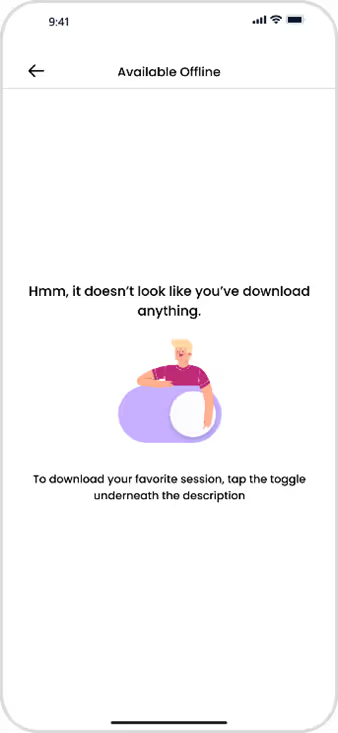
1. Delight Your Users
Small, delightful experiences can greatly influence how users perceive your product. These moments are not about functionality; they are about adding fun, lifting spirits, and inspiring joy.
Consider ways to evoke emotions in your users, aiming to create enjoyable and memorable moments.
Key Benefits:
- Increased Engagement: Positive experiences create feedback loops that encourage users to return.
- Organic Growth: Delightful interactions are more likely to be shared, naturally extending your reach through word of mouth—the most powerful form of marketing.
- User Happiness: Boosts overall satisfaction and fosters a deeper emotional connection with your product.
2. Make the Effort Visible
Revealing the hard work behind your service enhances its perceived value. When users seethe effort put into creating a product, their appreciation grows.
Key Benefits:
- Higher Conversions: Highlighting your dedication can improve conversion rates.
- Greater Trust: Users are more likely to trust and value your service when they recognize the effort behind it.

3. Use Faces
Using human faces in your design can attract attention and evoke empathy.
- Guide Attention: Faces looking towards CTAs or key content can effectively direct user focus.
- Stay Authentic: Choose real, relatable photos to maintain authenticity.
- Evoke Emotion: Select faces that reflect the emotions you want users to feel.
Key Benefits:
- Increased Engagement: Faces build personal connections with users.
- Enhanced Trust: Authentic visuals humanize your product and build trust.
%201.avif)

The directional gaze image emerged as the clear winner, revealing the powerful impact of guiding viewer attention with simple visual cues.

7 Design Approaches to Build Stronger Emotional Engagement
Small, delightful experiences can greatly influence how users perceive your product. These moments are not about functionality; they are about adding fun, lifting spirits, and inspiring joy.

In an age where digital interactions define user experiences, creating a strong first impression in UI/UX design is critical. As a seasoned designer with over 6 years of experience and numerous successful projects under my belt, I understand that users, much like judges, form opinions within seconds. Implementing design strategies that resonate with human judgment not only captivates users but establishes trust and credibility from the get-go.

Summary
This article presents four ways to craft a strong first impression in UI/UX: use clean, visually appealing layouts; engage users with interactive, personalized touches; make interactions effortless through consistency, smart defaults, and clear error handling; and prioritize action with continuous feedback, collaboration, and testing. The focus is on clarity, convenience, and empathy so users feel understood, confident, and in control from the first interaction.
1. Looks Matter
Just like we notice someone's appearance, the visual appeal of a digital interface is crucial. A clean and uncluttered design, like the below website, should grab attention and make it easy for users to find what they need.
By keeping things neat and focusing on what's needed, designers make users feel comfortable and in control.
Research shows that users make judgments about a website's aesthetic within 0.05 seconds. A clean, uncluttered design allows users to navigate easily and discover content efficiently. Consider brands like Notable Brand that have redefined their interfaces to prioritize clarity


4 Tips for making a Great First Impression in Design
In an age where digital interactions define user experiences, creating a strong first impression in UI/UX design is critical.
As a designer, crafting an effective Call to Action (CTA) is a crucial aspect of digital design. It's not just about aesthetics; it's about creating a functional pathway that guides users towards a desired action. Whether it's signing up, making a purchase, or just getting more information, a well-designed CTA can make a significant difference in the user experience and conversion rates. This guide focuses on the key design principles for creating CTAs that are not only visually appealing but also highly effective in driving user action.
10 Key Design Techniques for Crafting Effective CTAs
1. Size and Visibility
Ensure the CTA is large enough to be easily clickable, especially on hand held devices.
Buttons need a minimum touchable area of 44x44 points for easy identification and interaction. This size ensures users can comfortably tap or click on them, enhancing accessibility and user experience across different devices and input methods. These guidelines are sourced from the Web Content Accessibility Guidelines (WCAG).

2. Color Contrast
Use colors that create a visual pop against the background.
High contrast not only draws attention but also aids in accessibility.
3. Margin and Padding

Surround CTAs with sufficient whitespace to make them stand out.
Padding is crucial to prevent accidental clicks and to maintain design cleanliness.
4. Consistent Styling
Keep a uniform style across the website for brand consistency.
Consistent styling includes colors, shapes, and typography.
5. Interactive Elements (Hover and Active States)

Design interactive elements like hover effects to provide feedback and enhance engagement.
Subtle animations or color changes can indicate interactivity.
6. Strategic Positioning

Place CTAs where they are most likely to be noticed and acted upon.
Common effective locations include near vital information, at content's end, or within forms.
7. Hierarchy and Prominence
Establish a clear hierarchy among different CTAs.
More critical actions like "Sign Up" or "Buy Now" should be more prominent.
8. Mobile Responsiveness
Ensure CTAs are easily accessible and functional on mobile devices.
Adjust button sizes and spacing for smaller screens.
9. Typography and Clarity
Use legible fonts and appropriate sizes for clarity.
Avoid overcrowding with text; keep the message concise and direct.
10. Testing Across Browsers and Devices
Regularly test CTAs across different browsers and devices for consistent performance.
Adapt and refine based on feedback and user interaction data.
Conclusion
Designing effective CTAs is a critical skill for any digital designer. It's about combining aesthetics with functionality to create an intuitive pathway for user interaction. By considering these key design elements, you can create CTAs that not only enhance the visual appeal of your website or app but also significantly improve user engagement and conversion rates. Remember, a successful CTA is one that resonates with the user and seamlessly guides them towards the desired action, making it an indispensable tool in your design toolkit.

Designing Impactful CTAs: A Designer's Guide to Call-to-Action Excellence
As a designer, crafting an effective Call to Action (CTA) is a crucial aspect of digital design.



.svg)