Published Date -

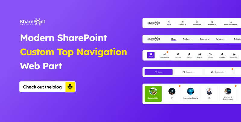
Modern SharePoint Custom Top Navigation Web Part: Boost UX and Productivity
For today’s employees, getting the right information quickly is critical to staying productive. Employees need to access the right information with minimal clicks, avoiding cluttered menus and outdated links. This is where a Custom Top Navigation Web Part comes into play. This web part is not just a design enhancement, it is a functional solution that makes SharePoint intranets smarter, cleaner, and more user-friendly.
From simple menus to dynamic mega menus, we offer various custom top navigation web parts. Here’s what they look like.
1. The Informative Navigation Bar

- Organization’s Logo: neatly placed on the left, giving the navigation bar a professional, branded look.
- Quick Links: positioned right beside the logo, each with its own icon and label for tools, portals, or important pages just a click away.
- Standout Feature (Right Side):
1. Livestock market updates
2. Current date display
3. Real-time currency values for key countries - Overall Design: clean, functional, and designed to keep users informed and connected directly from the top of the page.
2. The People-First Navigation Bar

- Logo on the left: your organization’s logo placed neatly for a clean, familiar look.
- Quick Links beside the logo: smooth row of shortcuts to tools, portals, and key pages.
- Smart search on the right: type a colleague’s name to instantly see:
1. Department
2. Reporting structure
3. Quick contact options (email or Teams) - Purpose-driven design: navigation that goes beyond pages, helping people connect across the organization.
3. The Alert-Ready Navigation Bar

- Fresh Quick Links layout: visually engaging, easy to spot, and super intuitive for users.
- Built-in alert notifications: each Quick Link carries a badge showing the number of newly added items.
- Always up to date: users never miss important updates, as alerts are right where they navigate.
- Smart communication: more than navigation, it keeps people informed seamlessly within the SharePoint page.
4. The Mega Menu Navigation Bar
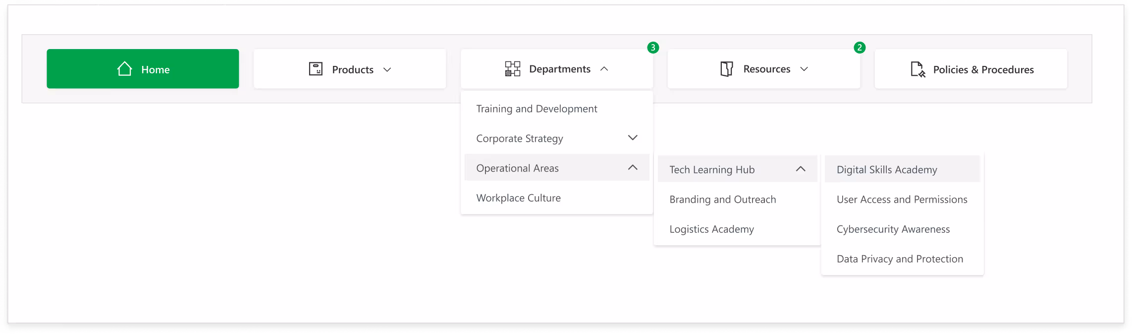
- Perfect for structured teams: ideal for organizations that thrive on organized navigation.
- Quick Links with alerts: like the previous setup, showing badges for newly added items.
- Hover-triggered Mega Menu: moving your cursor over a link reveals dropdowns with nested options.
- Organized content: updates, announcements, and detailed sub-links are all cleanly arranged.
- Dynamic and functional: smart design that keeps everything accessible and easy to navigate.
5. The Card-Based Navigation Bar
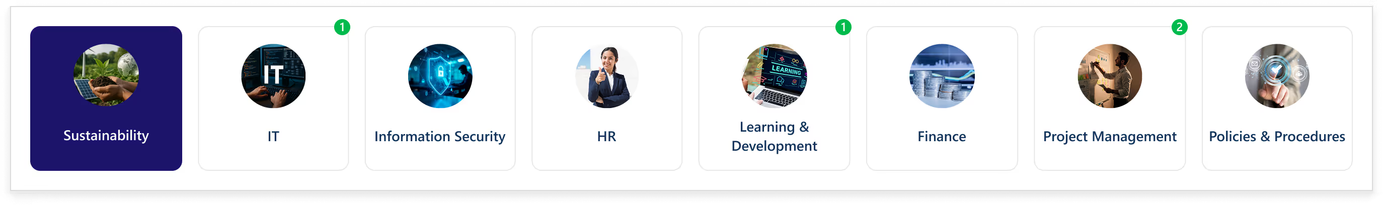
- Card-style Quick Links layout: each link presented in a modern, visually appealing boxed format.
- Customizable images: add your own images to make links more personal and eye-catching.
- Built-in alert notifications: highlight updates, new content, or actions that need attention.
- Engaging and visual design: transforms regular navigation into an exciting, interactive experience.
Conclusion
From informative dashboards to people-focused search tools, from alert-ready updates to mega menus and boxed layouts, custom Top Navigation Bars offer endless possibilities.
The best part? You can mix style with function to create navigation that feels intuitive, interactive, and uniquely yours.
faqS

Agnes Prismitha
Agnes Prismitha is a Product Ambassador with 1.8 years of experience in building collaborative digital workplace solutions. She works closely with both technical teams and stakeholders to ensure solutions meet business needs and encourage product adoption.


.svg)
