Published Date -

20 Game-Changing SharePoint Design Tips You Need in 2026
In today’s fast-paced workplace, a well-designed intranet isn’t just a “nice to have”; it’s a productivity booster, a culture-shaper, and a vital communication tool. As more organizations adopt Microsoft SharePoint for internal communication, collaboration, and knowledge sharing, the way you design your SharePoint intranet can make or break its effectiveness.
Below are transformative SharePoint intranet design tips that can elevate your intranet from “just another portal” to a powerful, intuitive, and user-friendly hub.
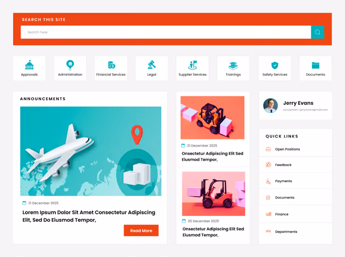
1. Use Hero Web Parts to Surface High-Priority News
The first thing users see when they open the intranet matters; that’s why Hero Web Parts deserve more respect than mere “decorative” images. Instead of treating them as flashy banners, think of them as your intranet’s front page: a place for real, high-impact communication.
- Announcements: company-wide updates, deadlines, new initiatives
- CEO or leadership messages: set tone and direction
- Alerts or urgent notices: e.g., department-specific emergency info
- Company vision/mission/values: especially useful for new hires
- Polls, feedback requests, idea submission links: when you need quick employee input
- Useful content during seasonal changes, e.g., weather advisories, especially in the rainy season or extreme heat
- Reminders: celebrations, compliance deadlines, events
- Background videos: brief clips about company culture, onboarding, brand story
By leveraging Hero Web Parts for purposeful and timely content, you make the home page of your intranet an important communication hub, not just a placeholder image.
2. Keep Navigation Simple and Clear
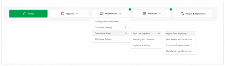
Your intranet may house tons of information documents, policies, apps, team pages, updates, and training materials, but users shouldn’t need a map to find anything.
- Use a mega-menu when you have many categories or sub links. It keeps navigation neat and avoids long dropdowns that break UX.
- Use user-friendly, consistent naming conventions for links. Avoid jargon or overly generic names like “Documents123” or “Misc.”
- Position navigation in a standard location, typically at the top. This aligns with common web and app UI/UX patterns, so users don’t have to hunt for the menu.
- Provide visual cues for states: default, hover, active/pressed. This helps users understand where they are in the site and what’s clickable.
- Double-check that each menu link points to the correct and relevant content. Dead or misdirected links are a sure way to frustrate users and lose trust.
Clear navigation in SharePoint is like giving every user a roadmap, helping them reach the information they need without confusion or wasted time.
3. Use White Space to Improve Readability.
An intranet often contains dense information articles, policies, tables, and links, which can easily overwhelm the user if not laid out thoughtfully. That’s where white space (or blank space) becomes one of your most powerful design tools.
- It prevents visual clutter, making content easier on the eyes and easier to digest.
- It helps structure content logically: grouping related items, separating distinct sections, and defining hierarchy.
- It improves readability and comprehension, reducing cognitive load on users.
- It gives breathing room, preventing users from feeling overwhelmed by too much information at once.
Rule of thumb: Don’t pack too many web parts onto one screen without spacing. Let content breathe. Use margins, padding, and blank space between rows and columns. A clean layout isn’t empty, it’s intentionally
designed to guide the user’s focus.
Explore the best SharePoint design examples
4. Add Personalization Where It Counts
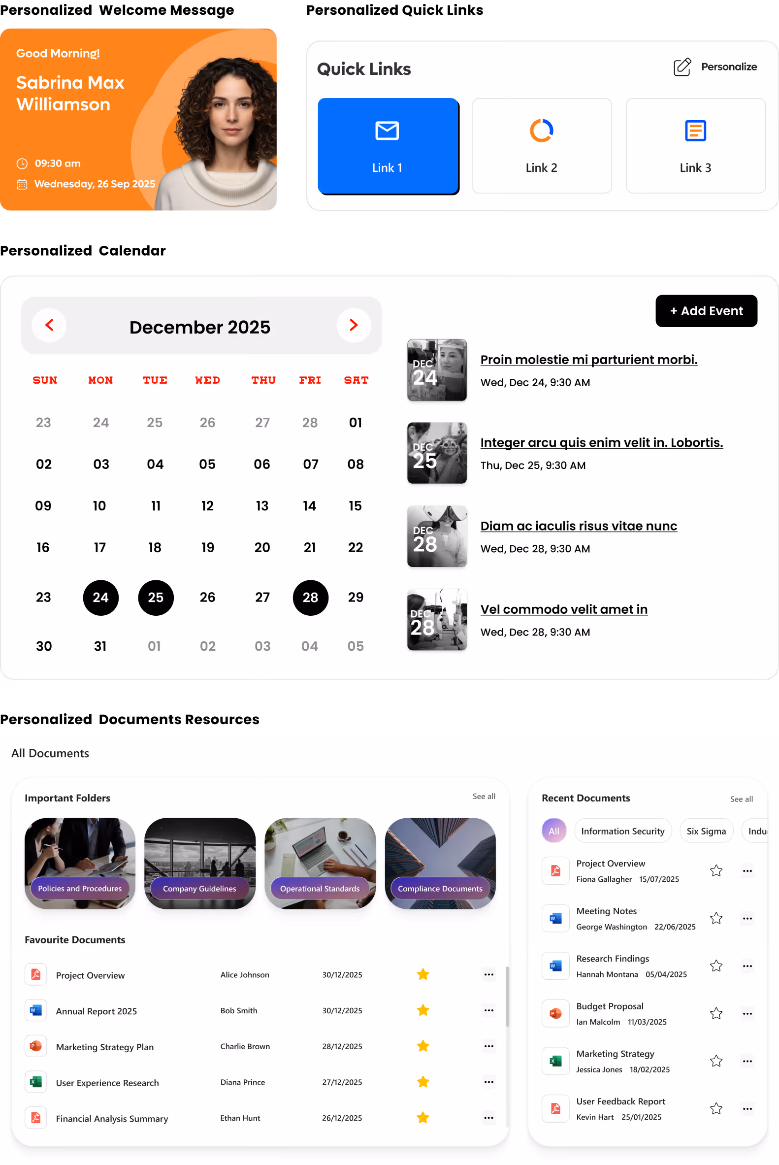
In an age where personalization is the norm, on social media, news feeds, even entertainment, your intranet should follow suit. A one-size-fits-all intranet rarely fits anyone particularly well.
- News and announcements: showing updates relevant to a user’s department, role, or location. · Quick links: Role-aware quick links that provide instant access to essential tools and apps. (e.g. HR forms for employees, project dashboards for team leads)
- Documents and resources: presenting what’s most relevant to the user rather than everything at once
- Welcome messages: personalized greeting or onboarding guidance for new joiners
- Events, training, calendar items: targeted to relevant teams or user groups
By giving users a customized view, you reduce noise, improve efficiency, and make it easier for them to focus on what matters, without sifting through unrelated content. The result? A leaner, clearer, and more impactful intranet experience.
5. Hide Complexity with Collapsible Sections
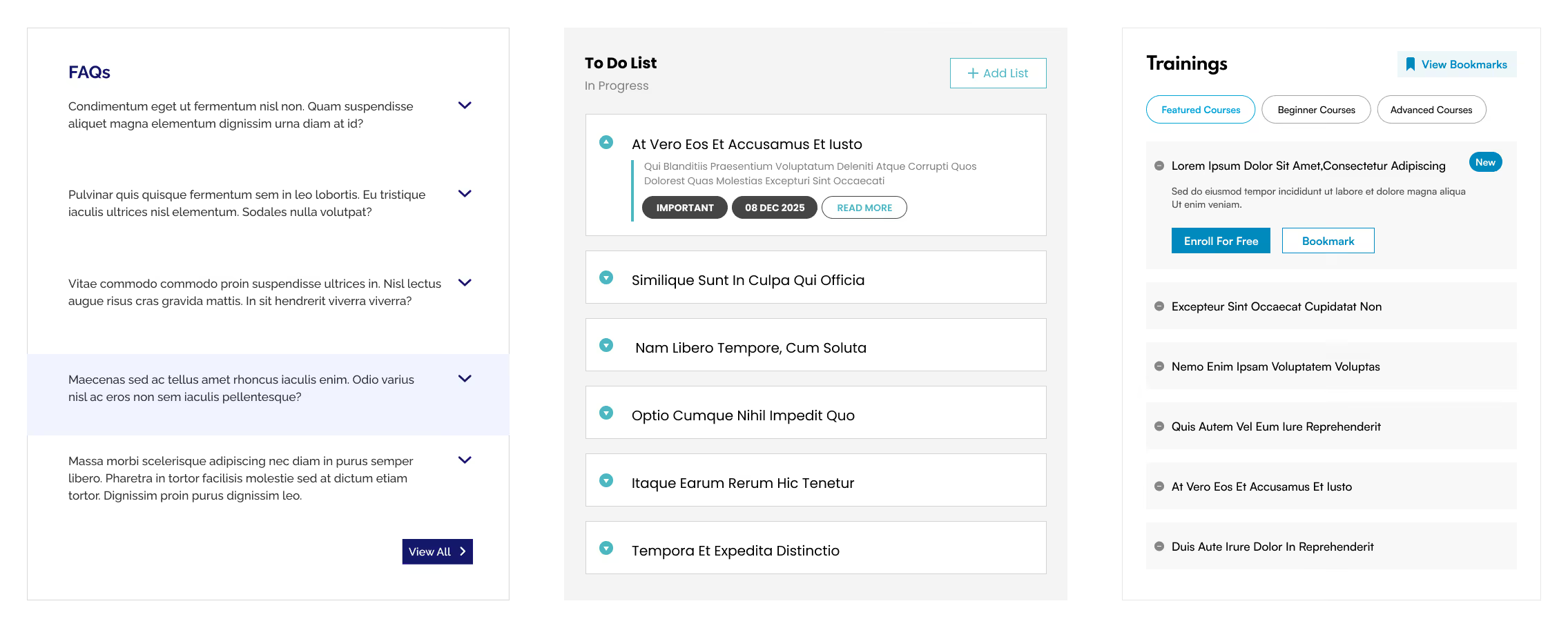
Sometimes you do need to present lots of information tables, detailed FAQs, long articles, or rich text, but that doesn’t mean it all should blast onto the user’s screen at once. Instead, use collapsible sections often implemented via accordions, to make complex information more digestible.
- Use accordions to organize FAQs, long policy documents, or help guides.
- Group dense content tables, multi-section reports, or long lists under collapsible headers.
- Let users expand only what they need, reducing overwhelm and keeping the UI clean.
- Especially useful for SharePoint pages with mixed content types, text, images, links, and embedded content where collapsing extra layers can greatly simplify navigation.
Collapsible sections let you balance having all information available when needed, without burdening the user with complexity by default. You can explore this in more detail in our guide on how to use flexible sections in SharePoint pages to simplify complex page designs and improve usability.
6. Prioritize Responsive Designs
In 2026 the desk bound employee is the exception, not the rule. Whether it is frontline workers checking schedules or executives approving requests between meetings, your intranet must be responsive. Designing for responsive layouts is not just about shrinking the desktop view; it is about
prioritizing touch targets and vertical scrolling to ensure the site works flawlessly on tablets, laptops, and smartphones alike.
- Test page layouts on the SharePoint mobile app: Ensure columns stack correctly and do not break the reading flow.
- Prioritize vertical scrolling over horizontal: Horizontal scrolling is notoriously difficult on touch devices.
- Use larger touch targets: Buttons and links should be easily tapable without zooming in.
- Simplify the home page for smaller screens: Use the "Hide on mobile" feature for non-essential web parts that clutter the small screen.
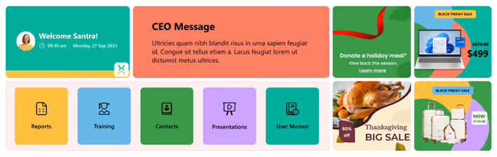
7. Leverage "Section Backgrounds" for Visual Hierarchy
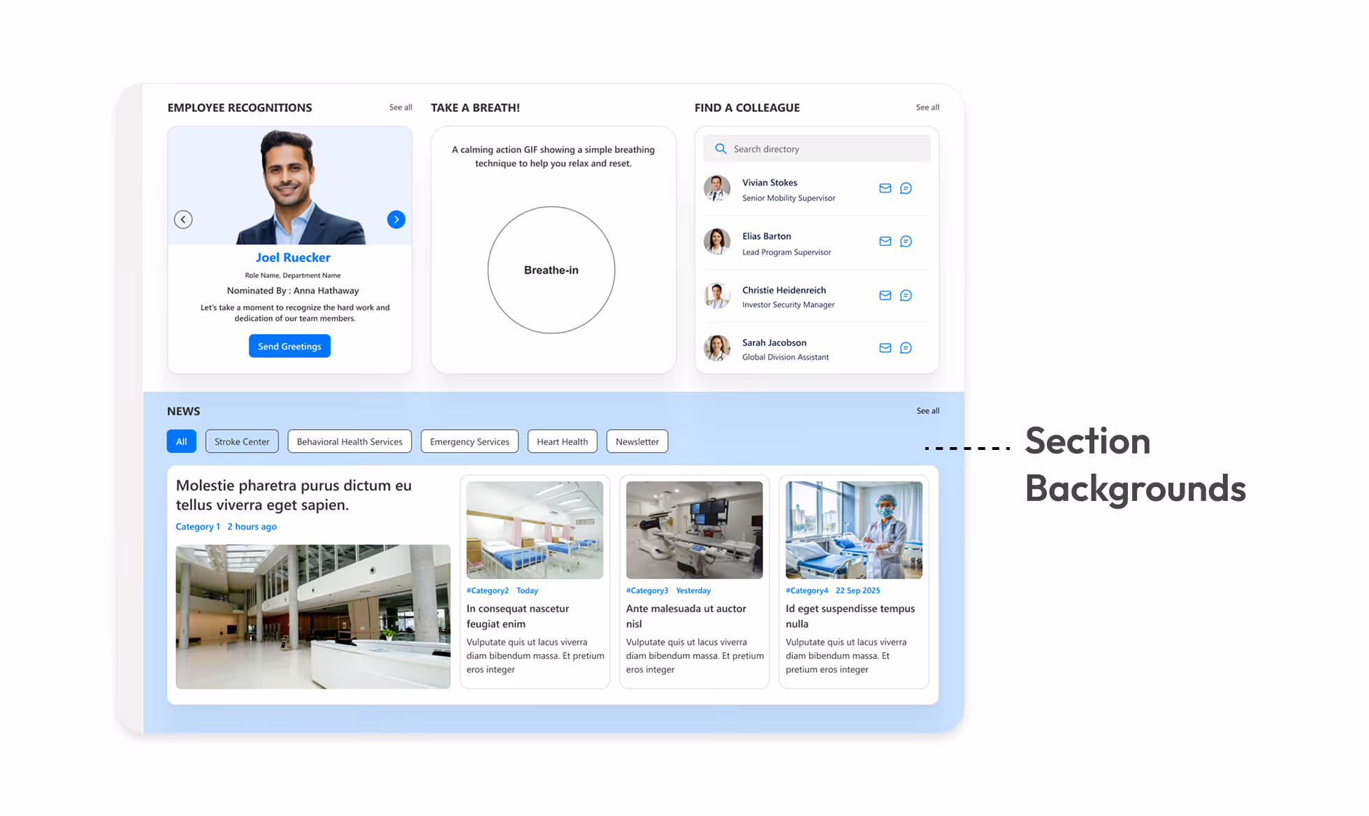
Monochromatic pages are functional but boring. SharePoint’s modern experience allows you to apply different background colors to specific page sections. This is a subtle but powerful way to break up long pages and signal a change in context to the user.
- Highlight key calls to action: Use a contrasting background color for sections containing critical buttons or forms.
- Separate content types: Use soft grey or brand tinted backgrounds to distinguish between "News" sections and "Resource" sections.
- Create visual rhythm: Alternating section colors prevents the "wall of text" fatigue and guides the eye down the page.
- Ensure contrast: Always verify that your text remains readable against the chosen background color (e.g. dark text on light backgrounds).
8. Standardize Your Page Templates
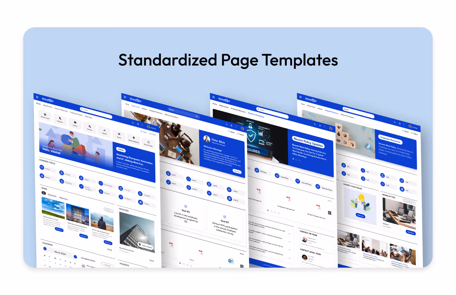
Inconsistency kills user confidence. If the HR page looks completely different from the IT page, users have to re-learn how to find information every time they switch departments. Creating and enforcing standard Page Templates ensures a cohesive experience across the entire intranet.
- Predefine web part placement: Decide where the "Contact Person," "Quick Links," and "News" web parts should always sit (typically the right-hand column).
- Save time for content creators: Authors can simply select a "New Policy Page" or "New Team Event" template rather than building from scratch.
- Maintain brand consistency: Ensure headers, banners, and footer information are uniform across all new pages.
- Reduce training requirements: When pages follow a pattern, users intuitively know where to look for specific data.
9. Utilizing "Button Web Parts" for Clear Calls to Action (CTA)
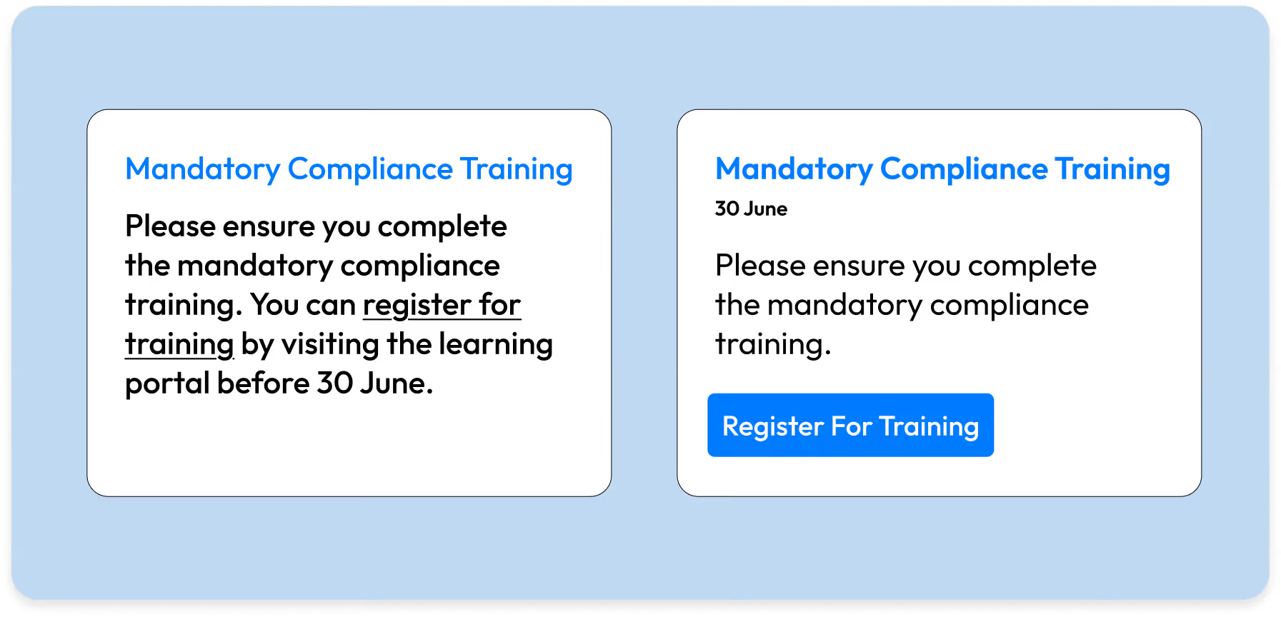
Hyperlinked text in the middle of a paragraph often gets missed. When you need a user to do something like "Submit Expense Report" or "Register for Training" use the Button Web Part. It acts as a visual signpost that stands out from the narrative text.
- Use descriptive labels: Instead of "Click Here," use specific action verbs like "Download 2026 Handbook" or "Access IT Helpdesk".
- Center align for impact: A centered button draws the eye immediately and implies a pause in the reading flow to take action.
- Consistent styling: Stick to one primary color for main actions and a secondary outline style for less critical links to avoid a "rainbow" effect.
- Place buttons strategically: distinct from the body text, usually after a brief explanation of why the user should click it.
10. Integrate "Viva Connections" Dashboard Cards
As SharePoint evolves into 2026, it is tightly integrated with Microsoft Viva. The Viva Connections Dashboard allows you to create interactive "cards" that act as mini applications right on your intranet home page. This moves your design from "static information" to "interactive utility."
- Task focused cards: Create cards for simple daily tasks like "Clock In Out," "Check Cafeteria Menu," or "View Pay Stub."
- Third party integration: Connect cards to external apps like ServiceNow, Salesforce, or Trello so users can see status updates without leaving the intranet.
- Audience targeting on cards: Just like news, ensure only managers see the "Manager Approval" card, keeping the dashboard clean for individual contributors.
- Interactive vs. Passive: Unlike a standard link, these cards can display live data (e.g. "3 Days of Leave Remaining") directly on the button.
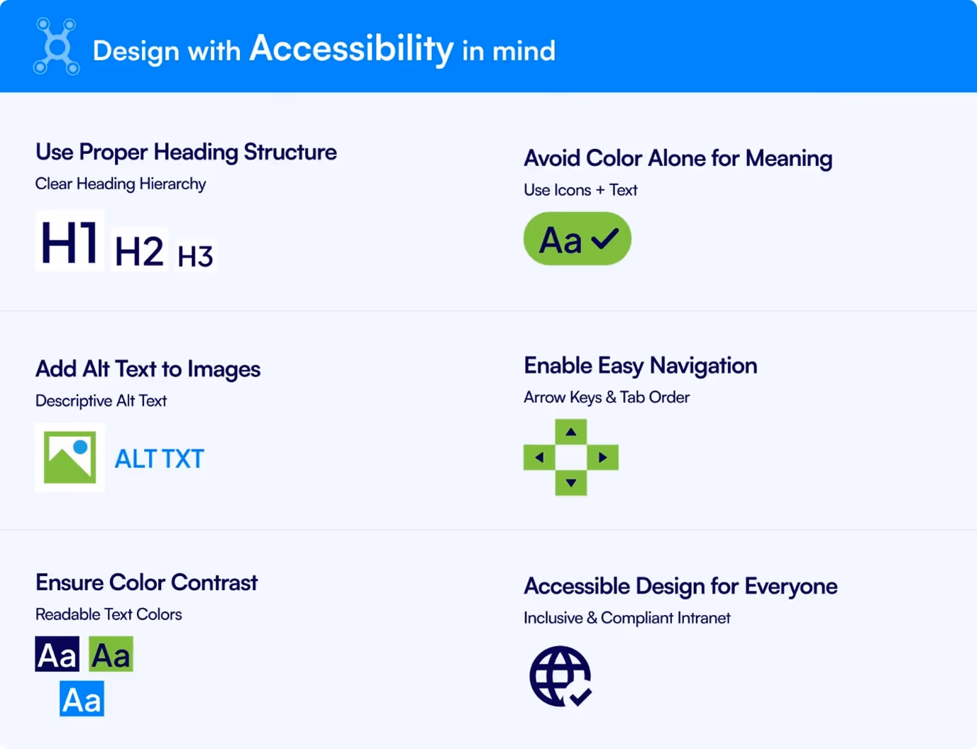
11. Design with Accessibility (WCAG) in Mind
An intranet that isn’t accessible excludes part of your workforce. In 2026, accessibility is not optional, it’s a baseline expectation.
- Use Proper Heading Structure: Maintain a clear heading hierarchy (H1, H2, H3).
- Avoid Color Alone for Meaning: Use icons along with text to convey meaning.
- Add Alt Text to Images: Use meaningful descriptions so images are understandable to all users.
- Enable Easy Navigation: Support keyboard navigation using arrow keys and logical tab order.
- Ensure Color Contrast: Use readable text colors with sufficient contrast.
- Accessible Design for Everyone: Build an inclusive and compliance-ready intranet experience.
Accessible design enhances the experience for all users, not only those with disabilities.
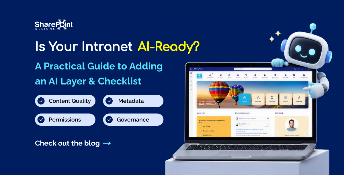
12. Design for AI-Driven Content Discovery
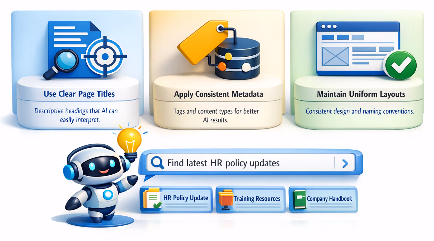
Structure pages and metadata so Copilot and AI search can surface the right content faster. Clear labels, consistent page layouts, and meaningful descriptions improve AI-powered recommendations and reduce manual searching.
- Use clear, descriptive page titles and headings so AI tools can accurately understand and categorize content. Use optimized image sizes (no oversized banners).
- Apply consistent metadata, tags, and content types to help Copilot surface relevant information quickly.
- Maintain uniform page layouts and naming conventions to improve AI recommendations and search accuracy.
13. Build a Strong Visual Content Strategy
Design isn’t only layout, it’s also how consistently visuals are used across the intranet.
- A defined icon style (outline vs filled, same size set)
- Consistent banner image dimensions
- Brand-aligned imagery (avoid random stock photos)
- Reusable graphics for processes, workflows, and timelines
A clear visual system reinforces brand identity and improves content comprehension.
14. Include “Last Updated” and Content Ownership Indicators
Outdated content kills trust faster than missing content. Users need to.
know whether information is current and reliable.
- Include a visible last-modified date on policy and procedure pages.
- Content owner or department contact
- Review frequency for critical pages (e.g., HR, Compliance)
This small design detail dramatically increases credibility and reduces unnecessary support queries.
15. Adaptable Icons and UI Design

Brand identities often evolve over time, and intranet design must adapt seamlessly to these changes. When brand colors shift, whether toward lighter, brighter, or darker palettes icons, typography, layouts, and imagery must be reviewed together to maintain visual balance and consistency.
Icon colors should complement background shades, text contrast must remain readable, and image overlays or accents should align with the updated brand tone. Layout spacing and visual weight may also need adjustment to ensure icons and UI elements remain clear and visually harmonious across pages.
From a design perspective, aligning UI elements with evolving brand colors:
- Preserves visual consistency and brand credibility
- Ensures readability and contrast across light or dark themes
- Prevents mismatched icons, text, and imagery
- Keeps the intranet modern as brand guidelines change
A well-aligned color system ensures the intranet continues to reflect the organization’s current brand accurately and professionally.
How to Make Your SharePoint Site Look Like a Modern Website?
16. Bring Organizational Branding into the Intranet Theme
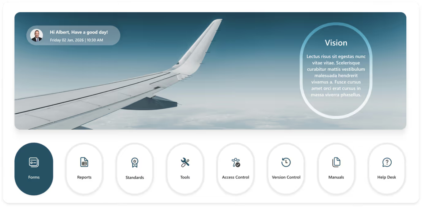
An intranet should feel like an extension of your organization’s identity not a generic digital workspace. App
lying brand-aligned themes helps employees feel connected and creates a more engaging, memorable experience.
For example, an aerospace industry intranet can reflect its domain by using aviation-inspired visuals, sky-based color palettes (blues, whites, greys), and clean, precise typography. Quick links can be designed as aircraft window-style cards or circular modules, reinforcing the aviation theme. Hero banners may feature aircraft wings, runways, or cloud-level perspectives, instantly setting the context.
Sections like company news, safety standards, technical documentation, tools, access control, and manuals can visually reinforce the organization’s mission of precision, safety, and innovation through industry-relevant imagery and structured layouts.
Brand-driven theming:
- Strengthens emotional connection with employees
- Makes the intranet feel purposeful and professional
- Improves recognition and recall of key sections
- Creates a cohesive experience across pages
When the intranet reflects the organization’s brand and industry, it feels familiar, focused, and far more engaging than a neutral, one-size-fits-all design.
How Good UX Drives Intranet Adoption?
17. Apply Seasonal Visual Design Variations to the Intranet
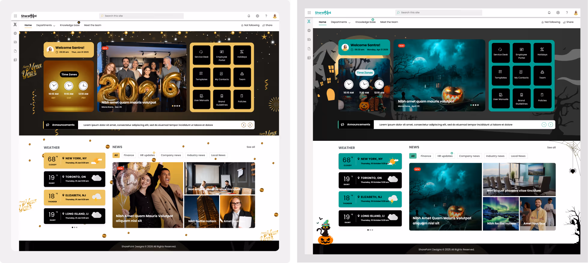
Seasonal theming is a powerful visual design technique that keeps the intranet feeling fresh without altering its structure. By updating design elements for occasions like Halloween, Christmas, New Year, or local
holidays, you can introduce visual variety while maintaining usability and consistency.
Design changes can include themed hero banners, festive illustrations, accent colors, icons, or subtle background patterns applied to specific sections. These updates should enhance visual hierarchy, draw attention to timely content, and create contrast without overwhelming the core layout.
From a design perspective, seasonal variations:
- Refresh the visual language without redesigning pages
- Improve engagement through timely visual cues
- Maintain layout consistency while changing aesthetics
- Reinforce brand flexibility within a structured design system
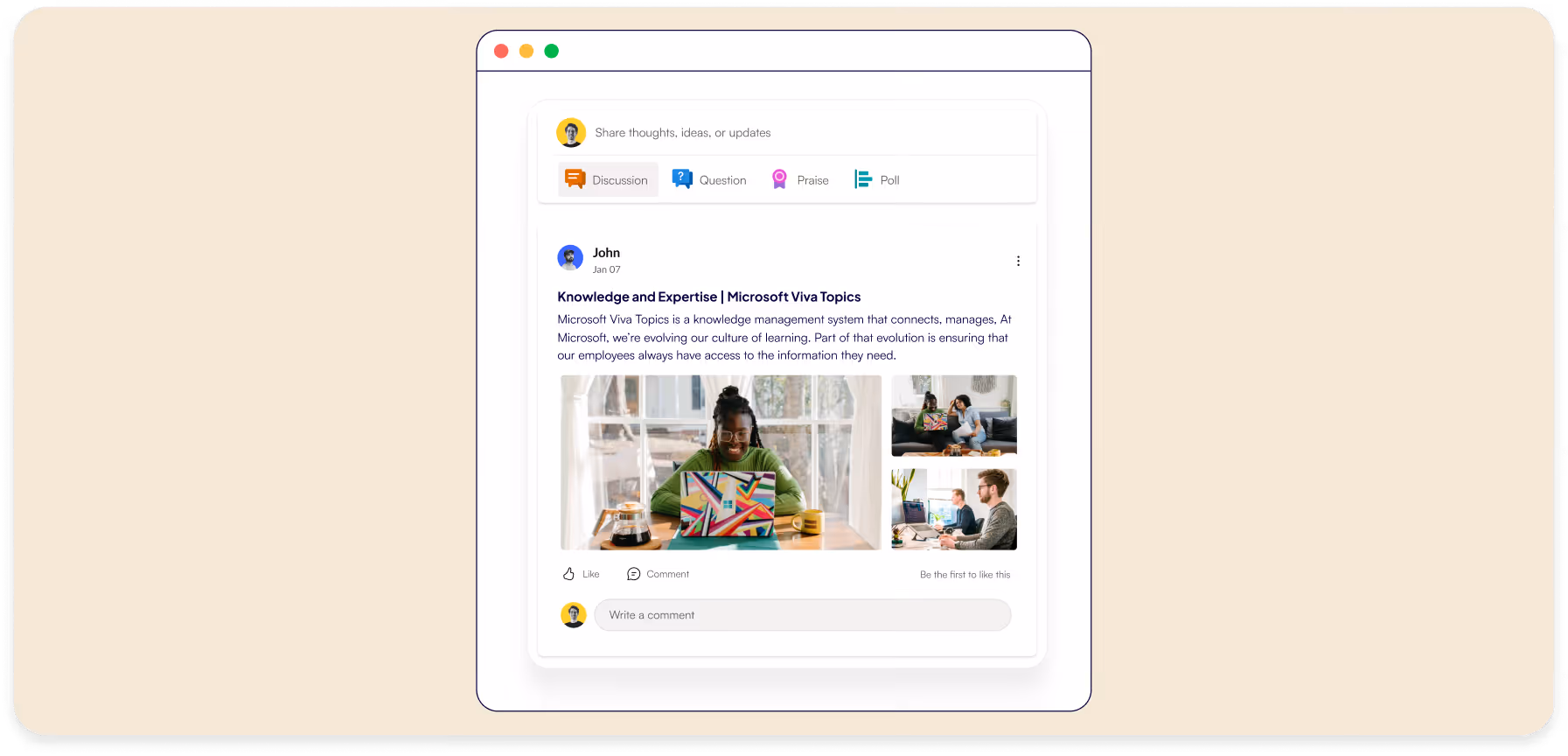
18. Use Micro-Interactions to Improve Engagement
Subtle hover effects, loading indicators, and visual feedback on buttons or cards help users understand actions instantly. These small interactions make the intranet feel modern, responsive, and intuitive without adding clutter.
- Add hover states and button animations to clearly indicate clickable elements and user actions.
- Use loading spinners, progress bars, or skeleton screens to reassure users while content loads.
- Provide instant visual feedback (success, error, or confirmation states) after user interactions to improve clarity and confidence.
19. Choose Brand-Aligned Typography for a Consistent Intranet Experience.
Typography plays a key role in reinforcing brand identity across the SharePoint intranet. Selecting fonts that align with brand guidelines ensures consistency, improves readability, and creates a familiar, professional experience for employees.
- Use brand-approved fonts (or their approved web-safe alternatives) to maintain a consistent visual identity across the intranet.
- Define clear font rules for headings, body text, and UI elements so content looks uniform on every page.
- Ensure chosen fonts are optimized for readability and accessibility across devices, including SharePoint mobile views.
Typography Trends for 2025
20. Ensure Design Consistency Across Microsoft 365 Touchpoints
Align SharePoint design with Teams, Viva, and Outlook experiences. Consistent icons, colors, and layouts across platforms create a seamless digital workplace and reduce cognitive load for users switching tools.
- Use a unified color palette and icon style across SharePoint, Teams, Viva, and Outlook to reinforce brand recognition.
- Maintain consistent layout patterns and navigation structures so users feel oriented when moving between tools.
- Align typography, buttons, and UI components across Microsoft 365 apps to deliver a familiar and cohesive user experience.
Conclusion
Great intranet design isn’t just about aesthetics; it is about efficiency and engagement. By implementing these strategies, you transform your SharePoint site from a static document repository into a dynamic workspace that employees actually enjoy using. Start applying these tips today to build a user centric digital hub that empowers your workforce for 2026 and beyond.
faqs

Johnsi Jayasingh
Johnsi Jayasingh is a technology leader and Co-Founder & Chief Innovation Officer with over 20 years of experience in digital solutions. She specializes in Microsoft technologies, including SharePoint and the Power Platform, driving modern digital workplaces. She is known for turning complex technology into simple, high-impact user experiences.


.svg)
