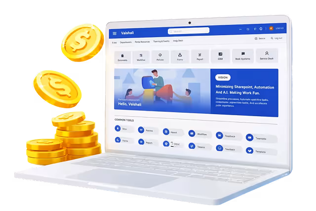
Published Date -

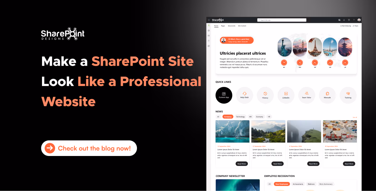
How to Make SharePoint Look Like a Real Website (What Actually Works)
Most people don’t hate SharePoint.
They hate how it looks.
The usual complaint sounds like this:
“It works, but it doesn’t feel like a website.”
And they’re right.
By default, SharePoint is built to manage content, not to impress users. But with the right structure, layout choices, and modern features, SharePoint can absolutely look and behave like a real, modern website.
We’ve seen this happen across intranets, HR portals, knowledge bases, and even internal marketing sites. Let’s walk through real scenarios and practical changes that turn SharePoint into something employees actually enjoy using.
Why SharePoint Often Doesn’t Feel Like a Website
In one organization, the intranet technically “worked.”
All documents were there. Permissions were fine. Search existed.
But employees still avoided it.
The reason wasn’t SharePoint itself. It was because:
- Pages looked cluttered
- Navigation felt confusing
- Branding was inconsistent
- Important content was buried
A website guides users.
A typical SharePoint site just stores information.
That’s the gap we need to close.
Step 1: Start with the Right SharePoint Site Type (This Matters More Than Design)
One of the biggest mistakes teams make is starting with the wrong site.
If your goal is to make SharePoint look like a website, Communication Sites are non-negotiable.
Why communication sites work better
- Full-width layouts
- Cleaner navigation
- Better visual hierarchy
- Designed for broadcasting information, not collaboration chaos
In almost every successful SharePoint website-style example we’ve seen, the foundation was a communication site, not a team site.
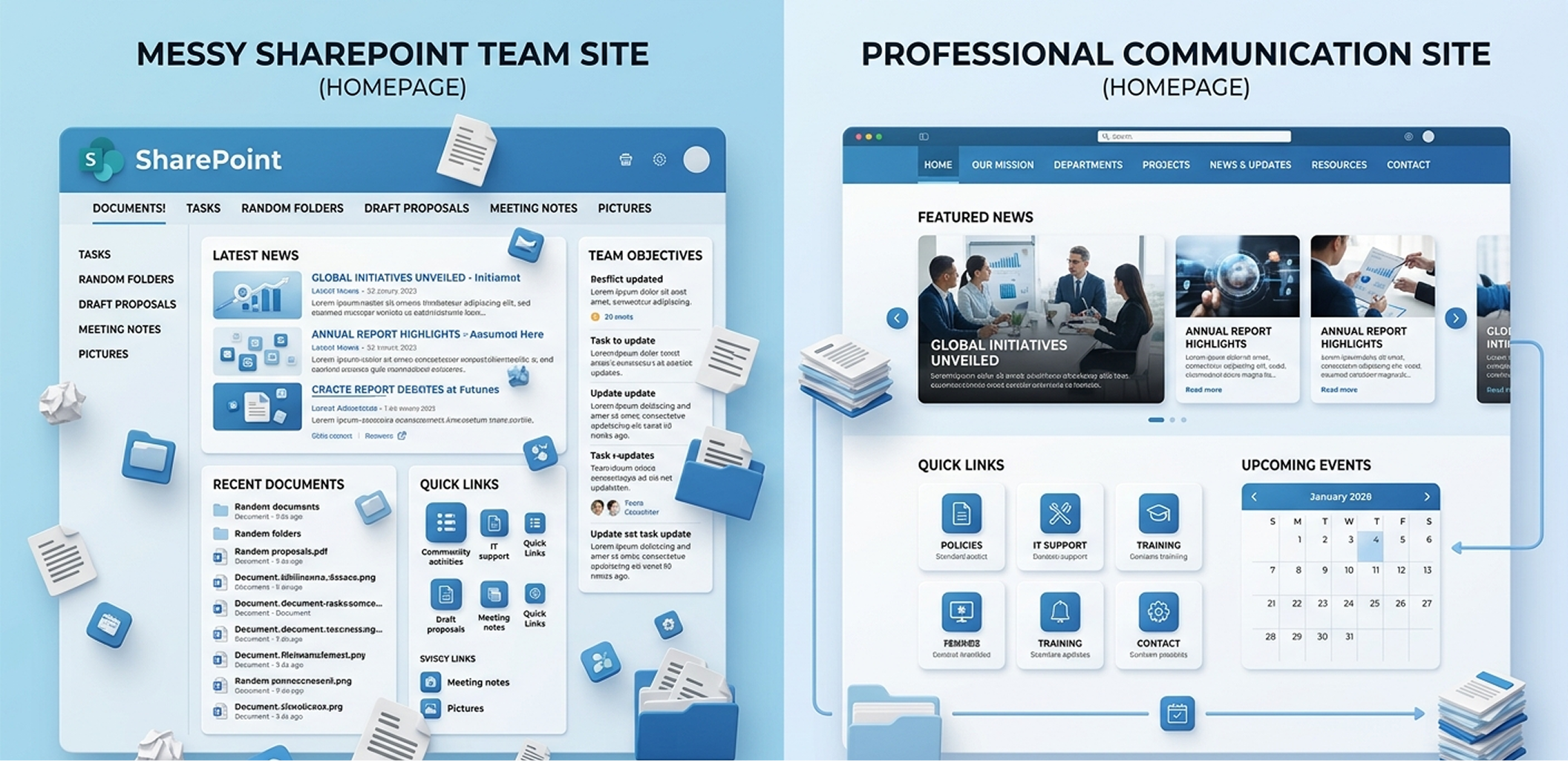
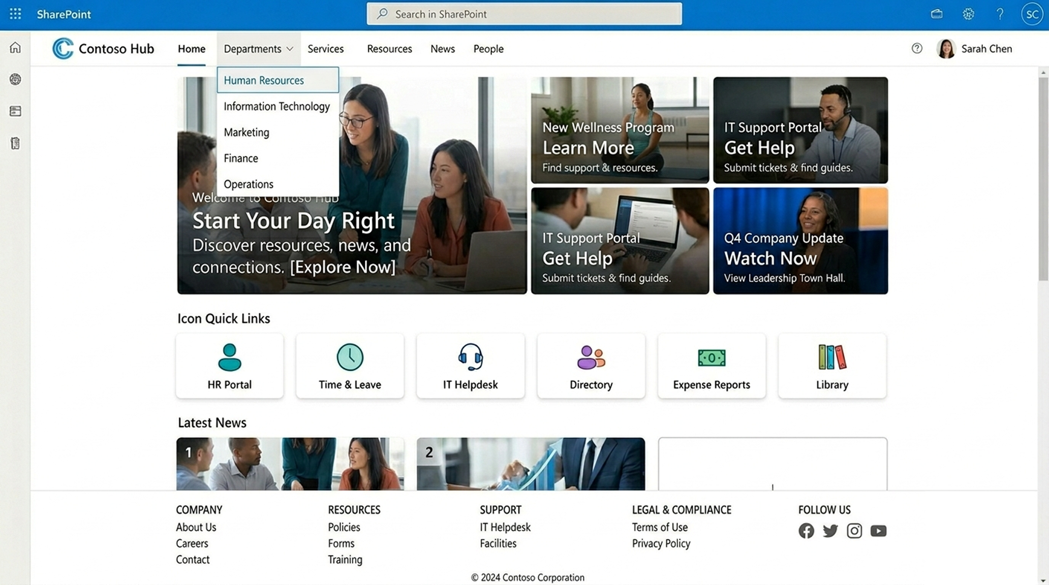
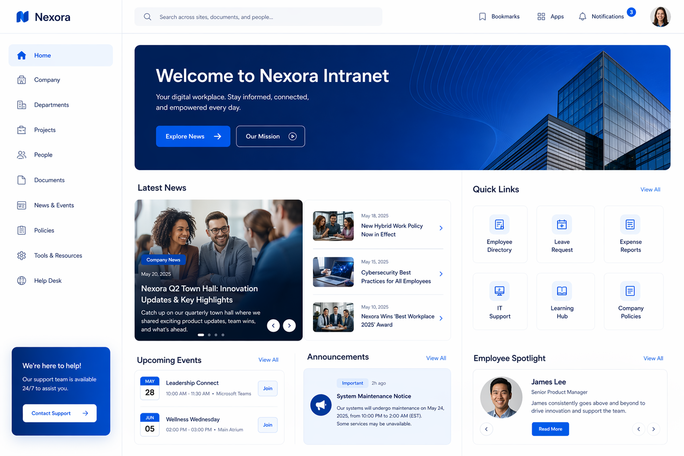
Step 2: Fix the Homepage First (Most SharePoint Website Problems Start Here)
In a real case, an intranet homepage had:
- 12 quick links
- 8 announcements
- 4 banners
- Zero clarity
After redesigning the homepage using modern SharePoint web parts, the layout changed to:
- One hero message
- 3–4 primary actions
- Targeted news
- Search at the top
Engagement went up within weeks.
What a website-like SharePoint homepage includes
- Hero web part with a clear purpose
- Quick Links with icons (not text lists)
- News web part with audience targeting
- Visible Microsoft Search
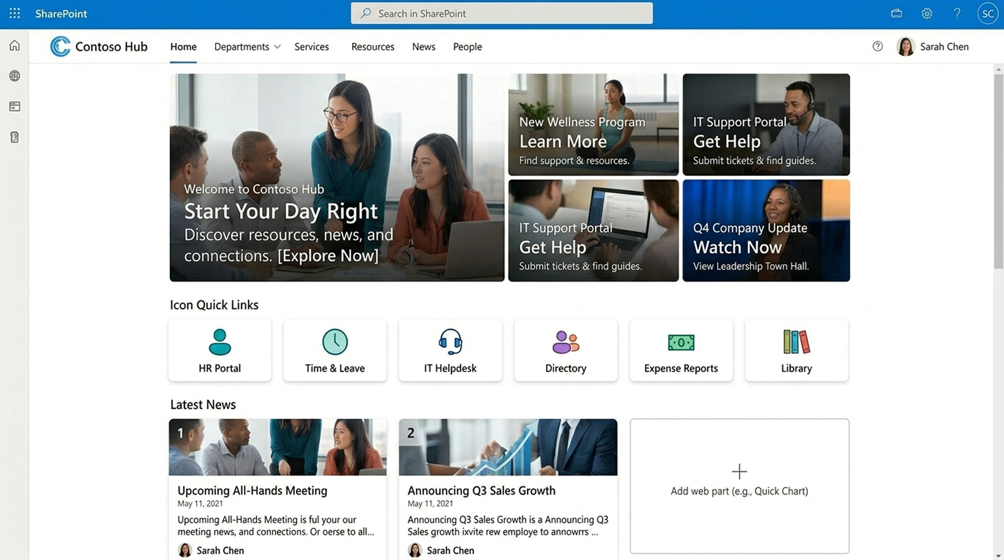
Key lesson:
A website homepage answers “What should I do here?”
Your SharePoint homepage should do the same.
Step 3: Use Navigation Like a Website, not a File System
One major difference between SharePoint and a website is navigation discipline.
In one company, each department added its own links. Navigation became unreadable.
They fixed this by:
- Using hub sites
- Standardizing navigation across all sites
- Limiting menu depth
- Adding footer navigation for secondary links
Now the intranet felt predictable. And predictability builds trust.
Website-style navigation tips for SharePoint
- Use hub navigation as your main menu
- Keep labels human, not technical
- Avoid document-library-first navigation
- Add a footer for policies and legal links.
Step 4: Branding Is More Than a Logo
Many teams think branding means uploading a logo and changing colors.
In reality, website-like SharePoint branding includes:
- Consistent fonts
- Spacing and alignment
- Image style consistency
- Reusable page layouts
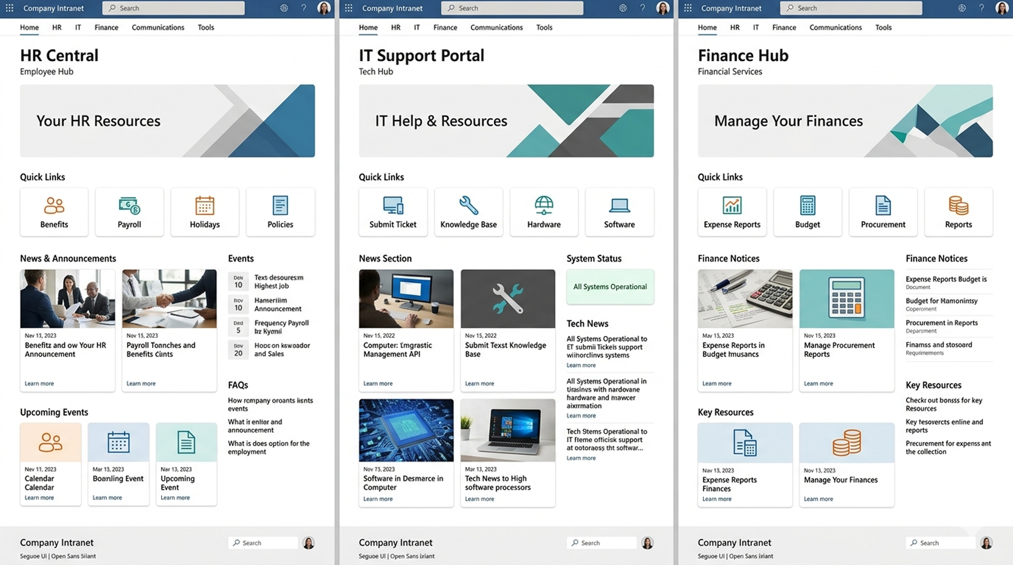
One organization reused the same homepage layout across HR, IT, and Finance using SharePoint intranet templates, ensuring visual consistency without custom code.
Employees stopped asking, “Am I on the right site?”
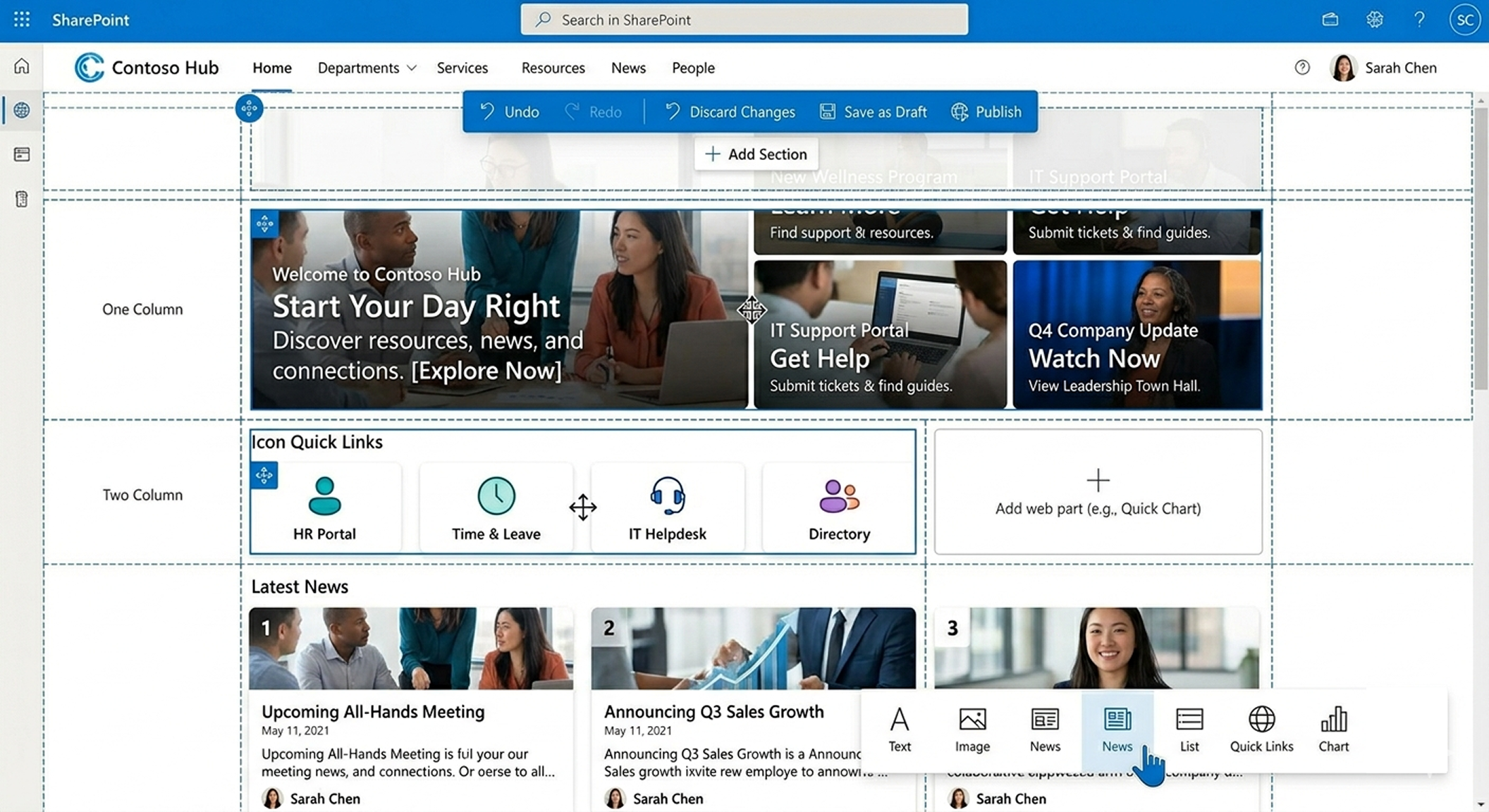
Step 5: Use Flexible Sections for Modern Page Design
Flexible sections give you web-level control:
- Mix one, two, or three columns
- Use full-width sections for banners
- Add vertical sections for sidebar links
This lets you:
- Present text and visuals side-by-side
- Showcase important content without clutter
- Create layouts that look custom-built
SharePoint’s flexibility is your creative freedom.
Know more: How to Use Flexible Sections in SharePoint Pages: A Simple Guide
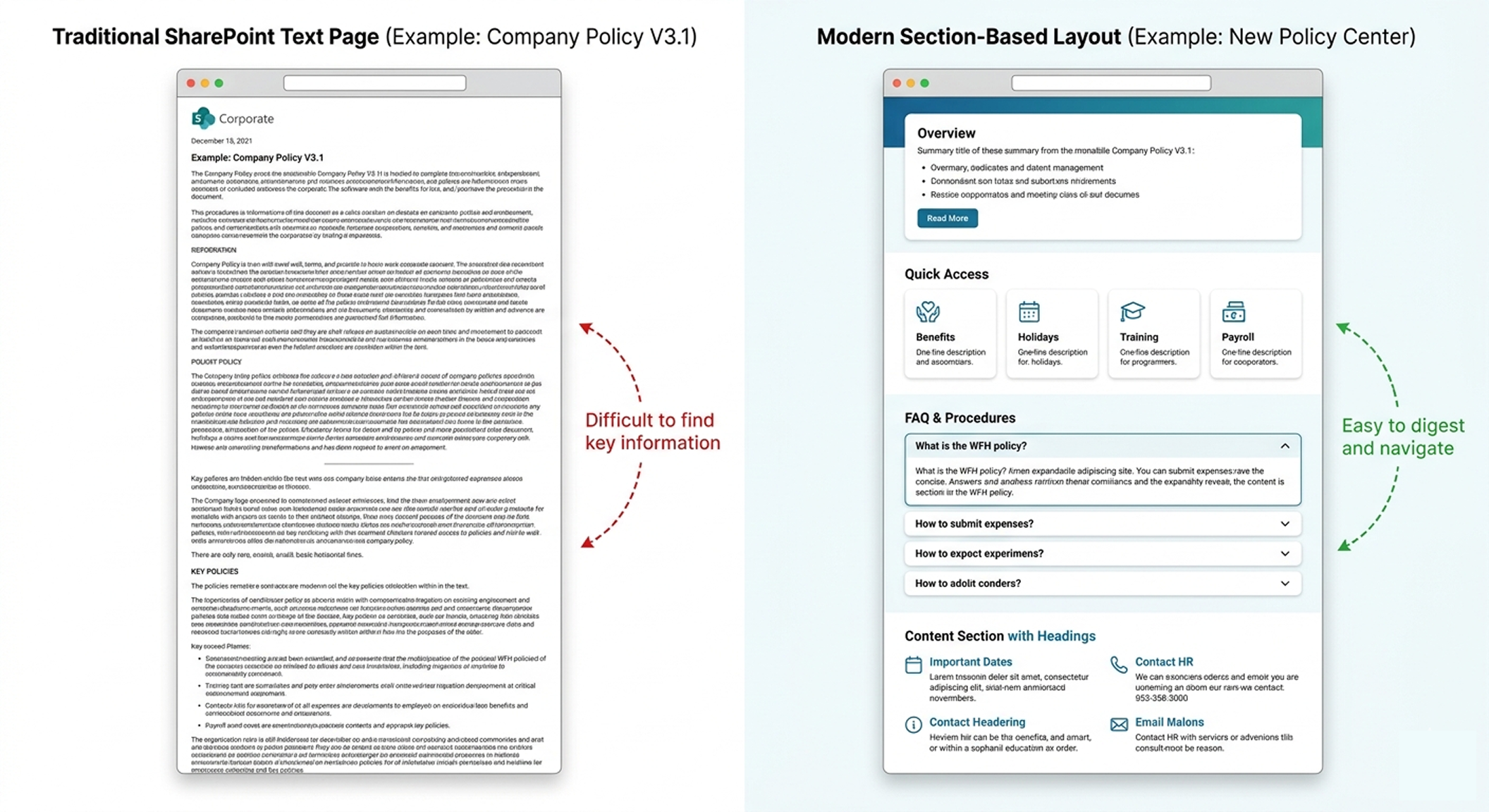
Step 6: Replace Long Pages with Section-Based Layouts
Websites don’t overwhelm users with walls of text.
Neither should SharePoint.
Successful SharePoint website examples use:
- Short sections
- Clear headings
- Visual break
- Callouts for key actions
For example, an HR policy page became:
- Summary at the top
- Accordion-style section
- Links to related topics
- Clear owner and last updated date
This one change improved trust and readability instantly.
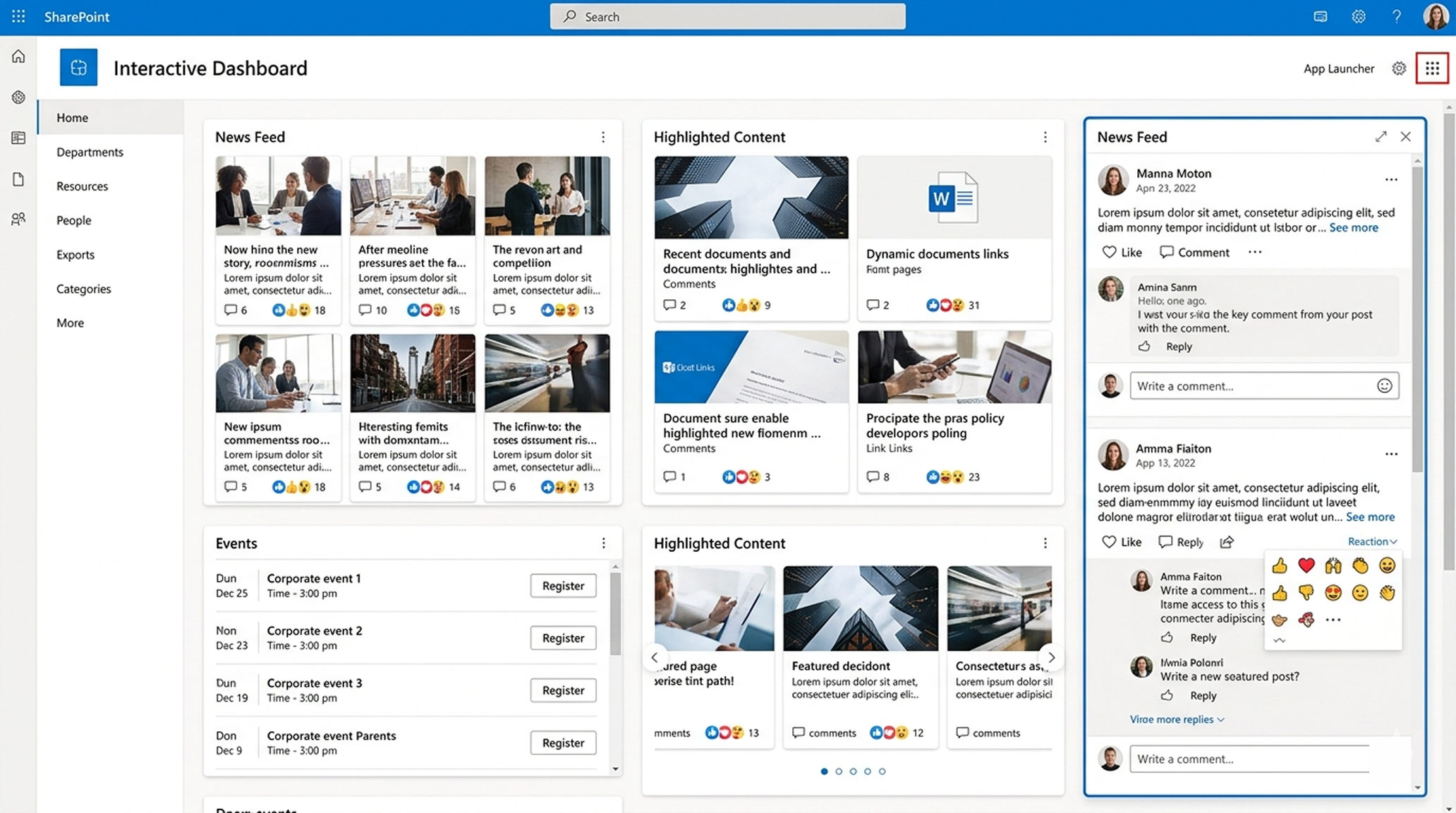
Step 7: Make SharePoint Feel Interactive (Not Static)
Websites feel alive. Static SharePoint pages feel forgotten.
Modern SharePoint fixes this with:
- News rollups
- Highlighted content
- Events web parts
- Dynamic links based on role
In one intranet, leadership updates were moved from PDFs to short posts with images and comments enabled. Engagement increased because it felt conversational.
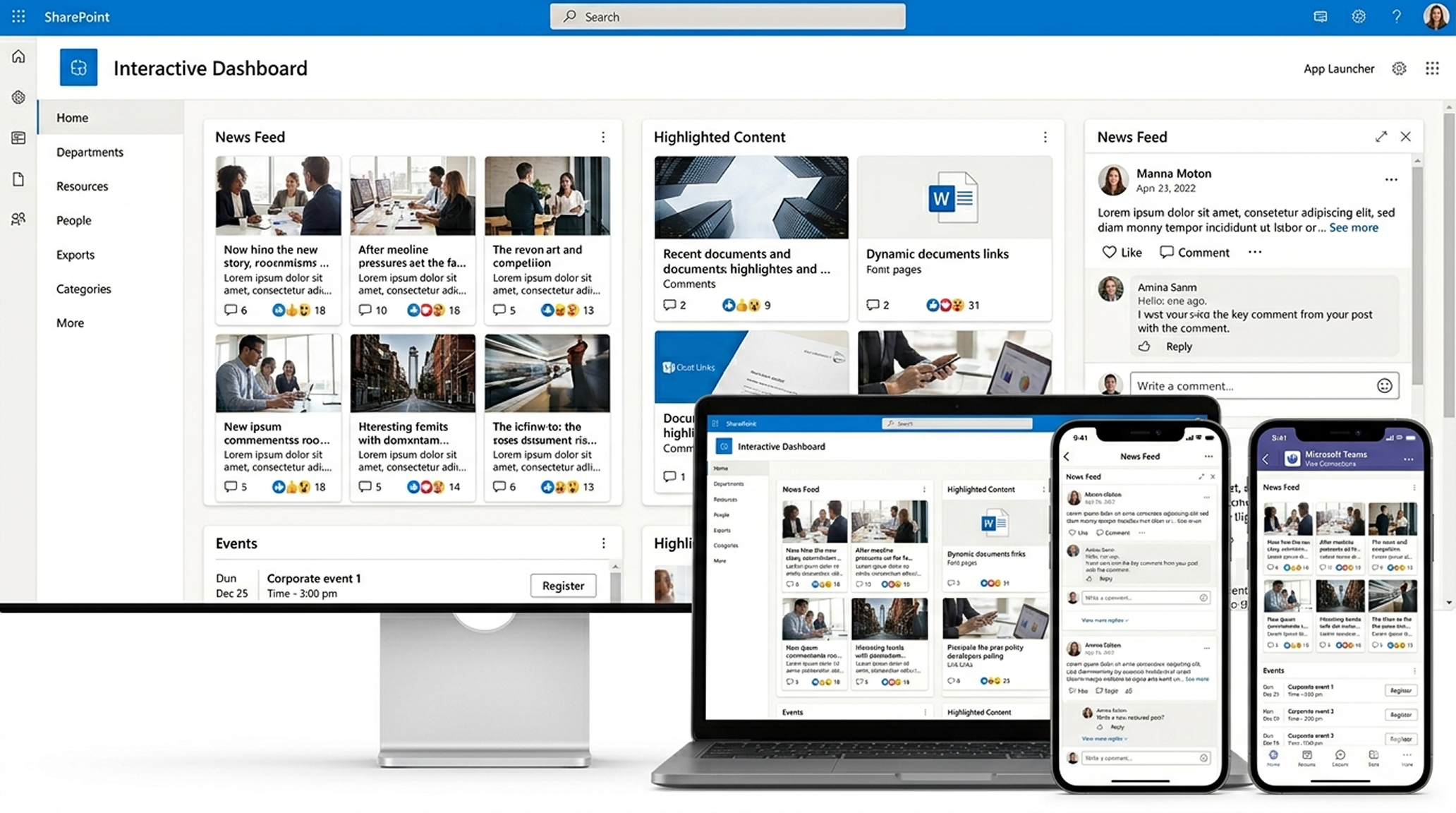
Step 8: Think Mobile First (Most “Website” Complaints Start on Phones)
A surprising number of “SharePoint doesn’t look good” complaints come from mobile users.
Modern SharePoint pages are responsive, but only if:
- Sections are designed thoughtfully
- Columns aren’t overloaded
- Quick links are touch-friendly
When organizations surface SharePoint through Viva Connections in Teams, intranet usage often increases without changing design, simply because access improves.
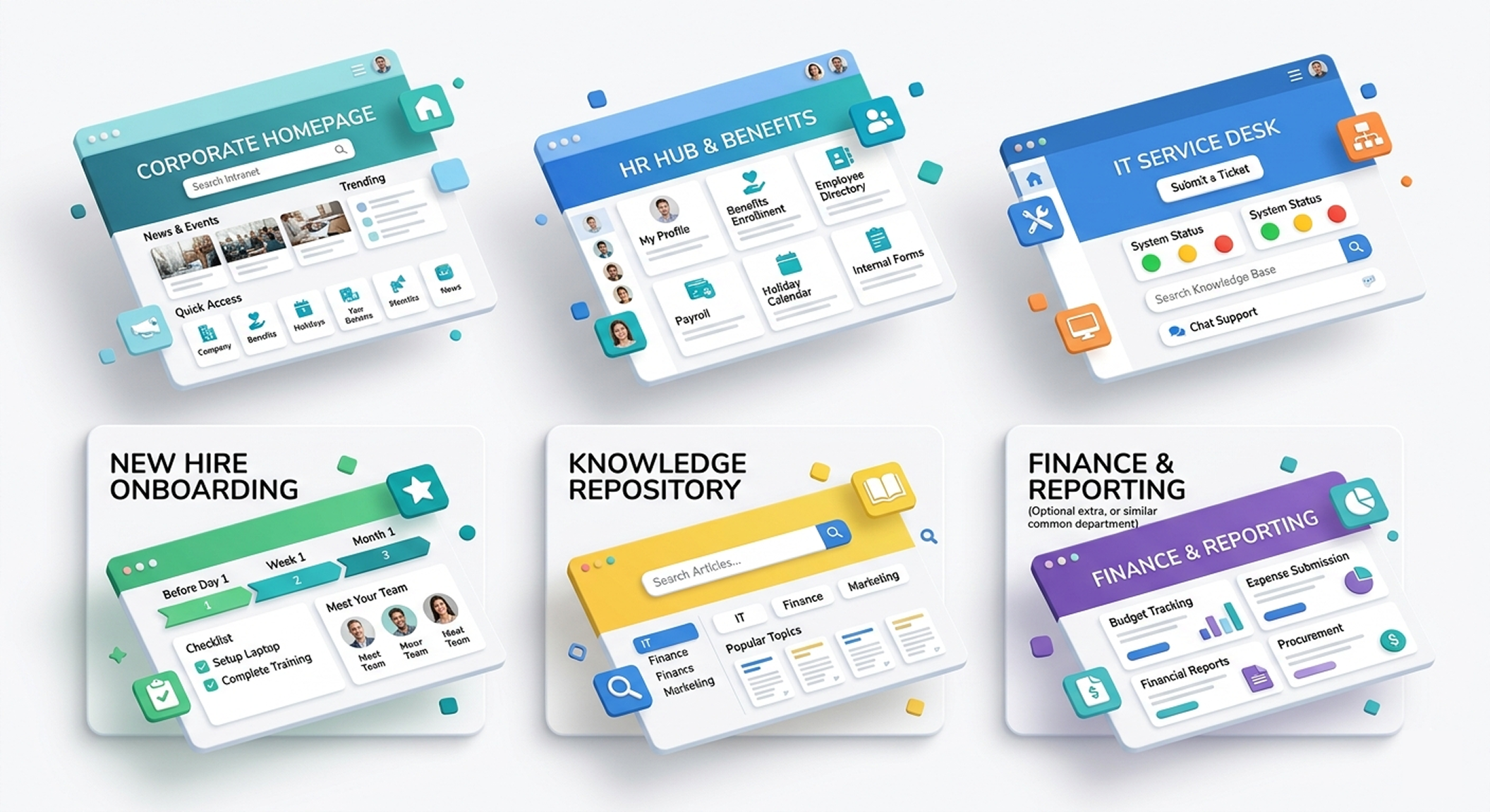
Step 9: Use Templates to Stay Consistent (This Is What Real Teams Do)
Here’s a reality check.
Most successful SharePoint websites are not custom-designed page by page.
They use:
- Homepage templates
- Department site templates
- HR and IT portal templates
- Knowledge base templates
- Onboarding templates
Templates don’t limit creativity.
They prevent inconsistency.
And consistency is what makes SharePoint feel like a professional website.
Step 10: Use Custom CSS or Fonts (Advanced)
If you have a developer or SPFx capability, you can elevate your site with:
- Custom fonts
- Animated sections
- Card layouts
- Interactive buttons and visuals
Note: Keep branding accessible and performance-friendly.
Conclusion: When SharePoint Is Designed Right, It Just Works
SharePoint doesn’t need to be “fixed” to feel like a real website.
It needs to be designed with intent.
The examples above show a clear pattern. When teams focus on structure over clutter, navigation over noise, and consistency over one-off pages, SharePoint stops feeling like a content dump and starts feeling like a digital front door employees actually trust.
What makes the biggest difference isn’t custom code or heavy development. It’s using the right site type, fixing the homepage first, applying website-style navigation, and reusing proven layouts. That’s how real teams turn SharePoint into something people open every day without being told to.


.svg)