Tech Ideas & Best Practices
Deploying a SharePoint page template to one site is easy. Deploying it to 85 sites is a different story entirely. The traditional route (PowerShell, PnP cmdlets, and one manual connection per site) is slow, error prone, and needs a developer on hand every single time. Template Deployer replaces that whole process with an experience that runs in the browser, natively inside SharePoint.
This guide covers everything: what Template Deployer is, the problem it solves, what you need before you start, and a full step by step walkthrough of deploying templates, tracking history, handling filename conflicts, and removing templates, clearly and without jargon.
Quick Summary : Template Deployer is a free SharePoint Framework (SPFx) web part. Add it to a page, pick your templates on the left and your target sites on the right, and click Deploy. It pushes templates to any number of sites at once, shows live progress, warns you before overwriting existing files, and logs every deployment automatically. No PowerShell, no scripts, no app registration, and you can remove a template from one site or many with a single click.
What is Template Deployer?
Template Deployer is a SharePoint Framework web part that runs natively inside SharePoint and turns the entire painful process of deploying to many sites into a few simple steps inside a browser. No PowerShell. No script. No terminal. No developer is required. You just opened a SharePoint page, and you are already there.
Because it is an SPFx solution, it picks up the authentication of whoever is signed automatically. There is no OAuth setup, no app registration to configure, and nothing to install on the client side. The moment the page loads, the tool is ready to be used.
The Problem It Solves
You spend hours building the perfect SharePoint page template: clean layout, the right web parts, properly branded, exactly how leadership wanted it. Everyone signs off. And then someone walks up to your desk and says:
“Can you push this to all 85 sites?”
And you sit there, knowing exactly what that means: PowerShell. Connect-PnPOnline. Get-PnPSiteTemplate. Invoke-PnPSiteTemplate. Site by site. For 85 sites. Manually. One at a time. Here is what that looks like every single time:
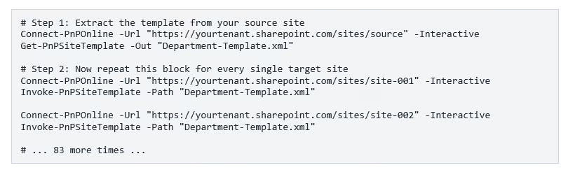
What makes this painful: You get no progress visibility at all. Filename conflicts either crash the script or silently overwrite your existing file. There is no audit trail, no rollback option, and you need PowerShell access plus a developer available every single time someone wants a template pushed.
That is not a workflow. That is a punishment. Every SharePoint admin has been there at least once, so we decided to fix it.
The Old Way vs. The Template Deployer Way
Before and after, side by side:
Before You Start: What You Need
- The Template Deployer web part added to a SharePoint page in your tenant (a single page is all you need, and it works from there for every site).
- Permissions to deploy across your target sites, typically a SharePoint administrator or an account with access to the sites you intend to deploy to.
- One or more-page templates saved in the source site's Site Pages / Templates folder, which is where Template Deployer reads your available templates from.
- A modern SharePoint site (Team site or Communication site). Modern pages and templates are not available on classic sites.
- A standard Microsoft 365 plan. No additional licence, PnP module, or PowerShell environment is required.
How to Deploy Templates with Template Deployer: Step by Step
Step 1: Open Template Deployer
When you first open Template Deployer, the Deploy Templates tab greets you. The web part has already done a lot of work before you click on anything. It has loaded your template source site, identified the Site Pages / Templates folder, and counted how many templates are available.
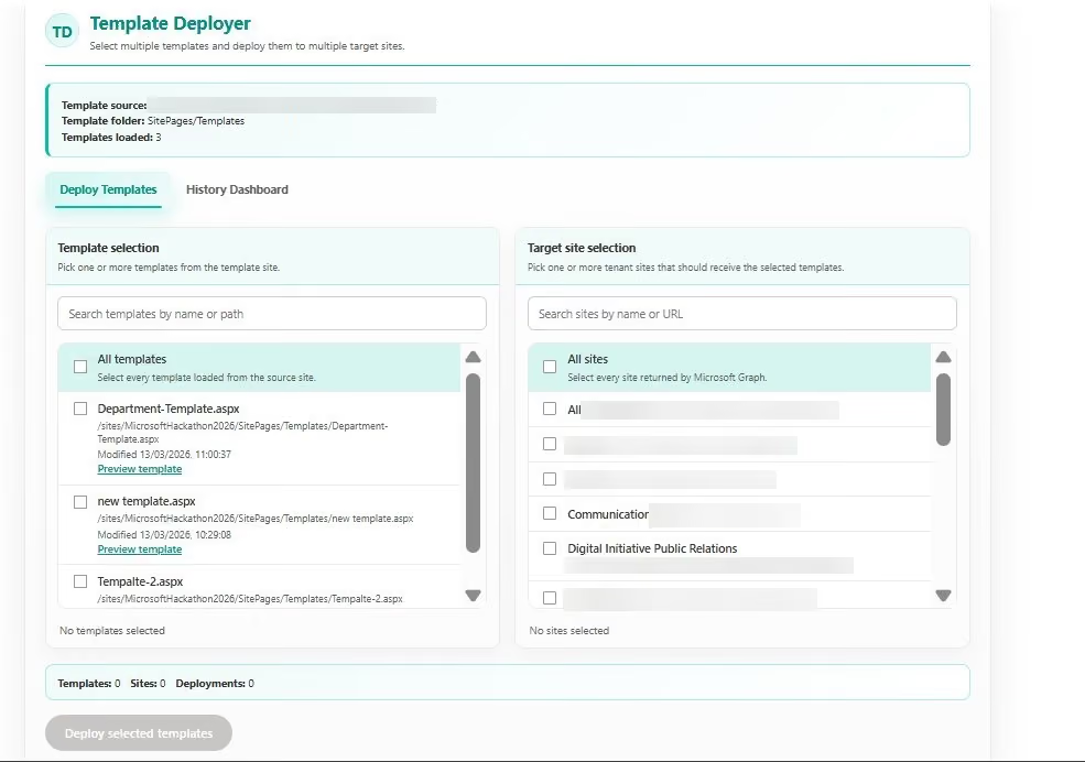
Left panel, Template Selection. Every template in the Site Pages / Templates folder shows up as a card with its filename, full path, and the time it was last modified. You can search by name or path, and each card has a “Preview template” link, so you can see exactly what the page looks like before you commit to deploying it anywhere.
Right panel, Target Site Selection. This pulls from Microsoft Graph in real time, so every SharePoint site in your tenant is listed. Search by site name or URL or tick the “All sites” checkbox at the top to select the entire tenant in one move.
Footer counter. A bar at the bottom keeps a running count of your selection: Templates, Sites, and Deployments. It starts at zero and updates the moment you begin selecting. The Deployments number is the one to watch, because it tells you the exact total number of operations about to run.
Step 2: Pick your templates and target sites
Here is what it looks like once you have made your selections. In this case, we have ticked Department-Template.aspx on the left and chosen testapp1 as the target site on the right. The footer has updated straight away to show Templates: 1, Sites: 1, Deployments: 1.
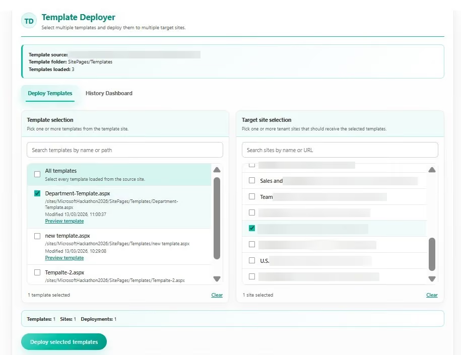
That footer number is really useful at scale. If you were deploying two templates across 85 sites, it would show 170 deployments before you clicked a single thing, with no guessing and no mental arithmetic. You can see the full scope of what you are about to do and confirm it is right before you pull the trigger.
Pro tip: Always glance at the Deployments count before deploying. It is the fastest sanity check that your template and site totals match what you actually intend.
When you are happy with your selection, the Deploy selected templates button at the bottom comes to life. Click on it and the deployment begins.
Step 3: Deploy and watch it happen live
The moment you click Deploy; the screen shifts into a live progress view where you can actually watch the work happening. Each site moves through its states in real time, going from pending to deploying to done right in front of you.
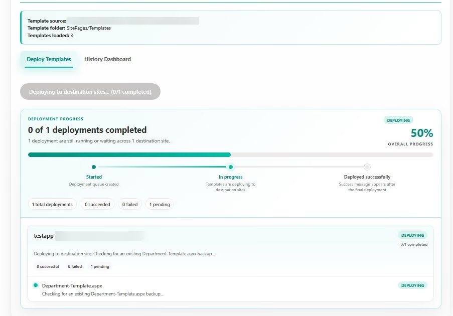
The progress screen lays out a pipeline with three stages, so you always know where things are:
- Started means the deployment queue has been created, and things are moving.
- In progress, means templates are actively being copied to the destination sites right now.
- Deployed successfully means every destination site has finished cleanly.
Under the hood: There is a 400 ms gap between each operation, plus automatic retry logic with exponential backoff for 429 throttle responses. This matters when you are hitting 85 sites. Template Deployer paces itself thoughtfully and recovers automatically if it hits a rate limit, rather than firing requests as fast as it can and hoping the API keeps up.
Each destination site also has its own status card showing how many of its assigned templates are complete. So, if you are deploying to ten sites and nine are done but one is still running, you can see exactly which one it is and how far along it is.
Step 4: Resolve any filename conflicts
This feature might save you the most grief. When a file with the same name already exists on one of the target sites, most approaches handle it badly. Scripts crash, or worse, silently overwrite your existing file. You only find out when users start asking why their page looks different.
Template Deployer catches the conflict before the copy even starts. As soon as it detects a filename that already exists on a destination site, it pauses the deployment and shows you a dialog so you can decide what to do.
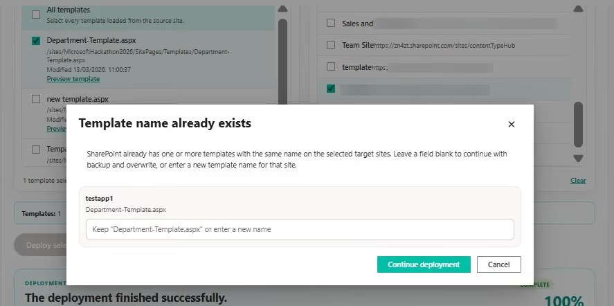
How does the rename work?
Leave the input field blank, and Template Deployer backs up the existing file before overwriting it with your new version. Or type a new filename, and your incoming template is deployed under that name instead, leaving the original completely untouched. Either way, nothing gets overwritten without you actively choosing it.
Once you have made your choice for each conflict, click Continue deployment and everything picks up right where it left off. It is a small dialog, but it represents a genuinely meaningful difference in how carefully this tool treats your content compared to a script that just barrels through.
Step 5: Confirm the finished result
When every site has finished, the progress screen settles into its final state and shows COMPLETE at the top right. The summary line confirms the totals: how many succeeded, how many failed, and how many are still pending. In a clean run, you want to see everything in the succeeded column.
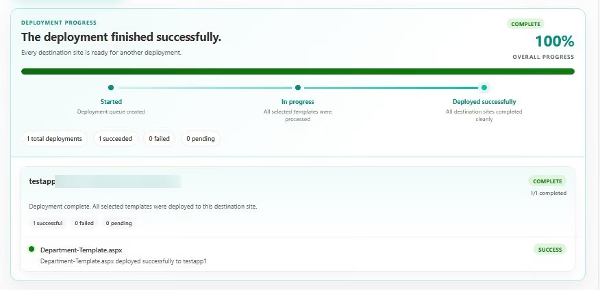
You do not have to take the tool word for it either. Click any site in the deployment results, and you can view the template live on that site in context, exactly as your users will see it when they open their page picker, the final confirmation you actually need. And if anything does go wrong, the result log shows the exact error message for every site that did not complete. Nothing is hidden.
Step 6: Review your full deployment history
Switch to the History Dashboard tab and you have a complete, searchable record of everything ever deployed through Template Deployer: every operation, every result, and every person who ran it.
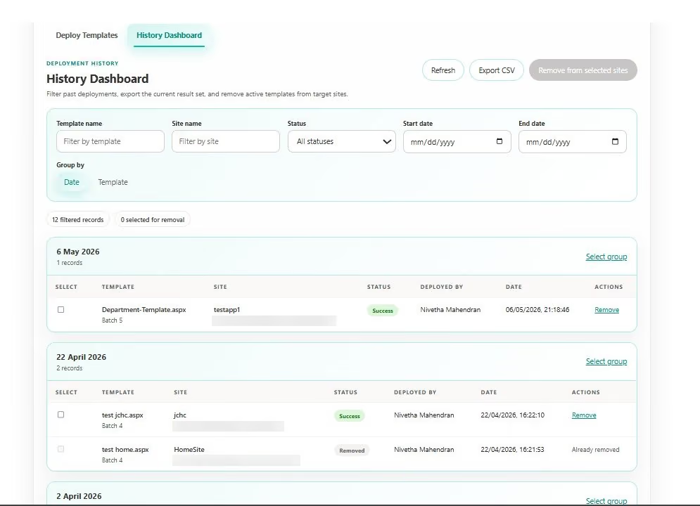
Every deployment is logged here automatically, so you always have a record to refer to. From this view you can filter by template name, site name, status, and date range. Group results by date for a chronological picture, or by template to see everything that happened to a specific template across all its deployments. When you need to share a report or hand out something off for an audit, the Export CSV button downloads the current filtered result set.
Step 7: Filter and group your history
Say you want the full story for Department-Template.aspx specifically. Type “department” into the Template Name filter and the list immediately trims to only the matching records. In this case it found seven records spread across different batches and dates.
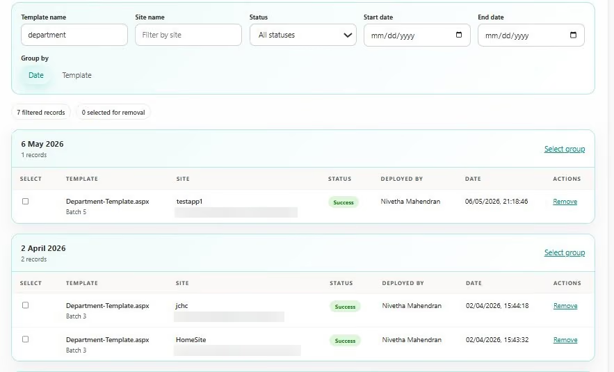
Now flip the Group by control from Date to Template, and the whole view reorganizes. Instead of date order, you see every site that Department-Template.aspx has ever been deployed to, all grouped together in one place.
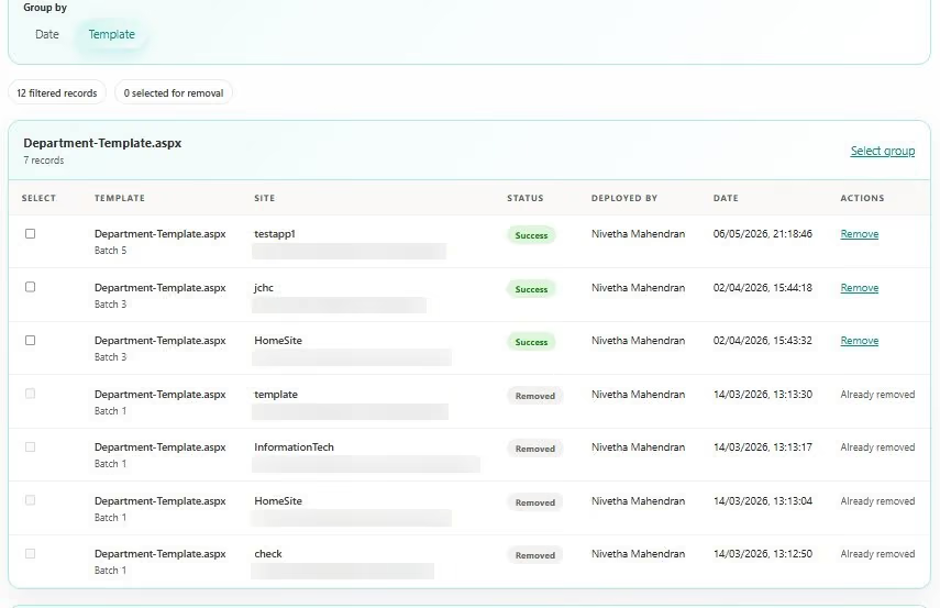
This grouped view is helpful when you need to understand the reach of a specific template. At a glance you can see which sites currently it have active, which sites have had it removed, who deployed each batch, and when, giving you the full picture without piecing it together from separate date groups.
Step 8: Remove a template from a site
When you need to take a template back off a site, you do not need a script or manual digging through SharePoint. Find the record in the History Dashboard and click the Remove link next to it. Before anything happens, Template Deployer shows a confirmation dialog.
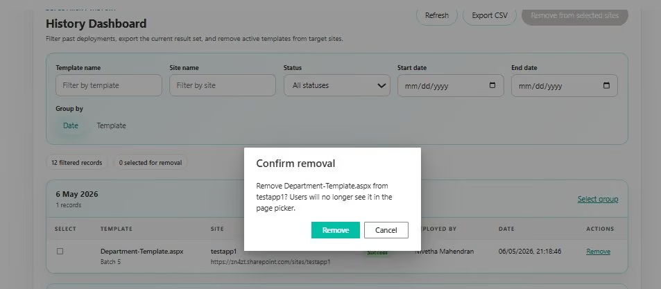
The dialog tells you exactly what will happen and gives you a chance to back out if you clicked Remove by mistake. Once you confirm, Template Deployer sends a REST API call to SharePoint and deletes the template page from the target site. While that happens, the button changes to read “Removing…” so you always know the request is still in flight and not to close anything.
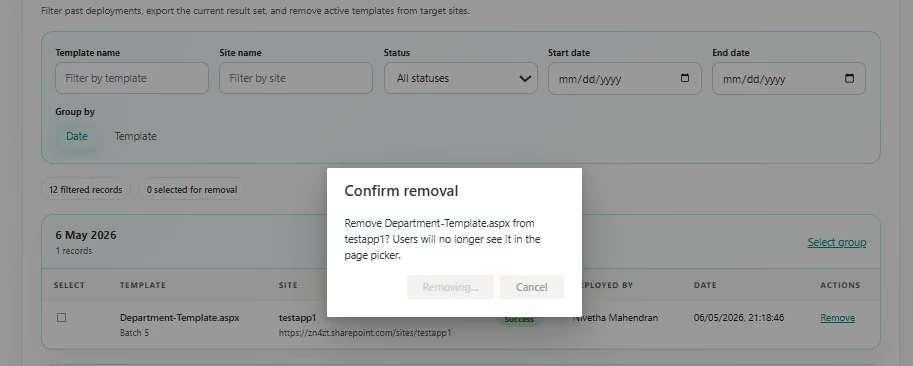

Once removal finishes, the history record updates on its own. The status column flips to Removed, and the Actions column shows “Already removed” going forward. This is not just a visual change; it is a permanent log entry recording that the template was intentionally removed from that site, not simply never deployed there.
Step 9: Remove templates from multiple sites at once
If you need to remove a template from several sites at the same time, you do not have to do them one by one. Tick the checkboxes next to the records you want to clear in the History Dashboard, and the “Remove from selected sites” button at the top of the page activates.
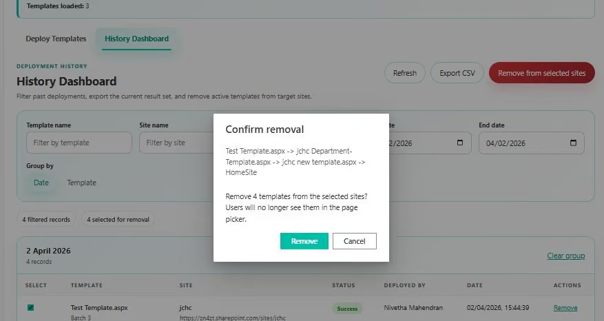
Clicking that button brings up a single confirmation dialog listing every template and every site involved in the bulk removal. You get to read through the full scope of what is about to happen before you confirm anything. Once you are satisfied, one click takes care of all of them together, and the log updates every record in the batch at the same time.
Template Deployer briefly
The capabilities you will reach for most often when rolling templates out across a tenant:
Template Deployer Best Practices
Before you deploy
- Preview first. Use the “Preview template” link on each card to confirm you are pushing the right page before you commit.
- Check the Deployments counter. Confirm the total operations match your intent, especially when combining multiple templates with many sites.
- Start narrow. For a new template, deploy one or two test sites first and verify the result before rolling out to the whole tenant.
During and after deployment
- Resolve conflicts deliberately. When the duplicate name dialog appears, choose to rename to preserve an existing page, or blank to back it up and overwrite. Do not click through on autopilot.
- Confirm live. Click through to a deployed site from the results view to see the template exactly as users will in their page picker.
- Read the error log. If any site fails, the result log names it and shows the exact error, so you can fix and run again only the affected sites.
Governance and audit
- Use history for accountability. Filter by template or site to answer, “where is this template live?” and “who deployed it?” in seconds.
- Export for audits. Use Export CSV on a filtered view when you need to hand out a record to compliance or leadership.
- Remove, don't orphan. When a template is retired, remove it through the dashboard, so the log captures the intentional removal rather than leaving stale pages behind.
Rolling templates out across a large tenant and want it done, right? SharePoint Designs can help you plan, brand, and deploy at scale.
Need Expert SharePoint Help?
SharePoint Designs is a Microsoft partner specialising in SharePoint Online intranet design, development, and deployment. Whether you need a fully branded intranet built from scratch, page templates designed to your brand, or tooling like Template Deployer rolled out across your organization, our team can help you get more out of Microsoft 365.
Book a Free Consultation here
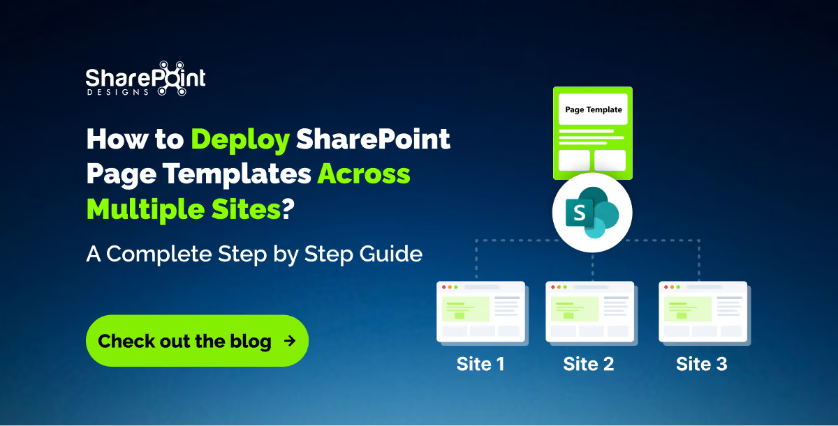
How to Deploy SharePoint Page Templates Across Multiple Sites: A Complete Step by Step Guide
Deploy SharePoint templates across multiple sites in minutes. Learn how Template Deployer simplifies bulk deployment, tracking, conflicts, and removal.

Is your SharePoint intranet usable for everyone?
For a growing number of employees, the honest answer is NO. Low-contrast text, unlabelled buttons, keyboard traps, inaccessible PDFs, and videos without captions quietly lock out colleagues with visual, motor, auditory, or cognitive disabilities. Most organizations don’t realize there’s a problem until an employee struggle in silence, raises a support ticket, or files an accessibility complaint.
Picture a new employee trying to complete mandatory onboarding using only a keyboard. They tab through the page, reach a button that never receives keyboard focus, and can’t continue. What should have taken five minutes now requires emailing HR for help. Multiply that across dozens of employees, and accessibility becomes a productivity problem, not just a compliance issue.
Accessibility isn’t a compliance checkbox you add before launch. It’s an ongoing design discipline that also makes your SharePoint intranet faster, clearer, easier to search, and simpler for everyone to use.
What is SharePoint intranet accessibility?
SharePoint intranet accessibility is the practice of designing, building, and maintaining SharePoint sites so employees with disabilities, including visual, auditory, motor, and cognitive impairments, can perceive, navigate, and interact with all content using assistive technologies such as screen readers, keyboard-only navigation, voice control, and screen magnification. Most organizations aim to meet WCAG 2.1 Level AA, the accessibility standard referenced by major regulations including the ADA in the United States and the European Accessibility Act (EAA).
Why does accessibility matters beyond compliance?
Many organizations treat accessibility as a legal requirement.
The organizations with the best employee experience treat it as a usability improvement.
An accessible SharePoint intranet can:
• Reduce HR and IT support requests
• Improve employee productivity
• Speed up onboarding
• Improve SharePoint search results through better content structure
• Help employees working on mobile devices
• Benefit non-native English speakers through captions and plain language
• Improve usability for every employee, not just those using assistive technology
Accessibility doesn’t necessarily mean designing for a small percentage of employees. It’s about removing unnecessary friction for everyone.
Why do most SharePoint intranets fail accessibility?
Microsoft has done a solid job making modern SharePoint pages accessible out of the box.
The problems usually begin after launch.
Content owners:
• upload scanned PDFs instead of searchable documents
• forget to add alt text
• create pages with multiple H1 headings
• embed videos without captions
• use vague links like “Click Here”
• choose low-contrast brand colors
• install third-party web parts that aren’t keyboard accessible
Accessibility slowly erodes one page, one document, and one news article at a time.
Common SharePoint accessibility mistakes
These issues appear in accessibility audits again and again.
Understanding the four WCAG accessibility principles (POUR)
Every accessibility recommendation ultimately supports one of these four principles.
Perceivable
Employees must be able to perceive information regardless of sensory ability.
Examples include:
• image alt text
• captions
• transcripts
• sufficient color contrast
Operable
Every function should work without a mouse.
Employees should be able to navigate every page using only:
• Tab
• Shift + Tab
• Enter
• Space
Understandable
Navigation should be predictable.
Content should use:
• plain language
• descriptive headings
• consistent navigation
• meaningful links
Robust
Content should work across:
• NVDA
• JAWS
• VoiceOver
• Narrator
• future browsers and assistive technologies
SharePoint features that improve accessibility
Many organizations overlook built-in Microsoft accessibility features.
Some of the most useful include:
• Accessibility Checker for Microsoft 365 documents
• Immersive Reader
• Live captions in Microsoft Stream
• Accessibility Insights for testing
• Microsoft Editor for plain language suggestions
• Keyboard shortcuts throughout Microsoft 365
Using these tools catches many accessibility problems before content is published.
Don’t forget document accessibility
One of the biggest accessibility blind spots isn’t SharePoint pages.
It’s documents.
Employees spend much of their day opening:
• Word files
• Excel spreadsheets
• PowerPoint presentations
• PDFs
If those documents aren’t accessible, the intranet isn’t accessible.
Common document problems include:
• scanned PDFs
• missing heading styles
• tables without headers
• images without alt text
• poor reading order
Treat every uploaded document like another web page.
SharePoint Accessibility Checklist
Visual
- Text meets 4.5:1 contrast ratio
- Font sizes remain readable when zoomed
- Information isn’t communicated through color alone
Images
- Every meaningful image has alt text
- Decorative images use empty alt text
- Charts include text summaries
Video
- Closed captions
- Transcript
- No autoplay with sound
Navigation
- Keyboard accessibl
- Logical heading order
- Descriptive links
- Skip-to-content available
- Visible keyboard focus
Documents
- Tagged PDFs
- Accessible Word documents
- Accessible PowerPoint
- Accessible Excel tables
Governance
- Accessibility owner assigned
- Quarterly review
- Accessibility included in publishing workflow
- Screen reader testing completed
How to test SharePoint accessibility
Automated tools are useful, but they don’t find everything.
A simple manual test takes less than five minutes.
Try this:
- Put your mouse aside.
- Press Tab repeatedly.
- Can you reach every link?
- Can you always tell where keyboard focus is?
- Can every button be activated?
- Can you return to the top using Skip to Content?
Then repeat the test using a free screen reader like NVDA.
You’ll quickly discover issues that automated tools miss.
Five accessibility improvements you can make today
If you’re short on time, start here.
- Add alt text to homepage images.
- Replace every “Click Here” link.
- Caption your latest training video.
- Replace scanned PDFs.
- Test your homepage without touching your mouse.
These five changes alone dramatically improve usability.
Accessibility governance: make it part of publishing
Accessibility shouldn’t depend on one SharePoint administrator.
Before publishing any page, ask:
• Does every image have alt text?
• Are headings logical?
• Are links descriptive?
• Are captions available?
• Has someone tested keyboard navigation?
Adding these checks to your publishing workflow prevents accessibility debt from building over time.
Common accessibility myths
“None of our employees use screen readers.”
You probably don’t know who does.
Many disabilities are invisible, and many employees won’t disclose them.
“Accessibility only helps disabled employees.”
Captions help people watching videos in open offices.
Keyboard navigation helps power users.
Plain language helps everyone.
“We’ll fix accessibility later.”
Accessibility is much cheaper to build into everyday publishing than to redesign hundreds of pages later.
Conclusion
The best SharePoint intranets don't advertise that they're accessible.
Employees simply find what they need, complete tasks without barriers,and move on with their day. That’s the real goal.
Accessibility is all about creating an intranet that works for every employee, every day.
.avif)
How to Make Your SharePoint Intranet Accessible: A Practical Guide and Checklist
Make your SharePoint intranet accessible to everyone with practical WCAG best practices. Explore common accessibility mistakes, testing tips, and a complete checklist to improve usability.

“We’ll Just Use AI to Build Our Intranet.”
A sentence we’ve been hearing in almost every second demo.
A few years ago, the objection was: “We’ll build it ourselves.”
Today, it has changed to: “We’ll just ask ChatGPT or Claude to create our SharePoint intranet.”
Honestly, we understand why.
AI is incredibly good at generating layouts, writing content, suggesting navigation, and even creating SharePoint page structures. It can produce something that looks impressive in minutes.
But after delivering hundreds of SharePoint projects, we’ve learned one thing: looking like an intranet and functioning like an intranet are two completely different things.
The Hidden Problem with AI-Generated Intranets
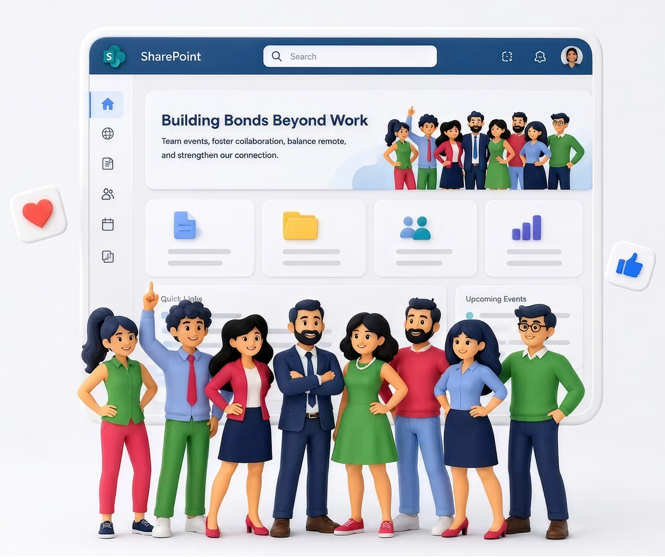
Most AI tools start with a prompt: “Create a modern HR intranet.” Within seconds, you receive a homepage, a news section, an employee directory, quick links, a hero banner, and department pages. Everything looks polished.
The problem?
It looks exactly like thousands of other intranets.
Your organization isn’t generic. Your employees aren’t generic. Your processes certainly aren’t generic. An intranet should reflect how your business actually works, not how an AI assumes businesses work.
AI Doesn’t Know Your Organization
AI has never attended your leadership meetings.
It doesn’t know
- how employees search for information,
- which departments rarely collaborate,
- which documents are most frequently requested,
- why employees ignore your current intranet,
- which approval processes create bottlenecks,
- how new hires actually onboard,
- what executives want employees to see first.
Without understanding these realities, AI makes assumptions. Great intranets are built on discovery, while AI builds on probability, and those are very different things.
It Designs Pages, Not Employee Experiences
Many AI-generated intranets look beautiful, until employees start using them.
Then the questions begin:
- Where do I find HR forms?
- Why are there three different document libraries?
- Why is search returning outdated files?
- Why is onboarding scattered across multiple pages?
- Why is nobody using this?
Aesthetics doesn’t measure a successful intranet; adoption does. If employees stop using it after two weeks, the design has already failed.
AI Doesn’t Challenge Bad Decisions
One of the most valuable things consultants do isn’t building; it’s asking uncomfortable questions. Questions like:
- Do employees actually need this page?
- Why are there six approval levels?
- Should this content even exist?
- Who owns this information after launch?
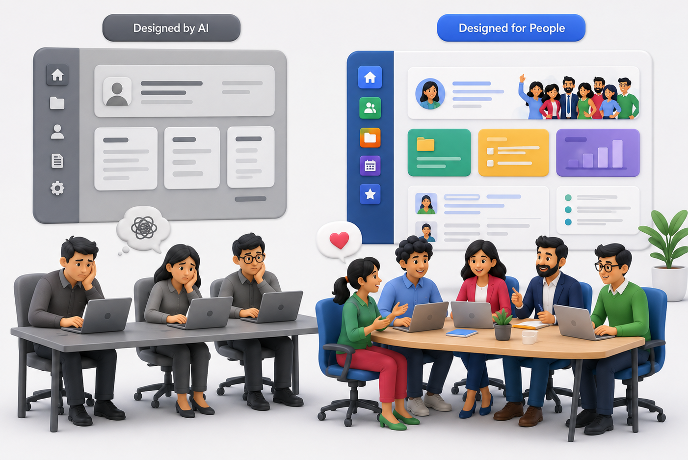
AI rarely pushes back; it simply executes your prompt. Human experts question assumptions before they become expensive mistakes.
Every Company Has Hidden Complexity
During discovery sessions, we often uncover things clients didn’t initially mention, like departments using different naming conventions, duplicate document repositories, outdated policies still being referenced, teams relying on personal OneDrive folders, or manual approval workflows that nobody enjoys. None of these appear in a prompt, yet they determine whether an intranet succeeds or fails.
AI Doesn’t Think About Governance
A homepage is only a tiny part of an intranet. Behind every successful SharePoint deployment are decisions like permission strategy, information architecture, metadata planning, search optimization, content lifecycle, governance policies, site ownership, and long-term maintenance.
These aren’t glamorous, but they’re exactly what keep an intranet useful years after launch. Ignoring them creates technical debt that becomes harder and more expensive to fix over time.
The Biggest Risk: False Confidence
Perhaps the biggest downside isn’t poor design; it’s believing the intranet is “done” because it looks complete. Modern AI produces convincing outputs, and it creates confidence before validation. Many organizations launch an AI-generated intranet only to realize months later that employees aren’t adopting it. By then, redesigning becomes significantly more expensive.
A Story We’ll Never Forget
A few months ago, we met with a prospective client. After our discovery session, they thanked us and said something we’ve been hearing more often:
“We’ll use AI to build this internally.”
Fair enough. They had talented people, they had Microsoft 365, and they believed AI would help them create everything they needed.
Several months passed, then they reached out again.
Not because SharePoint had failed. Not because AI had failed. Because the intranet wasn’t working for their employees. They had pages, navigation, and attractive layouts, but they didn’t have adoption.
Employees couldn’t find information, departments had inconsistent structures, content ownership wasn’t clear, search wasn’t delivering the right results, and nobody felt responsible for maintaining it.
The intranet looked finished, but the employee experience wasn’t. This time, instead of asking us to build pages, they asked us to redesign the entire experience. We started where we always do: understanding people before technology.
We interviewed stakeholders, mapped user journeys, simplified navigation, and reorganized content. We created governance, defined ownership, optimized search, and removed unnecessary pages. Only then did we begin redesigning.
The difference wasn’t that humans created prettier pages. The difference was that humans solved the right problems.
We Use AI Too
This isn't an article against AI.
In fact, we use AI every day.
It helps us generate ideas, speed up documentation, create content drafts, brainstorm layouts, and accelerate repetitive work.
AI makes our team faster. It doesn't replace discovery, strategy, or understanding your business.
The Best Intranets Are Built with AI and Human Expertise
Think of AI as an incredibly capable assistant, not as your intranet architect.
Architecture requires experience, and experience comes from solving real business problems across many organizations.
Technology changes, but employee behavior doesn't.
The organizations with the highest adoption rates aren't the ones using the newest AI tools; they're the ones that understand their people.
Before You Ask AI to Build Your Intranet…
Ask yourself a few questions:
- Does it understand how our employees work?
- Can it identify gaps in our business processes?
- Will it challenge our assumptions?
- Can it design governance for the next five years?
- Will it improve employee adoption, not just page design?
If the answer is "no," then AI should be part of the solution, not the entire solution.
Because the goal isn't to launch an intranet; it's to build one your employees actually use.
And that's where experience still matters.

AI vs. Human Expertise: What's the Best Way to Build a SharePoint Intranet?
Thinking of using ChatGPT or Claude to build your SharePoint intranet? Learn where AI adds value, where it falls short and why successful...

2.7 billion workers globally have no desk, no corporate email, and no reliable access to their company's intranet. Here's how to build a SharePoint intranet that actually reaches, engages, and empowers them.
- 2.7B workers globally are deskless - 80% of the world's workforce - Emergence Capital · Flip 2026
- 45% don't have access to their company intranet while at work - Tribe Communications Research
- $80B lost annually in US organizations from frontline communication failures - Dewpoint Communications 2026
- 80% lift in intranet traffic achievable with the right mobile-first SharePoint design - SharePoint Designs client data
Most enterprise intranets are built for one mental model: someone sitting at a desk, logged into a laptop, with time to read and browse. That model describes a minority of the global workforce.
The majority of your employees are on a factory floor, in a hospital ward, behind a retail counter, on a construction site, or behind the wheel of a delivery vehicle. They are the people who make your organization run, and in most companies, they are the last to receive important information, the least connected to company culture, and the most underserved by digital workplace tools.
This is not a peripheral problem. Frontline worker disengagement costs the global economy $8.9 trillion every year (Gallup). Communication failure drives higher turnover, slower adoption of change, and preventable safety incidents. And the evidence is unambiguous: organizations that close the frontline communication gap outperform those that don't across every measured dimension.
SharePoint, properly designed and deployed, can close that gap. This guide shows you exactly how.
Why Most Intranets Fail Frontline Workers
The failure mode is consistent across industries. An organization invests in a SharePoint intranet. IT signs off, leadership announces it, and within six months, usage is stagnant or declining. The reason is almost never the technology. It's the assumption that underlies the design.
Traditional intranet design assumes a corporate email address, a company-issued laptop, a fixed working location, reliable Wi-Fi, and time to browse. Frontline workers have none of these things as standard.
83% of frontline workers say they miss important information because it isn't communicated in a way they can access not because the information doesn't exist, but because the channel doesn't fit their working reality. Workplace Intelligence Research - Tribe Communications
The five design assumptions that exclude frontline workers
- Desktop-first layout - pages that shrink on mobile rather than reflow for it, with tiny tap targets and horizontal scrolling
- Corporate email as the access method - 83% of non-desk employees don't have a corporate email address (Tribe), which means standard SharePoint login flows exclude them before they start
- Wi-Fi dependency - intranets that load slowly on cellular data or don't support offline access are functionally inaccessible to workers on the floor, in transit, or in remote locations.
- Generic content broadcast - all staff announcements not filtered by role, location, or shift are ignored; irrelevant information is the fastest way to train employees to stop checking the intranet.
- IT as gatekeeper - when frontline workers need a helpdesk ticket to reset a password or access a page, they stop trying within days.
The Hidden Cost: The average frontline employee takes more than 8 hours to open a work message. A safety alert sent at the start of a shift will likely go unread until the shift ends. This is not a behaviour problem. It is a channel-fit problem. (Pickcel Deskless Communication Report 2026)
The Deskless Communication Gap - By the Numbers
- 80% of the world's workforce is deskless or frontline - Emergence Capital
- 4% of deskless workers feel strongly connected to their company - SemosCloud
- 68% would stay longer with employers who provide reliable mobile communication - WorkerPulse 2025
The numbers reveal a structural failure, not an engagement challenge. Most deskless worker communication strategies are not failing because employees are disengaged. They're failing because the tools in use were built for a different kind of worker entirely.
Email open rates for frontline workers are 23%compared to 41% for desk workers (Pickcel 2026). Organizations that rely on email as their primary frontline channel miss 77% of their audience with every message.
"Frontline workers are not a hard-to-reach population. They are a differently-connected one." - Pickcel Deskless Worker Communication Strategy 2026
Can SharePoint Work for Frontline Workers?
The honest answer is: yes, but only with intentional design. Out of the box, SharePoint's mobile experience has historically been one of the platform's weakest points. But that picture has changed significantly with the maturation of Microsoft Viva Connections, the Microsoft Teams Frontline Worker license tiers (F1 and F3), and SharePoint's own responsive design improvements.
The SPD Perspective: SharePoint is not the best platform for every frontline use case out of the box. But for organizations already paying for Microsoft 365, it is the most cost-effective path to a capable frontline intranet if you invest in design and configuration rather than defaulting to the out-of-box experience.
Where SharePoint genuinely excels for frontline workers
- Microsoft 365 integration - employees who already use Teams, Shifts, and Outlook can access the intranet from within the tools they're already using, eliminating the 'another app to download' problem
- Role-based personalization - audience targeting means a warehouse operative sees shift updates while a plant supervisor sees safety dashboards.
- Power Automate workflows - self-service forms, incident reporting, leave requests, and compliance sign-offs that replace paper processes
- Viva Connections dashboard - adaptive cards purpose-built for frontline daily tasks, accessible via Teams mobile without a separate login
- Cost efficiency - SharePoint is included in most Microsoft 365 licenses that organizations already hold
Viva Connections: The Game-Changer for Frontline Access
If there is a single feature that has transformed SharePoint's viability for frontline workers in 2025–2026, it is Microsoft Viva Connections. It surfaces the SharePoint intranet directly inside Microsoft Teams, delivering a curated dashboard of information and tasks most relevant to that specific worker, based on their role, location, and shift.
40–60% mobile adoption within 90 days is achievable for organizations with 1,000+ frontline workers when the intranet solves real daily tasks not just corporate announcements.
What you can build on the Viva Connections dashboard
- Shift schedule cards - show the worker their current and upcoming shifts pulled from Teams Shifts
- Safety checklist cards - daily or shift-start safety sign-offs that are submitted to SharePoint lists, creating an auditable compliance record
- Incident reporting cards - one-tap incident or near-miss reporting routed to the right manager via Power Automate
- Targeted news cards - role and location-specific news items surfaced directly on the dashboard
- Training & compliance cards - outstanding training modules and policy acknowledgments with one-tap access
- Manager communication cards - short leadership video messages, shift notes, and two-way feedback forms
Designing a Mobile-First Frontline SharePoint Intranet
Mobile-first design for frontline workers is not about making the desktop site responsive. It's about starting the design process from a 375px phone screen and treating everything else as an enhancement.
The 5 core principles of frontline-first SharePoint design
The 3-tap rule over the 3-click rule
Frontline workers need to reach any piece of critical information within 3 taps on a phone screen. Design your information architecture with the mobile thumb journey, not the desktop click path.
Touch-first interactions
Tap targets should be a minimum of 44×44 pixels. Dropdown menus that require hover states break on touch devices. Navigation should favour large icon tiles over text-heavy menus.
Single-column vertical layouts only
Multi-column SharePoint page layouts become cluttered horizontal scrolling nightmares on mobile. Use single-column sections for critical content. Horizontal scrolling is a hard failure for frontline UX.
Cellular-Optimized performance
Frontline workers are not on corporate Wi-Fi. Pages must load in under 3 seconds on a 4G connection. Compress all images, minimize web part count, and avoid video autoplay.
Offline-first critical content
SOPs, safety procedures, and emergency contacts should be accessible when network connectivity is intermittent. Microsoft Teams mobile caches content locally leverage this for compliance-critical pages.
7 Must-Have Features for a Frontline SharePoint Intranet
Role-based personalized homepage
A warehouse operative and an HR manager should never see the same homepage. SharePoint's audience targeting capabilities allow different news items, quick links, and navigation elements based on department, location, or job title. Implementation tip: Use Azure Active Directory groups to define 5–10 manageable, maintainable audience segments.
Integrated shift scheduling via Teams Shifts
Shift visibility is the single most frequently cited practical need among frontline workers. A SharePoint intranet connected to Microsoft Teams Shifts gives employees a daily reason to open the platform without logging into a separate scheduling system.
Mobile-optimized knowledge base with search
The most common frontline use case after schedule checking is finding a procedure, policy, or how-to. A well-architected SharePoint knowledge base with clean metadata, structured categorization, and a prominent search bar means workers can find SOPs in seconds rather than hours.
Push notification strategy via Power Automate
Intranet traffic is not passive; it is driven by notifications that give workers a reason to open the platform. Power Automate flows can send targeted Teams notifications when relevant content is published. Critical principle: relevance over frequency; no more than 3–4 notifications per day.
R code entry points for physical environments
QR codes posted in break rooms, production line entrances, and locker areas provide instant no-friction access to the most critical intranet pages, safety procedures, emergency contacts, shift rotas, and incident reporting forms.
Two-way communication: surveys, polls, and feedback
Workers who can only receive information disengage from communication tools within weeks. The most successful frontline intranets include embedded Microsoft Forms pulse surveys, reaction buttons on news articles, and direct feedback channels. Workers who receive regular feedback are 50% more likely to understand what's expected of them (goHappy 2026).
Multilingual content delivery
In most large frontline operations, English is not the first language of a significant portion of the workforce. SharePoint's multilingual publishing capabilities, combined with Azure Translator API integration, ensure every worker receives content in their preferred language with no IT overhead for maintenance.
The Frontline SharePoint Intranet Implementation Blueprint
PHASE 1: FRONTLINE DISCOVERY (WEEKS 1–2)
- Conduct 10–15 structured interviews with frontline workers across different roles, locations, and shifts
- Map the 5 most common information needs for each major frontline role.
- Audit existing communication channels: what's actually reaching frontline workers, and what's not?
- Identify your 'anchor use cases': 3–5 functional needs the intranet will solve daily.
- Map connectivity constraints: Do workers have company devices? What's the typical mobile data speed?
PHASE 2: INFORMATION ARCHITECTURE (WEEK 3)
- Design navigation around tasks, not departments. Frontline workers think 'I need to report an incident', not 'I need the Health and Safety section under HR.
- Define 5–8 audience segments and the personalization rules for each.
- Map the Viva Connections dashboard cards for each frontline role.
- Establish content ownership: who updates each section, and what is the review cycle?
PHASE 3: BUILD & TEST (WEEKS 4–7)
- Build the homepage and Viva Connections dashboard first. This is what frontline workers will open every time.
- Test every page in the SharePoint mobile app and on a physical phone before rolling it out wider.
- Run a pilot with 20–30 frontline workers across different roles and sites before full launch.
- Test page load times on 4G/LTE pages must load in under 3 seconds.
PHASE 4: LAUNCH & ADOPTION (WEEKS 8–10)
- Deploy through Teams, not email; the intranet should appear as a tab in frontline workers' existing Teams environment.
- Activate your frontline champion network to demonstrate and advocate in each team before launch day.
- Use physical touchpoints: A4 QR code posters in break rooms, locker areas, and shift handover spaces.
- Establish 30-day, 60-day, and 90-day adoption milestones with named accountability.
Frontline SharePoint Intranet: What Works by Industry
Real-World Results: SharePoint Designs Client Stories
Compass Group Denmark
Food Services · 3,000 employees · 350 canteens across Denmark
THE CHALLENGE
Critical food safety SOPs scattered across folders, email threads, and local drives. Frontline kitchen and cleaning staff predominantly Danish-speaking receiving English-only documentation. No governance workflow and no way to prove staff had understood safety-critical procedures.
WHAT CHANGED
SharePoint Designs built a centralized bilingual (Danish/English) Knowledge Base on SharePoint Online with Danish-priority intelligent search, auto-generated comprehension assessments for food safety SOPs, and a formal author-to-approver governance workflow.
RESULTS
✓ Bilingual Danish-priority search - frontline staff find correct language version automatically
✓ 100% governed approval workflow on every document
✓ Full audit-ready comprehension trail for food safety compliance
✓ Single source of truth replacing scattered multi-system documentation
Read full case-study here
Daikin - Global Digital Workplace
HVAC Manufacturing · 160+ offices · 30+ countries
THE CHALLENGE
160+ offices across 30+ countries with no multilingual support, leaving non-English speaking frontline workers completely disengaged from company communications. Fragmented systems meant employees in different countries used different tools, with no single digital thread connecting the entire workforce.
WHAT CHANGED
SharePoint Designs built a unified global collaboration hub with Azure-powered translation across 8 languages, personalized welcome banners by region, a Power Automate subscription model for daily or weekly content digests, and role-based content surfacing for every country.
RESULTS
✓ 45% faster content discovery
✓ 60% increase in recurring engagement (email subscription model)
✓ 8-language Azure translation coverage
✓ 50% improvement in regional inclusivity
✓ 35% gain in content management efficiency
Read full case-study here
SharePoint vs. Dedicated Frontline Apps: The Honest Comparison
Platforms like Blink, Staffbase, and Flip are purpose-built for frontline workforces. Here is an honest assessment of where they outperform SharePoint out of the box and where SharePoint, properly implemented, closes the gap or wins.
The Verdict: For organizations deeply standardized on Microsoft 365, SharePoint + Viva Connections is the most cost-effective and functionally comprehensive frontline intranet platform available but only when designed by a team that understands frontline UX.
The Frontline Intranet Launch Checklist
Before you go live - tick every box
☐ Homepage loads in under 3 seconds on a 4G mobile connection
☐ All pages tested on the SharePoint mobile app (not just desktop browser)
☐ Viva Connections dashboard configured with at least 3 role-relevant cards per frontline segment
☐ Audience targeting active: each role segment sees personalized content
☐ Navigation uses action-oriented labels ('Report an incident', not 'H&S Forms')
☐ Search configured with bookmarks for 10 most-searched frontline terms
☐ All Power Automate flows tested end-to-end on mobile, including routing to correct approvers
☐ QR codes designed, printed, and posted in all physical access points
☐ Content owner assigned and review date set for every page
☐ Frontline champion network briefed and equipped with demo scripts
☐ Push notification strategy defined: no more than 3 per day per worker
☐ Multilingual content live for all languages present in the workforce
☐ 30-day adoption target set and measurement dashboard configured
☐ Feedback channel open: workers can submit suggestions from day one
Ready to build a frontline intranet that actually gets used?
SharePoint Designs has deployed frontline intranets for organizations across the manufacturing, healthcare, food services, and retail sectors. We bring the design expertise and frontline UX knowledge that turn SharePoint from a compliance checkbox into a tool employees open every day.
Book a free consultation
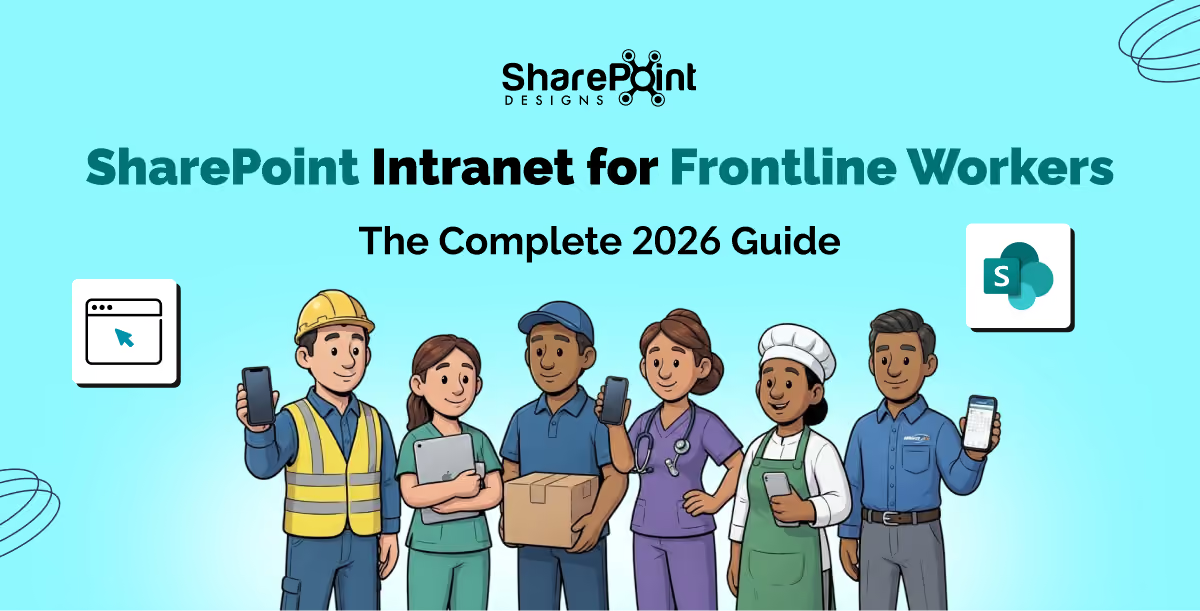
SharePoint Intranet for Frontline Workers: The Complete 2026 Guide
Build a SharePoint intranet for frontline workers with mobile-first UX, Viva Connections, Teams integration, offline access, and proven 2026 best practices.

Most organizations shopping for a SharePoint intranet ask the same first question: "Which product has the best features?"
That is the wrong question.
The right question is: "Do we need a product we configure ourselves, or a partner who builds and supports the solution for us?"
The answer to that question determines everything: your timeline, your total cost of ownership, your design quality ceiling, and critically, whether your employees actually use the intranet after it launches.
According to Social Edge Consulting, 91% of organizations run an intranet yet only 13% of employees use it daily, and nearly a third never log in. That is not a features problem. That is a fit problem. Organizations chose a platform built for administrators, not employees. Or they chose a product that looked great in a demo but couldn't be tailored to how their teams actually work.
This article breaks down the fundamental choice between an intranet-in-a-box product and a managed intranet design partner using real client outcomes, independently verified statistics, and an honest look at which approach delivers lasting employee adoption.
What is the Difference Between an Intranet Product and an Intranet Partner?
These terms get used interchangeably, but they describe fundamentally different relationships with your digital workplace.
Intranet Products
An intranet product is software you license and configure yourself. The vendor provides a set of pre-built components, web parts, templates, navigation structures, and your IT team installs and configures them within your Microsoft 365 tenant. The product has a fixed scope: what the web parts can do is what your intranet can do. Customization is limited to the configuration options the vendor has built in.
The advantages are real. Products are typically faster to get off the ground for organizations with capable IT teams and standard requirements. Origami Connect, for example, provides 40 pre-built SPFx web parts and installs directly into your Microsoft 365 tenant. A typical setup costs approximately $17,500 as a one-time perpetual license.
The constraint is the ceiling. Once you reach the boundary of what the product can configure, you are stuck. If your brand standards require something the template cannot produce, or your HR team needs a custom onboarding workflow, or you want Copilot Studio integrated into your search experience, a product cannot take you there.
Intranet Partners (e.g., SharePoint Designs)
An intranet partner is a firm that designs and delivers your intranet. Rather than selling you a license to configure, they take responsibility for the entire design and delivery from requirements and wireframes through to deployment, user training, and post-launch support.
SharePoint Designs operates this way. They offer two engagement models: pre-built intranet templates from $2,500 for organizations that need a fast, professional launch, and a fully custom bespoke design engagement at $50/hr for organizations that need a website-quality intranet built entirely to their specification.
The difference in outcomes lies in design quality, scalability, and the ability to build beyond standard intranet features into Power Platform workflows, AI agents, compliance systems, and custom web part development with no ceiling on what can be built.
Why do So Many Intranets Fail After Launch?
Understanding why intranets fail is essential before choosing how to build one. The statistics here are sobering.
- 91% of organizations run an intranet; only 13% of employees use it daily (Social Edge Consulting)
- Employees spend an average of 1.8 hours per day searching for information, often because the intranet does not surface what they need (McKinsey & Company)
- 54% of organizations manage documentation across five or more platforms (KM World Survey), meaning the intranet has failed to become the single source of truth
- Fortune 500 companies lose an estimated $31.5 billion per year through poor knowledge sharing (Bloomfire Research)
- According to Gallup's 2026 State of the Global Workplace, employees who find internal communication relevant to their work report higher engagement and retention. A platform that delivers the wrong content to the wrong people actively harms engagement.
The common thread across intranet failures is that the platform was chosen based on features in a demo, not on how the organization actually works. And it was configured by IT, not designed for employees.
A well-designed intranet built around actual user needs with clear navigation, brand alignment, personalization, and integrated workflows consistently outperforms a feature-complete product that employees have stopped checking.
What Makes a SharePoint Intranet Worth the Investment?
The ROI question matters. An intranet is not a quick tool you can swap out in six months; it is a core system your employees rely on every day.
Here is what genuinely drives return on investment from a SharePoint intranet:
Employee Adoption - The Only Metric That Matters Long-Term
An intranet nobody uses is not an asset. It is a liability. Every month of low adoption represents hours of lost productivity, continued reliance on email chains and disconnected file systems, and eroding trust in the platform.
Design quality is one of the strongest predictors of adoption. When an intranet looks and functions like a polished corporate website with branded visuals, logical navigation, personalized content, and fast search, employees engage. When it looks like a configured template that was not built for them, they do not.
This is where a managed design partner has a structural advantage over a self-serve product.
Integration With How Work Actually Happens
Most organizations do not just need an intranet homepage. They need the intranet to connect to the tools their teams actually use: approval workflows in Power Automate, compliance tracking for SOPs, document management with version control, HR onboarding checklists, dashboards in Power BI, and AI-powered search.
An intranet product provides what its web parts support. A design partner builds what your organization needs.
A Design That Scales as the Organization Evolves
Organizations change. Teams restructure, acquisitions happen, new compliance requirements emerge, and AI capabilities are now an expectation rather than a differentiator. An intranet that cannot evolve costs more to replace than it cost to build.
SharePoint Designs builds on Modern SharePoint from day one, the current, supported foundation within Microsoft 365, and extends it with Power Platform integrations, Copilot Studio, and AI agent development that can be added as the organization's needs grow. There is no ceiling on what can be built within the Microsoft ecosystem.
How Has SharePoint Designs Delivered This in Practice?
The following case studies are published on the SharePoint Designs website and represent verified client engagements across multiple industries.
Healthcare - London Women's Clinic Sees 80% Surge in Intranet Traffic
Industry: Healthcare | Clinics: 13 across England and Wales | Challenge: Deploy a branded intranet within one month
London Women's Clinic, established in 1985 on Harley Street, London, had previously engaged SharePoint Designs in 2022 to build a custom intranet but, due to internal circumstances, it was never launched. When they returned in late 2025, the requirement was clear: a ready-to-install SharePoint intranet template, deployed within one month, fully mobile-responsive, with custom web parts, and maintainable by a single intranet owner.
SharePoint Designs delivered a hybrid approach that combined template efficiency with custom flexibility. The solution included:
- Custom branding aligned to LWC's latest brand identity and dynamic theme.
- An interactive homepage featuring vision, mission, values, quick links, employee spotlights, and a message from the Managing Director
- An interactive facilities map web part, a custom build showing all 13 clinic locations with hover-detail functionality unique to LWC's requirement
- Reusable page templates for scalability as new clinics or departments are added.
- Full mobile responsiveness across desktop, tablet, and smartphone
Measured outcomes:
- 80% increase in intranet traffic following launch
- Significant improvement in internal navigation efficiency across 13 clinics
- Higher employee engagement and positive staff feedback on usability
- Reduced technical dependency through a single-admin management model
The intranet evolved from an information repository into a year-round engagement hub. (McKinnon & contributors, 2022)
Read the full case study here
Consumer Goods - Renewal by Andersen Achieves 80% Holiday Traffic Increase
Industry: Home Improvement | Company: Window replacement subsidiary of Andersen Corporation (110+ year legacy)
Renewal by Andersen needed a modern, vibrant, and visually distinctive design, including fully integrated festive seasonal branding for Halloween, Christmas, New Year, and Easter. The challenge was to design seasonal experiences that increased engagement without distracting from the core homepage content.
SharePoint Designs delivered a design-first engagement with custom layouts, branded icon sets and visual elements, an interactive homepage with quick links, news highlights, and event countdowns, animated custom web parts, a mobile-responsive experience, and reusable seasonal design templates that make future holiday updates fast and effortless. All original assets were created by the in-house design team specifically for RBA's intranet.
Measured outcomes:
- Holiday intranet traffic increased by 80%, driven by seasonal themes and interactive features.
- Employees praised the appealing, functional, and festive design.
- Navigation and usability improved across the organization.
- The intranet became a year-round engagement hub, strengthening employees' connection to the RBA brand. (Renewal by Andersen: Transforming Employee Engagement with a Modern SharePoint Intranet, 2025)
Food Services - Compass Group Denmark Centralizes Knowledge for 3,000 Employees Across 350 Canteens
Industry: Contract Food Services | Employees: 3,000 | Sites: 350 canteens | Operating brands: Food & Co, Eurest Facility Services, ESS
Compass Group Denmark faced a knowledge management crisis that reflects one of the most common and costly problems in distributed organizations. SOPs, food safety procedures, and compliance guides were scattered across disconnected systems, lacked bilingual support for the Danish-speaking frontline workforce, lacked governance workflows, and, most critically,lacked a way to verify that employees had actually understood what they read.
In a food safety environment, that last gap is not abstract. It is regulatory and operational risk.
SharePoint Designs delivered a centralized, bilingual Danish-English Knowledge Base on SharePoint Online, built specifically around Compass Group Denmark's operational structure.
The defining features of the solution:
Bilingual architecture that works structurally, not manually. When a food safety SOP is uploaded in English and a Danish translation is linked to it, the platform automatically surfaces the Danish version for Danish-speaking users without requiring any manual language selection. The language barrier was removed at the system level, not patched with a translation toggle.
Auto-generated document assessments. When uploading a compliance-critical document, authors can enable an assessment requirement. The platform automatically generates comprehension questions from the document content. The result: an auditable record confirming that a named employee at a named site read and understood a specific SOP on a specific date. No separate LMS. No manual question-writing. Full compliance audit trail.
Governed approval workflow. Every document passes through a structured author → approver → publish chain before reaching the workforce. No content reaches 3,000 employees without a named reviewer and a governance timestamp.
Advanced layered search with Danish-language prioritization baked into the algorithm, not a user preference, a system default. A kitchen team member searching for a food safety procedure finds the Danish-language version first.
This solution directly addressed the three industry-wide statistics that framed the challenge:
- Employees spend 1.8 hours/day searching for information (McKinsey)
- 54% of organizations manage documentation across five or more disconnected platforms (KM World)
- Fortune 500 companies lose $31.5 billion/year through poor knowledge sharing (Bloomfire)
Manufacturing - Kalsec Reduces Information Search Time by 40%, Navigation Time by 50%
Industry: Natural Food Ingredients | Location: Kalamazoo, Michigan, USA
Kalsec's out-of-the-box SharePoint intranet had four specific problems: low employee engagement, cluttered quick links with insufficient search, complex navigation producing a fragmented user experience, and no brand alignment or personalization.
These are the exact problems that plague self-configured SharePoint intranets not because of the platform, but because configuration-led implementation prioritizes what the tools can do over what employees actually need.
SharePoint Designs redesigned the intranet with:
- Smart quick links with search and categorization by relevance and department
- A personalized homepage with a dynamic welcome banner, improved search, and role-relevant content surfacing
- Simplified top navigation restructured around how employees actually move through the intranet.
- A modern, brand-aligned UI reflecting Kalsec's identity
Measured outcomes:
- ~40% reduction in time to find content, enabling quicker task completion across the organization
- Structured quick links reduced clutter and eliminated unnecessary navigation clicks.
- A modern interface measurably increased employee interaction and engagement.
- Simplified menus helped employees access key tools 2x faster.
Global Enterprise - Daikin Connects 160+ Offices Across 30+ Countries
Industry: HVAC Manufacturing | Scope: Global enterprise
When a global enterprise operates across 160+ offices on multiple continents, the intranet is not an internal website. It is the infrastructure of organizational culture and cross-border collaboration.
Daikin needed a solution that simplified collaboration, enhanced information accessibility, and built shared culture across geographically dispersed teams operating in vastly different contexts. SharePoint Designs delivered a modern SharePoint intranet that transformed fragmented regional systems into a unified global digital workplace connecting people, content, and communication across 30+ countries.
Fortune 500 - Johnson & Johnson Automates Work Order Management Across Markets
Industry: Healthcare | Employees: 130,000+ globally
Johnson & Johnson required an end-to-end Power Platform application to track and manage work orders and external consultants, replacing manual Excel-based processes that lacked real-time lifecycle tracking, consolidated reporting, and automated reminders for delays.
SharePoint Designs built a canvas Power App with data from multiple SharePoint lists, custom work order creation and assignment forms, a Power Automate flow for approvals and rejection notifications with automated delay reminders, and a Power BI performance dashboard filterable by timeframe and consultant.
Outcomes: Streamlined daily activities across markets and regions, significant time savings, reduced human error across the work order lifecycle, and automated approvals accessible from mobile via Teams and email.
When Should You Choose an Intranet Product Over a Partner?
Intellectual honesty matters here. Not every organization needs a managed design partner.
Organizations searching for an Origami Connect alternative are usually at the point where the product model has hit its ceiling either in design quality, Power Platform capability, or the need for a managed partner rather than a self-managed installation. If that describes your situation, the sections above and below set out exactly where the two approaches diverge.
That said, Origami Connect remains a strong product for specific use cases. Here is an honest breakdown:
An intranet-in-a-box product like Origami Connect is the right choice when:
- Your intranet requirements include standard news, navigation, people directory, quick links, and events, and you do not anticipate needing custom development.
- Your IT team is capable and willing to independently manage installation, configuration, and ongoing maintenance.
- You prefer a predictable one-time perpetual license cost (~$17,500) with no ongoing subscription or partner relationship.
- You need GCC or GCC High support for US federal or defense environments (where Origami Connect has a structural advantage)
- The speed of self-managed deployment is prioritized over design quality or the depth of customization.
A managed intranet partner like SharePoint Designs is the right choice when:
- Your brand standards are strict, and the intranet must match your corporate identity precisely.
- You need Power Platform integration: Power Apps, Power Automate, Power BI, Power Pages as part of the intranet, not bolted on separately.
- You want AI features: Copilot Studio, AI Agents, intelligent search, auto-generated compliance assessments.
- You need compliance-critical systems: SOP management with approval workflows, document management with version control, knowledge bases with audit trails.
- You do not want your team to manage configuration, troubleshooting, and ongoing maintenance.
- You want to start with a template at $2,500 and have a clear path to a fully custom intranet as your organization grows.
- You want 3 months of free post-launch design support without additional retainer costs.
Is SharePoint Designs the Right Origami Connect Alternative for Your Organization?
If you are actively evaluating SharePoint Designs as an Origami Connect alternative, the honest answer is: it depends on the gap you are trying to close.
Organizations typically start looking for an Origami Connect alternative for one of three reasons. First, they have reached the design ceiling: the intranet looks like a template and cannot be pushed any further to meet brand standards. Second, they need capabilities that fall outside Origami's web part scope, such as Power Platform workflows, Copilot Studio integration, compliance audit trails, or custom application development. Third, they want a partner relationship rather than a product relationship someone who is accountable for outcomes after launch, not just for providing a license.
SharePoint Designs addresses all three. As an Origami Connect alternative, it offers a lower entry point (templates from $2,500 vs. Origami's ~$17,500 one-time license), a higher design ceiling (fully custom, website-quality intranets built to exact brand specification), and a broader capability set (Power Platform, AI, Copilot Studio, and custom web part development with no ceiling). Crucially, it includes three months of free post-launch design support something no intranet product includes by default.
For a full side-by-side feature comparison across design, pricing, support, and AI capabilities, see the dedicated SharePoint Designs vs. Origami Connect comparison.
What is the True Cost of Getting the Intranet Decision Wrong?
This question deserves a direct answer because intranet projects that fail or underperform are not just a sunk cost. They create ongoing drag on the organization.
Every month of low adoption means:
- Employees continue to rely on email chains, shared drives, and word of mouth rather than a centralized system.
- HR teams manually field questions that an intranet policies section should answer
- New employees take longer to onboard because knowledge is fragmented.
- Compliance gaps accumulate because SOPs are not verified as having been read or understood.
- IT and internal comms teams spend time on maintenance rather than on value-adding work.
When these costs are annualized against the price of getting the intranet right from the beginning, the economics consistently favor investing in a partner who delivers a solution designed for adoption rather than a product configured to specification and then left in the hands of whoever has time to manage it.
How Do Review Platforms Rate SharePoint Designs vs. Intranet Products?
Review evidence is the most reliable signal of real-world experience. Here is what independent platforms show:
SharePoint Designs is rated 4.9/5 on Clutch and 4.5/5 on G2. Clutch recognizes them as a Top Microsoft ECM Company. Reviewers consistently highlight strong communication, ability to deliver tailored solutions, cost-effective pricing, and flexibility. Testimonials from Harvard University, Vanderbilt University, and Renewal by Andersen specifically call out the quality and responsiveness of the team relationship and the hands-on managed support model.
Origami Connect is rated 4.1/5 on G2 and receives positive feedback on Capterra for ease of use and responsive support. Some Capterra reviewers note there are "elements they wish they could customize further," a signal that the product ceiling is real for certain organizations.
The gap in ratings reflects the difference between a managed partner relationship and a self-serve product: when a partner is accountable for outcomes rather than just providing a license, the client experience is fundamentally different.
What Features Does SharePoint Designs Include That Go Beyond a Standard Intranet Product?
Beyond the intranet itself, SharePoint Designs delivers solution suites that extend the Microsoft 365 investment:
Document Management System (DMS) with Copilot smart tagging: files are automatically tagged and categorized, improving discoverability without manual metadata entry.
SOP and Policies Manager with compliance tracking, structured approval workflows, version control, and an auditable record of who read and acknowledged which policy and when.
Knowledge Management System (KMS) is a centralized, searchable, governed knowledge base that can support bilingual content, role-specific surfacing, and auto-generated assessments (as demonstrated in the Compass Group Denmark engagement).
Employee Onboarding Solution: a structured, workflow-driven onboarding experience built inside SharePoint, reducing time-to-productivity for new hires.
Copilot Studio and AI Agent development building conversational AI assistants that operate within the intranet context, answering employee questions, surfacing relevant documents, and automating common HR and IT requests.
Microsoft Teams app development extending the intranet experience into Teams, where many employees spend the majority of their working day.
None of these are available through an intranet-in-a-box product. They require a partner with deep Microsoft ecosystem expertise and a track record of delivering at enterprise scale.
Who is SharePoint Designs Right For?
Specific indicators that SharePoint Designs is the right choice:
- You are an organization with brand standards that a template cannot match.
- You are a regulated industry (healthcare, food safety, legal, financial services) where compliance tracking and audit trails are operational requirements.
- You are a global or multi-site organization that needs multilingual support, role-based content personalization, and governance at scale.
- You are a growing organization that needs an intranet with a clear path to Power Platform automation, AI integration, and custom development as needs evolve.
- You are an HR or internal comms team that wants a true partner for post-launch design support, not a product to troubleshoot independently.
What Does the Intranet Decision Look Like in Practice? A Direct Comparison
For organizations directly comparing SharePoint Designs and Origami Connect, a full feature-by-feature comparison is available at SharePoint Designs vs Origami Connect.
The headline summary:
Conclusion: The Intranet Your Employees Will Actually Use
An intranet is not a quick project. It is the system your employees interact with every single day, and the ROI is not measured at launch. It is measured in daily adoption, in how fast new employees find what they need, in whether the HR team stops fielding the same questions repeatedly, and in whether your compliance documentation is verifiably read and understood.
The question is not which product has the most web parts. The question is: what does your organization actually need, and who is the right partner to deliver it?
If your answer is a fully custom, AI-ready, brand-quality intranet delivered and supported by a Microsoft-certified partner with a clear path from a $2,500 template through to enterprise-scale Power Platform automation, SharePoint Designs is built for that.
Schedule a free consultation | View the Intranet Lookbook | Compare SharePoint Designs vs. Origami Connect | Explore Templates from $2,500
Intranet Product vs. Intranet Partner: Which is the Right Choice in 2026?
Choosing between a self-configured SharePoint product and a managed design partner comes down to one question: do you want to configure an intranet, or have one built and supported for you?
Many users assume that Microsoft OneDrive and Microsoft SharePoint are the same because both allow users to store and share files in Microsoft 365.
But the real difference is actually very simple:
- OneDrive is built for personal work and individual productivity.
- SharePoint is built for team collaboration and organizational content management.
In modern workplaces, organizations use both platforms together because each serves a different purpose. Understanding when to use OneDrive and when to use SharePoint helps employees collaborate more effectively while keeping information organized and secure.
Why does Microsoft 365 Include Both OneDrive and SharePoint?
Since both tools store files and documents, many people naturally ask:
“Why are there two separate tools?”
The answer lies in how the files are being used.
While both platforms manage documents, they are designed for completely different types of work environments.
What is OneDrive?
Microsoft OneDrive is designed for individual use.
It allows users to securely store personal files, drafts, notes, and work-in-progress documents in the cloud. By default, files remain private unless the user decides to share them.
Common OneDrive Use Cases
Users commonly store:
- Draft presentations
- Personal reports
- Temporary work files
- Individual notes
- Files under development
- Personal backups and synchronization files
In most cases, the content is managed and controlled by the individual employee.
What is SharePoint?
Microsoft SharePoint is designed for team collaboration and organizational content management.
Instead of personal storage, SharePoint provides a shared environment where departments and teams can:
- Store documents together
- Collaborate in real time.
- Manage permissions
- Organize information centrally
- Build communication portals and intranet sites.
SharePoint uses team sites and document libraries to help organizations manage shared content efficiently.
OneDrive vs SharePoint: Core Feature Comparison
Security and Governance Comparison
Both platforms are secure and part of the Microsoft 365 ecosystem, but they manage access differently.
- OneDrive focuses on personal ownership and privacy.
- SharePoint focuses on organizational governance and control of collaboration.
Pricing and Licensing Comparison
One important thing many businesses do not realize is that organizations typically do not choose OneDrive instead of SharePoint.
In most Microsoft 365 business subscriptions, both services are included together because they complement each other.
OneDrive vs SharePoint: Understanding the Real Difference in Microsoft 365
Many users assume that Microsoft OneDrive and Microsoft SharePoint are the same because both allow users to store and share files in Microsoft 365.

Introduction: A Deadline You Cannot Afford to Ignore
The technology industry runs on lifecycles, and 2026 marks one of the most consequential support-ending milestones Microsoft has ever staged. Long before the calendar turned to summer, Microsoft began winding down support for a cluster of widely deployed products, some of which date back to 2016. For IT administrators, security teams, and business leaders, this is not a distant warning. It is a live event unfolding right now.
This blog covers every major Microsoft product reaching end of support before and around July 14, 2026, what "end of support" actually means for your organization, the risks of inaction, and the migration paths available to you.
Understanding Microsoft's Support Lifecycle
Before diving into the specific products, it helps to understand what Microsoft means by "end of support." Every Microsoft product follows the Microsoft Lifecycle Policy, which typically spans 10 years, divided into two phases:
- Mainstream Support – Includes new features, non-security updates, bug fixes, and technical support.
- Extended Support – Covers only security updates and critical patches. No new features, no design changes, no non-security bug fixes.
When Extended Support ends, Microsoft stops everything: no more security patches, no bug fixes, no technical assistance, and no time-zone updates. Your software will continue to run, but it will be permanently frozen in time as the threat landscape evolves around it.
The Big July 14, 2026, Deadline: Products Hitting End of Support
1. SQL Server 2016 - End of Support: July 14, 2026
SQL Server 2016 is arguably the most critical product reaching end of life on this date. Launched in 2016, SQL Server 2016 brought major improvements, including Always Encrypted, real-time operational analytics, and Query Store. It became a bedrock database platform for thousands of enterprise applications worldwide.
After a 10-year lifecycle, Microsoft ends extended support for SQL Server 2016 on July 14, 2026. From that date onward:
- No more security patches including for critical vulnerabilities discovered after July 14
- No bug fixes
- No technical support from Microsoft
- No vendor certifications
Why this matters critically: Databases are where sensitive data lives, including customer records, financial transactions, healthcare records, and intellectual property. An unpatched database is a known liability for auditors and cyber insurers. Regulatory frameworks such as PCI-DSS, HIPAA, and GDPR require organizations to run supported, patched software. Continued use of SQL Server 2016 after the deadline creates significant legal exposure.
Migration Options:
- Upgrade on-premises to SQL Server 2019 or SQL Server 2022
- Migrate to the cloud via Azure SQL Database or Azure SQL Managed Instance.
- Purchase Extended Security Updates (ESUs) if available, though this is a temporary bridge, not a solution.
Large-scale database migrations require extensive testing, verification of application compatibility, and potential code modifications, so organizations that haven't started planning should treat this as a five-alarm situation.
2. SharePoint Server 2016 & SharePoint Server 2019 - End of Support: July 14, 2026
Both SharePoint Server 2016 and SharePoint Server 2019 will reach the end of extended support simultaneously on July 14, 2026. Microsoft will no longer release security updates, cumulative updates, or provide technical support for either version after this date.
- SharePoint Server 2016 entered mainstream support in May 2016 and ended mainstream support in July 2021.
- SharePoint Server 2019, released in October 2018, ended mainstream support in January 2024.
SharePoint is not merely a file repository; it powers intranets, document management workflows, HR portals, legal archives, and business-critical collaboration tools. Leaving it unpatched is a serious risk.
The Security Angle: Threat actors routinely scan the internet for unpatched SharePoint installations. A single unpatched vulnerability could expose corporate documents, HR files, financial data, and legal records. After July 15, 2026, any new vulnerability discovered in SharePoint 2016 or 2019 will remain unpatched forever on those versions.
Critically, unlike Windows Server or SQL Server, Microsoft has NOT announced a paid Extended Security Update (ESU) program for SharePoint 2016 or 2019. There is no fallback option. Organizations must migrate.
Migration Options:
- SharePoint Server Subscription Edition (SE) - Microsoft's evergreen on-premises product, suitable for organizations with data sovereignty or latency constraints. Note: it uses a subscription model, meaning ongoing costs.
- SharePoint Online (Microsoft 365) - The cloud-first path. Offers automatic updates, Microsoft Teams integration, AI-powered features, and elimination of server maintenance overhead. This is Microsoft's recommended path and the catalyst most organizations should embrace.
Compare available SharePoint migration tools here: SharePoint Migration Tools Compared →
3. Project Server 2016 & Project Server 2019 - End of Support: July 14, 2026
Often deployed on top of SharePoint infrastructure, both Project Server 2016 and Project Server 2019 reach the end of support on July 14, 2026. Microsoft will no longer provide security updates, bug fixes, or technical support for these on-premises project management platforms.
Organizations using Project Server for portfolio management, resource planning, and project tracking must act now. The migration path leads to Microsoft Project Online or Microsoft Project as part of Microsoft 365, both of which offer cloud scalability and continuous updates.
Products That Already Crossed the End-of-Support Line: October 14, 2025
While July 14, 2026, is the marquee date, several important Microsoft products have already ended support in the months leading up to it.
4. Exchange Server 2016 & Exchange Server 2019 - End of Support: October 14, 2025
Exchange Server 2016 and Exchange Server 2019 reached the end of support on October 14, 2025 which is already behind us. If your organization is still running either version without a migration plan, you are operating in unsupported, high-risk territory right now.
After October 14, 2025, Microsoft stopped issuing:
- Security fixes for newly discovered vulnerabilities
- Bug fixes affecting server stability
- Time-zone updates
- Technical support
The Microsoft Exchange engineering team communicated this deadline at 12-month, 9-month, 6-month, and 1-month intervals, giving ample warning. The message was clear: migrate or face cascading risk.
Available Paths:
- Exchange Online (Microsoft 365) - The recommended cloud-first option, available as a standalone service or via an Office 365 subscription.
- Exchange Server Subscription Edition (SE) - An evergreen, version-less on-premises product that reached general availability on July 1, 2025. For Exchange 2019 customers, an in-place upgrade to SE is supported. Exchange 2016 customers typically need a side-by-side upgrade.
- Extended Security Updates (ESU) - Microsoft announced a limited one-time, six-month ESU program for Exchange Server 2016/2019 as a short-term lifeline for organizations still completing migrations.
5. Microsoft Office 2016 & Microsoft Office 2019 - End of Support: October 14, 2025
Both Microsoft Office 2016 and Microsoft Office 2019 also reached the end of support on October 14, 2025. This includes widely used applications like:
- Word 2016/2019
- Excel 2016/2019
- PowerPoint 2016/2019
- Outlook 2016 and Outlook 2019
- Access 2016/2019
Organizations still running these Office versions are now using software that will receive no further security updates. The recommended path is migration to Microsoft 365 Apps (formerly Office 365 ProPlus), which receives continuous security and feature updates.
Microsoft 365 Apps on Windows Server 2016: A Special Note
Adding another layer of complexity, support for Microsoft 365 Apps on Windows Server 2016 ended on October 14, 2025. However, Microsoft announced it will continue to provide security updates for Microsoft 365 desktop apps running on Windows Server 2016 for a total of three years, ending October 10, 2028, as a grace period for customers completing migrations. Devices will remain on Version 2602 and receive only security updates until that date.
What About Windows Server 2016?
You may notice Windows Server 2016 is not on the July 14, 2026, list. That's because its extended support end date is January 12, 2027, still critically close, but not part of the July wave. Organizations running Windows Server 2016 should treat the July 2026 deadline as a rehearsal and get migrations fully underway. Windows Server migrations are rarely quick: they require application compatibility checks, hardware assessments, and staged rollouts. January 2027 is closer than it seems.
Available Upgrade Paths:
- Windows Server 2019
- Windows Server 2022
- Windows Server 2025 (the current latest version)
- Azure Virtual Machines or Azure hybrid services for cloud migration
The Real-World Impact of Running Unsupported Software
Let's be direct about what happens when you continue operating on unsupported Microsoft products past their deadlines:
1. Security Exposure
Every vulnerability discovered after the end-of-support date goes permanently unpatched. Attackers actively scan for and exploit known vulnerabilities in end-of-life software. The longer you wait after the deadline, the more exposed your environment becomes.
2. Compliance & Regulatory Failure
Healthcare organizations under HIPAA, financial institutions under PCI-DSS, and businesses operating under GDPR all require the use of supported, actively patched software. Running unsupported software can mean:
- Failed security audits
- Regulatory fines
- Breach liability
- Loss of certifications
3. Insurance Risk
Cyber insurers are increasingly scrutinizing organizations' software currency. Running known end-of-life software can affect your cyber insurance coverage, increase premiums, or invalidate claims in the event of a breach.
4. Operational Degradation
Without cumulative updates, system performance can deteriorate over time. Incremental patches provide stability; once these stop, databases and servers become progressively harder to maintain and troubleshoot without vendor support.
Your Action Plan: What to Do Right Now
If your organization is running any of the affected products, here is a pragmatic roadmap:
Step 1: Inventory Your Environment
Run a full audit of every instance of SQL Server 2016, SharePoint 2016/2019, Project Server 2016/2019, Exchange 2016/2019, and Office 2016/2019 in your infrastructure. Include dependencies what applications connect to these servers?
Step 2: Assess Your Risk
Prioritize based on data sensitivity and business criticality. A SQL Server holding financial records ranks higher in urgency than a development instance. Classify and triage.
Step 3: Choose Your Migration Path
Decide between cloud (Microsoft 365, Azure SQL, Exchange Online) and on-premises (newer server versions, Subscription Edition products). Consider your data sovereignty needs, latency requirements, budget, and internal expertise.
Not sure which tool to use for your migration?
See our SharePoint Migration Tools Compared guide to evaluate the top options side by side.
Step 4: Test Before You Migrate
Never migrate production workloads without validating compatibility in a staging environment. Application compatibility testing, custom workflow verification, and third-party integration checks are all essential pre-migration steps.
Step 5: Execute in Phases
For large organizations, a phased migration is safer than a big-bang cutover. Move non-critical workloads first, validate, then proceed to business-critical systems.
Step 6: Document Everything
If leadership decides to accept the risk of temporarily running unsupported software, that decision must be formally documented, with sign-off from appropriate stakeholders and a defined remediation timeline.
Before you start, download the Intranet Migration Best Practices eBook, expert tips from Microsoft MVPs to ensure a smooth, secure SharePoint migration.
Microsoft Ends Support for SharePoint 2016/2019 & SQL Server 2016 on July 14 - Here's Your Plan
The technology industry runs on lifecycles, and 2026 marks one of the most consequential support-ending milestones Microsoft has ever staged.
An AI-ready intranet is an internal knowledge platform with clean, up-to-date content, accurate permissions, structured metadata, and connected systems. This allows AI search, chat assistants, and RAG-based applications to retrieve reliable answers while respecting access controls and governance policies.
Most enterprise intranets, built over a decade of SharePoint migrations and departmental silos, are not there yet. This guide covers what AI readiness actually means, how to add an AI layer on top of an existing intranet, and a checklist that IT and ops leaders can use to assess their current standing.
Why is this the Need of the Hour?
Consider a common scenario: an employee joins a company and asks, "How many work-from-home days am I allowed per month?" The intranet contains three versions of the policy: one from HR, one from a departmental wiki, and one from a SharePoint site that was never retired after a migration.
An AI assistant retrieves the oldest version because it contains the most keywords in common.
The employee follows the wrong policy; their manager approves it, and HR must later intervene.
It is not an AI issue. The issue was that the organization never decided which document was authoritative.

What "AI-Ready" Actually Means?
An intranet doesn't become AI-ready by installing a chatbot. The chatbot is the visible layer; what makes it trustworthy lies beneath it. In practice, an AI-ready intranet has four properties:
- Content is current and deduplicated, so the AI layer isn't retrieving three contradictory versions of the same policy.
- Permissions are enforced at the data layer, not just the UI layer, so a retrieval system can't surface a document to someone who shouldn't see it.
- Information carries metadata (owner, department, last-reviewed date, sensitivity) that lets an AI system reason about relevance and trust, not just keyword match.
- Systems are connected through APIs or a unified index rather than living in isolated silos that no single search can reach.
None of this requires ripping out the existing intranet. It requires treating the intranet as a knowledge base that a model will consume, and cleaning it up the way you would for any new system of record.
How to Add an AI Layer to Your Intranet?
1. Audit and clean content before anything else. Identify what's authoritative, what's outdated, and what should be archived or deleted. This is unglamorous and is also the single biggest determinant of whether the eventual AI layer is trustworthy.
2. Fix identity and permissions at the data layer. Any retrieval system (commonly known as Retrieval-Augmented Generation, or RAG) needs to inherit existing access controls so it never surfaces a document to someone without permission to view it. This usually means connecting the AI layer to your identity provider and document permissions rather than building a separate access model.
3. Add metadata and structure. Owner, last-reviewed date, department, and confidentiality level allow an AI system to weigh sources rather than treating every document as equally authoritative.
4. Choose the right architecture. For most intranets, RAG over your existing content (rather than fine-tuning a model on internal data) is the right starting point: it's faster to update, easier to audit, and lets you trace any answer back to a source document. Agentic layers, where the AI can take action rather than just answer questions, are a later step once retrieval is reliable.
5. Pilot on a narrow, high-value use case. IT helpdesk FAQs, HR policy questions, or onboarding documentation are common starting points because the content is bounded and the value of getting it right is easy to measure.
6. Govern and monitor continuously. Track what the AI layer is being asked, where it's getting things wrong, and which documents it cites most. This feedback loop is what turns a one-time pilot into a system that improves over time.
7. Scale deliberately. Expand to additional departments and content sources only after the governance and feedback processes from the pilot are working, not before.
The Intranet AI-Readiness Checklist
Content
- Duplicate and outdated documents identified and archived
- Authoritative sources clearly designated.
- Content owners assigned and documented.
- Last-reviewed dates present on key documents
Access and governance
- Permissions audited against the current org structure
- AI retrieval layer inherits existing access controls (not a separate permission model)
- Sensitive categories (legal, HR, financial) are flagged and handled distinctly.
- A named owner for AI governance, not just IT operations
Technical foundation
- Unified or federated index across intranet, wikis, and shared drives
- Metadata schema in place (owner, department, sensitivity, date)
- Retrieval architecture chosen (RAG as the default starting point)
- Source citation built into AI responses so answers are traceable.
Rollout and monitoring
- Pilot scoped to a single, bounded use case.
- Feedback mechanism for flagging wrong or outdated answers
- Usage and accuracy were tracked before the scope was expanded.
- Plan for keeping content fresh as the underlying intranet changes

Is Your Intranet AI-Ready? A Practical Guide to Adding an AI Layer & Checklist
An AI-ready intranet is an internal knowledge platform with clean, up-to-date content, accurate permissions, structured metadata, and connected systems.
Rebuilding SharePoint today is like renovating an old house while still living in it. You cannot just tear everything down and start fresh because people are still cooking in the kitchen, working in the rooms, and storing their lives in the cupboards. So instead, you fix the plumbing, improve the lighting, and slowly turn chaos into something not just livable but enjoyable.
That is exactly what is happening with SharePoint in modern workplaces.
At some point in almost every enterprise conversation, someone says, “We should probably replace SharePoint.”
And technically, that sounds appealing. Clean slate. Fresh start. New tools. But in reality, SharePoint is already deeply embedded in how organizations run. It is not just another software that can be replaced easily. It contains decades of documents, approvals, permissions, workflows, and most importantly, user behaviors.
SharePoint is not the problem, user experience is:
SharePoint is powerful. It stores and governs information at scale. The issue is not capability. The issue is user experience.
Employees do not struggle because information does not exist. They struggle because they cannot easily find it, trust it, or know which version is correct.
If someone asks, “Where is the onboarding checklist?” the answer is, “It is somewhere in SharePoint.” It’s like someone asking for directions to a specific place and getting the reply, “It’s somewhere in the city.”
Why replacement rarely works?
Replacing SharePoint sounds simple in theory, but reality is different.
Because organizations are not just replacing a tool. They are replacing:
- Years of content
- Governance and compliance rules
- Embedded workflows
- Deeply ingrained behavior
There is always a moment when a team says, “Our entire process depends on this,” and suddenly the replacement idea becomes less attractive.
How to rebuild SharePoint with an experience layer?
Modern enterprises are not actually trying to throw SharePoint away. They are rebuilding around it.
Instead of users navigating folders and libraries, companies are adding an experience layer that provides:
- Intelligent search
- Contextual answers
- Structured knowledge access
- Task-driven interfaces
This changes everything. Employees stop thinking about where information lives and start focusing on getting work done.
SharePoint becomes the back-end system of record, while the experience layer becomes the front door.
Employees do not want to “use SharePoint.” They want answers:
- What is the latest version?
- What should I do next?
- Who approved this?
One of our clients once summed it up perfectly: “We do not want to understand the folder structure. We just want the file.”
Final thought
Modern workplaces are not replacing SharePoint because the real problem was never SharePoint itself. It was the gap between information and experience.
And the companies that get this right are not tearing the house down. They are renovating it while still living in it, making it quieter, smarter, and finally easier to navigate.
This blog is based on our real-time experience with over 700 clients over the past 10 years.
Why Modern Workplaces Are Rebuilding SharePoint, Not Replacing It?
Rebuilding SharePoint today is like renovating an old house while still living in it. You cannot just tear everything down and start fresh...
Microsoft’s Copilot Cowork is a new AI-powered “co-worker” designed to autonomously plan and execute multi-step tasks across your work apps as a major leap beyond traditional chatbots. Launched in early 2026, Microsoft’s answer to Anthropic’s Claude Cowork (an AI agent introduced just weeks earlier). Copilot Cowork combines Anthropic’s Claude AI technology with Microsoft 365’s ecosystem, creating a digital assistant that works with you inside your day-to-day tools to boost collaboration and creativity. This post explores what Copilot Cowork is, how it compares to Claude Cowork, its key features and use cases, and how it can supercharge productivity for innovation teams.
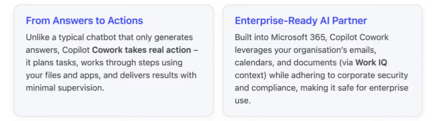
What is Copilot Cowork?
Copilot Cowork is an AI assistant that you can delegate work to, as if it were a capable team member. You describe the outcome you want, and Cowork generates a step-by-step plan, uses the necessary tools (like Office apps, calendars, email) and data to execute each step, and then presents the outcome.
For example, if you ask it to “prepare next week’s client update presentation,” Copilot Cowork can gather information from your emails and documents, draft slides in PowerPoint, schedule prep meetings on your Outlook calendar, and collate any relevant Excel stats, all while keeping you informed and allowing you to adjust the plan.
This agentic (“autonomous agent”) approach means Copilot Cowork isn’t just answering questions, it’s carrying out tasks on your behalf. It works within the Microsoft 365 cloud environment, drawing on Microsoft’s Work IQ intelligence layer (which aggregates your work data like mails, chats, files, and meetings) to provide rich context.
As a result, Copilot Cowork can do things like prepare a client meeting briefing by cross-referencing your recent email thread with that client, pulling data from a shared spreadsheet, and even blocking time on your calendar for preparation. This depth of integration into your work life is something a standalone AI agent (like a local app) can’t easily replicate.
Notably, Microsoft built Copilot Cowork in close partnership with Anthropic, the AI company behind the Claude model. In fact, the underlying AI brain of Copilot Cowork is Anthropic’s Claude, integrated directly into Microsoft 365 Copilot’s infrastructure. Microsoft opted to collaborate instead of creating a new model from scratch after investing in Anthropic in late 2025, so it could bring Claude’s advanced capabilities into the enterprise setting quickly. Jared Spataro, Microsoft’s AI at Work chief, put it plainly: “What Anthropic has done is demonstrate the value of these agentic capabilities. Microsoft is all about commercialization.” In other words, Anthropic showcased the concept of an AI co-worker, and Microsoft scaled it for business use, leveraging its secure cloud, huge user base, and deep integration in workplace tools.
Key Features and Capabilities
Copilot Cowork introduces a range of powerful features aimed at making knowledge work more efficient and innovative:
- Autonomous Multi-Step Workflows - “Agentic” AI is the core of Cowork. You can delegate complex or repetitive workflows, and it will handle them from start to finish. It breaks your request into sub-tasks, executes them in sequence (or even in parallel when possible), and checks in if it needs guidance. For instance, if tasked with organizing a project kickoff, Copilot Cowork might create a project plan, draft an agenda in Word, schedule a Teams meeting with invitees, and set up a SharePoint folder for shared files doing in minutes what might take you hours.
- Contextual Intelligence via Work IQ – Because it’s built into Microsoft 365, Copilot Cowork has native access to your work context: your Outlook emails, Teams chats, OneDrive files, calendars, and more. It uses this Work IQ knowledge to make smarter decisions. For example, when drafting a document or email on your behalf, it can pull relevant facts from recent files or conversations. When scheduling or coordinating, it knows your real calendar availability and deadlines. This means the output is highly tailored to your actual work environment and team, which standalone AI tools can’t match.
- Multi-Model Collaboration (Claude + GPT) – Uniquely, Microsoft 365 Copilot (and the Cowork agent) takes advantage of more than one AI model to improve quality. Copilot Cowork can use OpenAI’s GPT for content generation and Anthropic’s Claude to review or refine the results, a feature called “Critique.” In Microsoft’s research agent tests, this two-model approach achieved a 13.8% higher deep-research accuracy score (DRACO benchmark) than a single-model answer. In practice, this means you get more accurate and well-rounded outputs – for example, a detailed analysis report written by GPT might be double-checked by Claude for factual accuracy and completeness before you see it1. Copilot can even display a Council of multiple model responses side-by-side for comparison, so you get the benefit of diverse AI “opinions” on complex problems.
- Seamless Microsoft 365 Integration – Copilot Cowork works across the apps you use every day. It can create or edit documents in Word, build slides in PowerPoint, analyze data in Excel, extract action items from Teams meeting transcripts, send emails via Outlook, and more, all through the same interface. In a demo, Microsoft showed Cowork automatically compiling a competitive analysis report by pulling information from meeting notes and customer data, outputting a Word doc and a supporting Excel sheet with charts. Because it operates inside the M365 apps, the formatting and file compatibility are taken care of your AI-generated content arrives in the tools you’re already comfortable with.
- Enterprise-Grade Security & Compliance – Designed for corporate environments, Copilot Cowork runs within your organization's secure Microsoft 365 cloud, so it respects all your established permissions, data governance, and auditing rules. Every action the AI takes whether it’s accessing a document or sending an email on your behalf it is logged and auditable by IT. Any files it creates or modifies are stored in your company’s secure cloud, with the usual access controls. This is a critical differentiator from local AI agents: for companies in regulated industries or with strict compliance needs, Copilot Cowork provides the transparency and control required to trust an AI with real work.
- Built-in “Skills” and Tool Integrations – Copilot Cowork comes with specialized capabilities (Microsoft calls them skills) to handle common tasks. For example, it has a calendar management skill to intelligently schedule or rearrange meetings (accounting time zones, availability, etc.), and a daily briefing skill that can summarise your day’s priorities. It can tap into the Microsoft Graph to retrieve contacts or past communications. Over time, Microsoft is likely to add more such skills (and allow custom ones), so the AI can interface with third-party tools or internal systems, further extending what tasks it can automate.
How Copilot Cowork Boosts Productivity and Innovation
For innovation teams and leaders, Copilot Cowork can be a gamechanger. By offloading routine and multi-step chores to the AI, teams can spend more time on creative, high-value work. Here are a few ways Copilot Cowork enhances productivity in collaborative and creative environments:
- Accelerating Project Workflows: Tedious project tasks like gathering status updates, scheduling meetings, or assembling reports can be handed to Copilot Cowork. For example, an innovation lead could ask, “Summarize this quarter’s R&D experiment results and prepare a slide deck with key findings.” Copilot Cowork will fetch data from the related documents and emails, generate a summary report, and draft slides complete with charts in PowerPoint. The team can then focus on refining strategy and brainstorming ideas, rather than crunching numbers and copy-pasting info.
- Enhanced Meeting Preparation: In collaborative work, a lot of time goes into meeting prep and follow-ups. Copilot Cowork shines here by digging through your organisational knowledge to prepare you for meetings. If you have a brainstorm scheduled, you can instruct Cowork: “Gather all recent customer feedback and product improvement ideas from our team chats and create a brief for the meeting.” It will scan your Teams channels and emails for relevant input and present a concise brief. After the meeting, you could ask it to compile action items and even draft follow-up emails. By doing heavy lifting, the AI frees everyone to concentrate on the creative discussion during the meeting, rather than on note-taking or clerical work.
- Continuous Planning and Coordination: Copilot Cowork can serve as an ever-ready project coordinator. For instance, innovation teams often run recurring processes (like monthly innovation reviews or budget planning cycles). Cowork can automate these repeatable workflows for a “monthly innovation portfolio review,” it could automatically pull the latest metrics from Excel, draft an updated report, and send calendar invites for review meetings every month. It ensures nothing falls through the cracks, and that processes run on schedule, with minimal manual effort.
- Cross-functional Collaboration: Because it operates with an awareness of shared files, team calendars, and group chats, Copilot Cowork can help connect dots between different team members’ work. Suppose the design team, engineering team, and marketing team are all working on a new product launch. Copilot Cowork can aggregate insights from each team’s files and chats to generate a combined update or to identify inconsistencies and information gaps in the plan. This not only saves time in chasing information but can also reveal insights that spark new ideas (for example, spotting a recurring customer concern in supporting tickets and bringing it to the product team’s attention).
- Example Early Adopter Success: One early adopter, Capital Group, reported significant benefits from Copilot Cowork. Their teams used it for planning, scheduling, creating deliverables, and preparing executive reviews, all within their secure Microsoft 365 environment. Barton Warner, SVP of Enterprise Tech at Capital Group, highlighted that Cowork isn’t just about generating text, “it’s about taking real action connecting steps, coordinating tasks, and following through across everyday workflows.” Equally important, he noted that because the AI works on their enterprise data within established security boundaries, they can “experiment, learn, and scale with confidence,” focusing on where AI truly adds value. In short, Copilot Cowork let their people move faster on innovation projects by handling the busy work reliably in the background.
Copilot Cowork vs. Anthropic Claude Cowork
Microsoft’s Copilot Cowork emerged very shortly after Anthropic’s Claude Cowork, and at first glance these two “AI coworkers” sound similar – both use Anthropic’s Claude model and both can execute multi-step tasks. However, they are built for different contexts and users. Here’s how they compare:
- Origins and Approach: Anthropic was first to debut the AI co-worker concept with Claude Cowork in January 2026, as a standalone desktop agent. It amazed many by showing an AI could perform lengthy, tool-using tasks on a PC. Microsoft’s response in March 2026 was not to compete directly, but to partner with Anthropic. Microsoft integrated the Claude cowork technology into its own Copilot product, essentially wrapping Claude’s capabilities inside the Microsoft 365 cloud environment. So under the hood, both tools leverage the same AI engine (Claude) for reasoning, but Microsoft adds its multi-model orchestration and enterprise integration on top.
- Integration and Environment: Claude Cowork runs locally on your device. This means it can, in theory, work across any application you have, giving it a lot of flexibility for individual power users. You don’t need Microsoft 365 at all, it’s an independent app. However, running locally also means it lacks built-in access to cloud-based organizational data. It can’t natively tap into a company like SharePoint or your team’s Exchange calendar because it operates outside that cloud ecosystem. Copilot Cowork, by contrast, lives inside Microsoft 365’s cloud. It’s deeply integrated with Office apps and leverages your company data (with permission) emails, SharePoint files, Teams channels, calendars via Work IQ. This makes it extremely powerful for enterprise use, because it operates with full awareness of your organizational context (something a local agent can’t achieve).
- Collaboration and Use Cases: Both tools can handle similar categories of tasks for example, calendar management, drafting documents, doing competitive research, preparing meeting summaries, and coordinating multi-document workflows. The big difference is who they serve. Claude Cowork is tailored more to individuals (developers, researchers, or small teams) who want an AI helper on their personal machine without corporate strings attached. It’s great if you’re a solo operator or a startup techie who needs an AI to automate tasks across various local apps (maybe coding, web research, file operations) and you don’t need it to know about an enterprise network. Copilot Cowork is built for enterprise teams already using Microsoft 365. Its sweet spot is in scenarios where multiple colleagues, shared cloud data, and organizational processes are involved exactly where having that enterprise context “pulls ahead for enterprise users”. For example, coordinating a cross-department project or generating a brief that draws on company-wide information is where Copilot Cowork excels, whereas Claude Cowork in those cases would be limited by only local data.
- Security and Governance: Because Claude Cowork runs locally, it inherently has limited oversight or governance there’s no automatic record of what it accessed on your machine or what it did, which might be acceptable for personal use but is a red flag in big organizations. In fact, any sensitive data it handles isn’t centrally tracked. Copilot Cowork, on the other hand, is cloud-based and auditable by default: all actions it takes in your Microsoft 365 tenant can be logged and reviewed. It adheres to your organization’s identity and access controls (only accessing data you’re allowed to) and keeps administrators in the loop. Microsoft even introduced a tool called Microsoft Agent 365 (available as an add-on) that lets IT monitor and manage AI agent activities across the company, set up policies, and catch any risky behavior. None of that structure exists for a local agent like Claude Cowork. For a CISO or compliance officer, this governance is often non-negotiable in enterprise settings.
- Availability and Licensing: Claude Cowork is available through Anthropic’s platform, typically as part of their Claude AI service subscription (with usage-based pricing). It can be used by anyone who signs up, without needing corporate approval. Copilot Cowork is offered to businesses; it requires a Microsoft 365 E5 subscription or the new E7 “Frontier” Suite (an even higher-tier package launching in 2026 that bundles all the AI goodies). In other words, an individual can’t just download Copilot Cowork an organization needs to enable it for their users. It’s currently in early access (via the Frontier programmer) as of March 2026, with broader rollout expected soon.
Below is a side-by-side comparison of Microsoft Copilot Cowork vs. Anthropic Claude Cowork in terms of features, integrations, and use cases:
A New Era of AI-Assisted Work
In summary, Copilot Cowork represents a new era of AI in the workplace moving from passively assisting with information to actively collaborating on real projects and tasks.
It’s like having a super-skilled assistant who can work at digital speed, attending meetings, reading documents, and producing drafts in parallel, all orchestrated under your guidance.
For innovation leads and forward-thinking teams, this means more time to innovate: the AI takes care of preparation and execution, while humans focus on creativity, strategy, and fine-tuning the results.
Meanwhile, Anthropic’s Claude Cowork shows another side of this evolution: a more open-ended AI agent for individual use, demonstrating what’s possible when an AI can control a computer like a human assistant would. Microsoft’s approach, however, is to bring that power into the everyday tools of business in a governed, scalable way.
By teaming up with Anthropic, Microsoft essentially turned a cutting-edge concept into a product that companies can deploy with confidence.
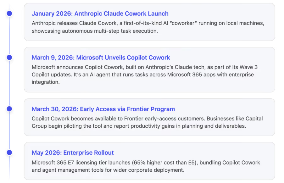
Conclusion
In a world where innovation and speed are paramount, tools like Copilot Cowork offer a significant edge. By handling the busywork researching, compiling, organizing, cross-checking, this AI frees human teams to concentrate on creative problem-solving and big-picture thinking. At the same time, its integration into the Microsoft 365 suite means it works where you work, securely and contextually, rather than being a disconnected novelty.
For organizations already invested in Microsoft’s ecosystem, Copilot Cowork can amplify productivity across departments. Imagine product managers, engineers, and designers all benefitting from an AI that coordinates their inputs and keeps the project in sync, or an innovation lab where ideas progress faster because the AI continuously gathers insights and takes care of follow-ups.
As AI coworkers become more common, we’re likely to see heightened collaboration between humans and AI. Microsoft Copilot Cowork and Anthropic Claude Cowork are early exemplars of this trend, one optimized for the enterprise, the other for individual power users. Both underline a shift from AI as a tool you consult, to AI as a partner that actively participates in the work.
For innovation leads, that means an exciting opportunity to reimagine workflows: routine tasks can be offloaded, and human talent can be re-focused on innovation itself. In essence, Copilot Cowork lets your team spend less time juggling tasks and more time driving innovation forward.
%201.avif)
Microsoft Copilot Cowork: Your New AI Co‑Worker for Productivity and Innovation
Microsoft’s Copilot Cowork is a new AI-powered “co-worker” designed to autonomously plan and execute multi-step tasks across your work...
Quick Answer
To brand your SharePoint intranet, apply your company's primary colors to the site theme using SharePoint's Change the Look settings, upload your logo to the header, and select a consistent font pairing across all pages. The goal is to make the intranet feel like an extension of your corporate website not a generic Microsoft template. Done right, branded intranets see up to 40% higher daily adoption rates than unbranded ones.
Your employees open the intranet and the first thing they see is a grey Microsoft template with the default blue header and a placeholder logo. Within three seconds, they've already decided this isn't worth their time.
This is the branding problem that affects most SharePoint intranets and it's entirely fixable.
Branding your SharePoint intranet isn't about aesthetics for aesthetics' sake. It's about trust, recognition, and adoption. When your intranet looks and feels like your company, your colors, your logo, your voice employees stop seeing it as an IT tool and start seeing it as a company resource worth using every day.
At SharePoint Designs, we've branded over 800+ SharePoint intranets for organizations including Harvard University, Vanderbilt University, and multiple Fortune 500 companies. This guide distils everything we've learned into a step-by-step framework you can apply to your own intranet today.
Why does SharePoint Intranet Branding Matter?
An unbranded intranet sends an unintentional message to employees: this wasn't built for you. It looks like an afterthought. Employees who land on a generic SharePoint site with the default Microsoft theme are significantly less likely to return, less likely to search for content, and less likely to trust the information they find there.
The data backs this up. In our work across 800+ intranet deployments, we consistently find that branded intranets those using company colors, fonts, and logo prominently achieve measurably higher adoption within the first 90 days of launch compared to unbranded equivalents with the same content.
What does good Intranet Branding actually achieve?
- It builds immediate recognition. Employees shouldn't need to read the URL to know they're on the company intranet. The visual identity should communicate that within one second of the page loading.
- It signals that this is a permanent, invested resource. A polished, branded intranet tells employees that leadership cares about this tool. That perception alone increases usage.
- It reduces cognitive friction. When the intranet matches the visual language employees already associate with your brand, they navigate it more instinctively. Familiar colors and typography reduce the mental effort required to use the tool.
- It supports employer branding. For new hires especially, the intranet is often the first internal digital touchpoint after onboarding. A well-branded intranet reinforces the professionalism and culture they were sold during recruitment.
What are the Core Elements of SharePoint Intranet Branding?
There are four core branding elements to get right on a SharePoint intranet:
- Color palette - Your primary, secondary, and accent colors applied to headers, buttons, section backgrounds, and navigation
- Typography - Font choices for headings, body text, and UI elements
- Logo placement - Where your logo sits, at what size, and on which pages
- Visual language - Photography style, illustration style, icon sets, and graphic elements that feel consistent with your corporate identity
Each of these works together. Getting the colors right but leaving the default SharePoint font makes the intranet feel 70% branded. Getting all four right makes it feel completely native to your company.
You may also like: Typography Trends
Part 1: How to Choose the Right Colors for your SharePoint Intranet
SharePoint Online uses a theming system called Change the Look that lets you apply custom colors to your intranet without any coding. Here's how it works in practice.
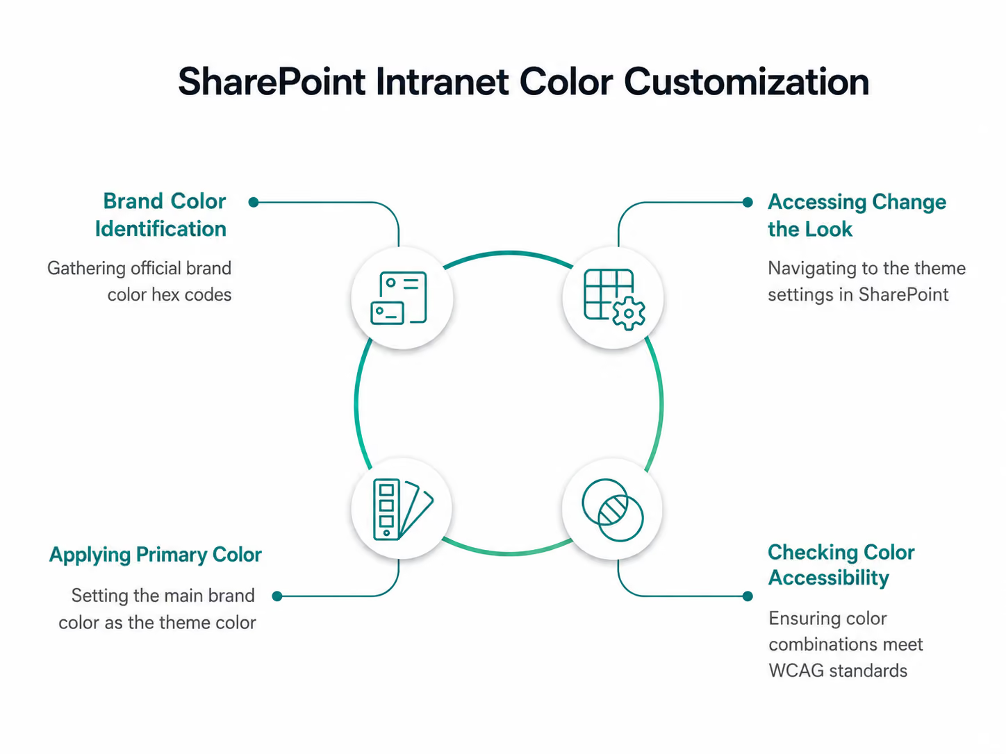
Step 1 - Identify your brand color values
Before touching SharePoint, collect your official brand color hex codes from your brand guidelines or marketing team. You'll need:
- Primary color - your main brand color (e.g. #0052CC for a corporate blue)
- Secondary color - a supporting color used for accents or secondary elements
- Neutral colors - your greys, whites, and off-whites for backgrounds and text
If your brand guidelines only specify Pantone or CMYK values, convert them to hex using a color converter tool before proceeding.
Step 2 - Access Change the Look
From your SharePoint home site, click the gear icon (Settings) in the top right → Change the look → Theme. You'll see a palette of Microsoft's pre-built themes. Ignore these you're going to create a custom one.
Step 3 - Apply your primary color
Click Custom at the bottom of the theme panel. You'll see a color picker where you can enter your hex code directly. Enter your primary brand color as the "Theme color."
SharePoint automatically generates a color ramp from your primary color lighter and darker variations used across different UI elements. Review this ramp carefully. Sometimes the auto-generated variations clash or become inaccessible if so, adjust manually.
Step 4 - Check color accessibility
This is a step most organizations skip and later regret. Every color combination on your intranet needs to meet WCAG 2.1 AA accessibility standards specifically a minimum contrast ratio of 4.5:1 for body text and 3:1 for large text and UI components.
Use the WebAIM Contrast Checker to test your primary color against white and against your neutral backgrounds. If you're a public sector organization or in a regulated industry, you may need to meet the stricter AAA standard.
What colors work best for SharePoint intranets?
The best performing intranet color palettes we've seen across our 300+ projects share a few characteristics:
- Use your primary brand color for the header and navigation only. Applying it everywhere dilutes its impact and makes the intranet feel visually noisy. The header and navigation are high-visibility areas strong brand colour here is immediately z without being overwhelming.
- Use neutral backgrounds (white or light grey) for content areas. Dark or heavily coloured page backgrounds make long-form content harder to read and reduce dwell time. White and off-white backgrounds consistently outperform colored ones for readability metrics.
- Reserve your accent color for calls to action. Buttons, links, and key navigation elements should use your accent color consistently. This creates a clear visual hierarchy that guides employees to take actions submit a form, find a document, read an announcement.
- Avoid pure black (#000000) for body text. Use a very dark grey instead (e.g. #1a1a1a or #111827). Pure black on white creates a harsh contrast that causes eye strain during long reading sessions. Most corporate brand guidelines already specify this.
Part 2: How to Choose and Apply Fonts to your SharePoint Intranet
SharePoint Online supports web-safe fonts natively and also support web fonts through custom CSS injection for organizations with developer access. However, for most intranet projects, working with SharePoint's available font options is both faster and more maintainable.
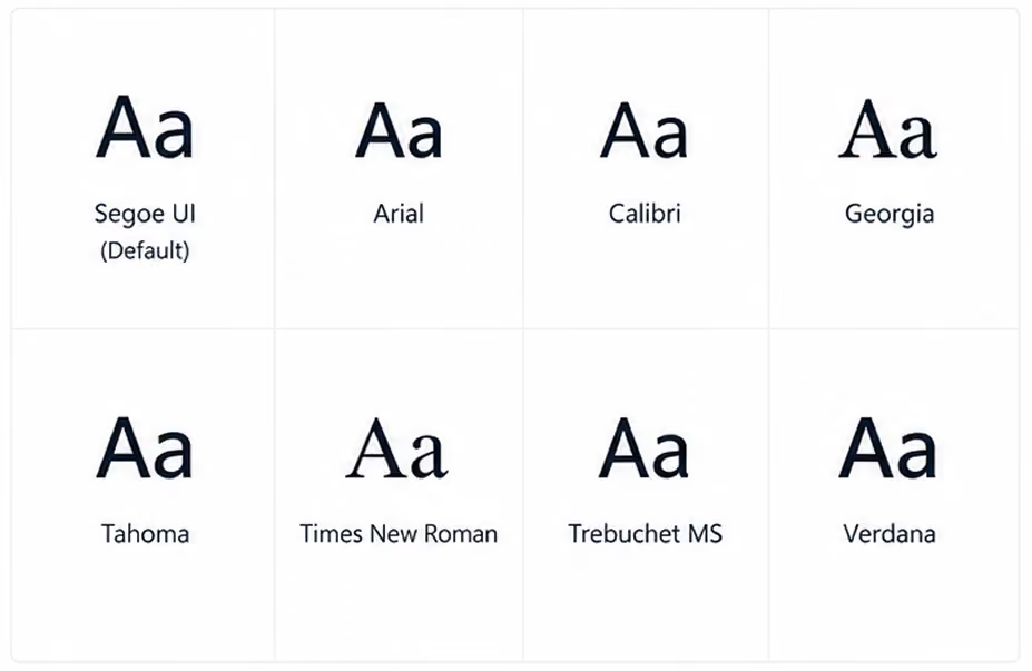
The available fonts in SharePoint's native theme settings include Segoe UI (Microsoft's default), Arial, Calibri, Georgia, Tahoma, Times New Roman, Trebuchet MS, and Verdana.
If your brand specifies a custom font that isn't in this list (for example, Gilroy, Proxima Nova, or a bespoke typeface), you have two options:
- Inject a Google Fonts or Adobe Fonts web font via a custom SPFx web part requires developer involvement but gives full control
- Choose the closest available system font that matches your brand's personality faster and simpler, suitable for most intranet projects
What font pairing works best for SharePoint intranets?
The most reliable and accessible font approach for SharePoint intranets is a two-font system:
- Heading font - bolder, slightly larger, used for H1, H2, H3 page titles and section headings
- Body font - clean, neutral, used for paragraph text, labels, and navigation items
The classic combination that works well across virtually every corporate intranet is Segoe UI for headings (it's Microsoft's own typeface optimized for screen readability) and Segoe UI for body text at a lighter weight. Simple, cohesive, and consistently legible across devices.
If your brand requires more personality, a safe alternative is Georgia for headings (adds warmth and editorial quality) with Arial for body text (neutral and universally accessible).
What font sizes should you use?
Consistent typographic hierarchy makes a SharePoint intranet dramatically easier to scan. Use these as a baseline:
Avoid going below 14px for any text employees need to read regularly. Small text on SharePoint's responsive grid can render even smaller on certain screen resolutions, making it inaccessible on some devices.
Part 3: How to Add and Position your Logo on SharePoint
The logo should appear in two locations at minimum on a well-branded SharePoint intranet:
1. The global navigation header - 0 top left of every page, visible on all sites and sub-sites within your intranet. This is the primary logo placement and the most important.
2. The home page hero section - either within the hero web part or as a standalone image element on the homepage. This reinforces the brand identity on the page employees see most frequently.
How do you add your logo to the SharePoint header?

Step 1 - Prepare your logo file
Your logo needs to be in PNG format with a transparent background. SVG is not supported in all SharePoint contexts. Recommended dimensions: 200px wide × 50px tall at 2x resolution (so upload at 400px × 100px for retina screens). Ensure the logo is legible against your header background color, test both light and dark backgrounds.
Step 2 - Go to Change the Look → Header
Settings gear → Change the Look → Header.
Here you can upload a custom logo image directly.
Step 3 - Upload and position
Click the logo upload area and select your PNG file. SharePoint will position it in the top left of the global header automatically. You can adjust the header layout between Compact, Standard, and Minimal. Standard is the most widely used for branded intranets as it gives the logo adequate breathing space.
Step 4 - Set the site name
Decide whether to show the site name text alongside the logo or suppress it. If your logo is a full wordmark (logo + company name), suppress the text to avoid duplication. If your logo is an icon or symbol only, keep the site name text visible.
What are common logo mistakes on SharePoint intranets?
- Using a logo with a white background instead of transparent. This creates a white box around your logo sitting on a colored header one of the most common and most visible branding errors we see. Always use a PNG with transparent background.
- Uploading a logo that's too small. SharePoint compresses uploaded images. If you upload a small logo, the compression makes it blurry. Always upload at 2x the intended display size.
- Using a dark logo on a dark header. Check contrast carefully. A dark navy logo on a dark teal header background disappears. Either lighten the logo version or choose a header background that provides sufficient contrast.
Part 4: How do you make the whole intranet feel visually consistent?
Applying colors, fonts, and a logo is the foundation but visual consistency across a multi-site intranet requires additional discipline. Here's what the best-branded intranets we've built share:
- Standardized page templates. Create saved page templates in SharePoint for the most common page types news article, department hub, policy document, event listing. Each template has pre-set section layouts, background colors, and web part placements that reflect your brand guidelines. This means whoever creates a new page, the output is always on-brand.
- A defined image style. Decide whether your intranet uses photography (real people, real offices), illustration, or icons and stick to it. Mixed visual styles are one of the most common causes of an intranet looking "off" even when the colors and fonts are correct. A branded photo library shared internally gives content authors the right assets to pull from.
- Consistent icon sets. SharePoint's default icons are functional but generic. Replacing them with a consistent icon set that matches your brand's visual style whether that's outlined, filled, or illustrated significantly elevates the overall feel. Microsoft's Fluent UI icon library is free, comprehensive, and designed to work within the Microsoft 365 environment.
- Section backgrounds used intentionally. SharePoint lets you set background colors on individual page sections. Used well, this creates visual rhythm and hierarchy alternating a white section with a light brand-color section breaks up long pages and draws attention to key content areas. Used poorly (random colours with no logic), it makes pages look chaotic.

You may also like: 10 UX Pitfalls that make your employees hate your Intranet
Part 5: What are the most common branding mistakes on SharePoint intranets?
Across 800+ intranet projects, these are the mistakes we see most frequently:
Applying brand colors everywhere. Covering every section, button, and background in your primary brand color doesn't make the intranet look more branded it makes it look exhausting. Brand colour should be used at strategic points to create impact. White space is your ally.
- Ignoring mobile. Over 30% of intranet visits now happen on mobile devices. SharePoint's responsive design means your intranet will reflow for mobile automatically, but your branding elements won't always translate perfectly. Test your logo size, navigation, and hero sections on a phone before launch.
- Inconsistent department pages. A beautifully branded homepage loses credibility the moment an employee clicks through to a department page that looks completely different. Brand governance who can change what and how needs to be established before launch and enforced afterwards.
- Not updating branding after a rebrand. When a company rebrands, the intranet is frequently the last digital property to be updated. This means employees are working in an intranet that contradicts the new brand identity they're seeing everywhere else. Build a branding update checklist into your intranet governance plan from day one.
- Using the wrong SharePoint theme scope. SharePoint has site-level themes and hub-level themes. If you apply branding only at site level, sub-sites and associated sites won't inherit it. Apply your theme at hub site level so it cascades consistently across the entire intranet.
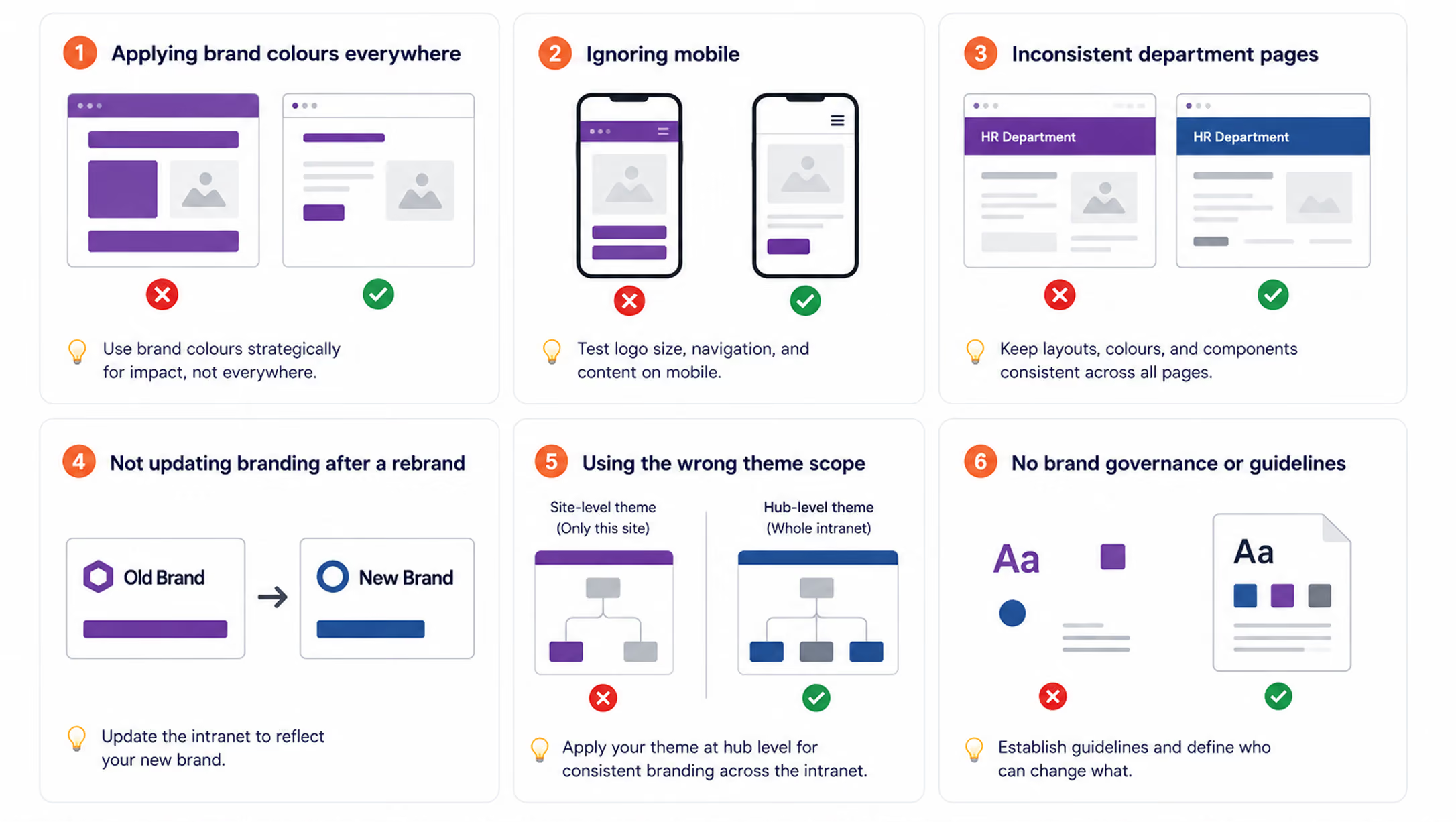
Your SharePoint Intranet Branding Checklist
Before launching a branded SharePoint intranet, run through this checklist:
- Brand color hex codes collected from official brand guidelines
- Color accessibility tested (minimum 4.5:1 contrast ratio)
- Custom theme applied at hub site level
- Logo uploaded in PNG format with transparent background at 2x resolution
- Logo tested against header color for contrast
- Site name text shown or suppressed (consistent decision)
- Font hierarchy defined for H1, H2, H3, body, and navigation
- Page templates created for each major content type
- Image style guide defined and photo library shared
- Icon set selected and consistently applied
- Section background colors used with a clear logic
- Mobile view tested on iOS and Android
- Department pages and sub-sites checked for brand consistency
- Branding governance policy documented
%201.avif)
How to Brand your SharePoint Intranet: Colours, Fonts & Logo Guide (2026)
To brand your SharePoint intranet, apply your company's primary colors to the site theme using SharePoint's Change the Look settings,

Overview
Fluent UI’s CommandBar is a powerful component for building toolbars with built-in support for responsive layouts and overflow handling. Under normal circumstances, when available horizontal space is insufficient, excess command items should automatically move into the overflow menu (represented by the three-dot icon).
However, in real-world applications, especially those with dynamic data or responsive layouts, developers may encounter a common issue:
CommandBar items extend outside the container instead of moving into the overflow menu.
This article explains why this behavior occurs and presents a reliable solution to ensure proper overflow handling.
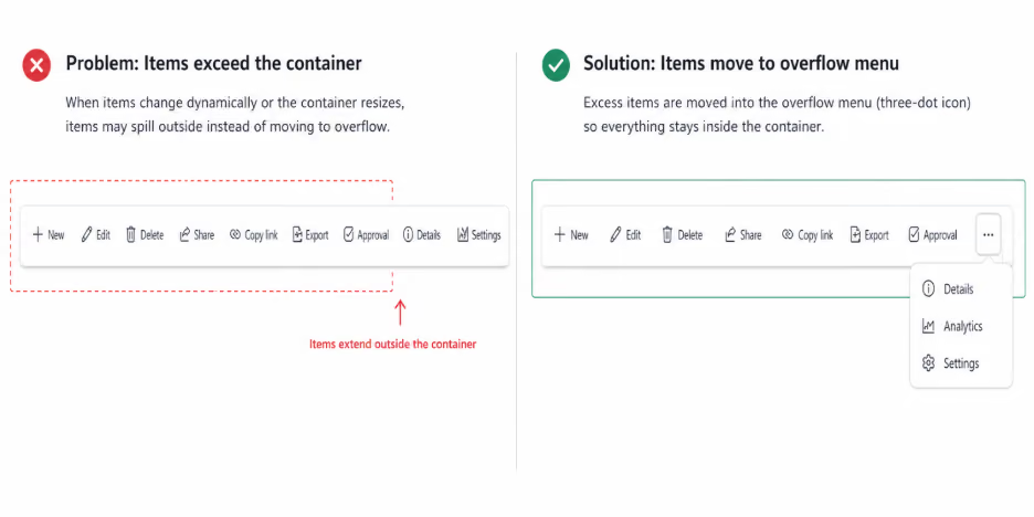
The Problem
The issue typically appears when:
- CommandBar items are updated dynamically.
- Items are conditionally added or removed (filters, permissions, feature flags)
- The container is resized after initial render.
- The layout changes due to responsive design.
In these scenarios, the CommandBar may fail to move excess items into the overflow menu, causing buttons to spill outside the container and break the layout.
Root Cause
Internally, Fluent UI’s CommandBar performs width and layout calculations only during its initial render cycle.
These calculations determine:
- Available container width
- Visible command items
- Overflowed items
When the items array changes after the initial render, the component does not automatically re-evaluate its layout. As a result, newly added or resized items are rendered without proper overflow recalculation.
The Solution
To resolve this issue, we need to explicitly force the CommandBar to recalculate its layout.
This can be achieved through two coordinated steps:
- Force a remount of the CommandBar using a dynamic key
- Trigger a resize event to ensure layout recalculation.
This approach ensures Fluent UI re-measures the available space and correctly moves excess items into the overflow menu.
Implementation
1. Use a Dynamic key on the CommandBar
<CommandBar
key={`commandbar-filter-${commandBarKey}`}
overflowButtonProps={{ ariaLabel: "More items" }}
items={items}
buttonAs={CustomButton}
className={styles.commandBarContainer}
/>
Changing the key value forces React to unmount and remount the component, triggering Fluent UI’s internal layout logic.
2. Update the Key When Items Change
useEffect(() => {
if (items.length > 0) {
const timer = setTimeout(() => {
setCommandBarKey(prev => prev + 1);
// Trigger layout recalculation
window.dispatchEvent(new Event("resize")); }, 100);
return () => clearTimeout(timer);
}
}, [items.length]);
Why This Works
- Updating the key forces a full component remount
- Remounting triggers Fluent UI’s width and overflow calculations.
- Dispatching a resize event ensures recalculation in responsive layouts.
- Overflow items are correctly moved to the three-dot menu.
- This approach provides consistent and predictable behavior even when CommandBar items are dynamic.
When to Apply This Fix
- This solution is recommended when:
- CommandBar items are dynamically generated.
- UI changes depend on user interaction or filters.
- The CommandBar is placed inside a responsive or resizable container.
- Overflow behavior is inconsistent or broken.
Conclusion
The Fluent UI CommandBar does not automatically recalculate overflow when its items change after initial render. While this is a known limitation, it can be addressed effectively by forcing a controlled remount using a dynamic key and triggering a resize event.
Until native support for automatic recalculation is introduced, this approach remains the most reliable and production-safe solution for handling dynamic CommandBar layouts.
Fluent UI CommandBar Overflow Issue: Preventing Items from Exceeding the Container
Fluent UI’s CommandBar is a powerful component for building toolbars with built-in support for responsive layouts and overflow handling.


.svg)