Published Date -

Is Your SharePoint Intranet Mobile-Friendly? Here's How to Check and Fix It
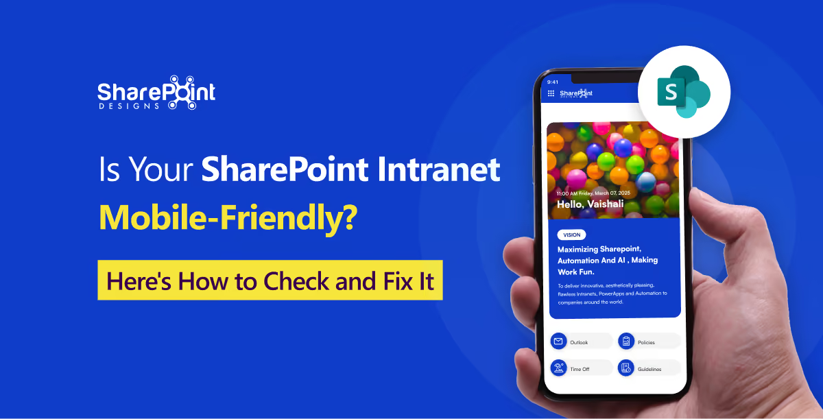
In 2026, employees don’t access their intranet only from desktop computers. Frontline workers check shift schedules on their phones. Sales reps pull up documents before meetings. New hires browse onboarding pages from their mobile devices.
If your SharePoint intranet only works well on a desktop monitor, it may be failing a significant part of your workforce.
A mobile-friendly SharePoint intranet allows employees to find information, complete tasks, and read content across different screen sizes without excessive scrolling, pinching, or zooming.
SharePoint Online’s modern pages are responsive by default, but basic responsiveness doesn’t always translate into a genuinely usable mobile experience.
This guide covers where SharePoint intranets commonly break on mobile, what a good mobile experience looks like, and how to fix common issues without rebuilding your intranet from scratch.
Why Mobile-Friendliness Matters for Your Intranet
Your intranet is where employees access HR policies, IT support, organizational announcements, documents, and everyday tools.
If that experience is difficult to use on a phone, employees may stop checking it. They might message a colleague instead of searching for information, miss important announcements, or avoid using certain resources altogether.
This is especially important for frontline and hybrid workers.
Warehouse teams, field staff, retail employees, and other employees without a fixed desk may rely heavily on mobile devices to access workplace information.
A mobile-friendly intranet isn’t simply about making a desktop page smaller. It’s about making the employee experience work effectively on smaller screens.
Where SharePoint Intranets Commonly Break on Mobile
1. Multi-Column Layouts Don’t Work Well on Mobile
Multi-column layouts can collapse poorly on smaller screens.
Web parts designed for a three-column desktop layout may stack vertically on mobile, pushing important content further down the page.
The visual hierarchy that works well on a wide desktop screen may not work as effectively on a narrow smartphone.
2. Navigation Becomes Difficult to Use
Mega menus and deeply nested navigation can become a maze of taps on a phone.
If employees need several taps to reach frequently used information, they may give up and ask a colleague instead.
Your SharePoint intranet navigation should prioritize the information employees access most often and keep the mobile journey as simple as possible.
3. Hero Banners and Images Aren’t Optimized
Wide desktop banners can become awkwardly cropped on mobile devices.
An image that looks impressive at 1440px can lose its focal point at 375px if it isn’t designed with responsive layouts in mind.
Large, unoptimized images can also affect page loading times, particularly when employees are using mobile connections.
4. Text Density Is Too High
A paragraph that looks comfortable on a wide screen can become a wall of text on a smartphone.
Use:
- Shorter paragraphs
- Descriptive headings
- Bullet points
- Appropriate font sizes
- Adequate line spacing
These small changes can make your SharePoint intranet design much easier to read on mobile devices.
5. Custom SPFx Web Parts Aren’t Tested for Mobile
This is one of the most commonly overlooked issues.
SharePoint’s out-of-the-box web parts provide responsive capabilities, but custom SPFx web parts still need to be designed and tested for different screen sizes.
Dashboards, forms, document management tools, and other custom components may work perfectly at desktop breakpoints but become difficult to use at tablet and mobile widths.
Test custom components at:
- 1440px — desktop
- 1024px — smaller desktop/tablet
- 768px — tablet
- 375px — mobile
A proper responsive design process should account for all of these screen sizes.
6. The SharePoint Mobile App and Browser Experience Can Differ
Don’t test your intranet only on a desktop browser.
Employees may access your intranet through:
- SharePoint mobile app
- Mobile browser
- Microsoft Teams
- Tablet
- Desktop browser
Testing across these experiences helps identify layout, navigation, and web part issues before employees encounter them.
What a Mobile-Friendly SharePoint Intranet Actually Looks Like
Mobile-friendly goes beyond simply asking, “Does it fit on the screen?”
A genuinely usable mobile intranet should have the following characteristics.
Priority Content Is Reachable Quickly
The most-used links, such as leave requests, IT tickets, announcements, and employee resources, should be easy to access.
Employees shouldn’t have to navigate through several layers just to complete a common task.
Touch Targets Are Easy to Use
Buttons, links, and interactive elements should be large enough to tap accurately without requiring users to zoom in.
Pages Load Quickly
Large images and unnecessary web parts can make an intranet feel slow on mobile connections.
Compressing images, optimizing media, and keeping pages lightweight can help improve the mobile experience.
Navigation Is Simplified for Small Screens
Instead of simply shrinking a desktop mega menu, simplify the navigation structure for mobile users.
Where appropriate, use SharePoint’s Hide on mobile option for web parts that are useful on desktop but add unnecessary clutter on smaller screens.
Typography Is Easy to Read
Employees shouldn’t need to pinch and zoom to read an announcement or policy.
Use readable font sizes, appropriate line spacing, and shorter content blocks to make information easier to consume.
The SharePoint App in Teams Extends the Intranet to Mobile
Many organizations use Microsoft Teams as their primary digital workplace.
The SharePoint experience in Teams can bring your organization’s SharePoint content closer to employees who spend most of their day working in Teams, including on mobile devices.
This makes it important to consider Teams when planning your SharePoint intranet design.
For frontline workers in particular, providing access to important news, resources, tasks, and tools through the platforms they already use can make the intranet more accessible.
If your organization is already using Teams extensively, integrating the intranet experience with Teams can be an important part of your mobile strategy.
SPFx Adaptive Card Extensions for Mobile-First Experiences
SPFx Adaptive Card Extensions (ACEs) can be used to create modular, interactive experiences for the SharePoint and Microsoft 365 ecosystem.
These experiences can be useful for scenarios such as:
- Viewing employee information
- Accessing frequently used resources
- Checking IT requests
- Accessing HR services
- Completing common employee tasks
For organizations building custom experiences, mobile-first design should be considered from the beginning rather than added after development is complete.
Mobile-Friendly SharePoint Intranet Checklist
Before starting a redesign, open your intranet on your own phone and ask:
- Can employees find the top three things they search for in under 10 seconds?
- Do any web parts overlap, get cut off, or fail to load?
- Is any text too small to read without zooming?
- Does the search bar work well on mobile?
- Is navigation easy to understand?
- Would a new employee know where to go without prior context?
- Does the experience work consistently across mobile and desktop?
- Have custom SPFx web parts been tested on mobile?
- Does the intranet work well when accessed through Teams?
If you hesitate on any of these questions, you’ve found an area worth improving.
How to Fix a Mobile SharePoint Intranet Without Starting Over
You don’t necessarily need to rebuild your entire intranet.
Most mobile-friendliness issues can be addressed through targeted improvements:
- Audit and simplify navigation specifically for mobile.
- Reorder web parts so critical content appears earlier on smaller screens.
- Use Hide on mobile for web parts that create unnecessary clutter.
- Rework custom SPFx web parts that weren’t designed with responsive breakpoints.
- Test layouts at 1440px, 1024px, 768px, and 375px.
- Compress and resize images to improve loading times.
- Improve typography and spacing for smaller screens.
- Test the intranet on actual mobile devices rather than only resizing a desktop browser.
- Consider integrating the intranet experience with Teams for employees who primarily work there.
A responsive optimization project can often be much more targeted than rebuilding an entire intranet from scratch.
Mobile-Friendly SharePoint Intranet Checklist
Final Thoughts
A mobile-friendly SharePoint intranet isn't simply a desktop intranet viewed on a smaller screen.
It should make information easy to find, navigation simple to use, content readable, and everyday tasks accessible regardless of the device employees use.
For organizations with frontline, hybrid, and mobile employees, optimizing the intranet for smaller screens can make a meaningful difference to employee experience and intranet adoption.
If your current intranet works well on desktop but feels difficult to use on mobile, you may not need to start over. A focused review of your SharePoint intranet design, navigation, content, performance, and custom web parts can identify the biggest problems and provide a practical path to improvement.
faqs

Mohammed Jamal

Mohammed Jamal is a UI/UX Designer with 3+ years of experience dedicated to crafting intuitive, user-centric digital experiences. He specializes in Web, SharePoint Intranet, Mobile, and Graphic Design, prioritizing seamless user journeys and high usability.





.svg)