Published Date -

Stop Copy-Pasting Your Property Pane Code: Meet @spdesigns/propertypane-controls
A shared, plug-and-play toolkit for color pickers and image pickers in SharePoint Framework (SPFx) web parts.
The Problem
If you've ever built more than one SharePoint web part, you've probably written the same little bits of property pane code repeatedly. A color swatch picker so users can pick a theme color, and an image picker so they can choose a picture and see a preview of it.
Here's what actually happens in real projects: every web part ends up with its own slightly different copy of the same file, usually called something like ColorPropertyControls.ts. One copy correctly reads the tenant's theme colors. Another copy was made before a bug fix went in, and nobody remembered to update it. In one web part, the color is saved as a simple piece of text (like "#FF0000"); in another, it's saved as a more complicated object. So a fix that works perfectly in one place quietly breaks in another.
In short: the same small feature gets rebuilt slightly wrong, over and over, across projects.
Why Not Just Use the PnP Library That Already Exists?
There's already a popular toolkit called @pnp/spfx-property-controls that gives you building blocks like a color picker and a file picker. It's genuinely good, and this new package doesn't replace it.
The catch is that PnP's controls are generic - they don't know anything about your specific SharePoint tenant's brand colors, they don't understand the idea of pairing "a background color with a matching accent color" as one single choice, and they don't show a preview of the image you've already picked next to the button that lets you change it. To get that specific behaviour, someone has to wrap the PnP controls in extra glue code - and that's exactly the code that keeps getting copy-pasted and drifting out of sync.
So the real choice was one of three options: keep copy-pasting the glue code forever, rebuild it slightly differently every time, or extract it once into a shared package that every project can install and update together. This package is that third option.
Introducing @spdesigns/propertypane-controls
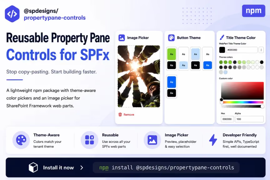
Think of this package as a small, ready-made toolbox that plugs into SharePoint's property pane - the panel on the right where site owners configure a web part. It ships two tools:
- ColorPropertyControls - a color picker manager that knows your tenant's theme colors, so the swatches it shows always match the actual site colors. It can show either a single compact color picker, or a pair of colors (like a background color and a matching accent color) chosen together as one unit.
- PropertyPaneImagePickerField - an image preview box designed to sit next to the standard image-selection button. It shows the picture that's currently selected, plus a "Remove" option to clear it.
It's a thin, opinionated layer that sits on top of the existing PnP controls - not a replacement for them. The goal isn't to reinvent the color picker or the file picker; it's to stop everyone rewriting the same wiring around them.
Getting Started: Installation
Install it the same way you'd install any other package:
If you're actively developing a change to the package itself and haven't published it yet, you can point your project at it by local path instead - just remember to build it first so the lib/ folder actually exists:
Next, set up the color manager once per web part. This should happen in onInit() - the web part's startup method - so that the tenant's theme colors are already loaded by the time someone opens the property pane:
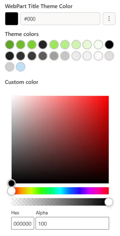
Feature 1: The Color Picker
Use this when you have one color to configure - say, a text color or a background color. Add one field for every color you want the user to be able to change:
Want to let the user type in any hex color code they like, instead of only picking from the preset swatches? Pass in a PropertyFieldColorPicker from the PnP library as an "additionalExpandedFields" option - it appears underneath the swatch grid whenever the picker panel is open:
A Small But Important Detail: How You Store the Color
Keep color properties as plain text, like textColor: string. That's what the compact color picker expects, and it means there's nothing to "reconcile" later - the picker just writes the hex value directly into the property.
Some older web parts instead store color as an object, like selectedColor: { themePrimary: string }. That still works, but there's a gotcha: the free-form hex picker always writes plain text, so it will overwrite the whole object unless you add a small repair step:
Plain text values never need that extra repair step - which is exactly why they're the recommended way to go. One less thing to accidentally get wrong.
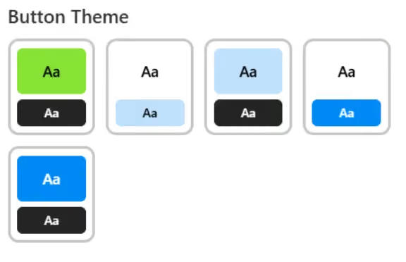
Feature 2: The Theme Swatch Picker (Paired Colors)
Sometimes you don't want one color - you want a matched pair, like a button's background color plus its accent color for a hover effect, or a gradient card's two-tone look. This is stored as a single "index" property (basically, "which pair number did they pick?"):
Here, storing the value as an object (selectedColors) is completely fine and expected, because nothing else ever writes to that property except this one call. It's a different situation from the single-color case above - not a contradiction of the earlier advice.
Feature 3: The Image Picker
Place PropertyPaneImagePickerField directly above the standard PropertyFieldFilePicker button that it works alongside. One important rule: keep the button's label text set to exactly "Select image" - the image picker looks for the file picker's button by matching that exact text, so it has to line up.

One thing worth calling out: the onDelete handler above only clears the property - it doesn't delete the actual file. That's the right default if the image lives in the user's own document library. Only delete the underlying file too if your web part is the one that uploaded it in the first place.
Moving an Existing Web Part Over
Migrating a web part off its old, hand-copied version of this code is meant to be boring - in a good way:
- Add the package as a dependency (see Installation above).
- Delete the web part's local copies of ColorPropertyControls.ts and PropertyPaneImagePickerField.ts.
- Change the import statement to point at "@spdesigns/propertypane-controls".
- That's it - no code changes needed. This package is a byte-for-byte extraction of the code that was already there.
Two habits from the old copy-pasted code are worth keeping even after migrating:
- Only restore a saved color or index inside onInit() when the property is still unset -otherwise you'll overwrite a color the user already picked, every single time they reopen the pane.
- Keep new color properties as plain text strings rather than objects, per the guidance above.
Why This Actually Matters
- Consistency - every web part behaves the same way, instead of having ten slightly different forks of the same file floating around.
- One place to fix things - a bug fix or a theme-loading improvement ships to every web part the next time they bump the version number, instead of being patched into one project and forgotten everywhere else.
- No extra weight - the underlying SharePoint and PnP libraries are "peer dependencies," meaning this package reuses what your web part already includes rather than bundling its own duplicate copy.
- Safe migrations - because it's a byte-for-byte extraction of existing code, moving a web part over introduces no behaviour change. There's nothing new to re-test beyond confirming the build still works.
- Cleaner pull requests - property pane wiring stops showing up as brand-new code in every PR, since it's now a dependency bump rather than a hand-written file.
The Bottom Line
If you've ever opened a new SPFx web part and thought, "didn't I already write this color picker somewhere else?" - that's exactly the itch this package scratches. Install it once, wire it up in a few lines, and stop reinventing the same property pane controls project after project.
faqs
Bharath

Meet Bharath, a Software Engineer specializing in Microsoft SharePoint development. He brings hands-on experience in SharePoint, SPFx, React, TypeScript, Power Automate, and PowerShell, delivering custom web parts, workflows, extensions, and modern intranet solutions across client and internal projects.








.svg)