Published Date -

SharePoint Intranet Branding Ideas: A Complete Guide to Themes, Fonts & Design
Introduction
A well-branded SharePoint intranet is more than just a visually appealing portal—it reflects your organization's identity and creates a consistent experience for employees. Modern SharePoint branding focuses on usability, visual consistency, and built-in branding capabilities such as themes, fonts, site branding, and custom components. By following branding best practices, organizations can create an engaging, professional, and user-friendly digital workplace that improves adoption and builds trust.
1. Branding Scope in SharePoint
Modern SharePoint provides a controlled branding model that helps maintain performance, accessibility, and long-term maintainability.
You can customize:
- Theme colors
- Font packages
- Site logo and header
- Navigation styles
- Page layouts
These built-in branding capabilities enable organizations to create a consistent and professional intranet experience while remaining aligned with Microsoft's modern SharePoint framework.
Note: Deep customizations, such as injecting custom CSS or directly modifying the DOM, are not recommended because they may be unsupported and could break after SharePoint updates.
2. Organization Theme Configuration
Previously, SharePoint theming was primarily done using PowerShell by defining a JSON color palette and deploying it at the tenant level. With recent updates in SharePoint, Microsoft has introduced Brand Center and Site Branding, making theme creation more user-friendly through UI.
However, it is important to understand:
- PowerShell-based theming is still supported and required for advanced/custom palette scenarios.
- Brand Center simplifies theme creation but does not fully replace the legacy theming engine.
Types of Theming in SharePoint
- Tenant-Level Theming Themes created at the tenant level are available across all SharePoint sites.
- Site-Level Theming Themes created at the site level are available only within that specific site.
1. Tenant-Level Theming (Using Brand Center)
Prerequisites
- Global Administrator or SharePoint Administrator permissions
Steps to Create Tenant Theme
- Go to the Microsoft 365 Admin Center.
- In the left navigation panel, go to Settings → Org settings, and then select Brand center.
- Click Copy link.
- Paste it into a new browser tab to open the Brand Center.
Create Brand Colors
- Click Add colors to navigate to the Brand colors page.
- Click Add a color to create a new brand color.
- Define color using:
- Use the color pickers to move around and select a color.
- Enter a Hexadecimal code value into the Hex box.
- Enter Red, Green, Blue values into the text boxes.
- Provide:
- Enter a name for your brand color.
- Use the toggle to control whether the color appears when users create themes.
- Save the color.
You can create multiple brand colors for reuse.
Create SharePoint Theme
- In Brand Center, go to:
- Apply your brand → SharePoint
- Under Themes, click Add theme
Choose your colors
- Primary color – Select the main color for your theme. You can choose from the brand color library or click Add a new color to define a custom color.
- Text color – Select the color used for text elements.
- Background color – Select the background color for pages and site content.
- Dark theme – Enable this option if you are using a dark background color.
- Accent color – Select the color used for highlights, buttons, and interactive elements.
As you configure each color, a preview panel on the right displays how the theme appears across:
- UI Elements
- SharePoint
- Viva Connections
Name your theme
- Enter a name for your theme.
- Enable Visible to make the theme available under Themes when users access Change the look.
Save the theme
- Click Save to create the theme.
- The theme will be available across all SharePoint sites in the organization.
Apply Tenant Theme
- Go to the SharePoint site where you want to apply the theme.
- Click on the Settings (⚙️ gear icon) in the top-right corner.
- In the Settings panel, under the SharePoint section, click on Change the look.
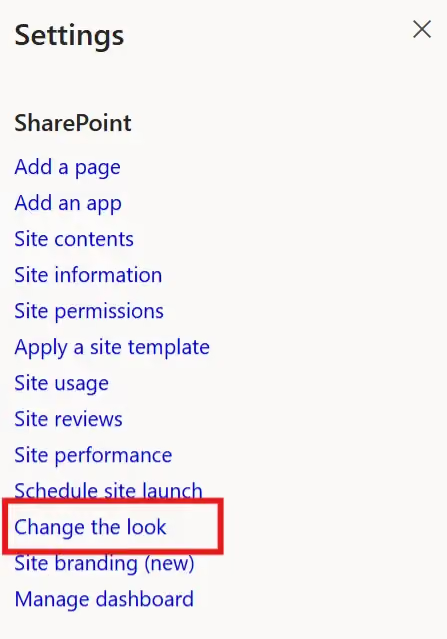
- In the Change the look section, click Theme.
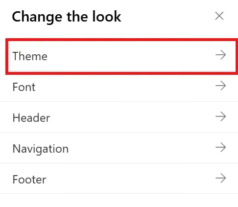
- In the Theme panel, From Your organization section, select the desired theme.

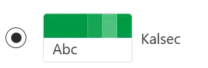
- Click Save to apply the theme to your SharePoint site.
2. Site-Level Theming (Using Site Branding)
Site-level theming allows localized customization without impacting other sites.
Prerequisites
- Site Owner / Full Control permissions
Steps to Create Site Theme
- Open your SharePoint site
- Click on the Settings (⚙️ gear icon) in the top-right corner.
- In the Settings panel, under the SharePoint section, click on Site branding (new).
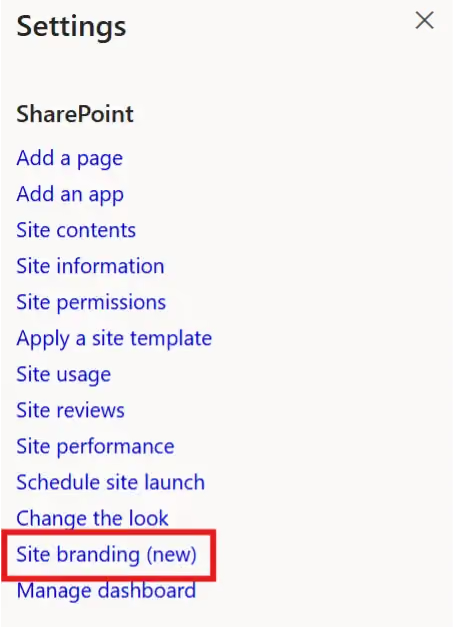
- The page will navigate to the Site branding experience, where you can customize the theme for your site.
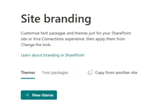
Create Theme
- Click + New theme to launch the theme designer.
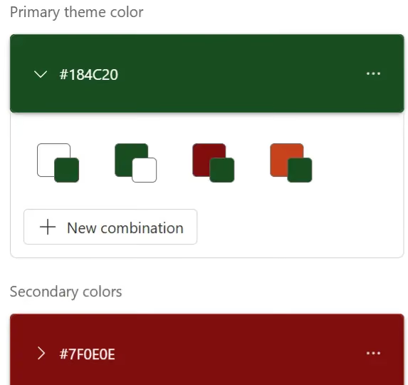
- Click + Add color to add your primary and secondary brand colors.
- You can select a color from your brand’s palette or click + New color.
- A color picker will appear, where you can either enter a custom HEX code or choose a color visually to define your theme colors.
Example:
- Primary color: 184c20
- Secondary color: 7f0e0e
Add Color Combinations (Optional)
- Click + New combination to add up to 16 combinations within the primary and secondary colors. In each color combination, you can switch around the background/accent color.
- A popup window will appear to create the new combination.
- In the Light mode section, select a color. You can choose from your brand’s palette or click + Add color to pick a new color.
- Notes:
- If you select the same color combination again in the New Combination popup, an error message will appear:
"Color combination already exists."
- After selecting the color, click Add to save the new combination.
- The color combination will be saved successfully.
- Repeat these steps to add additional color combinations as needed.
Save Theme
- Once you have finished configuring the colors, click Next to continue.
- Enter a name for your theme, then click Save.
Apply Site Theme
- Open the SharePoint site where the theme was configured.
- Click on the Settings (⚙️ gear icon) in the top-right corner.
- In the Settings panel, under the SharePoint section, click on Change the look.
- In the Change the look section, click Theme.
- In the Theme panel, your custom themes appear under the From this site section. Select the desired theme.
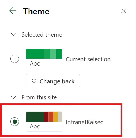
- Click Save to apply the theme to your SharePoint site.
3. Organization Font Configuration
SharePoint Brand Center allows organizations to configure custom fonts and apply consistent typography across SharePoint sites and Viva Connections experiences. Standardizing fonts helps reinforce brand identity and provides a consistent user experience.
Brand Fonts
Brand fonts are your organization's fonts that are uploaded and managed within the SharePoint Brand Center.
Prerequisites
- Global Administrator or SharePoint Administrator permissions.
Steps to Upload Brand Fonts
- Go to the Microsoft 365 Admin Center.
- In the left navigation panel, go to Settings → Org settings, and then select Brand center.
- Click Copy link.
- Paste the copied link into a new browser tab to open the Brand Center.
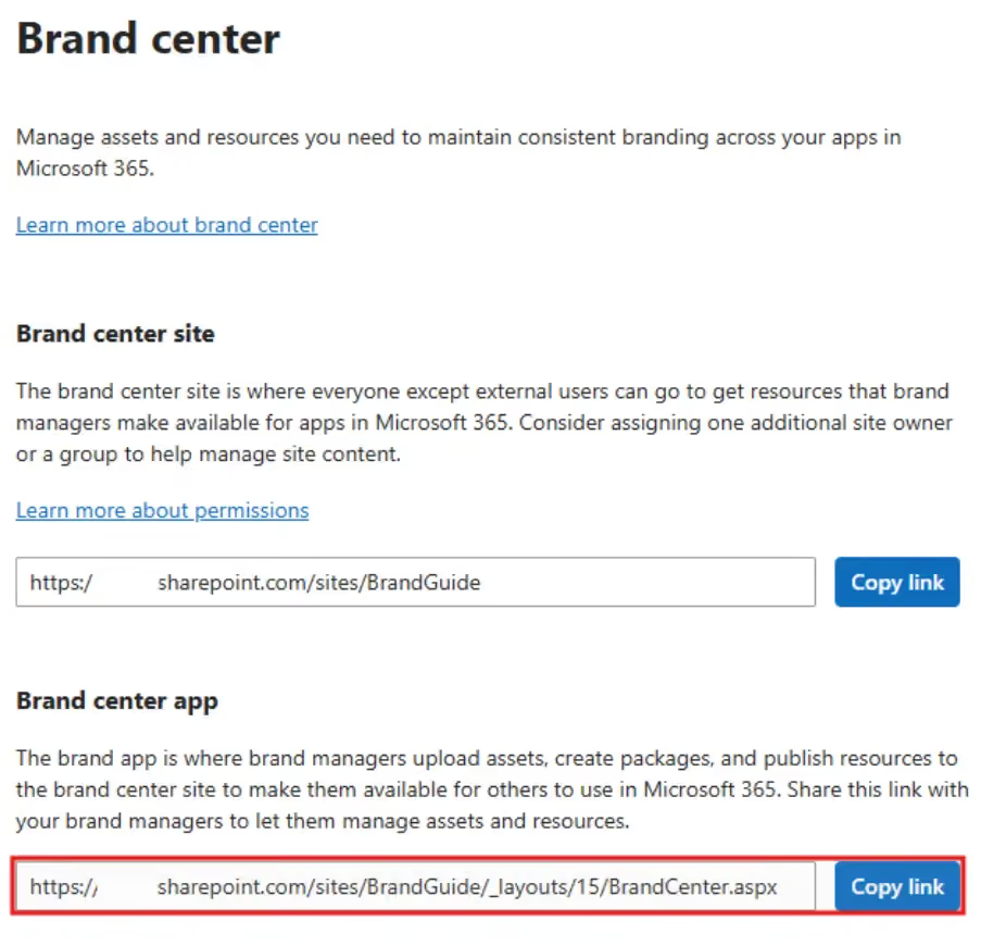
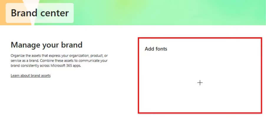
Manage Your Custom Brand Fonts
- From the Brand Center page, click Brand fonts.
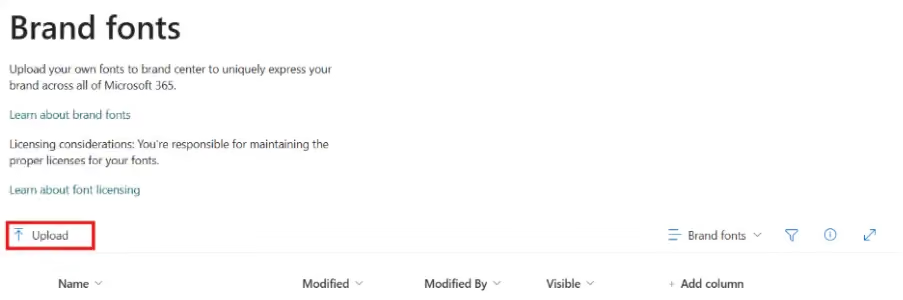
- On the Brand fonts page, click Upload to upload your custom font files.
Supported file types: .otf, .ttf, .woff, and .woff2.
Create Your Own Font Packages
There are two ways to create custom font packages:
- Brand Center Font packages created in the Brand Center are available across all SharePoint sites.
- Site Branding Font packages created in Site Branding are available only within that specific site.
Brand Center
- From the Brand Center page, click SharePoint to open the SharePoint branding page.
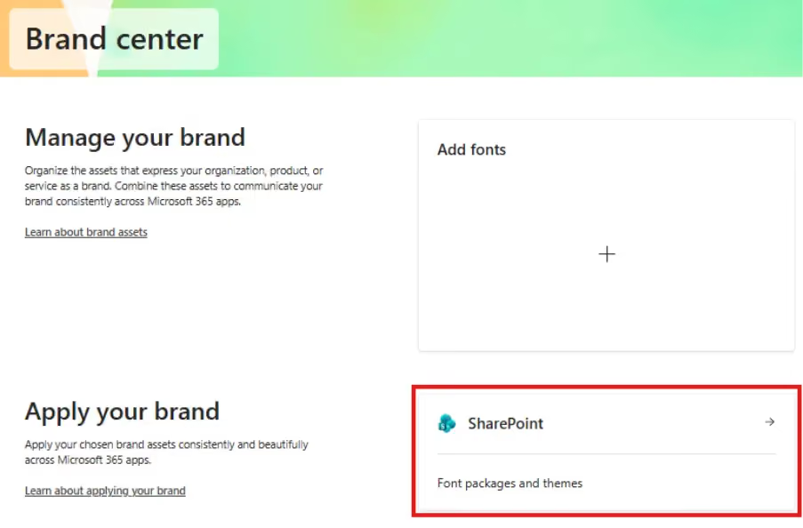
- Click Add font package.
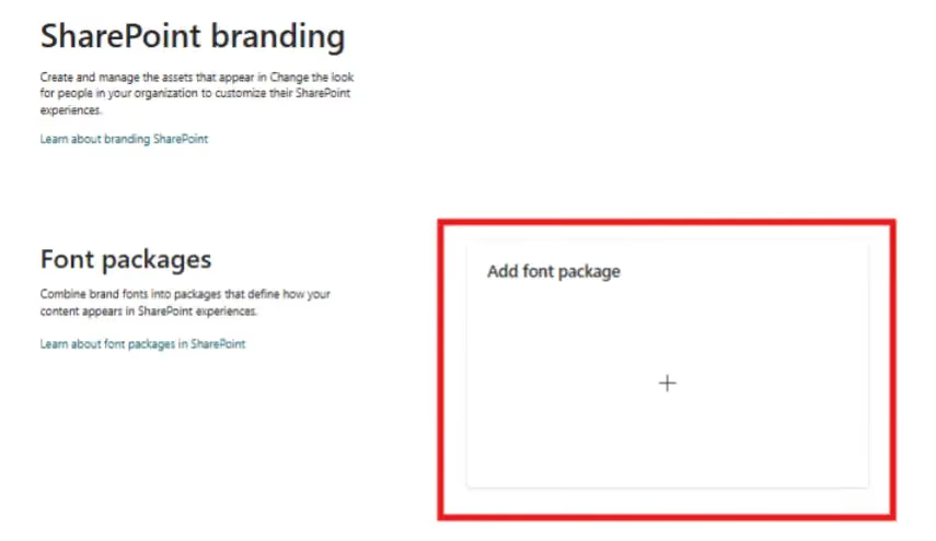
- The Create a font package page will open.
Configure the Font Package
- Select display and content fonts using the font families available in your Brand fonts library.
- You can select up to two different font families, or you can use the same font family for both display and content fonts.
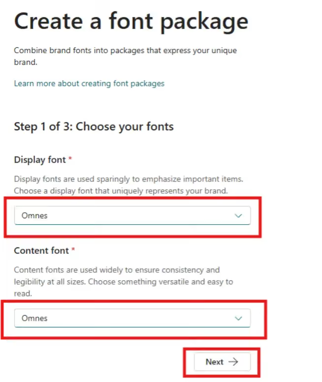
- Select the desired font family and font style for each of the four font slot mappings.
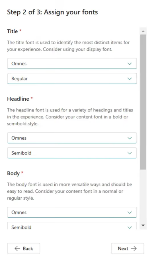
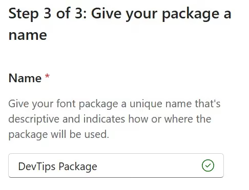
- Enter a name for your font package.
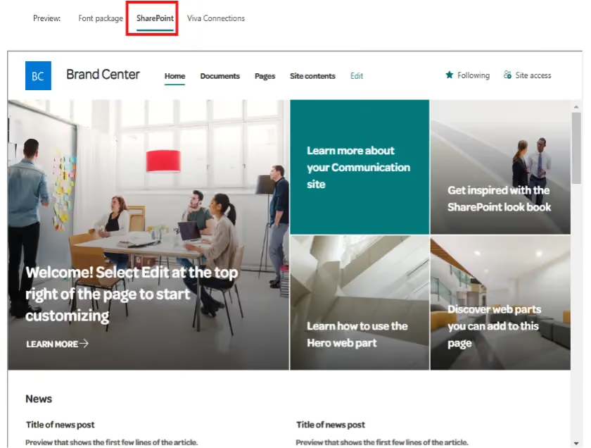
- Preview the font package in different experiences.
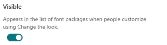
- Determine the Visible setting for your font package.
- Click Save.
After saving, it may take a few minutes for the font package to become available in the Change the look experience across SharePoint sites.
Apply a Font Package to Your SharePoint Site
- Go to the SharePoint site where you want to apply the font package.
- Click Settings (⚙️) in the top-right corner.
- In the Settings panel, under the SharePoint section, click Change the look.
- In the Change the look panel, click Font.
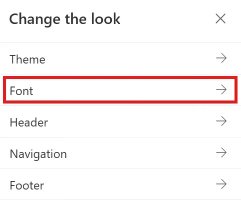
- In the Available font packages drop-down menu, your custom font packages will appear under From my organization.
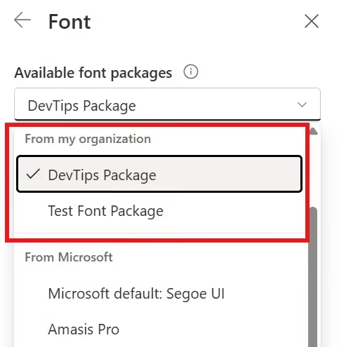
- Select the desired font package.
- Click Save to apply the font package.
Site Branding
Prerequisites
- Site Owner / Full Control permissions
Steps to Create a Font Package
- Open your SharePoint site.
- Click Settings (⚙️) in the top-right corner.
- In the Settings panel, under the SharePoint section, click Site branding (new).
- The Site Branding experience will open, where you can customize fonts for your site.
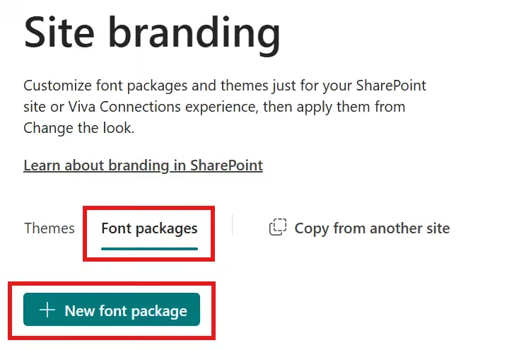
- Click Font packages.
- Click + New font package.
Configure the Font Package
- Select display and content fonts using the available font families.
- You can select up to two different font families, or you can use the same font family for both display and content fonts.
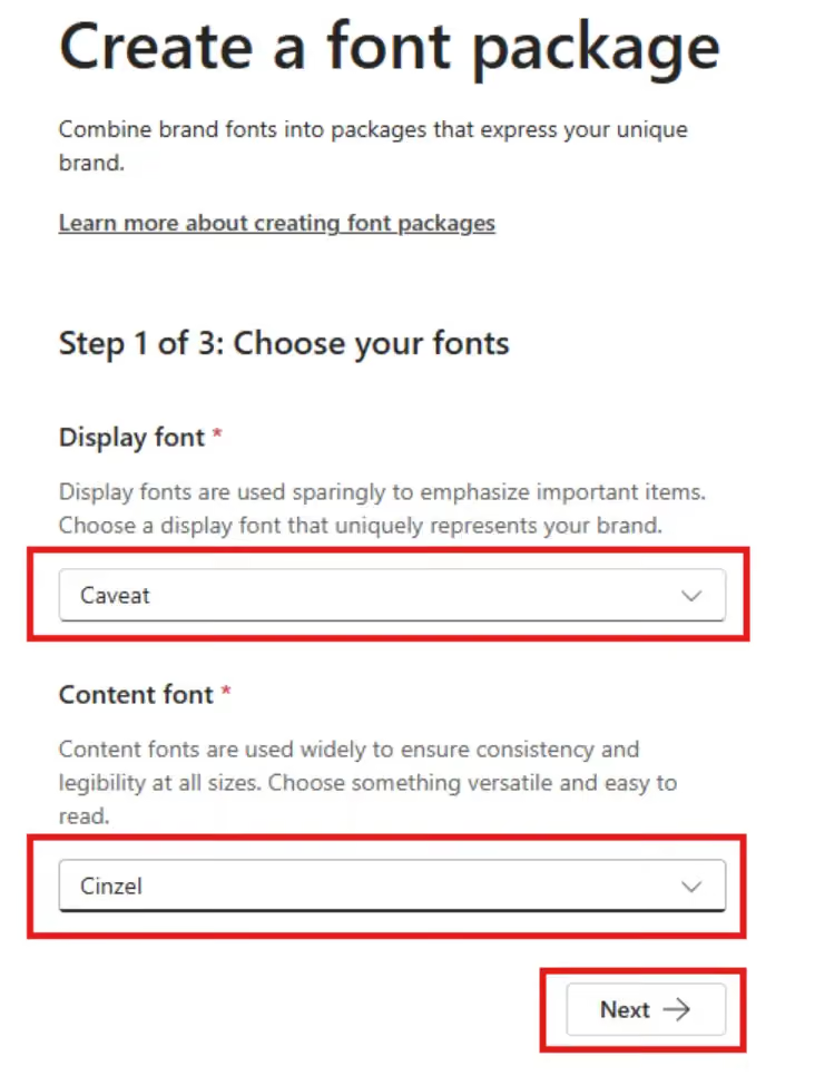
- If you want to add additional fonts, upload them in the Manage your custom fonts library within the Brand Center. You can follow the above instructions to upload new fonts.
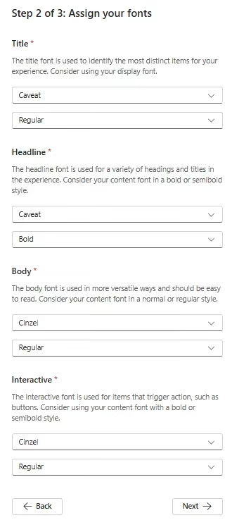
- Select the desired font family and font style for each of the four font slot mappings.
- Enter a name for your font package.
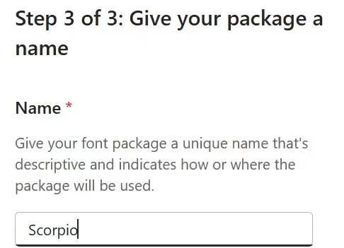
- Preview the font package in different experiences.
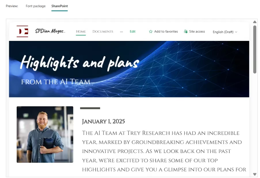
- Click Save.
Apply a Site Font Package
- Open the SharePoint site where the font package was configured.
- Click Settings (⚙️) in the top-right corner.
- In the Settings panel, under the SharePoint section, click Change the look.
- In the Change the look panel, click Font.
- In the Available font packages drop-down menu, your custom font packages will appear under From this site.
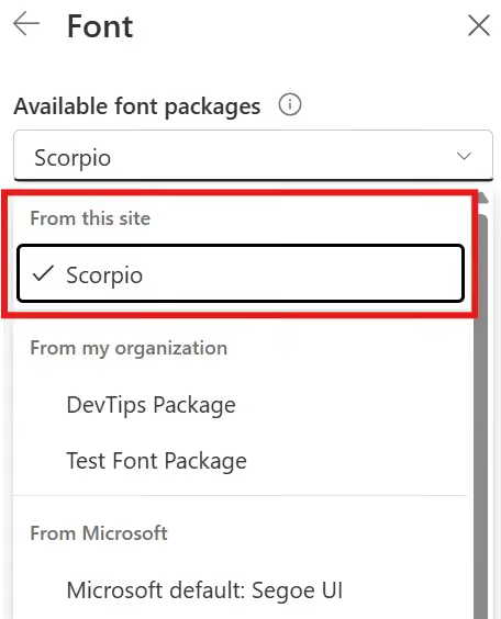
- Select the desired font package.
- Click Save to apply the font package.
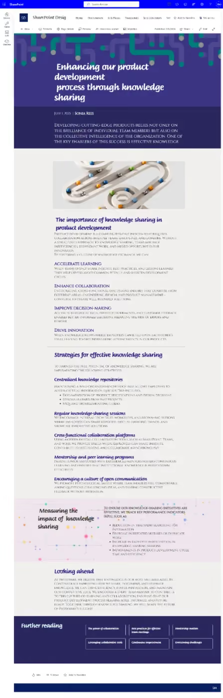
Once the font package is applied, your SharePoint site will display the selected font families across supported experiences.
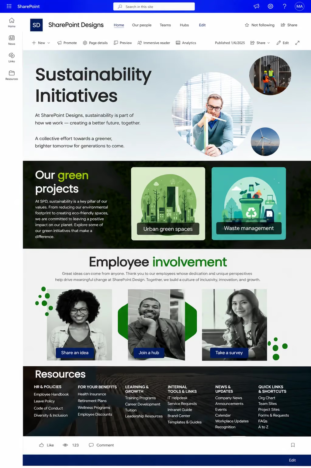
Figure: Example of a SharePoint site after applying a custom brand font package.
4. Site-Level Branding
In SharePoint, site-level branding allows each site to establish its own visual identity while still aligning with the organization’s overall theme. This is especially useful for departments, projects, or campaigns that require slight visual differentiation.
Even when a tenant-level theme is applied, site owners can customize specific elements to enhance usability and relevance.
Key Branding Elements at Site Level
1. Site Logo
The site logo represents the identity of the site.
- Appears in the header (top-left corner)
- Helps users quickly recognize the site
- Can be department-specific (e.g., HR, Finance)
Best practices
- Use a transparent PNG (recommended)
- Maintain consistent dimensions across sites
- Avoid overly complex designs
Add a Site Logo
- Open your SharePoint site
- Click on the Settings (⚙️ gear icon) in the top-right corner.
- In the Settings panel, under the SharePoint section, click on Change the look.
- In the Change the look section, click Header.
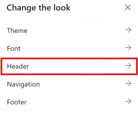
Header Configuration Options
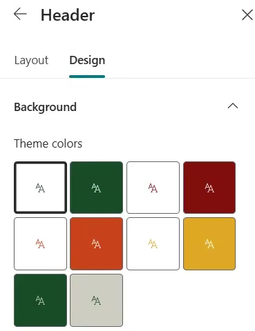
- Go to the Design Tab, You can select a background color or upload a background image.
- Background – Choose a background color for the header
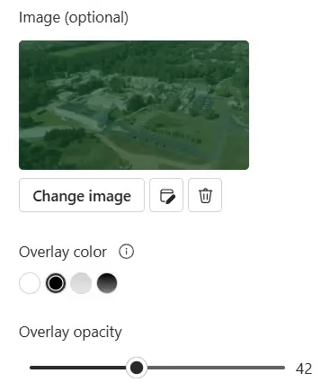
- Image (optional) – Upload a background image and adjust:
- Overlay
- Opacity
- Focal point
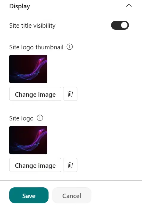
- Site title visibility – Toggle to show or hide the site title
- Site logo thumbnail – Upload a site logo thumbnail (must be a square logo for default use in experiences that require a square aspect ratio)
- Site logo – Upload the site logo. If using Extended layout, select Site logo alignment.
Note: To ensure that your icon renders properly, please pick one that fits within the range of 64 x 64 pixels to 192 x 64 pixels (width x height).
- Click Save to apply the changes to the header.
2. Header Layout
The header is one of the most visible branding elements in a SharePoint site. It defines the overall look of the site and helps establish a strong visual identity. Choosing the right header layout improves usability, enhances navigation visibility, and creates a better user experience.
SharePoint provides multiple header layout options to suit different site needs, ranging from simple content-focused layouts to visually rich branded experiences.
Customize Header Layouts
To customize header layouts in your SharePoint site:
- In the Settings panel, under the SharePoint section, click on Change the look.
- In the Change the look section, click Header.
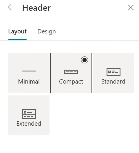
- SharePoint provides four header layout options:
- Minimal
- Smallest header with very limited height
- Displays only essential elements (logo and navigation) in a single line

- Compact
- Slightly larger than Minimal
- Displays the logo, site name, and navigation in a clean, single-line layout
- Suitable for most internal portals

- Standard
- Default layout with moderate height
- Provides better visibility for the logo and site name, with content arranged across two lines.
- Supports background color or image

- Extended
- Largest header layout with strong visual presence
- Supports large background images and richer branding
- Allows alignment control for logo and content
- Displays content across two lines with enhanced spacing

- Once you have selected the desired layout, click Save to apply the changes.
3. Navigation
Navigation should always be planned from the user’s perspective. A well-structured navigation system helps users quickly find content and easily move between pages and resources.
When planning site and page navigation, consider the following:
- Organizing – Group related content and similar functions logically.
- Labeling – Use clear and meaningful labels that users can immediately understand.
- Usability – Ensure users can navigate the entire experience easily and efficiently.
- Findability – Make it easy for users to quickly locate the information they need.

Effective navigation improves the overall user experience and helps create a more intuitive SharePoint intranet.
Customize Navigation Styles
To customize navigation styles in your SharePoint site:
- In the Settings panel, under the SharePoint section, click on Change the look.
- In the Change the look section, click Navigation.
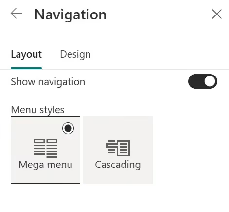
- SharePoint provides the following navigation options:
- Show navigation - Toggle to show or hide the site navigation.
- Menu styles: Mega menu – Displays sub-navigation links in a large horizontal panel, making it easier to organize and access multiple links. Best suited for sites with a complex structure.

- Cascading – Displays sub-navigation links in a traditional drop-down menu with nested levels. Best suited for sites with a simpler structure.
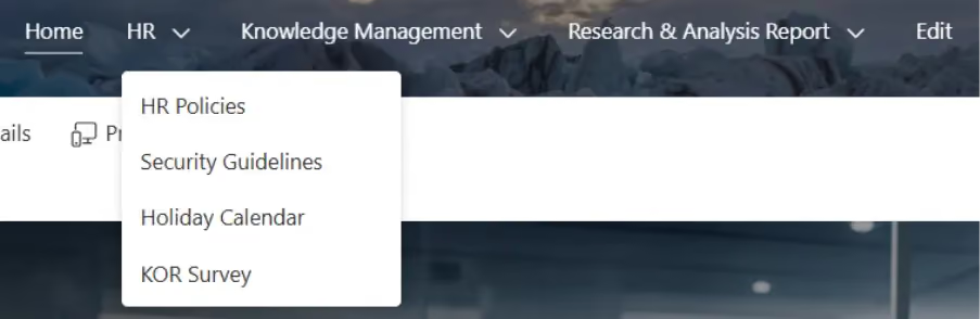
- Once you have selected the desired menu style, click Save to apply the changes.
4. Footer
The footer provides a consistent area for additional navigation and organizational information across the site.
Common footer elements include:
- Quick links
- Policies and compliance links
- Contact information
- Helpdesk or support resources
A well-structured footer improves access to important resources and enhances the overall user experience.
Customize the Footer
To customize footer in your SharePoint site:
- In the Settings panel, under the SharePoint section, click on Change the look.
- In the Change the look section, click Footer.
1. Design
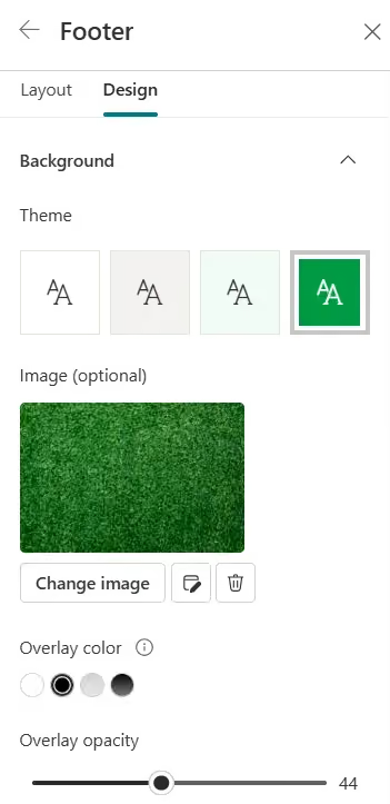
Footer Configuration Options
- Go to the Design tab. You can select a background color or upload a background image.
- Background – Choose a background color for the header
- Image (optional) – Upload a background image and adjust:
- Overlay
- Opacity
- Focal point
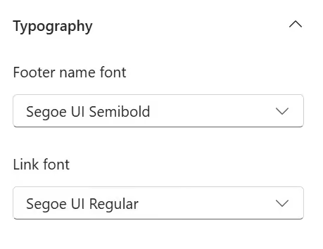
1. Typography
- Footer name font – Choose the available font style for the footer name
- Link font – Choose the available font style for footer links
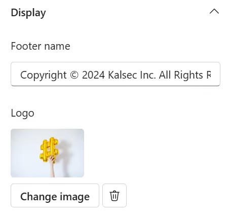
2. Display
- Footer name – Enter the footer name
- Logo – Upload a footer logo. The image is automatically resized.
2. Layout
Footer Layout Options
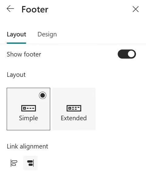
- Go to the Layout tab.
- Show footer – Toggle to show or hide the footer.
- SharePoint provides two footer layout options:
- Simple – Displays a single level of links and labels, up to eight columns wide.

- Extended – Displays footer links and labels in a larger, more structured layout with additional spacing and support for grouped navigation links, up to eight columns wide.

- Link Alignment - Adjust the alignment of footer links.
- Click Save to apply the changes to the footer.
Edit Footer Labels and Links
After adding a footer to your site, you can customize footer labels and links.
- Select Edit in the footer section on the left side
- Add, edit, or reorganize links and labels as needed

These elements help differentiate departments while maintaining overall consistency.
5. Page Design & Layout Standards
A consistent page design improves readability, usability, and the overall user experience. Well-structured layouts help users quickly understand content and navigate information more efficiently.
Modern SharePoint pages provide flexible layouts and responsive sections that help create visually consistent intranet experiences.
- Use Consistent Page Structure
A consistent page structure helps users quickly understand where content is located and improves overall usability. Maintaining similar layouts across pages creates a familiar experience throughout the intranet.
A typical page structure may include:
- Header or banner section
- Main content area
- Quick links or related resources
- Footer section
Using a consistent structure also helps maintain branding and improves content organization.
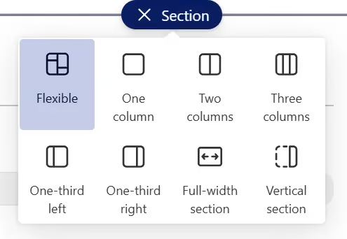
- Section Layouts
SharePoint provides multiple section layouts to organize content effectively based on business requirements.
- One-column Layout
The one-column layout provides a full-width content area and is best suited for content-focused pages such as announcements, articles, or policy documents.
Best practices:
- Use for long-form content
- Keep content clean and easy to read
- Avoid excessive web parts
- Two-column Layout
The two-column layout divides the page into two equal sections, allowing content and supporting information to be displayed side by side.
Best practices:
- Content with quick links
- News and related resources
- Balanced page designs
- Three-column Layout
The three-column layout is useful for displaying multiple categories or smaller content blocks within the same section.
Best suited for:
- Dashboards
- Quick access links
- Department highlights
Best practices:
- Avoid overcrowding columns
- Keep content concise
- One-third Left Column Layout
This layout provides a smaller supporting section on the left and a larger content area on the right.
Best suited for:
- Navigation links with primary content
- Quick links and resources
- Contact information alongside main content
- Supporting information with articles or announcements
- One-third Right Column Layout
This layout provides a larger content area on the left and a smaller supporting section on the right.
Best suited for:
- Articles with related links
- Announcements with supporting resources
- Main content with contact information
- Content pages with quick actions or related documents
- Full-width Section
Full-width sections span the entire page width and are available mainly in Communication Sites.
Best suited for:
- Hero web parts
- Banner images
- Important announcements
- Landing pages
Best practices:
- Use high-quality images
- Avoid placing too much content in full-width areas
- Vertical Section
Vertical sections provide a dedicated side panel for additional information alongside the main content area.
Common uses include:
- Quick links
- Contacts
- Related resources
- Action buttons
Best practices:
- Keep supporting content minimal
- Avoid excessive web parts in vertical sections
- Flexible Layout
The flexible layout allows web parts to be resized and arranged dynamically within the section. It provides greater control over spacing and content arrangement compared to standard column layouts.
Best suited for:
- Modern landing pages
- Dashboard-style layouts
- Interactive and visually rich pages
Best practices:
- Maintain proper spacing between web parts
- Avoid excessive resizing that affects readability
- Use consistent alignment for a cleaner appearance
- Web Part Usage
Web parts help create dynamic and interactive SharePoint pages.
Commonly used web parts include:
- Hero
- Quick Links
- News
- Events
- Image
- Text
- People
Best practices:
- Use only necessary web parts
- Maintain proper spacing between web parts
- Ensure visual consistency across pages
- Spacing and Alignment
Proper spacing and alignment improve readability and create a cleaner user interface.
Best practices:
- Maintain equal spacing between sections
- Align web parts consistently
- Avoid cluttered layouts
Consistent alignment creates a more professional and organized intranet experience.
6. Typography & Content Guidelines
Typography and content formatting improve readability and create a consistent intranet experience. Well-structured content helps users quickly scan and understand information.
Best Practices:
- Use Consistent Font Styles
Maintain consistent font styles across pages to create a unified visual experience. Avoid excessive text styling and multiple font families.
- Maintain Proper Heading Hierarchy
Use headings to organize content clearly:
- Heading 1 – Main title
- Heading 2 – Section title
- Heading 3 – Subsection title
- Keep Content Short and Readable
Use short paragraphs, bullet points, and meaningful headings to improve readability and content scanning.
- Use Clear and Meaningful Labels
Use simple and understandable labels for navigation, buttons, and section titles.
- Maintain Proper Spacing and Alignment
Maintain consistent spacing and alignment between sections and content blocks for a cleaner layout.
- Follow Accessibility Best Practices
Use proper color contrast, readable font sizes, and meaningful link text to improve accessibility.
Consistent typography and content formatting help create a more readable, accessible, and professional SharePoint intranet experience.
7. Image & Media Strategy
Images and media elements help create a visually engaging SharePoint intranet experience. Using consistent and optimized media improves branding, readability, and overall page performance.
Best Practices:
- Use High-Quality Images
Use clear and professional images for banners, backgrounds, and visual content to maintain a polished intranet appearance.
- Maintain Consistent Image Sizes
Use consistent image dimensions and aspect ratios across pages to create a uniform layout and avoid distorted visuals.
- Optimize Images for Performance
Compress and optimize images before uploading to reduce page load times and improve performance.
- Use Meaningful Visuals
Use images and icons that support the content and help users quickly understand the purpose of the page or section.
- Avoid Overusing Media
Avoid excessive use of large banners, videos, or animations that may distract users or impact page performance.
- Follow Accessibility Best Practices
Ensure media content is accessible to all users.
A well-planned image and media strategy helps create a more engaging, visually consistent, and performance-optimized SharePoint intranet experience.
8. Custom Branding Using SPFx
For advanced branding scenarios that cannot be achieved using out-of-the-box SharePoint capabilities, organizations can extend SharePoint using the SharePoint Framework.
SPFx provides a flexible and supported way to build custom branding experiences while maintaining compatibility with modern SharePoint.
Common Branding Scenarios:
- Custom Headers and Footers
Use Application Customizers to create organization-wide headers, footers, announcement bars, or utility navigation that provide a consistent experience across sites.
- Reusable Branded Web Parts
Develop custom web parts that follow your organization's branding standards, such as:
- News and announcement components
- Department dashboards
- Quick links and resource cards
- Employee directory and profile cards
- Dynamic UI Components
Create interactive and personalized experiences, including:
- Notifications and alerts
- Welcome messages
- Custom navigation menus
- Social media or event feeds
- Theme-Aware Components
SPFx components can automatically inherit SharePoint themes, ensuring that custom solutions remain consistent with your organization's branding.
Example 1: Custom Navigation

Description:
A custom navigation component built using SPFx that provides branded icons, quick access links, and a consistent navigation experience across the intranet.
Example 2: Personalized Greeting and News Carousel
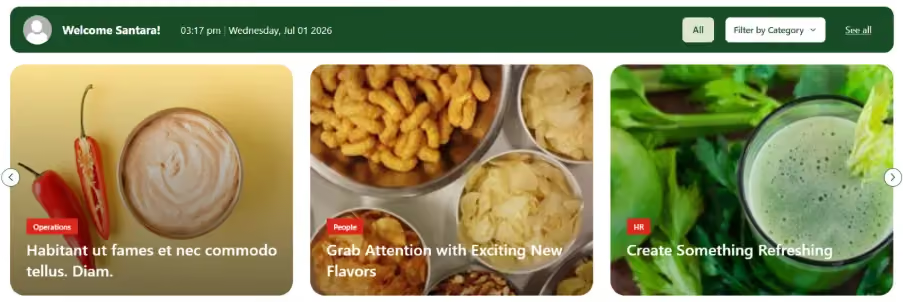
Description:
A custom SPFx web part that displays a personalized greeting, current date and time, and a branded news carousel with category filtering.
Best Practices:
- Use out-of-the-box capabilities whenever possible before implementing custom solutions.
- Build reusable components that can be used across multiple sites.
- Keep customizations lightweight to maintain performance.
- Follow Microsoft's design and accessibility guidelines.
- Avoid unsupported custom CSS or DOM manipulations that may break after SharePoint updates.
SPFx enables organizations to create unique and branded intranet experiences while maintaining a modern, scalable, and supported SharePoint environment.
9. Responsive & Mobile Experience
Modern SharePoint pages are responsive by default and automatically adapt to different screen sizes. However, validating the user experience across desktop, tablet, and mobile devices is essential to ensure content remains accessible and visually consistent.
Best Practices:
- Layout Behavior on Mobile Devices
Verify that page sections and columns stack correctly on smaller screens and that important information remains easy to access.
- Image Scaling
Use appropriately sized and optimized images to ensure banners and media elements display correctly without affecting page performance.
- Web Part Responsiveness
Test web parts on different devices to ensure content is displayed properly and interactive elements remain usable.
- Navigation Experience
Ensure menus, links, and buttons are easy to access and use on touch devices.
- Readability and Spacing
Verify that text remains readable and that there is adequate spacing between elements to avoid a cluttered mobile experience.
- Test Across Multiple Devices
Validate pages across different screen sizes and devices to ensure a consistent and user-friendly experience.
A responsive and mobile-friendly intranet ensures that users can access information efficiently from any device, improving engagement and productivity.
10. Performance Considerations
A visually appealing intranet should also be optimized for performance. Excessive media, customizations, and complex page layouts can negatively impact page load times and user experience.
Best Practices:
- Optimize and compress images before uploading.
- Avoid adding too many web parts on a single page.
- Use videos and animations sparingly.
- Keep custom SPFx solutions lightweight and efficient.
- Regularly review pages to remove unused content and components.
A well-performing intranet ensures that branded experiences remain fast, responsive, and easy to use across all devices.
11. Multi-Language & Localization
Organizations with a global workforce may need to provide content in multiple languages to improve accessibility and user engagement. SharePoint supports multilingual experiences, allowing sites and pages to be translated and displayed in users' preferred languages.
Best Practices:
- Enable multilingual support only when required.
- Provide translated content for important pages and resources.
- Use culturally appropriate images, icons, and terminology.
- Maintain consistent branding, navigation, and layouts across all language versions.
- Regularly review translated content to ensure accuracy and consistency.
A well-planned multilingual strategy helps deliver a consistent and inclusive intranet experience for users across different regions and languages.
12. SharePoint Intranet Branding Best Practices Checklist
Use the following checklist to ensure your SharePoint intranet follows branding best practices.
- Maintain consistent logos, headers, footers, and navigation across sites.
- Use appropriate page layouts and section layouts to improve readability.
- Follow consistent typography and content formatting guidelines.
- Use high-quality, optimized images and media to enhance user experience.
- Build lightweight and reusable SPFx components for custom branding.
- Validate the intranet experience on desktop, tablet, and mobile devices.
- Optimize pages by minimizing unnecessary web parts and large media files.
- Maintain consistent branding across multilingual sites, if applicable.
- Regularly review and update branding assets to align with organizational standards.
13. Conclusion
Effective SharePoint intranet branding goes beyond colors and logos. By combining consistent themes, typography, page layouts, media, navigation, and custom branding where needed, organizations can create an engaging, professional, and user-friendly digital workplace. Following these best practices helps ensure a consistent experience across all SharePoint sites while supporting performance, responsiveness, and long-term maintainability.
faqs

Nivetha Mahendran

She is a dedicated Software Engineer at SharePoint Designs, contributing to SharePoint web parts, extensions, Power Automate workflows, and modern intranet solutions. With a strong passion for learning and problem-solving, she continues to grow her technical expertise while delivering effective solutions for real-world client projects.






.svg)