Published Date -

How to Design a SharePoint Homepage Like a Modern Website?
Most SharePoint homepages don’t fail because of missing features.
They fail because employees land on the page and quietly think:
“What am I supposed to do here?”
If your homepage feels busy, ignored, or confusing, it’s usually not a SharePoint issue. It’s a design and intent issue.
Let’s break down how teams design SharePoint homepages that actually feel like modern websites and get used daily.
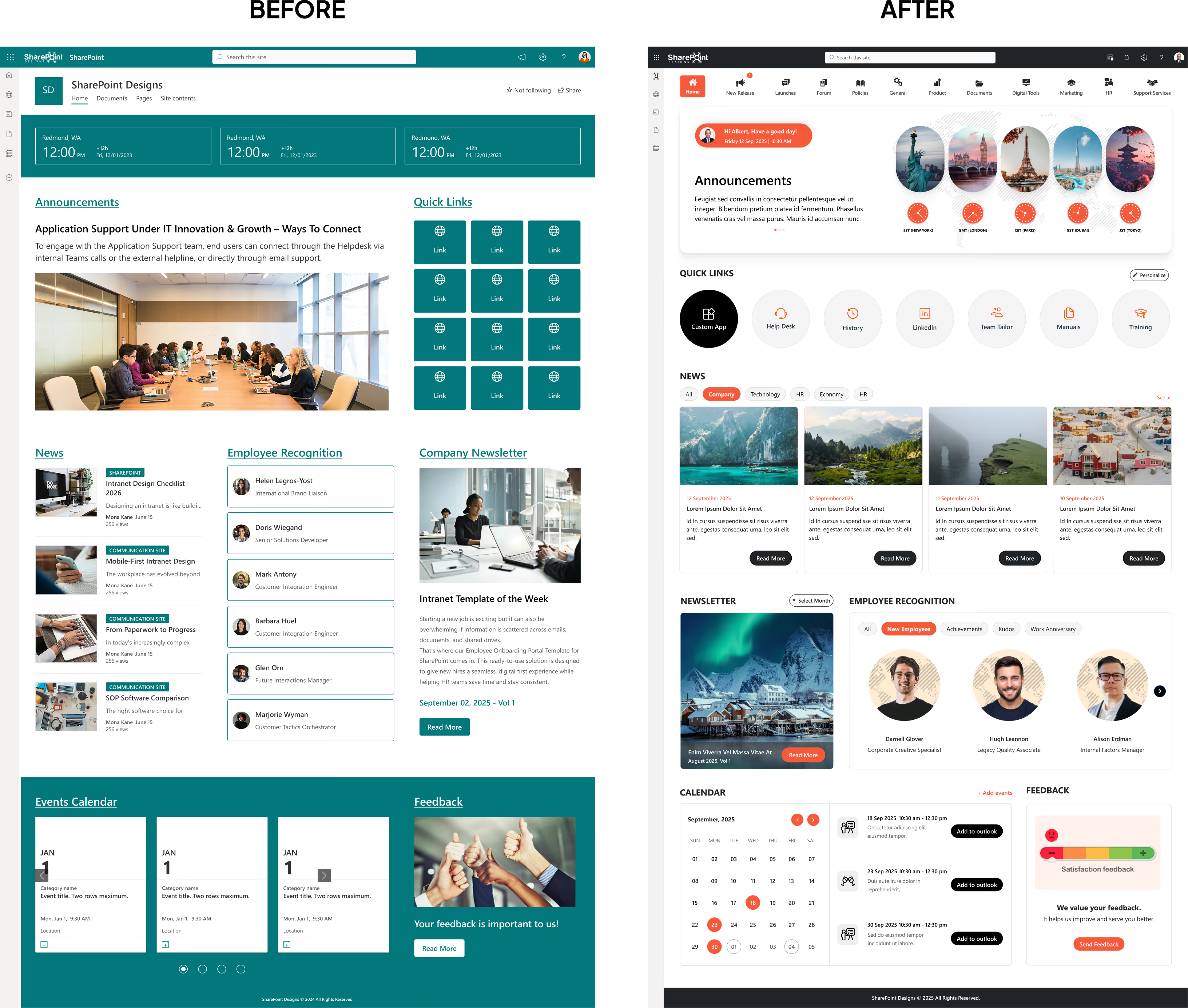
Before vs After: Why Most SharePoint Homepages Fail
Before redesign, many SharePoint homepages look like this:
- Every department asked for a link
- Announcements stacked endlessly
- Navigation labels only IT understands
- No clear starting point
After redesign, the same homepage becomes:
- One clear purpose at the top
- A few actions people use daily
- Clean sections instead of clutter
- Content that feels intentional
Nothing dramatic changed.
The thinking did.
That shift alone often improves engagement within weeks.
1. Start With One Clear Purpose (Not Everything at Once)
This is where most teams go wrong.
HR wants policies visible.
IT wants alerts.
Leadership wants announcements.
Everyone wants “just one more link.”
Modern websites don’t work that way.
Before touching layout or web parts, decide:
- Is this homepage for daily employee tasks?
- Is it primarily for communication and updates?
- Is it a navigation gateway to other sites?
A homepage can support many things, but it should lead with one.
How to make SharePoint look like a website
2. Design the Homepage Like a Landing Page, not a Dashboard
Dashboards are built for monitoring.
Websites are built for direction.
A website-like SharePoint homepage usually follows this flow:
- Context at the top (welcome, message, or purpose)
- Primary actions users take most often
- Supporting content like news or updates
- Secondary content further down
If users can scan the page and understand it without reading every word, you’re on the right track.
Here’s how common homepage elements contribute to a more website-like experience:
Web Parts That Make Your SharePoint Intranet Feel Like a Website
3. Use Visual Hierarchy to Reduce Thinking
One reason modern websites feel easy is visual hierarchy.
In SharePoint, this means:
- One dominant headline or hero section
- Clear separation between content blocks
- Fewer columns, not more
- Consistent spacing and alignment
If everything looks equally important, nothing feels important.
A simple test : If someone scrolls the homepage once and understands the layout without reading text, the hierarchy is working.
4. Make Navigation Feel Human, Not Technical
Employees don’t think in terms of “sites” and “libraries.”
They think in tasks.
Instead of:
- “Policies Library”
- “Forms Repository”
Use:
- “Company Policies”
- “Request Forms”
- “Get IT Help”
Website-style SharePoint navigation usually includes:
- Simple hub navigation at the top
- Clear, human labels
- Footer links for secondary content
Navigation should feel familiar, not clever.
5. Treat Quick Links Like Calls to Action
Quick Links are often treated as filler.
On modern websites, they’re treated as calls to action.
Effective homepage links:
- Are limited to 5–7 key actions
- Use icons for quick recognition
- Reflect what employees actually do every day
If a link hasn’t been used in months, it doesn’t belong on the homepage.
6. Design News Like a Feed, not a Notice Board
One big difference between old intranets and modern websites is how content is presented.
Website-style SharePoint homepages:
- Use card-based news layouts
- Show short summaries, not long titles
- Rely on visuals over text
- Use audience targeting
When news feels scannable, people actually read it.
7. Bring a Human Element into the Page
Websites feel alive because they reflect people, not just information.
Modern SharePoint homepages often include:
- New joiner highlights
- Leadership messages or short videos
- Polls or lightweight interactions
- Events and moments, not just updates
An intranet people enjoy opening gets used more often than one that’s purely functional.
8. Design for Mobile First (Not as an Afterthought)
A lot of “this doesn’t look good” feedback comes from mobile.
Website-like SharePoint homepages:
- Avoid overloaded columns
- Keep content tap-friendly
- Work cleanly in a single-column view
- Feel natural inside Microsoft Teams
If it works on mobile, it usually works everywhere else.
9. Use Consistent Layouts Instead of Reinventing Pages
Modern websites feel polished because patterns repeat.
The same applies to SharePoint:
- Reuse homepage sections across departments
- Keep layouts familiar
- Change content, not structure
Consistency builds trust. Employees shouldn’t have to relearn the intranet every time they visit a new page.
What Makes a SharePoint Homepage Feel “Un-Website-Like”
Avoid these common mistakes:
- Treating the homepage like a file directory
- Adding links for every department request
- Using internal jargon in navigation
- Designing only for desktop users
- Trying to showcase everything at once
Most homepage problems come from over-helping.
A Quick Test: Is Your SharePoint Homepage Website-Ready?
Ask yourself:
- Can users understand the page in 5 seconds?
- Are there fewer than 7 primary actions?
- Is search visible without scrolling?
- Does it work cleanly on mobile?
- Would a new hire know where to click?
If you answered “no” more than twice, the homepage needs refinement.
Why These Website Patterns Work Especially Well in SharePoint
These design patterns aren’t just borrowed from websites.
They work well in SharePoint because modern communication sites support:
- Full-width responsive layouts
- Audience-targeted content
- Search-first navigation
- Reusable page sections
No custom development required.
Final Thought: A Great SharePoint Homepage Feels Obvious
The best modern websites don’t impress users.
They guide them.
A SharePoint homepage that feels like a modern website:
- Has a clear purpose
- Uses visual hierarchy
- Speaks human language
- Prioritizes common actions
- Works beautifully on mobile
When employees instinctively know where to click without thinking, you’ve designed it right.
faqs

Agalya Thangaraj
Agalya Thangaraj is a UI/UX Designer, Intranet design specialist and Webflow Developer with over 6+ years of experience creating user-focused digital products. She specializes in UI/UX design and Webflow website development, delivering intuitive and responsive experiences. She is known for simplifying complex ideas into clear, high-impact user experience


.svg)