Published Date -

SharePoint Intranet Examples That Feel Like Real Websites with Use cases

This question comes up a lot when teams start redesigning their intranet.
What Makes a SharePoint Intranet Feel Like a Website?
If that’s on your mind too, don’t scroll too far, here’s the simple answer.
A website-like SharePoint intranet is built with clean layouts, clear navigation, strong visual hierarchy, and role-based content, so employees can find what they need quickly without training.
One of the biggest misconceptions about SharePoint is that it’s only good for documents. In reality, some of the most website-like experiences inside organizations today are built on SharePoint using modern pages, web parts, and thoughtful layout choices.
Most people don’t complain that SharePoint doesn’t work, they complain that it doesn’t feel right.
“It feels clunky.”
“It looks like a document dump.”
“It doesn’t feel like a real website.”
And yet, many organizations run SharePoint intranets that employees actually enjoy using. They open them daily, trust the content, and instinctively know where to click. The difference isn’t the platform, it’s how SharePoint is designed and structured.
Let’s look at real SharePoint intranet examples that feel like real websites, based on what employees actually see and experience, following the same principles covered in our guide on how to make SharePoint look like a website focusing on layout, navigation, and user intent.
1. Internal News & Media Portal (SharePoint Website Example)
Purpose:
In many organizations, internal news is buried in emails that employees skim or ignore. When teams move this content into a SharePoint internal news portal, engagement changes noticeably.
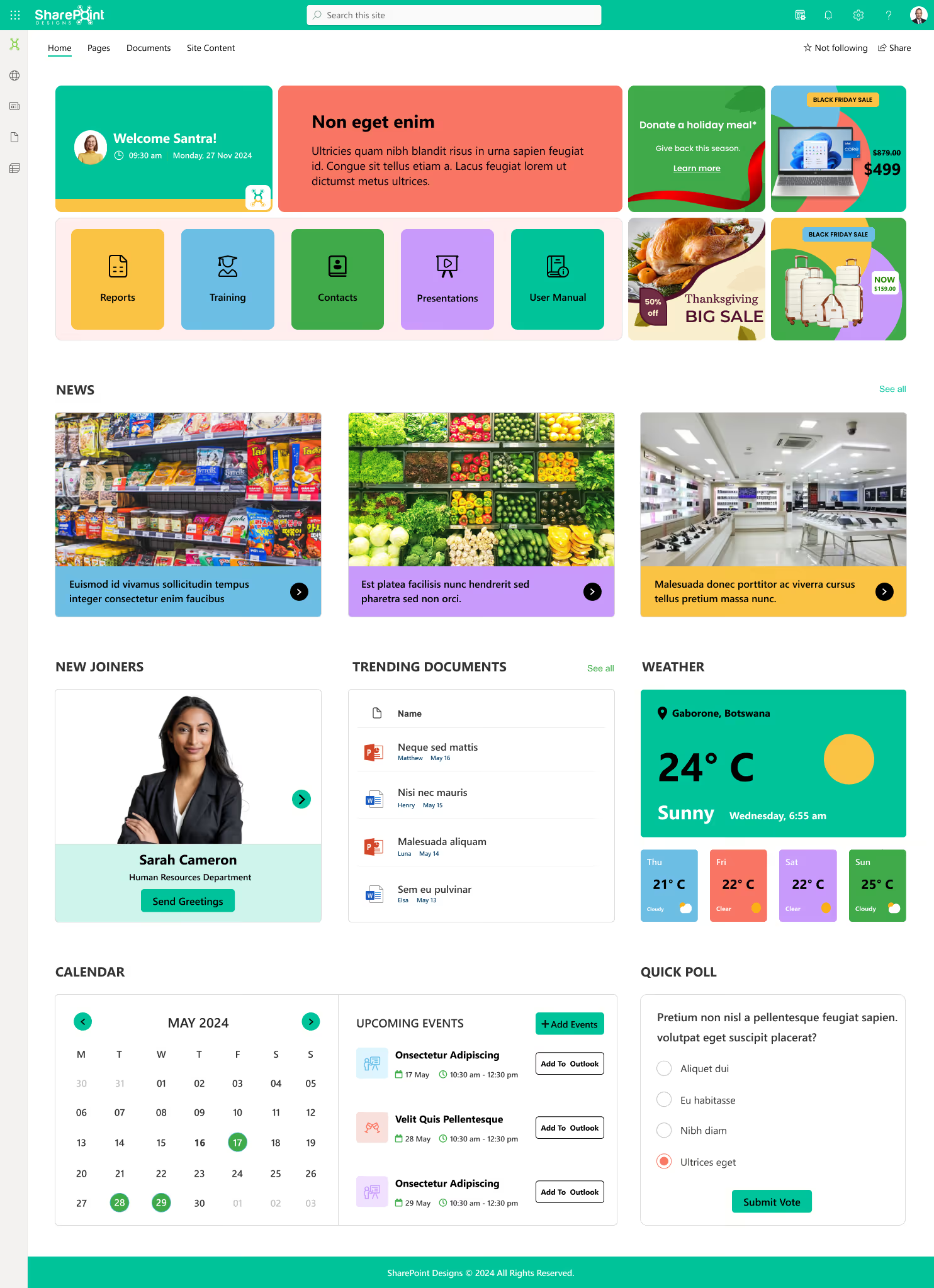
Built using modern SharePoint communication sites, the template is fully responsive, easy to customize, and scalable as your intranet grows.
What it feels like:
“A digital newsroom, not a notice board”
A clean, website-like SharePoint intranet homepage designed around how employees actually work. This template brings key information, quick actions, and internal updates into one clear, easy-to-use layout. A digital newsroom, not a notice board
Why this SharePoint website-style use case works:
Ideal for organizations that want a modern, employee-friendly intranet without complexity. Employees consume information the same way they do externally, visually, quickly, and on demand.
2. HR & Employee Services Hub (SharePoint HR Website Example)
Purpose:
HR portals are one of the most common website-like SharePoint use cases. Instead of sending employees through folders, teams design HR hubs that mirror external service websites.
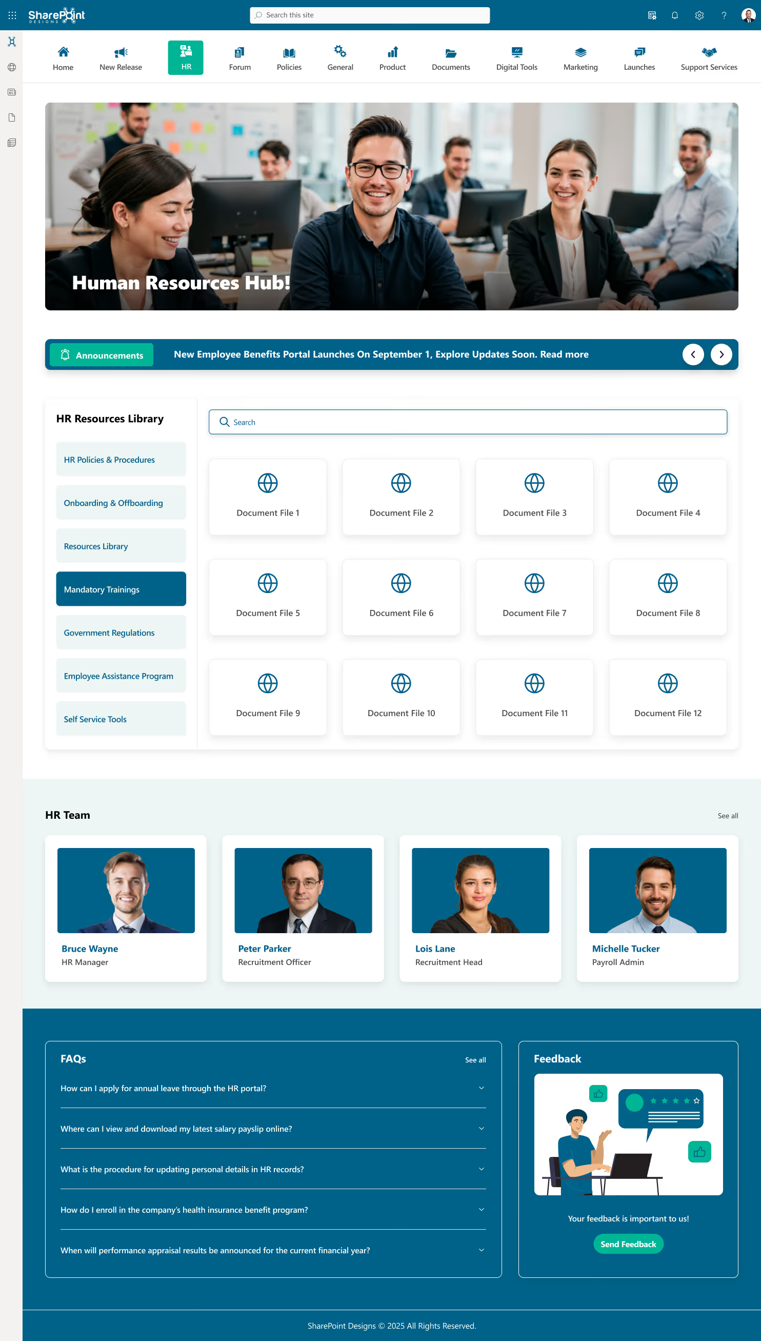
What it feels like:
“An HR microsite designed for self-service”
A website-like HR portal built on SharePoint that gives employees one clear place for policies, documents, and self-service tasks. The layout is clean, searchable, and designed to reduce everyday HR questions.
Why this works:
Ideal for organizations looking to create a simple, employee-friendly HR intranet without complexity. Employees don’t need to “learn SharePoint.” They just find answers.
3. IT Helpdesk & Knowledge Hub (SharePoint Self-Service Website Example)
Purpose:
Instead of emailing IT, employees first check a SharePoint IT helpdesk portal that behaves like a modern support website.
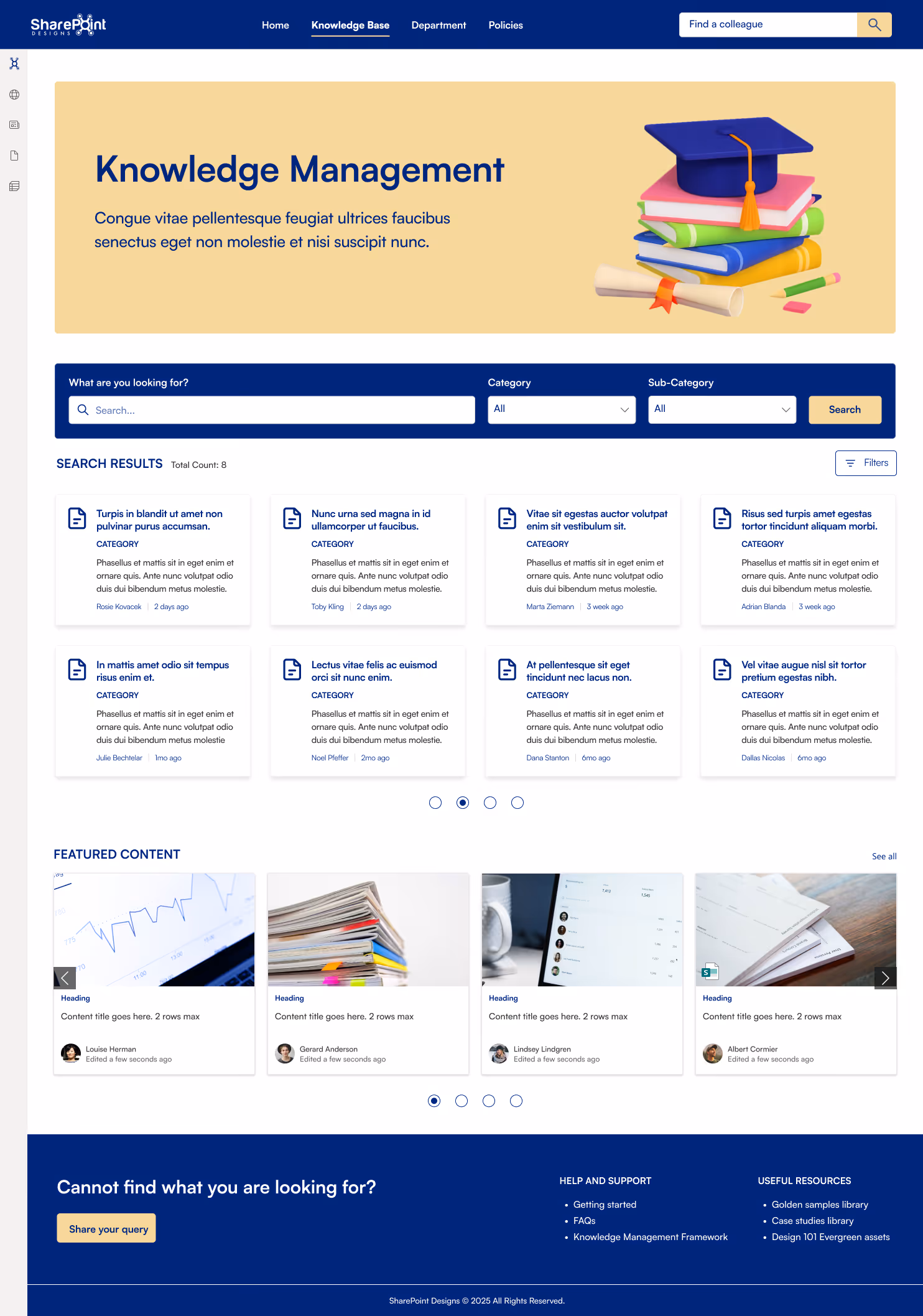
What it feels like:
“A modern self-service support portal.”
A clean, website-like knowledge base built on SharePoint that helps employees find answers quickly without digging through folders or asking around. The layout is search-first, structured, and designed for every day.
Why this SharePoint intranet example works:
Ideal for organizations looking to create a self-service knowledge center that actually gets used. Self-service only works when it’s easier than asking for help.
4. Department Showcase Sites (SharePoint Department Website Examples)
Purpose:
Departments often need visibility, not just storage. Many teams build department showcase sites that feel like standalone internal websites.
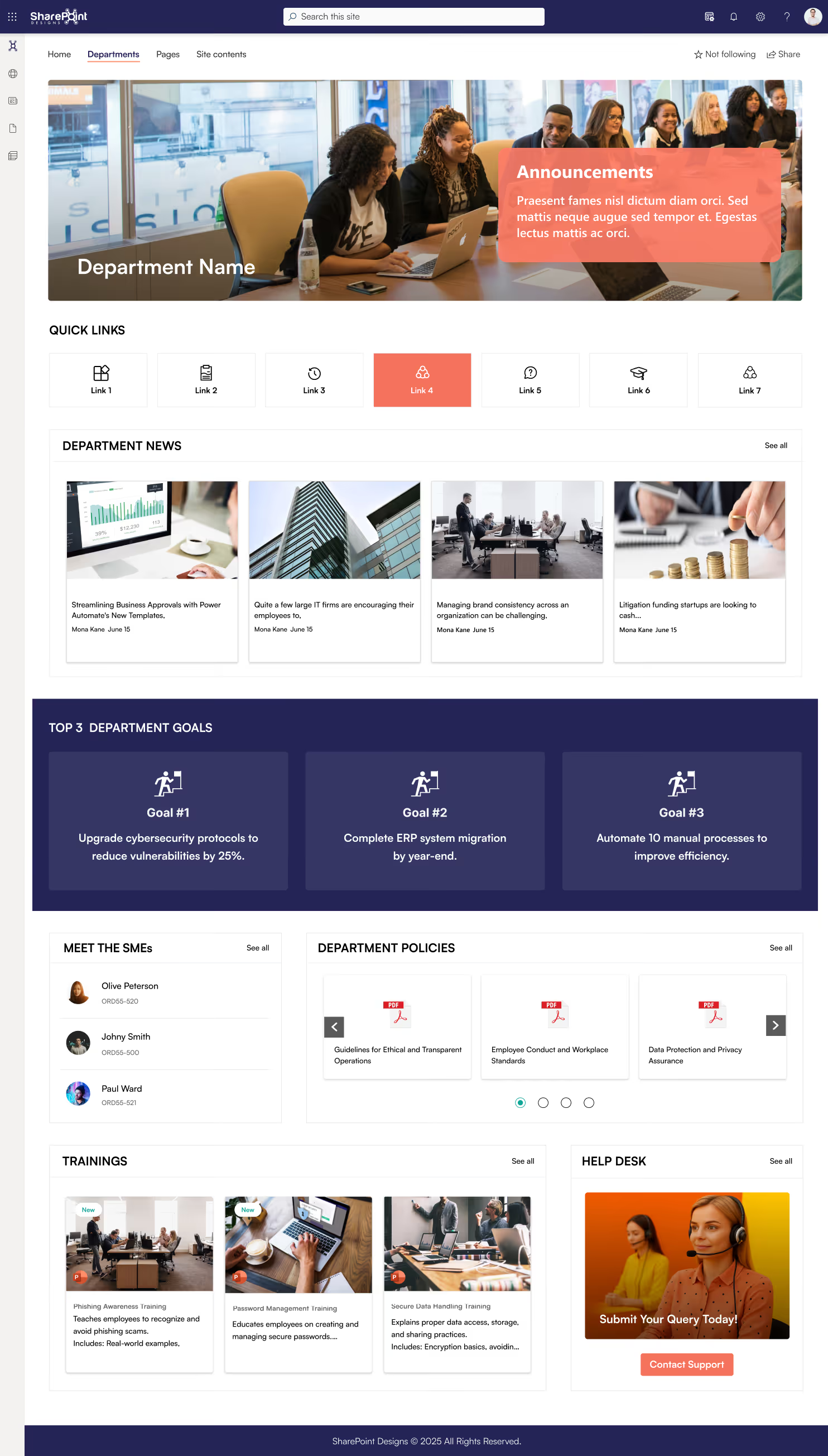
What it feels like:
“A departmental website with context and ownership”
A focused department workspace built on SharePoint, designed to bring people, priorities, and progress into one clear view. This template helps teams stay aligned without jumping between tools or pages.
Why this works:
Ideal for teams that want a structured, transparent, and easy-to-navigate department hub inside their intranet. Employees understand what each department does and who to contact, without digging through files.
5. Leadership Communication Portal (SharePoint Corporate Website Example)
Purpose:
Instead of PDF memos and long emails, organizations are creating leadership communication portals inside SharePoint.
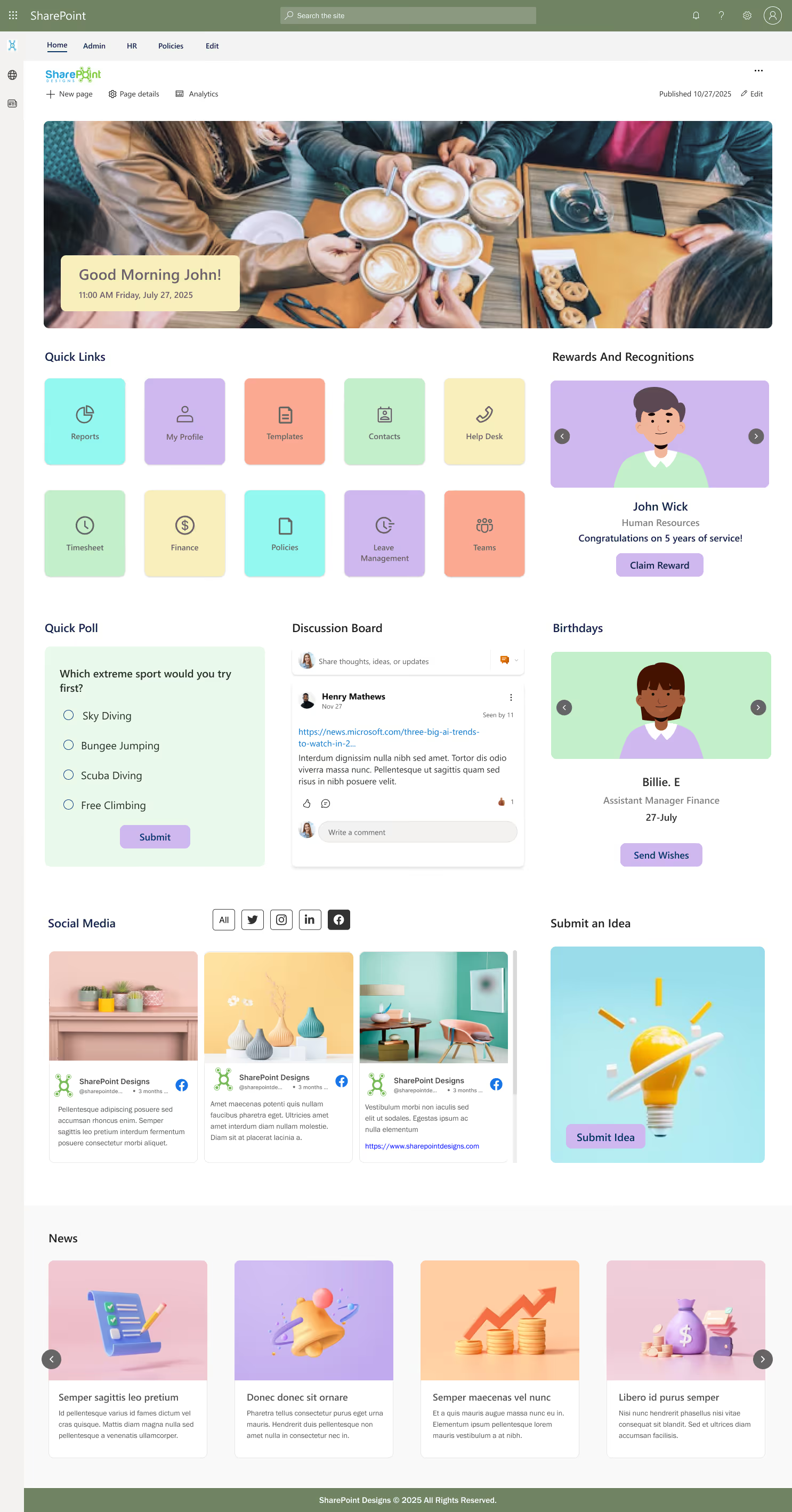
What it feels like:
“A corporate communication website, not an announcement dump”
A lively employee-centric intranet homepage built on SharePoint, designed to bring connection, conversation, and culture into the everyday work experience. This layout balances productivity tools with human interaction.
Why this SharePoint website-like experience works:
Ideal for organizations that want a social, engaging intranet homepage that employees enjoy returning to, not just a place to store files. Leadership feels visible and accessible, which builds trust.
Common Patterns Across SharePoint Sites That Truly Look Like Websites
Across real implementations, these patterns repeat:
- Clear homepage purpose
- Minimal navigation
- Strong visual hierarchy
- Consistent layouts
- Search-first design
- Mobile-ready pages
When these are in place, SharePoint stops feeling like “SharePoint.”
Final Thought
The best websites don’t impress users.
They don’t confuse them either.
They feel obvious.
If employees can land on your SharePoint site and instinctively know where to go, what to click, and how to find answers, you’ve already won.
Making SharePoint look like a website isn’t about heavy customization.
It’s about intentional structure, modern features, and user-first thinking.
faqS

Agalya Thangaraj
Agalya Thangaraj is a UI/UX Designer, Intranet design specialist and Webflow Developer with over 6+ years of experience creating user-focused digital products. She specializes in UI/UX design and Webflow website development, delivering intuitive and responsive experiences. She is known for simplifying complex ideas into clear, high-impact user experience


%201.png)

%201.png)


.svg)